Tag Archives: UX Strategy

Would your future self still buy it?

As is perhaps par for the course in ‘think pieces’, this one starts with the fact I came across a study recently that got me thinking about what ostensibly is a fairly simple question.

Think back to the person you were five years ago. Now imagine yourself five years from today. Which of those two people feels more like you?

My instinct was that the person in the past would feel closer. After all, I know him. I can remember what he did, what sort of things he cared about and some of the decisions he made. It is concrete, or at least salient. The future version is, by definition, imaginary.

Apparently, most of us see it the other way round.

The study published this summer in Personality and Social Psychology Bulletin looked at this across 12 studies involving more than 11,000 people in nine countries. Participants tended to see their future selves as more similar to who they are today than equally distant versions of themselves in the past.

Can you see the nice little trap in that? We can see how much we have changed because we have the evidence: jobs we once thought were perfect, clothes we wore, things we spent money on, opinions we would now rather prefer not to have quoted back to us. But when we look forwards, we tend to start with the person we are today and extend the line out, it is a line of betterment and the past shows the iterations from a more inferior you.

The researchers found something else too. People expected their future selves to be happier with decisions made today than they themselves were with equivalent decisions made by their past selves.

So I can look at a decision made by 2016 me and think, “Well, I wouldn’t do that now”, while remaining pretty confident that 2036 me will appreciate the excellent judgement displayed by 2026 me.

And, happily for someone in my industry and sphere of work, there’s probably quite a lot of consumer behaviour tucked up in there.

Psychologists and economists have studied a related phenomenon, projection bias, for some time: our tendency to assume that future tastes will resemble current ones more than they really will. Some of the evidence is charmingly mundane. People buy more cold-weather clothing when the weather happens to be cold when they order it, and are subsequently more likely to return it. See also portable aircon units this summer.

The same effect appears in much bigger decisions. Research covering tens of millions of car transactions and millions of house purchases found that the weather at the time of purchase affected choices including convertibles, four-wheel drives and, in a rather obvious reveal for where this study took place, how much buyers appeared prepared to pay for houses with swimming pools or air con. It’s self evident that a hot day can apparently make a swimming pool look like a more enduring feature of the life you want than it will seem in February.

All of which is mildly amusing when such a mistake is an unused coat. It becomes rather more interesting when the thing lasts a decade or more.

Consider buying a new kitchen. You are choosing it for a household that will change while the kitchen remains literally and figuratively unmoved. Children get older. People work differently. Parents become less mobile. The person who currently enjoys time consuming or otherwise elaborate cooking may not always do so. The huge island designed around a convivial bunch of people eating together may eventually accommodate two laptops a week’s post and an abandoned bowl of bananas.

Yet most kitchen-buying journeys quite reasonably concentrate on establishing what you want now and in the near term. How do you cook? What do you like? Which finish? Which appliances? How much storage? Sensible questions all, but they nevertheless assume that the customer answering them is a reasonable proxy for the customer who will still be living with those answers ten years down the line.

It’s a problem we wrestled with on AGA as an even clearer example. It is an unusually emotional purchase with an unusually long physical life. Someone can be buying a particular idea of home as much as an appliance, while making assumptions about how they will cook, entertain, use energy and organise their household many years into the future.

Cars too compress the same problem albeit into a shorter ownership cycle. A customer configuring a £70,000 car measurable can spend a remarkable amount of time deciding on wheels, trim, seats and tech while making shakier assumptions about the things that will more reliably determine whether the car actually suits them: mileage, commuting, children, dogs, mobility, where they live or whether they can charge at home. In which circumstances a configurator is very good at helping them specify the car they desire today. It is less interested in whether the car makes sense for the life they are likely to have whilst owning it.

Perhaps then the broader problem is that businesses are generally better at designing for differences between customers than for changes within the same customer. We segment people, research their needs and optimise journeys around what they tell us. Then, at the point of purchase, we implicitly freeze them in place.

Now, that lens becomes particularly interesting when the organisation, as most of course do, measures success at the point of conversion. In the examples above, the customer has ordered the kitchen, signed the finance agreement or placed the deposit, so the data point shows the journey worked. But that only tells us that the system was effective at producing a transaction. It says nothing about whether the decision aged well.

By way of a thought experiment then, imagine putting the following question halfway through a checkout:

“Under what reasonably foreseeable changes in your life would this stop being a good decision?”

Reader, your optimisation or conversion teams may reasonably object and, asked literally, it sounds like the business has decided suicidally to introduce doubt at precisely the moment it should be trying to remove it. But it is not a literal suggestion but rather a usefully provocative question for the people designing the whole purchase system.

What future changes could make this purchase wrong? Which can reasonably be anticipated? Where should the customer be helped to think about them, and where would that simply create needless anxiety? Can the product or service adapt later if those circumstances change?

A kitchen company might instead therefore help someone consider how a space works as children grow up or mobility changes. A retailer of high-end cast iron stoves might talk honestly about seasonal use, running costs and how people actually live with the product over many years. A car journey could surface likely changes in annual mileage, charging access or family use before somebody has spent a Sunday morning deciding between two varieties of tan leather.

This is less a matter of adding another clever question to the website than deciding what a good outcome actually is. Sometimes removing uncertainty will help the customer. Sometimes the same uncertainty is telling you something useful about the decision. For an expensive, long-lived purchase, someone who has never seriously considered whether the thing will continue to suit them may be very confident at checkout and considerably less confident six months later. Whereas someone whose reasonable doubts have been explored and answered may take slightly longer to decide, but they may also be less likely to cancel, regret the purchase or feel they were pushed into it.

That may be commercially useful in ways a purist conversion dashboard struggles to see. The sale still matters, obviously. But how can we ensure also continues to look like a good one once the customer has become somebody slightly different?

AI: I used AI to do some research to freshen up my knowledge of the specific behavioural biases at work and to stop me circling the point too many times. It produced an extract of the post and the tag list. The words however are therefore mostly mine.

Tagged , , , , , , , , , ,

Before Someone Signs Off on the Robots

Have you seen the new robotic parking at Gatwick? It looks quite cool.

It works like this: you drive up into a garage bay, get out, scan a code, take your luggage and wander off to get on a bus to the terminal. Meanwhile, as you bump along the perimeter roads on your way to Pret a Manger and a surly greeting at security, your car is being lifted by a robot and shuffled into a parking space “fully autonomously” and presumably without the clattering of doors into each other or a young lad with a vape doing power slides in a field.

It reminded me of another experience in innovation I recently revisited: Pod Parking at Heathrow.

Ten years or so ago I tried it on a business trip to Scotland. A pre-dawn drop-off in a largely empty car park (back then it was still newish and posh enough to feel business-only), followed by the novelty of a solo ride in a pod to the terminal.

Returning this year with my son on a ski trip, it was slightly less fun.

A busy car park hunting for a space. A long walk with bags to the station. Then the ignominy of sharing a pod with other people similarly bedecked with ski equipment and making inane small talk before setting off on a circuitous, stop-start loop towards the airport.

Notwithstanding the fact that I’m now in my late 40s, travelling with rather more family paraphernalia and rather less wide-eyed consultant enthusiasm for clever infrastructure, the whole thing instead felt like a technically neat attempt to solve the wrong problem.

But before I explain why, let’s return to Gatwick’s robots.

Apparently they’re constrained a little. A fact mentioned almost in passing in the voiceover of what I assume was a press video: there are limits on vehicle weight, wheel size and wheelbase.

Plenty of people wouldn’t think twice about that. I did.

The service is marketed as a premium solution and has a five-day minimum stay. So it seems reasonable to assume a fair proportion of customers will arrive in large, expensive family cars.

Let’s say you own an i7, a Volvo EX90 or perhaps you’ve ordered the Range Rover EV. None of those can use it.

Already this premium, cutting-edge parking solution can’t accommodate a fairly representative selection of premium, cutting-edge family cars. Edge cases, perhaps, but also edge cases sitting at the leading edge of a market that is getting heavier, longer and increasingly fond of enormous wheels. The 21-inch wheel restriction feels particularly egregious.

Of course, the robots can presumably be enhanced. But significant capital has already been sunk into the system. Does the machinery now keep pace with the cars, or do customers eventually discover that their apparently ordinary SUV has fallen outside the parameters of the futuristic car park?

In any event, I started wondering whether robotic parking is actually solving a consumer problem. Or, more accurately, whether it is solving the right consumer problem.

From Gatwick’s point of view it may make perfect sense. Cars can be packed closer together because people don’t need to open the doors. You need less circulation space. There may be fewer staff movements. Less risk of somebody clipping a wing mirror or rearranging the side of a Cayenne against a concrete pillar. Potentially you get substantially more parking capacity out of an extremely valuable piece of land. Those benefits are undeniable.

But you’ll note they are largely benefits to the airport and parking operator. The customer has a rather different problem.

They want to arrive, find where they need to go without circling three times, get kids and bags out, leave the car somewhere they trust is secure, and ultimately reach departures with the minimum possible faff.

Preferably, too, without standing in a bus shelter in horizontal sleet debating whether the matrix display’s ‘6 mins’ has in fact changed at all in ten minutes.

Seen that way, the robot is doing something very impressive several stages after the customer has stopped caring. Once I’ve walked away from the car, I don’t really mind how it gets parked. A robot can carry it above its head while bleeping like a jolly droid. My attention has moved on to the next thing: where is the bus, how long will it take, will there be space for the bags, and how long do I need to stand next to the pseudo-Love Island contestant in coordinated loungewear before I’m actually inside the terminal?

Which brings me back to Heathrow’s pods. The engineering proposition is, or at least was, immediately seductive. Small autonomous vehicles, ostensibly on demand, with a dedicated congestion-free route to the terminal. The PowerPoint similarly likely wrote itself. Judged narrowly as a transit system, it’s evidently clever.

But the judgement should be from the passenger’s experience. Here the journey begins not when the pod moves but when you stop your car: park. Extract luggage. Work out the nearest station. Walk in the rain. Wait. Board. Travel. Sometimes stop — “We will resume your journey shortly”. Get out. Walk again with luggage. Find the terminal entrance.

That is the system and, when closely observed, some fairly boring alternatives instead appear surprisingly competitive.

Put more bus stops alongside parking rows. Increase their visibility and directional signage. Cover the walking routes (maybe even with solar panels). Tell people exactly when the next bus will arrive. Run enough buses that nobody really needs to think about the timetable at all.

And make the bus itself good. Warm in February, properly air-conditioned in August. Comfortable seats. Proper luggage racks designed around what people actually take to airports rather than a grudging shelf above the wheel arch. A driver who says hello, helps someone with a heavy case and knows where they’re going. Give the thing a bit of design attention.

None of that is technologically remarkable, but I suspect the combined effect on the journey could be disproportionately positive.

You’re unlikely to find an architectural visualisation of a man standing happily beneath a bus shelter on the homepage of Dezeen. Or a breathless article about wayfinding signage in Monocle.

But it may produce a better experience.

Perhaps, too, there is another behavioural wrinkle. Five minutes of waiting for something you cannot quite predict can feel substantially worse than eight minutes of movement towards your destination. Walking, as many have observed, gives you a sense of progress and control.

Although luggage complicates the calculation.

A 400-metre walk without luggage can feel like useful progress. The same 400 metres dragging two cases, a ski bag and a slightly recalcitrant child across coarse tarmac is not quite the same behavioural proposition. At some point movement ceases to feel like autonomy and simply becomes work.

Which is why shaving two minutes from the vehicle journey may be almost worthless if the passenger has had to drag their luggage an extra 400 metres to reach it. A beautifully optimised autonomous transit system can quite easily lose to a diesel bus simply because the diesel bus stops adjacent to your car.

So often, sophisticated experience design goes slightly wrong along such lines. Organisations naturally optimise the things they can see, measure and control. In this case: vehicles per hectare, average transfer time, labour requirement, throughput, number of drivers, perhaps even CO₂. All sensible metrics.

People, rather inconveniently, experience the gaps between them. They experience the anxiety of where to go. The extra walk nobody included in the journey-time calculation. The toddler who needs a wee. The suitcase with a wobbly wheel. The bus that pulls away just as you approach the stop. Such things are difficult to measure, don’t align neatly to one system or department and so disappear from optimisation models altogether.

So when we end up with technically excellent things that somehow feel worse, I wonder if there is also an element of theatre at play.

Airports have always been preternaturally good environments for conspicuous modernity. The driverless pods, biometric gates, robots and baggage systems, vast digital screens. They are signals, often at a national identity level, of investment, progress and future-facing willy-waving.

A covered walkway, even with solar panels, is not that. Neither is a bus stop being moved 80 metres. Yet either could improve more journeys, more often, for less money.

None of which is to denigrate the robots too much. They’re far from pointless and if Gatwick can materially increase parking capacity without tearing up more green fields, robotic parking may prove to be quite the investment. Judge it on density, operating cost, reliability and land use and the argument may be very strong. But then call it what it is: clever parking infrastructure.

The more useful question is simply whose problem we’re actually solving. Sometimes installing a fleet of robots that lets you cram more cars onto the same patch of land genuinely does improve the customer experience. Sometimes the customer would get rather more from a bus stop 80 metres nearer their car, an accurate countdown and a warm bus with somewhere sensible to put the cases. The difficult part of experience strategy is having the confidence to work out which before someone signs off on the robots.

AI: I used ChatGPT to tidy up some grammar and that, dear reader, is all.

Tagged , , , , , , , , , , , , , , , , , , , , , , , ,

Is 40% of Work Unnecessary?

Back when I was a full-time employee I can distinctly remember, like many of us I assume, looking at my calendar and thinking: this cannot all be essential.

The client work was demanding, but it was real. Framing problems. Untangling clumsy journeys. Making regulated systems usable. That part didn’t trouble me. It was what I always wanted to believe I was actually being paid to do.

The Sunday night dread was never about the difficulty of the UX tasks I had to do; it was about the prospect of defending a button placement to three people whose job titles I didn’t fully understand.

That feeling was neither rare nor dramatic. It was simply ambient.

Minimal home office desk in soft winter light, with a laptop, an open weekly diary filled with handwritten notes, and worn leather gardening gloves beside a window overlooking a blurred garden hedge.

When a YouGov poll reports that 37% of UK workers felt their job didn’t make a meaningful contribution, and a similar Dutch poll finds it at 40%, it therefore feels somewhat familiar.

David Graeber called them “bullshit jobs.” His argument was broad. Mine is narrower. Most knowledge roles contain a necessary core wrapped in a layer of activity that grows over time. Reviews of reviews. Meetings about alignment. Artefacts written, designed and built to signal diligence in output. Essentially, as Clarkson used to say “I did a thing!“.

None of it looks absurd taken in isolation. Together, it grows.

For more than twenty years I worked five days a week in agency life. The rhythm was typically conventional: full calendars, visible participation, institutional choreography. It signalled seriousness. It was still frequently fun around the margins. It also created drag.

In late 2024 I left, and as I found my new life as a freelancer I was able to cut the week to <5 paid days.

I didn’t change the nature of the work but I have changed the size of the container.

The client conversations still happen. The user experience architecture still happens. The thinking still happens. What has (mostly) disappeared are the rituals that demonstrated I was thinking. Those pre-reads, two hour workshops on alignment. Status updates with no status updates. The sorts of meetings that PMs get all excited about or shitty with you when they can’t move their Trello/GANT along a notch.

The surprising part was how little of that missing activity altered the outcome.

On the other days I study human–AI interaction (more on this in the weeks and months to come) and I work at our allotment. Recently I completed the task of laying a hedge in a centuries-old craft. Laying hedge is slow and slightly brutal on the hands. You cut partway through the stem, bend it, weave it into the next. At the end of the afternoon there’s a line you can lean against. If it fails, you can see the weak point, and if you can’t, a sheep probably can.

There is no meeting about the hedge. It either stands or it doesn’t.

That contrast isn’t noodling pastoral escapism. It simply highlights something about knowledge work: when outcomes are abstract and time is fixed, activity expands to reassure everyone involved. AI now presses on that reassurance.

A large share of white-collar work involves drafting, structuring, summarising and formatting. My wife and brother are both lawyers and I can see it in the sheer volume of their workload. These tasks will become faster with machine learning and ai modelling. One person can carry more of them. That has and will create slack.

Organisations can therefore reduce the same container I did. Or they can preserve the container and invent new layers to supervise the tools that removed the previous layers.

The exact percentage (whether 40% or otherwise) is less important than the recurring personal question: “If we stopped doing this, what would actually fall apart?” Most people can answer that for at least part of their own week.

The difficulty isn’t identifying what’s surplus work. It’s that that surplus seems to underwrite role hierarchy, salary bands, and the whole shared fiction of the full week. Remove it and you have to redesign more than diaries.

Cutting my own week didn’t change the work I did. It changed what was visible. Once you notice how much of a calendar exists to justify itself, it’s difficult to stop noticing.

AI: Just a bit of Grammarly used to tidy up the copy and some ChatGPT to surface some references and generate a (rubbish) image because algorithms.

Tagged , , , , , , , , , , , , , , , , , , ,

Beyond the Meme: A High-Fidelity Defence of the Ferrari Luce

I took my time (!) before I posted my wildly popular critique of the rail clock, but the noise around Jony Ive’s work on the Ferrari Luce interior is so loud and so utterly ignorant and misinformed that I couldn’t let it slide without getting my just-off-the-boil take on it.

The short story is that Ive’s LoveFrom team, with Marc Newson (more on him later) collaborated with Ferrari to produce the cockpit for the new and first full EV from the marque, the Luce.

I watched a long video that walked through the glorious little details, and I confess I was seriously impressed. But reading other people’s postings all over our favourite ‘professional’ social media, I simply couldn’t reconcile their takes with what I was seeing. Of course, much of it was ‘iPhone on wheels!’ ‘Lazy Jony just repeats himself’, some of it was the ‘not Ferrari’ commentary, from people who even plainly stated they were not Ferrari owners, nor ever likely to be. This criticism is for the birds; it’s as shallow as a puddle and, worse still, it ignores the brief.

The purpose of LoveFrom’s work here was interaction architecture first, styling taste second. Form followed function.

Photo Credit Jordon Golson

Let’s think about the context within which Ferrari is operating. This is their first full EV. A product which by its nature will be shorn of the usual mechanical theatre: the sound of the engine, the vibration, the drama of the gearbox. To this, the answer from Ferrari’s competitors and the sector in general has been to ‘tech it up’ with drama replaced by screens. Ive et al. sought to question “What replaces visceral connection in an electric Ferrari?” Very Emotional Design of them, I’d say. This is a challenge grounded in reality.

The stated principle is that an electric powertrain does not need to be represented in a fully digital interface. Connecting physicality to this electric vehicle is an intentional design move. It’s been at least a four and a half year exercise with Ferrari and LoveFrom, certainly not a quick styling pass. Golson reports that before they drew a single line, they spent over six months on research and produced four books covering philosophy, design history, Ferrari’s cultural meaning, human attention plus physical interaction. Ignorant of this, clowns on LinkedIn confidently assert that “they don’t get the brand”. Presumably, their Miro mood boards do a better job. Benedetto Vigna is quoted as still reading those books, and that they have forced Ferrari to re-examine why things were done a certain way – a specific example being a discussion about steering wheel spoke angles that drove them back to test drivers. That’s quite a rare admission: research artefacts being used internally as a continuing design governance tool, not a theatre prop. Flavio Manzoni, Ferrari’s Chief Designer, gave LoveFrom autonomy for the first months; at the six-month mark after the “first handshake” they returned with a cohesive proposal across exterior, interior, and UX, and it was described as “very disruptive.”

Let’s be clear too that Jony is a car man. He owns a Europa (from which the Nardi steering wheel inspiration came) Newson too, both of them demonstrate they have serious literacy in automotive. They have instrument and horological mentalities. They are obsessed with materials and process. Working together on this skewers both the idea that this was “Ive doing iPhone again” and that this is not for drivers.

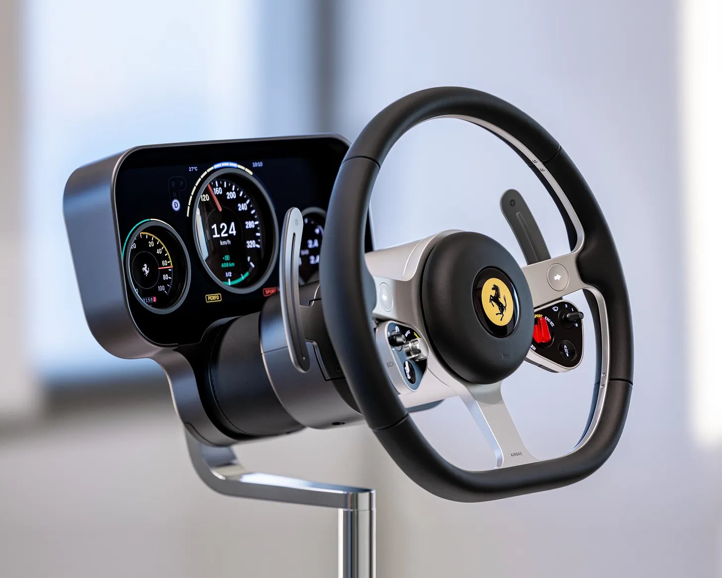
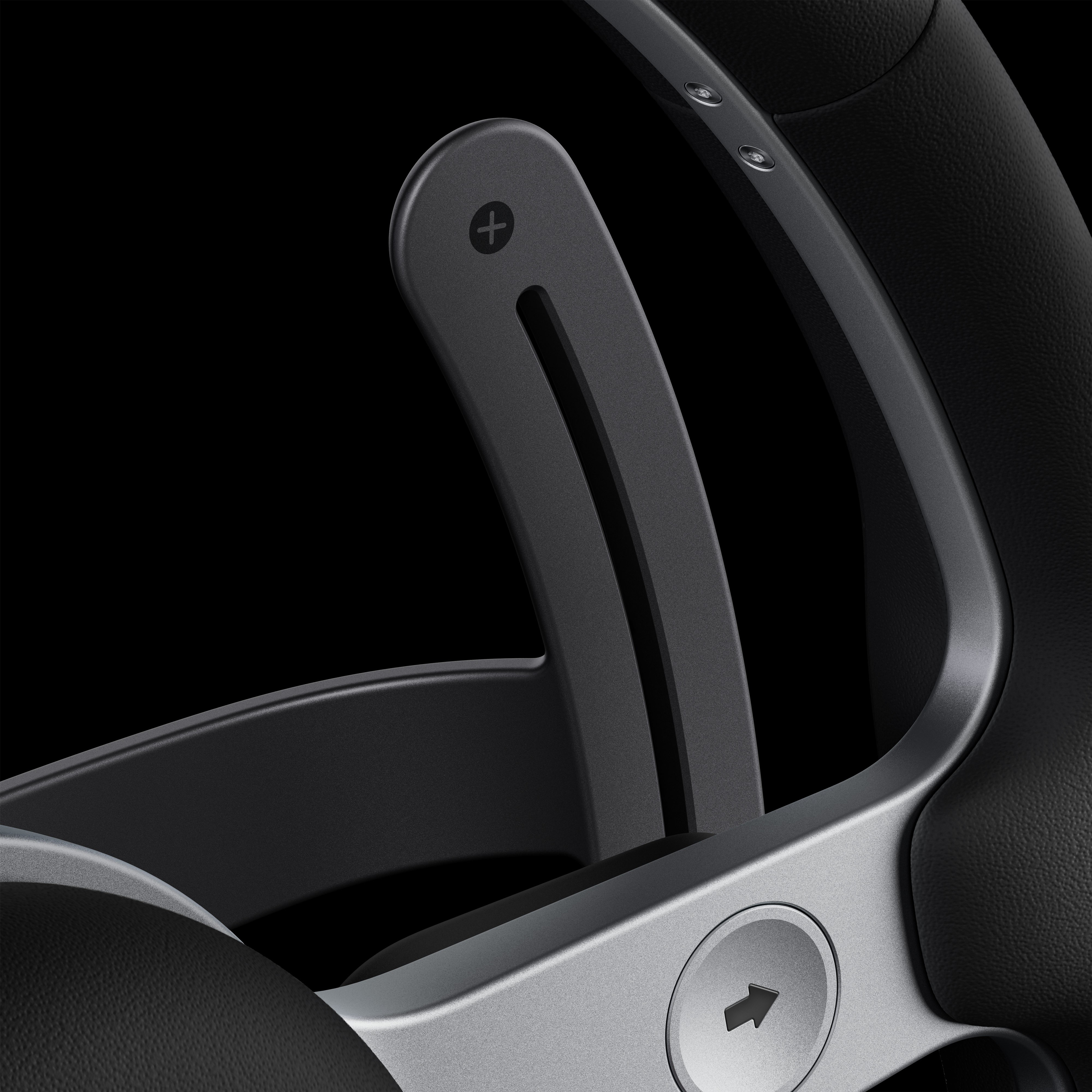
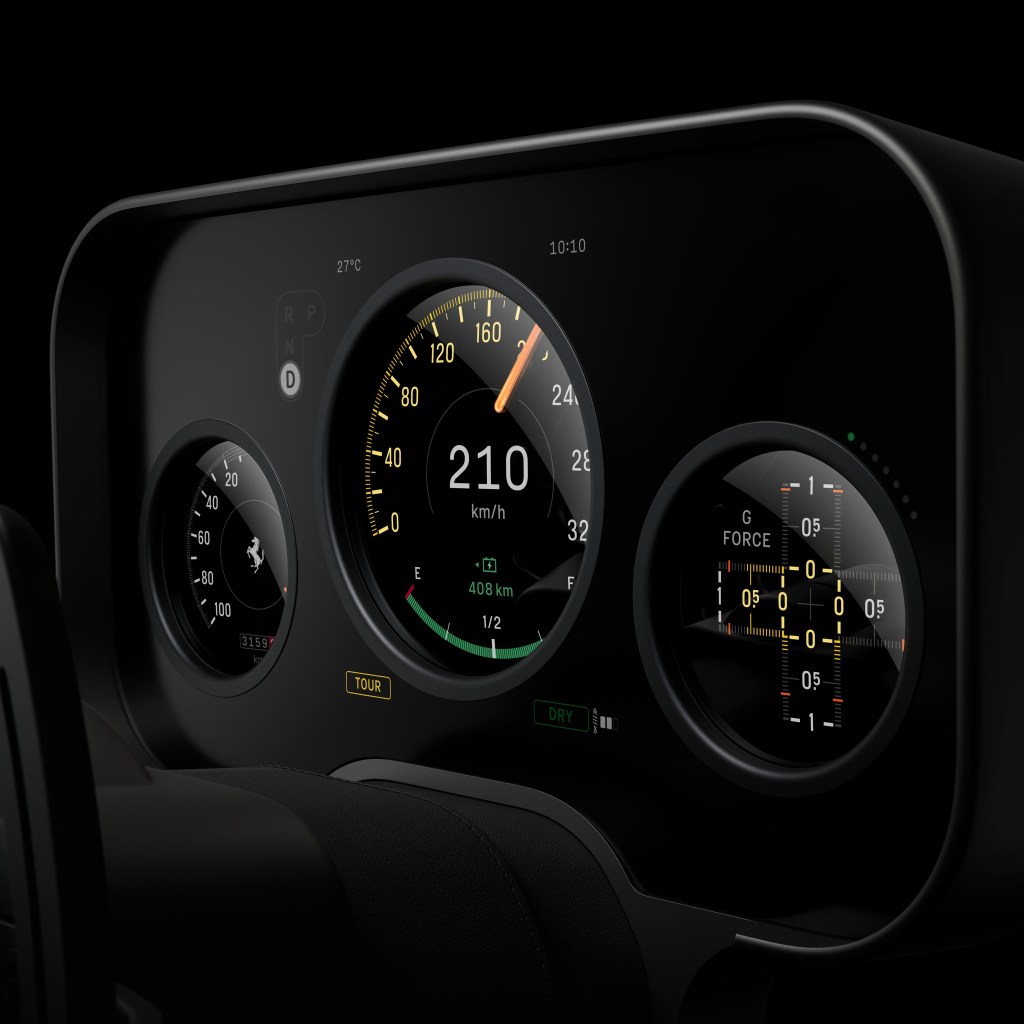
There are multiple areas in this cockpit which show considerable attention to detail that bridge the historic innovation with the new sophisticated precision and digitalisation of objects. The three-spoke heritage steering wheel with integrated force-sensitive buttons and switchgear, the moving binnacle, a multi-layered OLED cluster with convex lenses, an adaptive multigraph with independent aluminium hands, the glass key and magnetic dock. Of course, it will run CarPlay (not everyone does), though not, it appears, CarPlay Ultra.

These are matters of real substance and not a simple case of ‘putting buttons back’ in the driver’s reach. LoveFrom have treated each part as an object in its own right, and while the “buttons are back” message is a neat meme, it simplifies the human factors win that when your hand is reaching, having a physical datum that allows you to locate and operate a control is unbeatable and safe.

Photo credit: Ferrari/LoveFrom

Personally, the most naive and juvenile critiques are those that frame Jony’s work here as repetitive, and optimisation led, and both are absurd for different reasons. Firstly, repetition is not a negative when one considers that this is about principles, not a signature style. LoveFrom under Ive is in demand for the former, not the latter. You know when you hire Ive (and to be clear, he can choose who he wants to work with) that you are going to be working with someone that’s going to abstract this design problem to an atomic level and do so with a human-centred approach, then render it with the most exquisite sense of object and materiality. That he chooses to do this with aluminium, glass, clean geometry, and reduction is much the same as how any artist chooses their palette.

To further insist that this is optimisation and not creativity is then to take the most narrow definition of creativity as if optimisation is not a most vital part of creativity and especially in the context of automotive where frankly the last decade has shown anything but: the irony that as cockpits got simpler with fewer or bigger screens that our cognitive load soared and even the regulators got windy about what this meant for safety.

Perhaps just as naive was the assumption that the Ferrari model had been lost along the way as the project moved into the reality of production and execution. LoveFrom undertook the lion’s share of the design, and as San Francisco took on the design and coding, it was left to the Italians to engineer and driver test, along with the product development. A popular view is that this has somehow holed Ferrari’s ‘personalisation’ upsell model, as if this is what keeps the execs up at night in Maranello. It’s not. They sell arguably the world’s most desirable supercars; this cockpit is absolutely in this mould. If a customer wants personal stitching, a tweak here, a tweak there, of course, they’ll still get it, but this interior will, like the engine, be based around Ferrari’s view of perfection. The customer’s bespoke layer is on top of that.

Photo Credit: LoveFrom / Ferrari

Naturally, the criticism can be levelled at me that I am fanboying over those involved and, whilst I admire Ive, I’m not without my beliefs that he’s made some mistakes in the past. It’s also fair to say that I wonder how much his view of this project was ever robustly challenged vs. being waved through. Did the research depth give it such credibility and momentum that it was a foregone conclusion? PRNDL notes both Ive/Newson and Manzoni are quoted as saying it barely changed from that initial proposal, changes were more about proportion and ergonomics than fundamental rethinking.

I question too the manner in which these proposals can scale, age and remain serviceable.

Jewellery-grade interior components are lovely on a plinth and less charming after 30,000 miles, UV exposure, expensive moisturisers, and a few winters of grime. Whether parts can be repaired and replaced without becoming a boutique restoration exercise is a real question. The car being ultra-high-net-worth doesn’t remove the problem; it changes who pays for it and how quietly they complain.

The reveal was notable for being a left hand drive setup. OEMs have got accustomed to reducing physical mirroring of cabin elements, harnesses. No doubt screens and disappearing buttons have assisted them in delegating this to a software switch. Given how driver-centred some elements are in LoveFrom’s design, it’s an open question whether Ferrari will fully mirror the high-fidelity interactions for UK/Japan/Australia, or accept a ‘good enough’ conversion. This could be the strongest tell as to whether Ive and Newson’s principles can withstand operational and financial realities. If they mirror these interactions properly, it strengthens the whole “human-centred, truthful function” argument. If they don’t, it exposes it as geographically parochial.

Can this design language be reproduced across future models? It took LoveFrom five years to get this far with Luce, and they’re unlikely to be on retainer to roll out variants for other products down the line. I’m sure Newson and Ive have left behind a whole bunch of principles and specifications but, without the coach on the field, I wonder how successful the in-house teams will be at sticking to the playbook, especially as once the forcefield of Ive and co. has left, the bean counters and manufacturing value-engineers begin to circle.

It’s fair to dislike the look. It might even be funny to meme its similarity to a Fisher-Price wheel, but lazy shorthand isn’t grown up criticism, and I think it’s hugely important to celebrate a process where design has mattered deeply to everyone involved and that has been executed with real care for the end user and the craft or materials, manufacturing and objects. Ultimately, this has been a serious attempt to solve a product transition problem, to invigorate the brand for a new epoch in electrification, and the real test will be on the roads and the tracks, not in screenshots.

AI: I used Ai to sub-edit, do a bit of fact-checking and then generate the tag list and excerpts. That’s it.

Tagged , , , , , , , , , , , , , , ,

The world doesn’t need another post on Ai and creativity, but here’s one anyway

Apropos of nothing, I keep circling back to Bjarke Ingels’ throwaway observation he shared recently on Instagram about Ai prompting feeling a bit like briefing a team. You describe an intention, something comes back, you adjust. Anyone who’s spent time in a design or strategy studio recognises that scenario instantly, the loose sketch of an idea, the return volley, the shrug, the “maybe try it with less… erm whatever that is.” It felt like it was a nice clean analogy and I was nodding along.

But a studio isn’t a stochastic mirror. It’s a small society of taste and memory. People remember your last terrible idea. Someone raises an eyebrow when a line of copy looks off or a Figma file has gone fully feral. Someone else brings up the project you swore you’d never repeat. The feedback loop is human, textured, occasionally bruising. There’s judgement, shared reference points, work blue-tac’d up on the walls and a quiet sense of “let’s not embarrass ourselves again.”

This is where Ingels’ analogy starts to wobble. When you brief a human, you’re drawing on their judgement, experience, and the unspoken etiquette of a team. When you brief Ai, it behaves nothing like a junior designer and everything like a very confident autocomplete. It gives you the shape of participation without the substance. A colleague can resist you, encourage you to slow you down, challenge the premise. A (poorly prompted) model can’t. It just accelerates whatever direction you gesture toward, even when said direction is wafer thin.

And that, dear reader, is the seduction.

You type a mood, an intention, a half-formed thought, and it hands you an almost-finished artefact that looks uncannily like something you might have made if you’d only had more time or fewer meetings. The danger isn’t metaphysical (“is it creative?” please f- off, of course it is, have you actually looked up the definition of creative?1). The danger is how easy it becomes to confuse fluency with thought.

In my view, craft survives when you know what good feels like before you’ve picked up the pen or clicked New Document. And that’s the bit people don’t want to hear. The reasoning, the taste, the internal guardrails — they’re all invisible, they take years. Instead we’ve bred a culture (particularly evident on LinkedIn) where commentary stands in for competence, and Ai’s instant coherence makes that substitution feel almost legitimate.

I’m genuinely unmoved by the theological wrangling over whether Ai creates. If it’s parrot or Picasso. It’s a probabilistic parlour trick. What matters is simpler: whether the person using it can spot when the output stops making sense and is in fact bullshitting. Shallow but shiny. A calculator is harmless until someone who never learned to add starts doing the accounts. As the kids say “Same energy”.

Used properly, Ai is a fast way to think aloud, and as a sole practitioner, it’s become one of my favourite ways to work. It’s my pressure valve. A drafting companion. It pushes out variations I’d never have the patience to make by hand. But it only works because I already have a decades long sense of structure and gut instinct, the bit that quietly mutters “nope, that’s wrong”, or more accurately “what the actual fuck?” before I can articulate why. Without that, the tool becomes the teacher, and its blind spots become your worldview. I keep thinking about graduates walking straight into roles heavily emboldened by Ai before their judgement has even started to calcify and in that sense it’s a bit like giving a BMW M3 to someone who’s just passed their test. The horsepower arrives long before the skill that stops you putting in a hedge.

This is why the creative and consultancy industries feel brittle. So many people want the polished thought without the unglamorous labour that gives it heft. They want the sketch without the sketching. The judgement without the years that make judgement possible. And Ai, obliging thing that it is, makes that performance look convincing enough to fool the untrained eye, and sometimes even the trained one.

None of this makes the technology good or bad. It just makes it pretty shouty. And once a tool starts talking back, the responsibility shifts to the person holding it. Which is really just to say: the work doesn’t get better because the software is clever. It gets better because someone in the room still knows what good feels like.

AI: This piece was assisted with Ai. I used it for the tags, excerpt, the image generation and a little sub-editing. The ideas, references, and anecdotes were, however all mine.

  1. If you want the long version of why the question “Is Ai creative?” is a trap, Lisa Talia Moretti does a tidy job of dismantling it. She walks through the mess of competing definitions, points out the extent of human labour and data sit behind every so-called “creative” output, and ends up arguing that generative Ai is better understood as a medium than a tool. ↩︎
Tagged , , , , , , , , , , , , ,

Time Returned, Time Resold

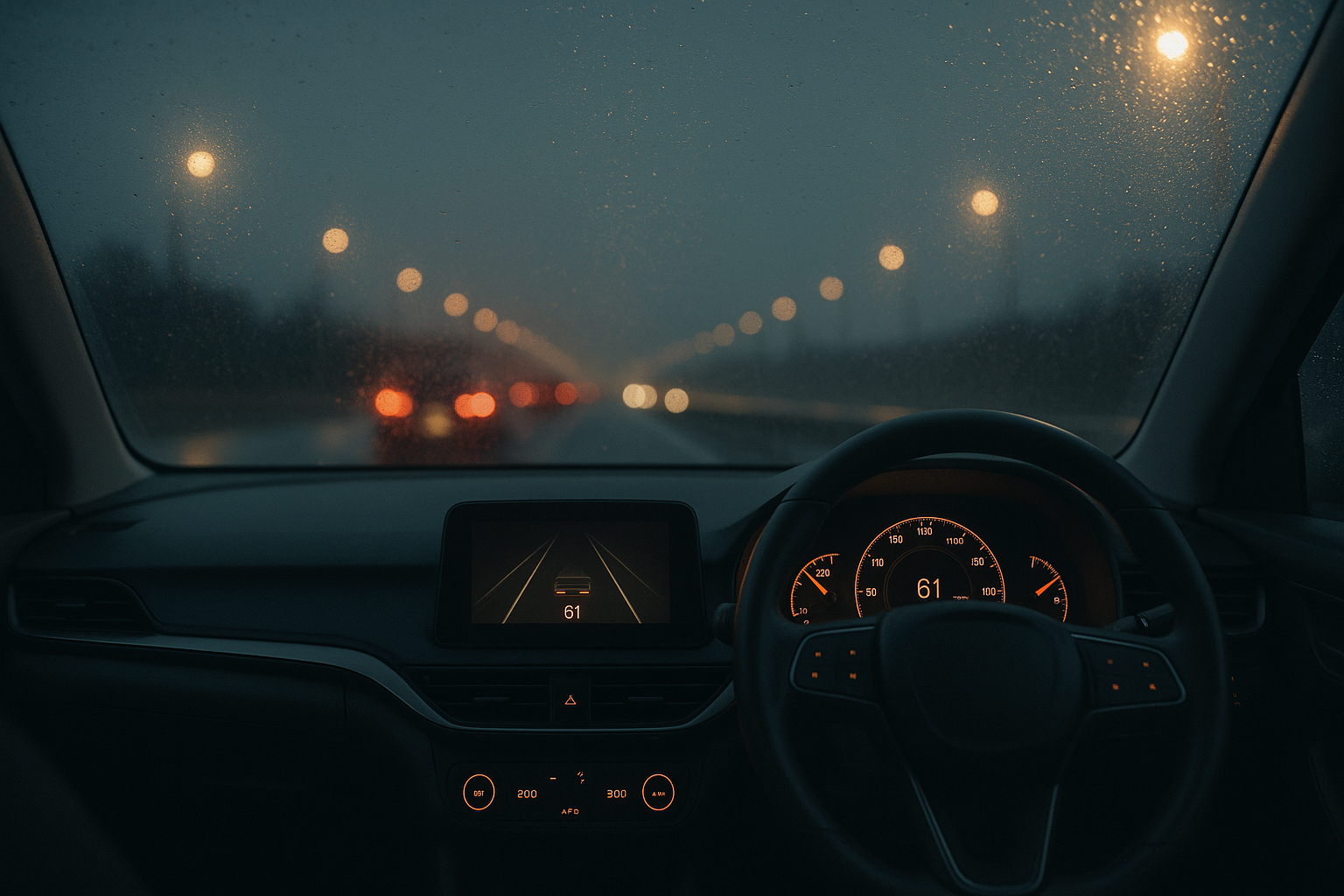
Rain-blurred motorway at dusk viewed through a windscreen; dashboard lights glow amber in an empty driver’s seat — a quiet image of autonomy and time unclaimed.
Autonomy promised freedom. Instead, it gave us metrics.

Every few years a new invention turns up promising to give us time back. The dishwasher did it, then the calendar app, now the self-driving car. Efficiency, they say, is liberation. But the minutes never come home. They’re quietly re-employed: answering messages that weren’t urgent until we saw them, scrolling through news we already half-read. We don’t get more time. It just comes back wearing a different outfit.

Design now speaks the intoxicating language of generosity. We’ll save you clicks. We’ll make it seamless. Lovely words, but they come with a tempo you didn’t choose. The system nudges, reminds, congratulates you on your streak. Even the oven chirps when it’s done pre-heating. Helpful, yes – in the way a personal trainer is helpful when all you wanted was a walk.

Efficiency was meant to hush the world, not make it chatter. Parcels update you mid-journey, cars suggest faster routes, TV apps interrupt the credits to make sure you don’t go off to bed just yet. You start to feel managed by your own apps and appliances. Is it me, or do they all sound slightly pleased with themselves?

Still, there is a deeper promise in all this autonomy. Because the best thing about a self-driving car isn’t speed, it’s permission. The choice to drive when you want to: for rhythm, for presence, for drivers like me who relish the satisfaction of line and camber, and to switch off when you don’t. The long crawl north to the Lakes. The dawn blast to the airport. The late-night, rain-spray-soaked slog home when you’d gladly hand over the wheel and let the motorway unspool while you exhale, watch the window-light flicker, maybe half-doze through an episode of something forgettable. Control should be optional, not constant.

That’s what the technology could be about: selective surrender or a quieter freedom. But for some unfathomable reason, the marketing and product design departments have decided autonomy is best packaged as constant optimisation. That means another dashboard app full of metrics and prompts and juanty reminders. We built cars clever enough to drive themselves, then gave them personalities that never stop talking.

Real luxury now isn’t speed but discretion: the right to decide how long something should take. To drive when you feel like driving. To look out of the window when you don’t. Technology can make both possible.

Convenience promised to return our hours, but mostly it’s taught us to account for them. Every minute feels spoken for. Perhaps the odd thing is how willingly we’ve agreed to it and the peculiar pleasure we take in shaving seconds off tasks we didn’t enjoy anyway.

Maybe the best thing a self-driving car could do is forget the ETA and let us forget, too.

AI: This piece was refined with AI, for the image prompt, tags, excerpt, and a little sub-editing. The ideas, references, and rhythm are mine.

Tagged , , , , , , , , , , , , , ,

Predictive Luxury: When the Algorithm Decides You’re Worth It

The paradox of modern luxury is that the more precisely it knows us, the less we seem to want it.
AI-driven personalisation flatters our taste so efficiently that desire itself begins to flatten. You open an app and there it is – the jacket you’d half-imagined, or the playlist that mirrors your mood before you’ve named it. The system anticipates, arranges, and completes. It feels frictionless, even generous.

But when everything fits this neatly, what’s left to reach for? Desire once depended on a perceptible gap, the space between wanting and getting. Now that gap has been optimised away. We no longer aspire; we’re simply anticipated.

Behind that easy charm sits a machinery, an industry, of prediction. Every scroll, hover, and hesitation becomes a confession. From these micro-gestures, the algorithm builds a probabilistic portrait: accurate enough to sell to, not to know.

This is predictive luxury – the luxury of convenience. It packages aspiration for the mass-affluent, translating status into data. The product is still expensive, but the experience is engineered for scale: “exclusive” taste delivered by statistical consensus. What once required discernment now arrives pre-approved.

To be clear, this isn’t curation. It’s correlation. Your discernment becomes the weighted average of everyone who clicked before you. Luxury houses once guarded their ateliers; now they guard their datasets. What was once stitched by hand is now inferred by pattern.

The shift sounds harmless until you notice what it removes.
Aspiration (the slow, self-defining kind) relies on uncertainty. We learned our taste through trial, boredom, and even embarrassment. Those edges are gone. There’s no risk in going to the restaurant where the algorithm has all but booked you the table. The algorithm keeps our preferences in a holding pattern, replaying what we’ve already confirmed, always within one standard deviation of safety.

The Predictive Plateau: a system that sells us the most probable choice, not the most interesting one. Left unchecked, it narrows the collective palate. As I argued in Luxury UX: Beyond Veneer, lasting equity comes from structure and restraint, not surface gloss. The real risk for luxury brands isn’t technological obsolescence but aesthetic homogeneity, a market trained to prefer the median.

Prediction is never neutral. Behind every act of personalisation sits a hierarchy of visibility, whom the machine believes is worth showing first. The more data you surrender, the clearer your silhouette in its model; those who resist become statistical ghosts.

There’s a quiet economics to this. By automating inequality, the algorithm devalues any form of wealth it cannot quantify or identify. The ultimate luxury, then, is to disappear from the data entirely, to operate through introductions, word of mouth, and private networks. The truly exclusive product is the one the algorithm cannot find, let alone recommend.

And yet there’s still one lever left: intentionality. The deliberate pause before purchase. The refusal to click “similar items”. The act of finding something the algorithm couldn’t possibly have foreseen. In a world of predictive luxury, this is not passive rebellion but an active aesthetic stance, a luxury of choice by will.

The smartest brands will design for this intentionality, not against it. They’ll reintroduce or retain friction as a feature: the waitlist, the mandatory consultation, the garment that demands to be felt. These are not inefficiencies but signals of depth, proof that the experience values attention over automation.

For all its precision, predictive luxury leaves a vacuum at the top. Once algorithms have colonised the middle (the mass-affluent market chasing “smart” recommendations), genuine exclusivity must move elsewhere. Increasingly, it drifts back to what machines can’t do: interpretation, eccentricity, the unrepeatable judgement of people who know.

That’s where true luxury now lives, in human-centred unpredictability. The ultra-wealthy and the culturally literate aren’t rejecting technology; they’re augmenting it. Data may light the runway, but the finale still belongs to the artisan, the editor, the quietly idiosyncratic expert who can surprise you in ways no model can.

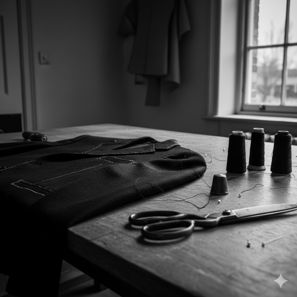
Close-up of a tailor’s worktable lit by soft natural light, showing thread spools, scissors, and a half-finished jacket with a visible imperfect seam — an image symbolising human craftsmanship and intentional imperfection in contrast to algorithmic precision.

British luxury has long understood this. Our best exports – Savile Row, Bentley Mulliner, McQueen, Hockney, Grayson Perry – thrive on that narrow line between discipline and disobedience. Their genius isn’t efficiency but editing: knowing when to break symmetry, when to leave the imperfect seam that proves a hand was there. The imperfect seam is a brand’s deliberate investment in unscalable production – the final, physical proof of value when all scalable processes have been commoditised. Curation, as I’ve argued before, isn’t collection. It’s the art of choosing what not to automate.

The challenge for brands now is to build value not through correlation but through judgement. To shift from efficiency to experience, from prediction to anti-prediction. Their next digital frontier isn’t better personalisation; it’s deliberate unpredictability, the algorithm that refuses to close the loop. Designing such friction isn’t romantic contrarianism; it’s the only sustainable strategy for generating new forms of scarcity, and with them, price elasticity.

Because in an economy obsessed with knowing what comes next, the rarest thing a brand can offer is the pleasure of not knowing, of being surprised, seen, and momentarily off-script. That’s the new exclusivity. That’s predictive luxury, undone.

Acknowledgements: This piece was partly inspired by Antonia Hock’s recent post on invisibility and the next era of ultra-luxury.

AI: This piece was refined with AI, for the image prompt, tags, excerpt, and a little sub-editing. The ideas, references, and rhythm are mine. You can still see my hand.

Tagged , , , , , , , , , , , , , , , , , , ,

Luxury UX beyond veneer: structure as brand equity

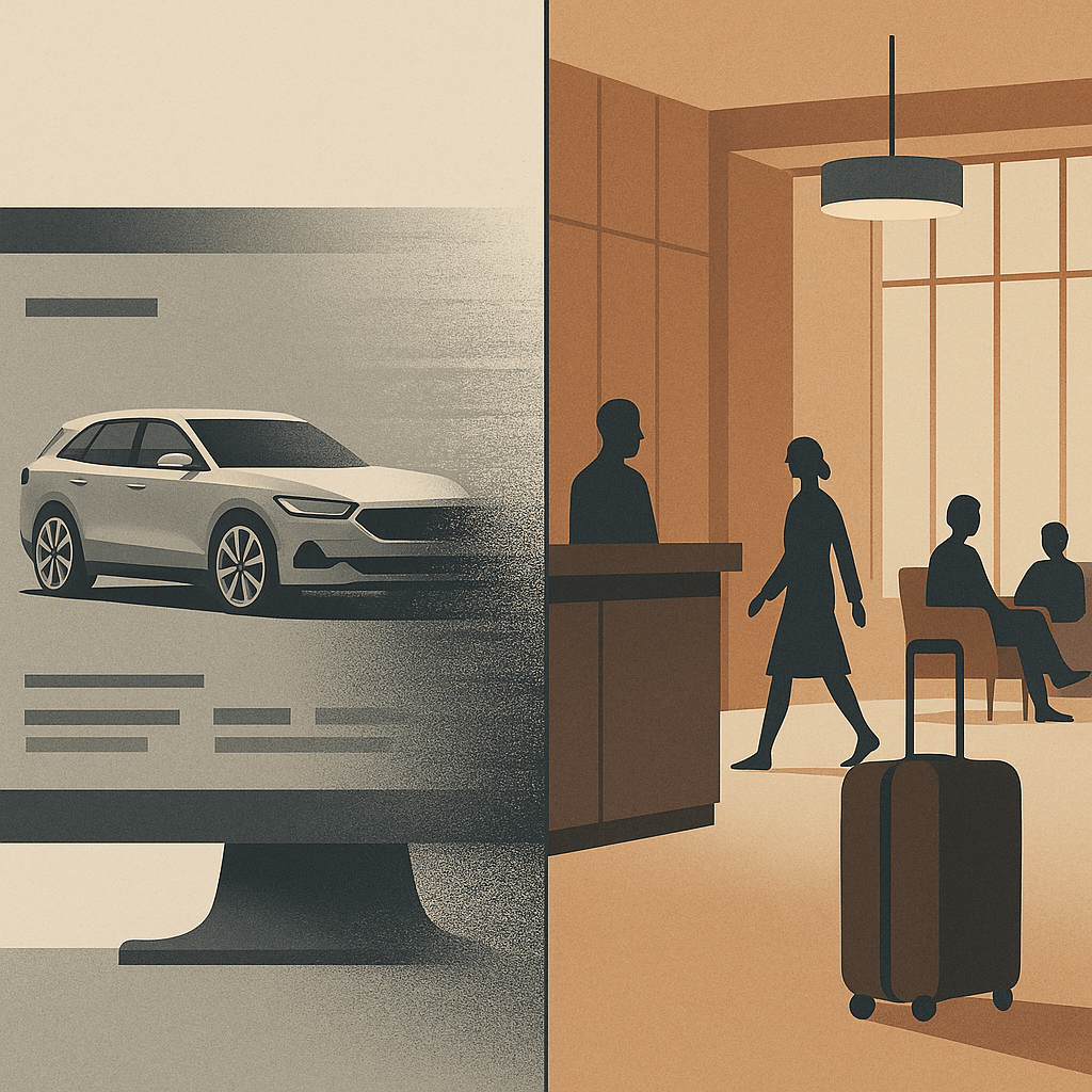
Split illustration in muted tones: on the left, a sleek SUV fades into static on a computer configurator screen; on the right, a calm hotel lobby with warm wood panelling, guests moving easily, and luggage arriving without fuss. The contrast shows polish versus structure, with luxury defined by order and rhythm rather than surface gloss.
Luxury isn’t in the chrome or the marble, it’s in whether the flow holds together without a fuss.

Luxury brands spend fortunes on surface. The right serif typeface. The right depth of cream on a website background. The right stock gsm on the brochure. Product renders with depth of field and lighting artefacts. But luxury UX cannot stop at veneer. If the underlying structure is clumsy, if journeys collapse into confusion or friction, then no amount of polish will hold that illusion.

The truth is that structure itself carries brand equity. The way a digital product is architected, how steps are ordered, how rules are introduced, how decisions are simplified, does more to signal competence and care than a thousand pixels of perfected pack shots. At Jaguar Land Rover we learned that millions of pounds of glossy configurator rendering and photoshoots is wasted if the journey collapses under its own contradictions.

When veneer is not enough

Consider that car configurator (I know I’ve been there before). The surface details may be flawless: chrome toggles, cinematic photography and transitions, elegant typography. Yet if the underlying structure forces a prospective customer through contradictory options, backtracking, or endless reloads, the brand is weakened. The luxury dissolves. Instead of modernity, the prospect experiences muddle. Instead of trust, they feel doubt.

Luxury is clarity disguised as ease. It is the sense that someone has already edited the path, made the trade-offs, and left you with decisions that feel not just coherent but inevitable. That coherence is structural. It is information architecture, not simple brand varnish.

Structure as invisible luxury

In regulated sectors, be it finance, healthcare, mobility, the stakes are higher still. Here, the user must feel that the product knows where it is going. A well-structured flow reassures not only through compliance but through a designed rhythm: disclosure followed by choice, choice followed by confirmation. In finance, disclosure sequencing is as much brand equity as trust marks in the footer. At Aviva, I saw how form ordering and timing mattered more than any banner, ad or brand flourish: get it wrong and trust collapses, get it right and the entire flow feels humane.

    This isn’t just true for luxury. At parkrun, where we were engaged to think about participant and volunteer profiles, the brand moment wasn’t surface polish but whether participants could find a barcode or book a roster slot without friction. There are quieter sectors away from money and luxe, but the principle holds: structure carries the brand.

    Hospitality and the British lens

    Top-end hospitality has always understood that structure outlasts surface. A hotel lobby isn’t luxury because of materials and furnishings alone; it’s luxury because check-in is peaceful, calming, effortless, because luggage appears without fuss, because the guest never feels unwillingly abandoned. The choreography, the sequencing of service, is the brand. Digital is no different. Done well, it is hospitality by other means.

    And here, for me, Britishness adds something. Where continental, EMEA or American luxury can lean toward performance, grand gestures, overt pampering, British luxury often communicates through understatement. Polished restraint. A dry nod over a champagne cascade and a platter of Dubai chocolate. That sensibility, translated into UX, means editing with discipline: fewer options, quieter confirmations, a flow that carries the user forward without ever drawing attention to itself. Not austere, not joyless. Just less show, more order.

    Brand equity in restraint

    A luxury brand earns equity not just through what it offers, but through what it withholds. The best experiences show judgement in what not to display, what not to demand, where to pause. Luxury isn’t ensured by the liberal application of gloss. Sheen can be appropriated, copied, imitated overnight. What endures is structure: the edits, the sequencing, the courage to strip things back until only what matters remains.

    When the experience lands with this quiet integrity, the user may never notice the scaffolding beneath. But they will feel the brand in the unbroken rhythm of moving forward without friction. That is luxury UX beyond veneer, luxury as restraint, stewardship, clarity. A quiet moral order and the calm assurance that polish and structure belong together if the experience is to endure.

    AI: This piece was written by me. I used ChatGPT as a sub-editor to keep tone aligned with my voice. The experiences, perspectives and final edits are mine. AI also produced the tag list, excerpt and image that accompanies it.

    Tagged , , , , , , , , , , , , ,

    The quiet panic of parenting in a digital world

    A moody, hyperrealistic photograph shows a teenage boy and an older man, presumably his father, sitting across from each other at a wooden kitchen table in muted, late afternoon light. Both are absorbed in their smartphones, their heads bowed. A single slice of toast on a white plate sits in front of the father, while two closed books are stacked near the boy. The light filters softly through sheer curtains behind them, illuminating a quiet, timeless kitchen. The scene evokes a sense of mutual disconnection and the quiet ache of modern life.

    When I was around 15, I’d get into trouble for calling a girl I was ‘seeing’ after 9pm on the house phone. I remember the jeopardy when her dad answered. It wasn’t just awkward, it felt catastrophic in that very teenage sense. There was no texting, no soft-launching your feelings via Reels. If you wanted to reach someone, you reached their entire household. Privacy was negotiated in real time, and a cordless phone allowing you to slink off to a private corner was borderline futuristic.

    I mention this not to romanticise a pre-digital age but to mark a boundary: I don’t truly understand what it’s like to grow up now. Not really.

    We’ve been told, often with good reason, that today’s teenagers are in trouble. Jonathan Haidt calls them the “anxious generation”, a cohort rewired by phones and social media. Since around 2012, adolescent mental health (especially among girls) has deteriorated alarmingly. Haidt blames the smartphone: a device that didn’t just enter childhood but, frankly, annexed it. The evidence is worrying, declines in sleep, attention, face-to-face connection. An uptick in self-harm, anxiety, emotional exhaustion. The argument isn’t hysterical. It lands.

    But Dean Burnett suggests we’ve misdiagnosed the patient. The panic, he argues, isn’t just in the teens, it’s in us. The parents, the teachers, the adults nervously refreshing headlines while peeking at their own screen time stats. According to Burnett, much of this alarm stems from a mix of generational disorientation (a kind of collective unease that what we grew up with is no longer relevant), recurring moral panic, and good old-fashioned ignorance. We didn’t grow up with these tools, so we assume they’re harmful. We project. We catastrophise. We fear what we don’t fluently use.

    The result is a pervasive sense of being at a loss. Some parents clamp down, banning apps, enforcing rigid rules on screen-time that feel increasingly arbitrary. Others detach, paralysed by the sheer bloody complexity of it all. But the most common response that I pick up from parents around me is probably the most human: low-level dread wrapped in middle-class guilt. We don’t really understand what our kids are doing, but we feel complicit anyway.

    And then, just as we start to piece together a measured response, “Right! phone-free supper time!”, delayed access, schools running digital literacy workshops, the next threat pops up. Welcome to Whack-a-Mole Parenting. Just as the cultural tide begins to turn on one device, another rises, this time more subtle, more embedded, more seductive.

    A recent Substack essay by Cal Newport took this from another angle. Reflecting on Ezra Klein’s critique of The Anxious Generation debate, he argued that we’ve become so beholden to statistical validation that we’ve lost touch with our own moral instinct. That rings uncomfortably true. We don’t just hesitate to act, we hesitate to know. When it comes to phones and parenting, our sense of what’s right is so often deferred, diluted, or apologised for.

    Take me, for example. I ask ChatGPT more (personal) questions, now than I ever asked Google. Some are practical: how to structure an email, what to cook with these leftovers, when should I plant out these seeds. But others are… not. I’ve caught myself consulting it about health worries, internal dilemmas, parenting doubts, things I wouldn’t bring up at dinner, or even necessarily with my family, my friends. Because it remembers. Because it adapts. Because it flatters you by bending to your will.

    And this is me: a reasonably grounded adult with (I hope) a steady compass and a mild allergy to digital hysteria. Yet even I find it maddeningly addictive. Not the technology itself, but the relation. The illusion of being known, helped, mirrored. I can only imagine how powerful this is for a 14-year-old who isn’t just seeking answers but identity.

    So the question isn’t whether smartphones are making kids anxious. They are, in some ways. But the deeper story is that we’re all overwhelmed by the sheer pace of paradigm shifts. We can’t metabolise one tech wave before the next hits us in the face.

    What Would Good Design Do?

    This is where design comes in. Not as damage limitation, but hopefully as orientation. The best design doesn’t just solve problems. It asks better questions. Like: what rhythms support attention? What thresholds help people feel held, not hijacked? How can digital relationships exist without replacing the real ones?

    The design problem is not abstract. It’s visible everywhere. Think of Snapstreaks – a design mechanism that rewards compulsive interaction with digital trophies. Or TikTok’s For You page – a personalised feed of videos that TikTok’s algorithm thinks you’ll be interested in, which notoriously appears to learn vulnerability faster than it learns taste. These aren’t neutral tools. They’re attention economies wired for compulsion, not care. If you’re a parent watching this unfold, it’s not just confusing, it’s existential.

    Anna Dahlström, a UX designer and storyteller I trust deeply, put it like this: “We need to design this—not as a roadmap, but as the future we want our kids and their kids to live in.”

    A brief aside here: Earlier this year, OpenAI’s Sam Altman and LoveFrom’s Jony Ive announced a collaboration to create a physical device for the “AI age.” They talked about daily rhythms, calm interfaces, emotional connection. And while their vision sounds noble, it also confirms the underlying anxiety: that our tools are no longer just functional, they’re emotional infrastructure. If anything, their announcement makes this conversation more urgent. Because the question isn’t whether the tech will be beautifully built. It’s whether it will reflect what matters.

    That means not just critiquing the addictiveness of AI companions, but imagining something better. Less extractive. More human. Here’s what that might look like (after an hour of making notes this morning):

    • Design for pause, not push. Platforms should default to stillness, not stimulation. Kill the endless scroll. e.g. “You’ve seen it all, for now” or opening to a prompt rather than a firehose of dopamine content, or making ‘like’ less of a tap and more of a hold, restricted to just a few per day. Default to a quiet mode after 20 mins. Ask a user “why are you sharing this?”
    • Design for self-awareness. Don’t just track engagement. Track how users feel when they leave. Make reflection part of the loop. e.g. “How did that make you feel?”, reporting this along with screen time weekly reports. An in-app emotion metric that algorithmically analyses your interaction cadence, scroll patterns, message tone.
    • Design for companionship, not substitution. If AI is going to listen, let it redirect. Let it nudge us toward real conversations, not just simulated ones. e.g. “This sounds important. Have you considered talk to [name]?” or helping the user plan social activities, remember dates or conversation starters.

    The tools aren’t going away. But the way we design them can still reflect care, pace, and conscience. That’s not a nostalgic idea, it’s a classic UX problem and one worth solving.

    Coda

    When I was a teenager, the phone was something you had to ask permission to use. Now, it’s something we all struggle to put down. Maybe the answer isn’t more rules or fewer apps. Maybe it’s knowing what to do with ourselves in the quiet space that’s left when the screen goes dark.

    That’s where design still has a role to play, instead of locking us out, it guides us home.

    AI disclaimer: This piece was written by me, but I used ChatGPT to sub-edit, surface research, help shape the structure, and keep the tone aligned with my voice. The experiences, perspectives, and final edits are mine. AI also produced the tag list, excerpts and image that accompanies it.

    Tagged , , , , , , , , , , , , , , , , ,

    Amazon’s UX: Why Customers Ignore the Chaos

    Amazon’s interface is a mess. Everyone knows it, doesn’t matter if you’re in the industry or you just use it to buy lightbulbs, the odd book and some fancy Tupperware. It’s the digital equivalent of a hoarder’s house, clutter everywhere. A friend of mine once memorably described looking for something as like “rummaging through a warehouse with a torch”, but [she does it because] “I know the bloody thing I want is in there somewhere”. On any given part of the site there’s inexplicable stacks of unrelated items, and a sense that at any moment, something might fall on you. My particular hate are sponsored listings, intruding like pushy sales reps with their irrelevant nonsense while you’re on the way to buy the actual thing you searched for (although sometimes the actual thing turns out to be a not-quite-there copy from some random far-east factory). Genuine customer reviews also get buried under an avalanche of SEO-stuffed nonsense, and yet, dear reader… here I am, ordering 90% of what I buy from Amazon. And you do too.

    However frustrating the experience, it isn’t bad enough to drive people away. Fast delivery, sheer product choice, and a checkout process so frictionless it should be flagged with Gamble Aware. All of this outweighs the UX sins.

    So, Does UX Even Matter?

    It is a question worth asking. If a platform’s core proposition is so compelling, with cheap prices, instant gratification and no meaningful alternative, does the user experience really determine success? Or does it just need to be functional enough?

    The Amazon Conundrum

    Armchair critics love to dissect Amazon’s UX. In the dark corners of the UGC web, Reddit threads are full of users raging against the chaotic interface. Tech journos lament the aggressive Prime pushing, the pay-to-win search results. On paper, it’s a usability horror show. But let’s be clear, Amazon isn’t neglecting UX. It employs entire teams of UX designers, researchers, and engineers who are constantly refining the experience. Not to make it more elegant, but to make it better at selling things. If adding another sponsored listing increases revenue, they’ll do it. In 2022 alone, Amazon made over $31 billion from its advertising business, largely driven by these placements, making it a core part of their revenue model (Vox). If customers still find something to buy despite the friction, then as far as Amazon is concerned, the system is working just fine. The difficulty we have as UXers is understanding and reconciling this. Because we see ‘Sponsored’ listings trump the actual best-result search listing we say “This is wrong, users hate this!” but somewhere deep in Amazon HQ is the data to say, “You know what, they actually don’t, and here’s some more $” (EcommerceFuel and others provide further context on how Amazon’s sponsored listings work and why they persist). The same logic applies to other blunt instruments like relentless pop-ups (deeply irritating but demonstrably effective at nudging hesitant users into making a decision) and those blinking, anxiety-inducing countdown timers all over that Instagram brand’s shop aren’t there by accident either.

    When UX Takes a Back Seat

    Of course, Amazon is hardly alone. Plenty of other sites with objectively terrible UX remain dominant because their value proposition is simply stronger than the frustration they cause:

    • Booking.com drowns you in pop-ups and ‘Only 1 left at this price!’ warnings. Yet its vast selection and competitive pricing make it impossible to ignore.
    • British Airways’ website looks and feels like it’s been trapped in 2009, but people still book flights because, they will always believe the brand stands for something British and the pilots are the best trained and most decent in the skies.
    • Vinted The latest upstart eCommerce brand is having a runaway success in the UK but this is absolutely down to the simplified sell-send logistics and payment process, and definitely not to the bloody awful filtering and product exploration UX (seven different ways to filter on Ralph Lauren sweaters anyone?).
    • GP surgery websites, National Rail, car park booking systems, there’s a vast ecosystem of poorly designed necessities that survive because users effectively have no choice or poorly rationalise their value/essentialism.

    This phenomenon isn’t anecdotal or lost on UX thinkers. As David C. Wyld argues in The Endless Battle Against Bad UX, poor usability is pervasive in major companies, and fixing it isn’t always a top priority. Similarly, The World is Running on Bad UI (Michal Malewicz) notes how many essential services and platforms operate on clunky, outdated interfaces yet remain functionally irreplaceable. Their insights reinforce the central argument here: bad UX doesn’t necessarily mean bad business.

    The Captive Audience Factor

    The obvious point here is that there is a difference between platforms like Amazon, where the UX is frustrating but functional, and services where users are stuck with whatever’s available. The difference with Government portals, legacy corporate systems, anything remotely tied to infrastructure is that these things aren’t just designed badly; they are fundamentally unmotivated to improve.

    It’s not even a matter of UX being ignored (again, plenty of these organisations are populated by skilled and well-meaning design folks), it’s often a mix of limited budgets, outdated tech stacks, bureaucracy (many hands), and the sheer pain and complexity of rebuilding something that’s been patched together over decades.

    The same logic applies to countless internal systems in large organisations, where usability takes a backseat to bureaucratic inertia and legacy technology. Everyone grumbles about it, but change is slow, and innovation rarely prioritises the dull but essential parts of work life. Just as no one is investing to replace the office microwave that’s been there since the turn of the millennium, so we continue to suffer through whatever shitey interface we’re given.

    The Reluctance to Overhaul

    Could Amazon wholesale overhaul its UX if it wanted to? Technically, yes. But would it be worth it? Probably not. The site is a sprawling ecosystem of millions of products, channels and third-party sellers, advertising deals, and logistics chains. Trying to impose a sleek, minimalist interface would mean unpicking the very mechanics that drive sales at an enormous cost.

    The same goes for other massive platforms. The bigger and more layered a system becomes, the harder (read more expensive) it is to rebuild from the ground up. This is exactly the scenario I described in The Local Maximum Problem, where businesses become trapped in cycles of micro-optimisation rather than taking bold steps toward meaningful UX improvements. Businesses, especially ones as enormous and entrenched as Amazon, often optimise for small, short-term gains instead of taking the risk of a complete overhaul. They’ve reached a peak where micro-adjustments keep the machine running, even if they don’t solve fundamental UX flaws. Redesigning from scratch is a leap into the unknown, and when the current setup is still printing money, who would take that risk? Maybe they update a search filter. Maybe they tweak the layout slightly. But the underlying experience remains a Frankenstein’s monster of competing priorities.

    So, Does UX Matter?

    Yes, but not in the way purists would like to believe. Good UX reduces friction, increases trust, and improves efficiency, but it doesn’t always dictate whether people use a platform. When the value proposition is strong enough, users will tolerate a lot.

    The idealistic view is that platforms should improve out of respect for their users. But what do you think? Have you ever abandoned a platform because of its terrible UX, or do you find yourself sticking with frustrating experiences because the value proposition is just too strong? Perhaps if people keep clicking, why fix what isn’t broken?

    Tagged , , , , , , , , , , , , ,