Tag Archives: passenger experience

Before Someone Signs Off on the Robots

Have you seen the new robotic parking at Gatwick? It looks quite cool.

It works like this: you drive up into a garage bay, get out, scan a code, take your luggage and wander off to get on a bus to the terminal. Meanwhile, as you bump along the perimeter roads on your way to Pret a Manger and a surly greeting at security, your car is being lifted by a robot and shuffled into a parking space “fully autonomously” and presumably without the clattering of doors into each other or a young lad with a vape doing power slides in a field.

It reminded me of another experience in innovation I recently revisited: Pod Parking at Heathrow.

Ten years or so ago I tried it on a business trip to Scotland. A pre-dawn drop-off in a largely empty car park (back then it was still newish and posh enough to feel business-only), followed by the novelty of a solo ride in a pod to the terminal.

Returning this year with my son on a ski trip, it was slightly less fun.

A busy car park hunting for a space. A long walk with bags to the station. Then the ignominy of sharing a pod with other people similarly bedecked with ski equipment and making inane small talk before setting off on a circuitous, stop-start loop towards the airport.

Notwithstanding the fact that I’m now in my late 40s, travelling with rather more family paraphernalia and rather less wide-eyed consultant enthusiasm for clever infrastructure, the whole thing instead felt like a technically neat attempt to solve the wrong problem.

But before I explain why, let’s return to Gatwick’s robots.

Apparently they’re constrained a little. A fact mentioned almost in passing in the voiceover of what I assume was a press video: there are limits on vehicle weight, wheel size and wheelbase.

Plenty of people wouldn’t think twice about that. I did.

The service is marketed as a premium solution and has a five-day minimum stay. So it seems reasonable to assume a fair proportion of customers will arrive in large, expensive family cars.

Let’s say you own an i7, a Volvo EX90 or perhaps you’ve ordered the Range Rover EV. None of those can use it.

Already this premium, cutting-edge parking solution can’t accommodate a fairly representative selection of premium, cutting-edge family cars. Edge cases, perhaps, but also edge cases sitting at the leading edge of a market that is getting heavier, longer and increasingly fond of enormous wheels. The 21-inch wheel restriction feels particularly egregious.

Of course, the robots can presumably be enhanced. But significant capital has already been sunk into the system. Does the machinery now keep pace with the cars, or do customers eventually discover that their apparently ordinary SUV has fallen outside the parameters of the futuristic car park?

In any event, I started wondering whether robotic parking is actually solving a consumer problem. Or, more accurately, whether it is solving the right consumer problem.

From Gatwick’s point of view it may make perfect sense. Cars can be packed closer together because people don’t need to open the doors. You need less circulation space. There may be fewer staff movements. Less risk of somebody clipping a wing mirror or rearranging the side of a Cayenne against a concrete pillar. Potentially you get substantially more parking capacity out of an extremely valuable piece of land. Those benefits are undeniable.

But you’ll note they are largely benefits to the airport and parking operator. The customer has a rather different problem.

They want to arrive, find where they need to go without circling three times, get kids and bags out, leave the car somewhere they trust is secure, and ultimately reach departures with the minimum possible faff.

Preferably, too, without standing in a bus shelter in horizontal sleet debating whether the matrix display’s ‘6 mins’ has in fact changed at all in ten minutes.

Seen that way, the robot is doing something very impressive several stages after the customer has stopped caring. Once I’ve walked away from the car, I don’t really mind how it gets parked. A robot can carry it above its head while bleeping like a jolly droid. My attention has moved on to the next thing: where is the bus, how long will it take, will there be space for the bags, and how long do I need to stand next to the pseudo-Love Island contestant in coordinated loungewear before I’m actually inside the terminal?

Which brings me back to Heathrow’s pods. The engineering proposition is, or at least was, immediately seductive. Small autonomous vehicles, ostensibly on demand, with a dedicated congestion-free route to the terminal. The PowerPoint similarly likely wrote itself. Judged narrowly as a transit system, it’s evidently clever.

But the judgement should be from the passenger’s experience. Here the journey begins not when the pod moves but when you stop your car: park. Extract luggage. Work out the nearest station. Walk in the rain. Wait. Board. Travel. Sometimes stop — “We will resume your journey shortly”. Get out. Walk again with luggage. Find the terminal entrance.

That is the system and, when closely observed, some fairly boring alternatives instead appear surprisingly competitive.

Put more bus stops alongside parking rows. Increase their visibility and directional signage. Cover the walking routes (maybe even with solar panels). Tell people exactly when the next bus will arrive. Run enough buses that nobody really needs to think about the timetable at all.

And make the bus itself good. Warm in February, properly air-conditioned in August. Comfortable seats. Proper luggage racks designed around what people actually take to airports rather than a grudging shelf above the wheel arch. A driver who says hello, helps someone with a heavy case and knows where they’re going. Give the thing a bit of design attention.

None of that is technologically remarkable, but I suspect the combined effect on the journey could be disproportionately positive.

You’re unlikely to find an architectural visualisation of a man standing happily beneath a bus shelter on the homepage of Dezeen. Or a breathless article about wayfinding signage in Monocle.

But it may produce a better experience.

Perhaps, too, there is another behavioural wrinkle. Five minutes of waiting for something you cannot quite predict can feel substantially worse than eight minutes of movement towards your destination. Walking, as many have observed, gives you a sense of progress and control.

Although luggage complicates the calculation.

A 400-metre walk without luggage can feel like useful progress. The same 400 metres dragging two cases, a ski bag and a slightly recalcitrant child across coarse tarmac is not quite the same behavioural proposition. At some point movement ceases to feel like autonomy and simply becomes work.

Which is why shaving two minutes from the vehicle journey may be almost worthless if the passenger has had to drag their luggage an extra 400 metres to reach it. A beautifully optimised autonomous transit system can quite easily lose to a diesel bus simply because the diesel bus stops adjacent to your car.

So often, sophisticated experience design goes slightly wrong along such lines. Organisations naturally optimise the things they can see, measure and control. In this case: vehicles per hectare, average transfer time, labour requirement, throughput, number of drivers, perhaps even CO₂. All sensible metrics.

People, rather inconveniently, experience the gaps between them. They experience the anxiety of where to go. The extra walk nobody included in the journey-time calculation. The toddler who needs a wee. The suitcase with a wobbly wheel. The bus that pulls away just as you approach the stop. Such things are difficult to measure, don’t align neatly to one system or department and so disappear from optimisation models altogether.

So when we end up with technically excellent things that somehow feel worse, I wonder if there is also an element of theatre at play.

Airports have always been preternaturally good environments for conspicuous modernity. The driverless pods, biometric gates, robots and baggage systems, vast digital screens. They are signals, often at a national identity level, of investment, progress and future-facing willy-waving.

A covered walkway, even with solar panels, is not that. Neither is a bus stop being moved 80 metres. Yet either could improve more journeys, more often, for less money.

None of which is to denigrate the robots too much. They’re far from pointless and if Gatwick can materially increase parking capacity without tearing up more green fields, robotic parking may prove to be quite the investment. Judge it on density, operating cost, reliability and land use and the argument may be very strong. But then call it what it is: clever parking infrastructure.

The more useful question is simply whose problem we’re actually solving. Sometimes installing a fleet of robots that lets you cram more cars onto the same patch of land genuinely does improve the customer experience. Sometimes the customer would get rather more from a bus stop 80 metres nearer their car, an accurate countdown and a warm bus with somewhere sensible to put the cases. The difficult part of experience strategy is having the confidence to work out which before someone signs off on the robots.

AI: I used ChatGPT to tidy up some grammar and that, dear reader, is all.
Tagged , , , , , , , , , , , , , , , , , , , , , , , ,

Killing Time: The New British Rail Clock and the Quiet Downgrade of Agency

There’s a very British idea, popularised for a certain generation by mid-00s Top Gear, that you simply shouldn’t be seen running. While Clarkson would hurl a Ferrari at the Alps and Hammond would squeal, James May absolutely wouldn’t “leg it” through a station on television. The joke only worked because it sat on an older social rule: hurrying is vulgar; being in control is a virtue; arriving on time is the outward sign of having your life vaguely together.

It isn’t wholly true, of course. Any weekday at rush hour will show you people going like stabbed rats through the barriers to catch the seemingly only service to Guildford in the next hour. But the sentiment matters, because it explains what a station clock is really for. It isn’t there to decorate the concourse and look great on design renders. It’s there to let you preserve one’s dignity while still making the train.

And that’s why the new national railway clock redesign (unveiled in October 2025) is such an interesting failure. On the surface it’s excellent: it uses Rail Alphabet 2, Margaret Calvert’s updated typeface, digitised by Henrik Kubel, and it’s been delivered by Design Bridge and Partners as the first national update in decades. It’s legible, high contrast, and properly British in the best sense: quietly authoritative. The hands and numerals look like they belong to an infrastructure system rather than a lifestyle brand.

Then you look for the seconds.

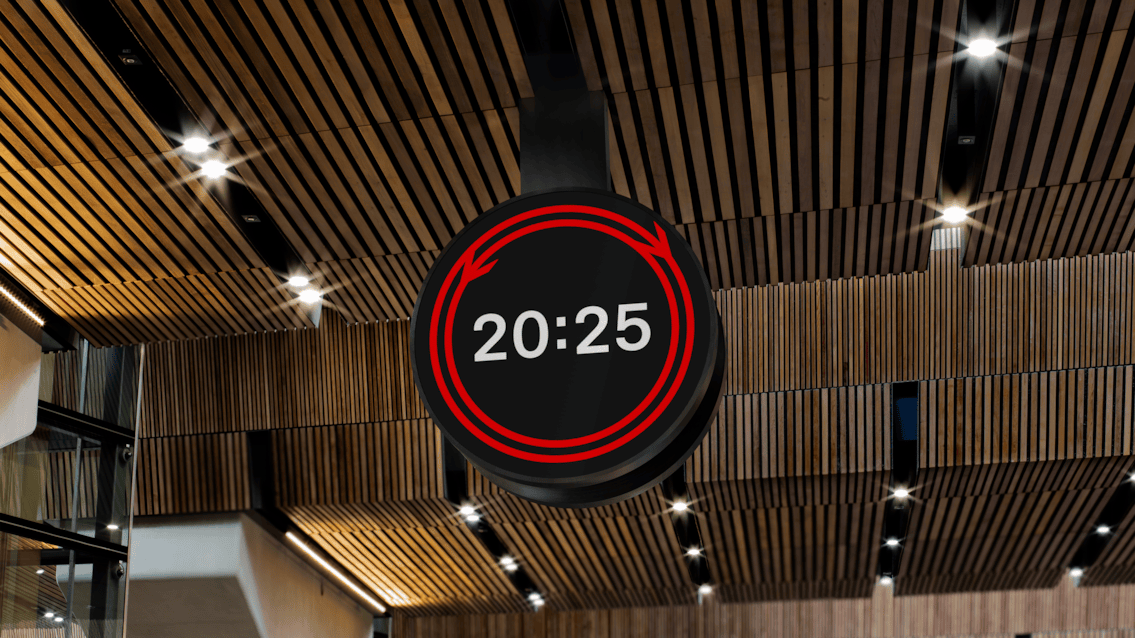
In the new design, the traditional seconds hand is replaced by an animated version of the double-arrow logo. It splits and moves around the rim on two red tracks, meeting at the 12 and the 6 every 30 seconds. It’s clever. It’s kinetic. It’s also a very specific choice about what kind of information the most visible clock in the system should prioritise.

A circular black digital clock hanging from a wooden slatted ceiling with recessed spotlights, displaying the white text "20:25" inside a red-parallel track style bordered circle with bidirectional arrows indicating the seconds on a loop or cycle.
The new national railway clock redesign

It’s worth being precise about the scope of the complaint here. Seconds haven’t been abolished from the railway. In stations, they can still be available in places where they truly matter operationally, on platform screens and in platform contexts. The issue is that the big “master” clocks, that is to say the concourse clock, the exterior clock, the one you can see from across the hall, have chosen to make seconds less instantly legible, right at the point where humans make their first, most consequential decisions.

Because a station clock isn’t décor. It’s a contract between passenger and system.

A public clock in a transit hub is the final arbiter between the system’s schedule and your autonomy. When there’s a tight connection, when platform numbers change, when the train is somewhere over there with the doors open and you’re deciding whether to jog or accept defeat with dignity, the clock is the one thing that’s meant to be beyond interpretation. You don’t need it to have a vibe. You need it to be right—and to be readable at a glance, from a distance, while moving.

The traditional sweeping seconds hand gives you linear, active information. It’s not just “the time”; it’s the rate at which your margin is shrinking. You can glance once and know, without thinking, whether you have 75 seconds of brisk walking or 15 seconds of that un-British sprint.

The new clock asks something different of you. The seconds are still there, technically, but they’re encoded as movement you have to read. A person now has to decode a logo’s behaviour under pressure in a concourse already full of stimuli: screens, announcements, people drifting into your path with a wheelie case, the whole theatre of urgent politeness. Where a seconds hand was a data point, the animated mark becomes a small task. That task is a cost. And in a station, costs are paid in stress.

The 17:22 Runner

Consider the 17:22 runner at Waterloo: you hit the concourse at 17:20:45, bag strap slipping, the smell of victuals you don’t have time to buy, and you need one piece of information: how much time is left before your decision becomes irreversible. Not an approximate sense of now. Not a calm impression of punctuality. A countdown.

A conventional clock gives you that instantly because you already know how to read it. An animated rim cue forces you to observe the rate of change. That’s fine when you’re admiring the clock from a distance; it’s unhelpful when you’re trying to decide whether running will be safe, or even worth the social embarrassment. Uncertainty multiplies stress. It also drives worse choices. People misjudge, dash late, squeeze through doors, and take risks because the system refused to hand them the most basic ingredient of rational behaviour: precise time, early enough to act on it.

“Yes, but John the platform shows seconds” isn’t the rebuttal people think it is. By the time you’re on the platform, you’ve already committed. The concourse is where you decide whether you even have a chance, which route through the station you’ll take, whether to stop and check a board, whether to abandon the sprint and save yourself the indignity. The master clock is the one you can see before you commit to direction. That’s precisely why it matters that this clock has become interpretive.

A clock that makes you watch it for longer is a clock that’s failed its job.

Inclusive design, and the point where it gets misapplied

The public defence for removing a traditional seconds hand has been framed in inclusive design terms: reduce visual clutter; lower cognitive load; create a calmer centrepiece in a visually noisy environment; consult accessibility experts; ensure legibility for neurodivergent and visually impaired passengers. Some of that is solid. High contrast, proportion, and type are genuine wins. Rail Alphabet 2 looks built for this.

But inclusive design doesn’t mean deleting information. It means structuring it.

In UX terms, the answer to noise is hierarchy: make core information dominant and secondary information available without demanding attention. A well-designed seconds hand is background data until it becomes foreground data. You can ignore it when you’ve got slack time; you can rely on it when you don’t. The design choice here replaces a familiar, instantly legible secondary signal with an abstract one that requires interpretation at exactly the moment users least want interpretation.

Even if you accept the intention, the interaction cost is being paid by the wrong person. The domestic traveller with plenty of time and a Soduku in Swindon can enjoy the calm. The time-poor traveller (often the one juggling childcare, shift work, awkward connections) and the general friction of British public life, gets the burden of decoding.

It seems this is the recurring pattern in modern service design: smoothing the interface for people with margin and pushing the remaining complexity onto those without it.

Precision as theatre: the Swiss counterpoint

If you want proof that precision can be humane rather than harsh, Switzerland has already done the case study for you. The SBB clock is iconic for a reason. Its red seconds hand completes a circuit in 58.5 seconds and pauses for 1.5 at the 12. That movement isn’t decoration. It’s a synchronisation signal for dispatch1 and a trust signal for passengers. It tells you, without a word, that the system is coherent and the public time is shared.

The Swiss obsess over the second because they understand the relationship between granularity and trust. The more precisely a system can tell you what’s happening, the less you have to fill the gaps with anxiety. Precision reduces drama.

The British redesign moves in the opposite direction. It doesn’t deny time; it aestheticises it. It turns the master clock into something closer to a brand artefact: an, admittedly handsome, graphic identity with a reassuring rhythm. The result is a timepiece that feels contemporary while quietly stepping back from its core civic purpose.

Active information to passive vigilance

There’s a useful parallel in the removal of old split-flap departure boards. The clack of the tiles was a kind of haptic affordance; it announced itself. It pulled your attention at the moment something changed. Modern digital screens are silent and passive. They don’t summon you; you have to keep checking them. The burden of vigilance moves from the system to the person.

This clock is part of the same drift. By replacing an instantly readable seconds hand with motion you must interpret, the clock becomes less of an arbiter and more of a piece of wall art. It undeniably looks better and increases cohesiveness across the rail estate. It works worse at the moments that actually matter.

Seconds still exist elsewhere in the network. That’s the point. The railway has kept precision where it’s operationally necessary, then softened it where it’s socially authoritative. Calm should be the outcome of a system that runs with surgical precision. It shouldn’t be manufactured by making the most public-facing clock in the building slightly less precise, slightly less immediate, and slightly more about how the railway would like time to feel.

AI: I used AI for the tags, the excerpt, and a light sub-edit. The ideas, references, observations, and anecdotes are mine.

  1. The hand only restarts when it receives an electrical “minute pulse” from a central master clock. This ensures that every clock across the entire Swiss network (from Geneva to St. Gallen) synchronises the turn of the minute to the exact same millisecond. It’s a happy accident that this technical constraint has left to a better end result for users. ↩︎
Tagged , , , , , , , , , , , , , , , , , , ,