There’s a lovely small detail in BMW’s Neue Klasse safety engineering that interested me rather more than the breathlessly inevitable claims in the press pack about computing power.
If the car detects a cyclist approaching while you start to open the door, it can briefly stop the electronic lock releasing. You pull the handle. Nothing happens for a second or so. Cyclist passes. Door opens.
It is in itself a tiny intervention, but it tells a story about the way we have designed automotive interfaces for years. The usual approach would be to detect the cyclist, flash something, perhaps in the mirror, make a noise and hope the person opening the door notices the warning, understands it and reacts before depositing said cyclist across the road, GoPro and all.
We have become very good at warnings. Cars bong, flash, vibrate and illuminate little amber hieroglyphics all over the place. Much of the time this is eminently sensible. But every warning also represents a decision about responsibility: the system knows something, tells the dumb distracted human, then leaves the same fallible human to sort it out.
In this case BMW appears to have asked a more pertinent question. Given that the car already knows there is an immediate hazard, and given that delaying the door by perhaps a second has almost no meaningful cost, why involve the human in that particular bit of the decision at all?
We spent quite a lot of time thinking about this during the Human–AI Systems course I took this year with Cambridge University. Discussions about automation and Ai tend to drift towards capability: what can the machine do, how clever is it, how much should we automate? The problem is usually much more prosaic. Who is actually best placed to do each part of the job?
Here, the person still decides to open the door. The car does not second-guess where they are going or decide they should remain imprisoned in a BMW for their own good. It simply refuses to execute that intention for the brief period in which doing so would be obviously dangerous. That feels like good judgement.
And it connects to something I like finding in much broader experience work. When a problem becomes visible at an interface, the natural response is to improve the interface. Make the warning clearer. Increase the contrast. Rewrite the copy. Add another confirmation step. It’s catnip on social media where junior designers are endlessly posting ‘better’ forms and processes.
Sometimes all of that work is downstream of the more useful question: why have we made this the user’s problem?
A better warning cannot compensate for badly allocated responsibility.
There will obviously be limits to this. Systems that intervene too readily become infuriating, unpredictable and eventually distrusted, we can all think of examples where this is the case. But this particular example is wonderfully clean: immediate hazard, high confidence, trivial delay, potentially nasty consequence.
So yes, BMW’s new computing architecture is probably very clever but not as pleasing as the fact that someone used a little of it to make one warning unnecessary.
AI: Ai was used to correct a smattering of the most egregious grammatical errors.
I took my time (!) before I posted my wildly popular critique of the rail clock, but the noise around Jony Ive’s work on the Ferrari Luce interior is so loud and so utterly ignorant and misinformed that I couldn’t let it slide without getting my just-off-the-boil take on it.
I watched a long video that walked through the glorious little details, and I confess I was seriously impressed. But reading other people’s postings all over our favourite ‘professional’ social media, I simply couldn’t reconcile their takes with what I was seeing. Of course, much of it was ‘iPhone on wheels!’ ‘Lazy Jony just repeats himself’, some of it was the ‘not Ferrari’ commentary, from people who even plainly stated they were not Ferrari owners, nor ever likely to be. This criticism is for the birds; it’s as shallow as a puddle and, worse still, it ignores the brief.
The purpose of LoveFrom’s work here was interaction architecture first, styling taste second. Form followed function.
Photo Credit Jordon Golson
Let’s think about the context within which Ferrari is operating. This is their first full EV. A product which by its nature will be shorn of the usual mechanical theatre: the sound of the engine, the vibration, the drama of the gearbox. To this, the answer from Ferrari’s competitors and the sector in general has been to ‘tech it up’ with drama replaced by screens. Ive et al. sought to question “What replaces visceral connection in an electric Ferrari?” Very Emotional Design of them, I’d say. This is a challenge grounded in reality.
The stated principle is that an electric powertrain does not need to be represented in a fully digital interface. Connecting physicality to this electric vehicle is an intentional design move. It’s been at least a four and a half year exercise with Ferrari and LoveFrom, certainly not a quick styling pass. Golson reports that before they drew a single line, they spent over six months on research and produced four books covering philosophy, design history, Ferrari’s cultural meaning, human attention plus physical interaction. Ignorant of this, clowns on LinkedIn confidently assert that “they don’t get the brand”. Presumably, their Miro mood boards do a better job. Benedetto Vigna is quoted as still reading those books, and that they have forced Ferrari to re-examine why things were done a certain way – a specific example being a discussion about steering wheel spoke angles that drove them back to test drivers. That’s quite a rare admission: research artefacts being used internally as a continuing design governance tool, not a theatre prop. Flavio Manzoni, Ferrari’s Chief Designer, gave LoveFrom autonomy for the first months; at the six-month mark after the “first handshake” they returned with a cohesive proposal across exterior, interior, and UX, and it was described as “very disruptive.”
Let’s be clear too that Jony is a car man. He owns a Europa (from which the Nardi steering wheel inspiration came) Newson too, both of them demonstrate they have serious literacy in automotive. They have instrument and horological mentalities. They are obsessed with materials and process. Working together on this skewers both the idea that this was “Ive doing iPhone again” and that this is not for drivers.
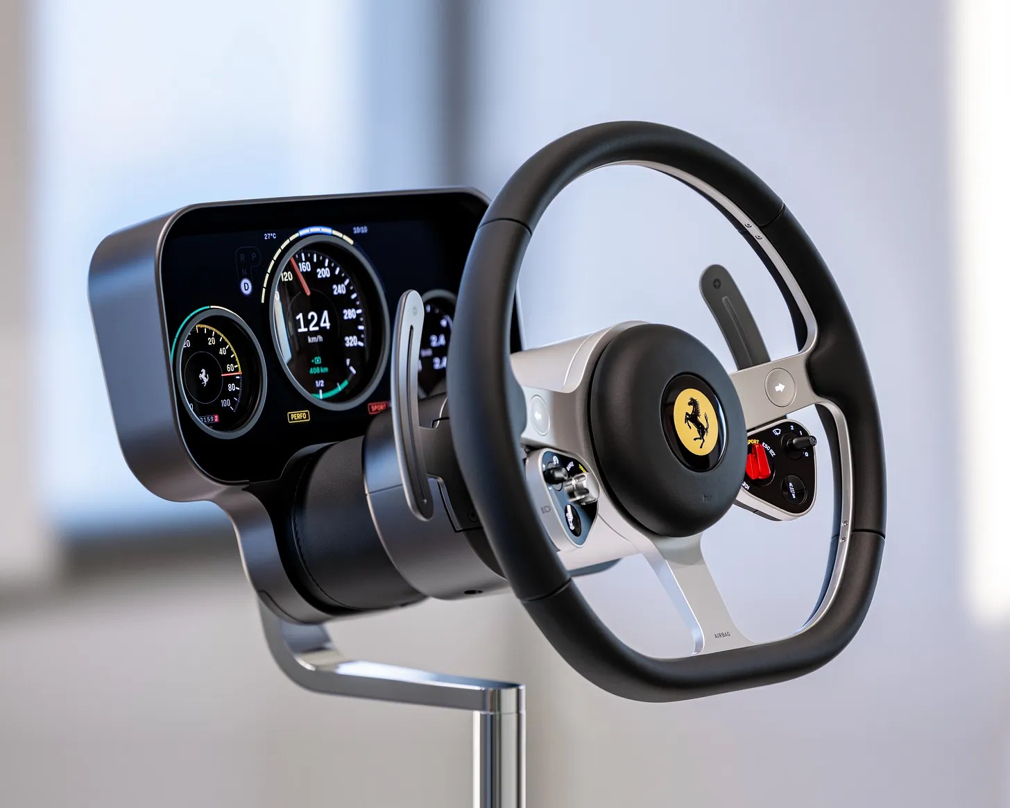
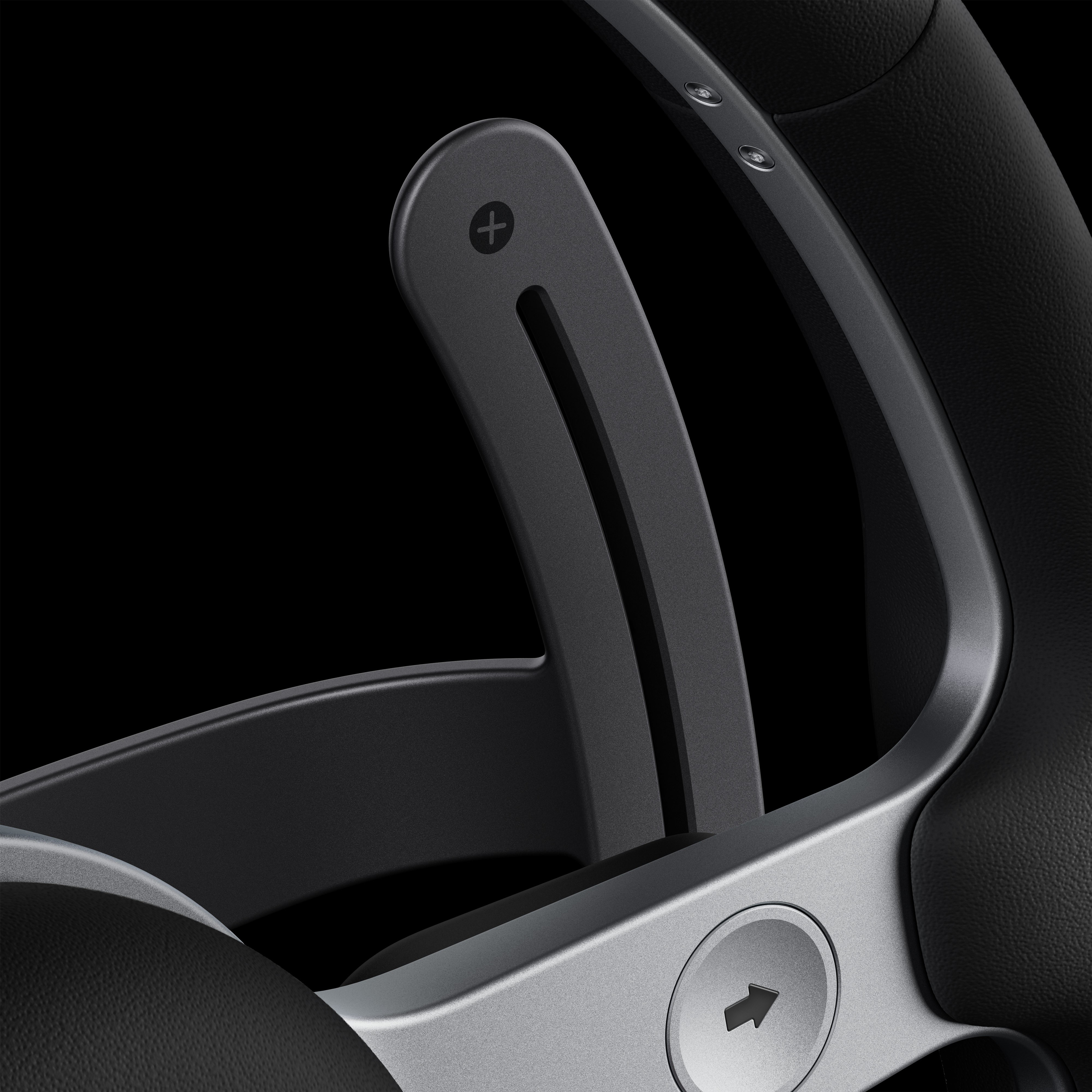
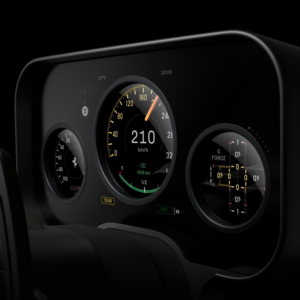
There are multiple areas in this cockpit which show considerable attention to detail that bridge the historic innovation with the new sophisticated precision and digitalisation of objects. The three-spoke heritage steering wheel with integrated force-sensitive buttons and switchgear, the moving binnacle, a multi-layered OLED cluster with convex lenses, an adaptive multigraph with independent aluminium hands, the glass key and magnetic dock. Of course, it will run CarPlay (not everyone does), though not, it appears, CarPlay Ultra.
These are matters of real substance and not a simple case of ‘putting buttons back’ in the driver’s reach. LoveFrom have treated each part as an object in its own right, and while the “buttons are back” message is a neat meme, it simplifies the human factors win that when your hand is reaching, having a physical datum that allows you to locate and operate a control is unbeatable and safe.
Photo credit: Ferrari/LoveFrom
Personally, the most naive and juvenile critiques are those that frame Jony’s work here as repetitive, and optimisation led, and both are absurd for different reasons. Firstly, repetition is not a negative when one considers that this is about principles, not a signature style. LoveFrom under Ive is in demand for the former, not the latter. You know when you hire Ive (and to be clear, he can choose who he wants to work with) that you are going to be working with someone that’s going to abstract this design problem to an atomic level and do so with a human-centred approach, then render it with the most exquisite sense of object and materiality. That he chooses to do this with aluminium, glass, clean geometry, and reduction is much the same as how any artist chooses their palette.
To further insist that this is optimisation and not creativity is then to take the most narrow definition of creativity as if optimisation is not a most vital part of creativity and especially in the context of automotive where frankly the last decade has shown anything but: the irony that as cockpits got simpler with fewer or bigger screens that our cognitive load soared and even the regulators got windy about what this meant for safety.
Perhaps just as naive was the assumption that the Ferrari model had been lost along the way as the project moved into the reality of production and execution. LoveFrom undertook the lion’s share of the design, and as San Francisco took on the design and coding, it was left to the Italians to engineer and driver test, along with the product development. A popular view is that this has somehow holed Ferrari’s ‘personalisation’ upsell model, as if this is what keeps the execs up at night in Maranello. It’s not. They sell arguably the world’s most desirable supercars; this cockpit is absolutely in this mould. If a customer wants personal stitching, a tweak here, a tweak there, of course, they’ll still get it, but this interior will, like the engine, be based around Ferrari’s view of perfection. The customer’s bespoke layer is on top of that.
Photo Credit: LoveFrom / Ferrari
Naturally, the criticism can be levelled at me that I am fanboying over those involved and, whilst I admire Ive, I’m not without my beliefs that he’s made some mistakes in the past. It’s also fair to say that I wonder how much his view of this project was ever robustly challenged vs. being waved through. Did the research depth give it such credibility and momentum that it was a foregone conclusion? PRNDL notes both Ive/Newson and Manzoni are quoted as saying it barely changed from that initial proposal, changes were more about proportion and ergonomics than fundamental rethinking.
I question too the manner in which these proposals can scale, age and remain serviceable.
Jewellery-grade interior components are lovely on a plinth and less charming after 30,000 miles, UV exposure, expensive moisturisers, and a few winters of grime. Whether parts can be repaired and replaced without becoming a boutique restoration exercise is a real question. The car being ultra-high-net-worth doesn’t remove the problem; it changes who pays for it and how quietly they complain.
The reveal was notable for being a left hand drive setup. OEMs have got accustomed to reducing physical mirroring of cabin elements, harnesses. No doubt screens and disappearing buttons have assisted them in delegating this to a software switch. Given how driver-centred some elements are in LoveFrom’s design, it’s an open question whether Ferrari will fully mirror the high-fidelity interactions for UK/Japan/Australia, or accept a ‘good enough’ conversion. This could be the strongest tell as to whether Ive and Newson’s principles can withstand operational and financial realities. If they mirror these interactions properly, it strengthens the whole “human-centred, truthful function” argument. If they don’t, it exposes it as geographically parochial.
Can this design language be reproduced across future models? It took LoveFrom five years to get this far with Luce, and they’re unlikely to be on retainer to roll out variants for other products down the line. I’m sure Newson and Ive have left behind a whole bunch of principles and specifications but, without the coach on the field, I wonder how successful the in-house teams will be at sticking to the playbook, especially as once the forcefield of Ive and co. has left, the bean counters and manufacturing value-engineers begin to circle.
It’s fair to dislike the look. It might even be funny to meme its similarity to a Fisher-Price wheel, but lazy shorthand isn’t grown up criticism, and I think it’s hugely important to celebrate a process where design has mattered deeply to everyone involved and that has been executed with real care for the end user and the craft or materials, manufacturing and objects. Ultimately, this has been a serious attempt to solve a product transition problem, to invigorate the brand for a new epoch in electrification, and the real test will be on the roads and the tracks, not in screenshots.
AI: I used Ai to sub-edit, do a bit of fact-checking and then generate the tag list and excerpts. That’s it.