Tag Archives: customer experience

Would your future self still buy it?

As is perhaps par for the course in ‘think pieces’, this one starts with the fact I came across a study recently that got me thinking about what ostensibly is a fairly simple question.

Think back to the person you were five years ago. Now imagine yourself five years from today. Which of those two people feels more like you?

My instinct was that the person in the past would feel closer. After all, I know him. I can remember what he did, what sort of things he cared about and some of the decisions he made. It is concrete, or at least salient. The future version is, by definition, imaginary.

Apparently, most of us see it the other way round.

The study published this summer in Personality and Social Psychology Bulletin looked at this across 12 studies involving more than 11,000 people in nine countries. Participants tended to see their future selves as more similar to who they are today than equally distant versions of themselves in the past.

Can you see the nice little trap in that? We can see how much we have changed because we have the evidence: jobs we once thought were perfect, clothes we wore, things we spent money on, opinions we would now rather prefer not to have quoted back to us. But when we look forwards, we tend to start with the person we are today and extend the line out, it is a line of betterment and the past shows the iterations from a more inferior you.

The researchers found something else too. People expected their future selves to be happier with decisions made today than they themselves were with equivalent decisions made by their past selves.

So I can look at a decision made by 2016 me and think, “Well, I wouldn’t do that now”, while remaining pretty confident that 2036 me will appreciate the excellent judgement displayed by 2026 me.

And, happily for someone in my industry and sphere of work, there’s probably quite a lot of consumer behaviour tucked up in there.

Psychologists and economists have studied a related phenomenon, projection bias, for some time: our tendency to assume that future tastes will resemble current ones more than they really will. Some of the evidence is charmingly mundane. People buy more cold-weather clothing when the weather happens to be cold when they order it, and are subsequently more likely to return it. See also portable aircon units this summer.

The same effect appears in much bigger decisions. Research covering tens of millions of car transactions and millions of house purchases found that the weather at the time of purchase affected choices including convertibles, four-wheel drives and, in a rather obvious reveal for where this study took place, how much buyers appeared prepared to pay for houses with swimming pools or air con. It’s self evident that a hot day can apparently make a swimming pool look like a more enduring feature of the life you want than it will seem in February.

All of which is mildly amusing when such a mistake is an unused coat. It becomes rather more interesting when the thing lasts a decade or more.

Consider buying a new kitchen. You are choosing it for a household that will change while the kitchen remains literally and figuratively unmoved. Children get older. People work differently. Parents become less mobile. The person who currently enjoys time consuming or otherwise elaborate cooking may not always do so. The huge island designed around a convivial bunch of people eating together may eventually accommodate two laptops a week’s post and an abandoned bowl of bananas.

Yet most kitchen-buying journeys quite reasonably concentrate on establishing what you want now and in the near term. How do you cook? What do you like? Which finish? Which appliances? How much storage? Sensible questions all, but they nevertheless assume that the customer answering them is a reasonable proxy for the customer who will still be living with those answers ten years down the line.

It’s a problem we wrestled with on AGA as an even clearer example. It is an unusually emotional purchase with an unusually long physical life. Someone can be buying a particular idea of home as much as an appliance, while making assumptions about how they will cook, entertain, use energy and organise their household many years into the future.

Cars too compress the same problem albeit into a shorter ownership cycle. A customer configuring a £70,000 car measurable can spend a remarkable amount of time deciding on wheels, trim, seats and tech while making shakier assumptions about the things that will more reliably determine whether the car actually suits them: mileage, commuting, children, dogs, mobility, where they live or whether they can charge at home. In which circumstances a configurator is very good at helping them specify the car they desire today. It is less interested in whether the car makes sense for the life they are likely to have whilst owning it.

Perhaps then the broader problem is that businesses are generally better at designing for differences between customers than for changes within the same customer. We segment people, research their needs and optimise journeys around what they tell us. Then, at the point of purchase, we implicitly freeze them in place.

Now, that lens becomes particularly interesting when the organisation, as most of course do, measures success at the point of conversion. In the examples above, the customer has ordered the kitchen, signed the finance agreement or placed the deposit, so the data point shows the journey worked. But that only tells us that the system was effective at producing a transaction. It says nothing about whether the decision aged well.

By way of a thought experiment then, imagine putting the following question halfway through a checkout:

“Under what reasonably foreseeable changes in your life would this stop being a good decision?”

Reader, your optimisation or conversion teams may reasonably object and, asked literally, it sounds like the business has decided suicidally to introduce doubt at precisely the moment it should be trying to remove it. But it is not a literal suggestion but rather a usefully provocative question for the people designing the whole purchase system.

What future changes could make this purchase wrong? Which can reasonably be anticipated? Where should the customer be helped to think about them, and where would that simply create needless anxiety? Can the product or service adapt later if those circumstances change?

A kitchen company might instead therefore help someone consider how a space works as children grow up or mobility changes. A retailer of high-end cast iron stoves might talk honestly about seasonal use, running costs and how people actually live with the product over many years. A car journey could surface likely changes in annual mileage, charging access or family use before somebody has spent a Sunday morning deciding between two varieties of tan leather.

This is less a matter of adding another clever question to the website than deciding what a good outcome actually is. Sometimes removing uncertainty will help the customer. Sometimes the same uncertainty is telling you something useful about the decision. For an expensive, long-lived purchase, someone who has never seriously considered whether the thing will continue to suit them may be very confident at checkout and considerably less confident six months later. Whereas someone whose reasonable doubts have been explored and answered may take slightly longer to decide, but they may also be less likely to cancel, regret the purchase or feel they were pushed into it.

That may be commercially useful in ways a purist conversion dashboard struggles to see. The sale still matters, obviously. But how can we ensure also continues to look like a good one once the customer has become somebody slightly different?

AI: I used AI to do some research to freshen up my knowledge of the specific behavioural biases at work and to stop me circling the point too many times. It produced an extract of the post and the tag list. The words however are therefore mostly mine.

Tagged , , , , , , , , , ,

Before Someone Signs Off on the Robots

Have you seen the new robotic parking at Gatwick? It looks quite cool.

It works like this: you drive up into a garage bay, get out, scan a code, take your luggage and wander off to get on a bus to the terminal. Meanwhile, as you bump along the perimeter roads on your way to Pret a Manger and a surly greeting at security, your car is being lifted by a robot and shuffled into a parking space “fully autonomously” and presumably without the clattering of doors into each other or a young lad with a vape doing power slides in a field.

It reminded me of another experience in innovation I recently revisited: Pod Parking at Heathrow.

Ten years or so ago I tried it on a business trip to Scotland. A pre-dawn drop-off in a largely empty car park (back then it was still newish and posh enough to feel business-only), followed by the novelty of a solo ride in a pod to the terminal.

Returning this year with my son on a ski trip, it was slightly less fun.

A busy car park hunting for a space. A long walk with bags to the station. Then the ignominy of sharing a pod with other people similarly bedecked with ski equipment and making inane small talk before setting off on a circuitous, stop-start loop towards the airport.

Notwithstanding the fact that I’m now in my late 40s, travelling with rather more family paraphernalia and rather less wide-eyed consultant enthusiasm for clever infrastructure, the whole thing instead felt like a technically neat attempt to solve the wrong problem.

But before I explain why, let’s return to Gatwick’s robots.

Apparently they’re constrained a little. A fact mentioned almost in passing in the voiceover of what I assume was a press video: there are limits on vehicle weight, wheel size and wheelbase.

Plenty of people wouldn’t think twice about that. I did.

The service is marketed as a premium solution and has a five-day minimum stay. So it seems reasonable to assume a fair proportion of customers will arrive in large, expensive family cars.

Let’s say you own an i7, a Volvo EX90 or perhaps you’ve ordered the Range Rover EV. None of those can use it.

Already this premium, cutting-edge parking solution can’t accommodate a fairly representative selection of premium, cutting-edge family cars. Edge cases, perhaps, but also edge cases sitting at the leading edge of a market that is getting heavier, longer and increasingly fond of enormous wheels. The 21-inch wheel restriction feels particularly egregious.

Of course, the robots can presumably be enhanced. But significant capital has already been sunk into the system. Does the machinery now keep pace with the cars, or do customers eventually discover that their apparently ordinary SUV has fallen outside the parameters of the futuristic car park?

In any event, I started wondering whether robotic parking is actually solving a consumer problem. Or, more accurately, whether it is solving the right consumer problem.

From Gatwick’s point of view it may make perfect sense. Cars can be packed closer together because people don’t need to open the doors. You need less circulation space. There may be fewer staff movements. Less risk of somebody clipping a wing mirror or rearranging the side of a Cayenne against a concrete pillar. Potentially you get substantially more parking capacity out of an extremely valuable piece of land. Those benefits are undeniable.

But you’ll note they are largely benefits to the airport and parking operator. The customer has a rather different problem.

They want to arrive, find where they need to go without circling three times, get kids and bags out, leave the car somewhere they trust is secure, and ultimately reach departures with the minimum possible faff.

Preferably, too, without standing in a bus shelter in horizontal sleet debating whether the matrix display’s ‘6 mins’ has in fact changed at all in ten minutes.

Seen that way, the robot is doing something very impressive several stages after the customer has stopped caring. Once I’ve walked away from the car, I don’t really mind how it gets parked. A robot can carry it above its head while bleeping like a jolly droid. My attention has moved on to the next thing: where is the bus, how long will it take, will there be space for the bags, and how long do I need to stand next to the pseudo-Love Island contestant in coordinated loungewear before I’m actually inside the terminal?

Which brings me back to Heathrow’s pods. The engineering proposition is, or at least was, immediately seductive. Small autonomous vehicles, ostensibly on demand, with a dedicated congestion-free route to the terminal. The PowerPoint similarly likely wrote itself. Judged narrowly as a transit system, it’s evidently clever.

But the judgement should be from the passenger’s experience. Here the journey begins not when the pod moves but when you stop your car: park. Extract luggage. Work out the nearest station. Walk in the rain. Wait. Board. Travel. Sometimes stop — “We will resume your journey shortly”. Get out. Walk again with luggage. Find the terminal entrance.

That is the system and, when closely observed, some fairly boring alternatives instead appear surprisingly competitive.

Put more bus stops alongside parking rows. Increase their visibility and directional signage. Cover the walking routes (maybe even with solar panels). Tell people exactly when the next bus will arrive. Run enough buses that nobody really needs to think about the timetable at all.

And make the bus itself good. Warm in February, properly air-conditioned in August. Comfortable seats. Proper luggage racks designed around what people actually take to airports rather than a grudging shelf above the wheel arch. A driver who says hello, helps someone with a heavy case and knows where they’re going. Give the thing a bit of design attention.

None of that is technologically remarkable, but I suspect the combined effect on the journey could be disproportionately positive.

You’re unlikely to find an architectural visualisation of a man standing happily beneath a bus shelter on the homepage of Dezeen. Or a breathless article about wayfinding signage in Monocle.

But it may produce a better experience.

Perhaps, too, there is another behavioural wrinkle. Five minutes of waiting for something you cannot quite predict can feel substantially worse than eight minutes of movement towards your destination. Walking, as many have observed, gives you a sense of progress and control.

Although luggage complicates the calculation.

A 400-metre walk without luggage can feel like useful progress. The same 400 metres dragging two cases, a ski bag and a slightly recalcitrant child across coarse tarmac is not quite the same behavioural proposition. At some point movement ceases to feel like autonomy and simply becomes work.

Which is why shaving two minutes from the vehicle journey may be almost worthless if the passenger has had to drag their luggage an extra 400 metres to reach it. A beautifully optimised autonomous transit system can quite easily lose to a diesel bus simply because the diesel bus stops adjacent to your car.

So often, sophisticated experience design goes slightly wrong along such lines. Organisations naturally optimise the things they can see, measure and control. In this case: vehicles per hectare, average transfer time, labour requirement, throughput, number of drivers, perhaps even CO₂. All sensible metrics.

People, rather inconveniently, experience the gaps between them. They experience the anxiety of where to go. The extra walk nobody included in the journey-time calculation. The toddler who needs a wee. The suitcase with a wobbly wheel. The bus that pulls away just as you approach the stop. Such things are difficult to measure, don’t align neatly to one system or department and so disappear from optimisation models altogether.

So when we end up with technically excellent things that somehow feel worse, I wonder if there is also an element of theatre at play.

Airports have always been preternaturally good environments for conspicuous modernity. The driverless pods, biometric gates, robots and baggage systems, vast digital screens. They are signals, often at a national identity level, of investment, progress and future-facing willy-waving.

A covered walkway, even with solar panels, is not that. Neither is a bus stop being moved 80 metres. Yet either could improve more journeys, more often, for less money.

None of which is to denigrate the robots too much. They’re far from pointless and if Gatwick can materially increase parking capacity without tearing up more green fields, robotic parking may prove to be quite the investment. Judge it on density, operating cost, reliability and land use and the argument may be very strong. But then call it what it is: clever parking infrastructure.

The more useful question is simply whose problem we’re actually solving. Sometimes installing a fleet of robots that lets you cram more cars onto the same patch of land genuinely does improve the customer experience. Sometimes the customer would get rather more from a bus stop 80 metres nearer their car, an accurate countdown and a warm bus with somewhere sensible to put the cases. The difficult part of experience strategy is having the confidence to work out which before someone signs off on the robots.

AI: I used ChatGPT to tidy up some grammar and that, dear reader, is all.

Tagged , , , , , , , , , , , , , , , , , , , , , , , ,

Christmas Shopping Observations, Part One.

Why Christmas shopping feels hostile, and why ‘catalogue commerce’ makes it worse.

December always brings the same rituals. Sitting in front of a website with a sense of mild dread. The kind one reserves for using a train station toilet, or getting into the coffee queue after parkrun. The intended tasks isn’t difficult or unpleasant in theory, just buy something thoughtful for someone you care about, but Christmas shopping always manages to feel like cognitive trench warfare. Retailers would have it as “the season of gifting”, the rest of us call it, problem solving with a shot glass of Baileys.

So, for some context, let’s go back to a couple of of weeks ago when I was trying to get myself a replacement down jacket. A bit like when I was trying to get Jo some new Asics, this wasn’t an extravagant task. It wasn’t even particularly interesting. Just a bit of a like-for-like replacement for a much-abused Rab. All I needed was a sub expedition-grade jacket. Black, simple. I know my sizes, I know I needed about 850+ fill power and I was ambivalent about much else. I had a shortlist of brands I like. But dozens of models, filters that are inconsistent across brands, categories that mean nothing to people outside of the industry and a product hierarchy that is the baffling output of a Content Management System (CMS) that’s been operated by a chimp1.

I wasn’t searching as much as performing archaeology. Sifting through layers and brushing off the irrelevant collateral.

A narrow, snow-dusted street in Stockholm’s Gamla Stan on a muted December afternoon. Warm ochre buildings rise on either side as bundled-up shoppers walk away from the camera. Soft shop-window lights and minimalist Christmas displays glow against the cold, creating a calm, human-scale contrast to typical frantic holiday retail.
The Christmas shopping we think we’re doing, before the dropdown menus, filters, and “Gifts for Her” pages slap us back into reality.


In design terms this is what we might call the Gulf of Execution, or as my colleagues and I at Dare liked to call the Experience Gap: the distance between what a human means and what the system is willing to accept. My intent was simple – “warm, minimalist natural down for standing around on platforms, by sports pitches and walking to the pub” – but the interface insisted I drop that down into a dialect of drop-down, checkboxes and jargonist euphemisms. A human request translated into machine-and-catalogue syntax. Little wonder the whole thing feels like a joyless chore.

And Christmas retail only amplifies this.

Every major high street site trots out its annual performance of “Gifts for Her”, a festival of generic filler: candles, scarves, bath sets, socks. The occasional novelty gift set embossed with typography that looks like it was designed at 4pm on a Friday whilst sucking on a fetid vape. It’s all indexed by price bands: “Under £10”, “Under £50”, “Over £250” – as if women are primarily sorted by budget code rather than, say, personality or taste.

No mother wants another hand cream selection.
No thirty-something woman wants coordinated gloves.
No partner wants to receive something that clearly began life as a procurement exercise.

The whole structure is built around the warehouse, not the person. It’s inventory logic masquerading as emotional intelligence. And the moment you notice it, you can’t unsee it: most “gift guides” reveal almost nothing about the recipient and everything about that the retailer wants to shift.

This is the failure baked-into catalogue commerce. It doesn’t matter which brand you pick; the underlying assumption is the same: that human desire can be expressed through filters, and that personality cab be captured in a category label. It’s tidy, rational and optimised. It’s also completely blind as to what makes shopping human in the first place.

Because real gift-buying begins long before the visit to the website. It begins in the cluttered contradictory emotional territory that sits just outside the browser window: What does she already have? What does she love? What has she told me about? What will she pretend to love? What feels thoughtless? What feels too much? What feels like you didn’t think at all (Hint: anything at Boots that comes in a gift box)? Retail ignores all of this and forces you straight into the grid (what we call the Product Listings Page (PLP) ), as if the process were orderly. Spoiler alert, it never is.

This is why Christmas shopping feels hostile. It’s not that the options are universal bad, just that the interface tries to convince you it understands and reflects your mental model when it plainly does not. Handing you a hundred variants of the same filler and expecting conversion gratitude. Somewhere between the filters, the categories and the bath sets you sense the truth: this isn’t built for you. It’s built to organise the warehouse.

Don’t worry though, there’s a better story coming, and the technology to enable it is finally here. But this isn’t the piece for solutions, it’s about naming the problem plainly as it is and without the retail gloss.

Next time I’ll get on to the other half of the picture: the system-level shift that’s going to quietly rewrite the entire experience from how we search to where the journey really begins.

For now its enough to acknowledge the obvious: Christmas shopping isn’t about solving and indecisiveness problem for dumb consumers. It’s a broken model designed around systems that are not built to reflect how people think, feel or choose, especially in December.

Part Two: How agentic solves this, and more.

AI: This piece was assisted with Ai. I used it for the tags, excerpt, the image generation and some very light sub-editing. The ideas, references, and anecdotes were all mine.

  1. Plot twist. I ended up with the Shackleton Ronne. I browsed online for weeks. I did huge amounts of research and comparison and then I went to the wonderful store on Piccadilly and spoke to a great sales assistant there who worked with me to ensure it was absolutely the right fit and will see me out for prob 5-10 years of use. ↩︎

Tagged , , , , , , , , , , , , , , , , , , , ,

The Loyalty Programme That Forgot How Parenthood Works

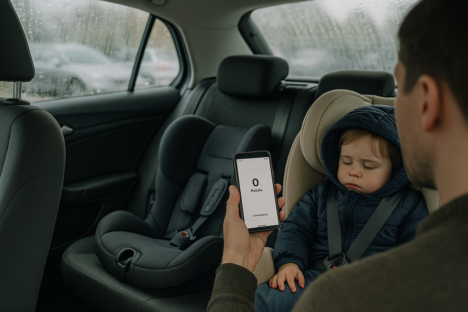
A parent stands by the open rear door of a family car on a rainy day, checking their phone which shows a zero loyalty points balance, while two Cybex child car seats are visible in the back on with a sleeping toddler in it.
Ten years, three seats, still loyal. The app says otherwise.

I’ve been through the Cybex catalogue more than once. Our son (2014) graduated seat by seat. Our daughter (2023) reset the cycle. That’s two children, multiple seats, a base, plus the odd accessory. All dutifully registered with Cybex’s Club, a loyalty scheme that promises free shipping, birthday treats, “exclusive offers” , y’know, the usual garnish.

This isn’t a flex. Cybex is high-end stuff, and we bought it because I lost a friend and his son in a dreadful car accident years ago and I became obsessed with buying the very best. That said …

Here’s how loyalty actually played out:

  • Jul-Sep 2023 — I registered three products: Cloud T (baby seat), Base T (for same), Sol Z-fix (Child’s booster). About 136 points earned.
  • Nov 2023 — a 100-point “bonus” dropped.
  • Summer–Autumn 2024 — the slow bleed: –45, –86, –5, –100. By the end of the year, the balance was gone. I saw the expiry warnings, but they were irrelevant – I didn’t need new products at that point.
  • Sep 2025 — I came back for our daughter’s next seat, the Sirona. Logged in before checkout: 0 points. Of course, after paying the account lit up with +150 “bonus”.

So the scheme doesn’t reward loyalty at all (beyond ‘free postage’). It rewards the purchase you’ve just made. A pat on the back after you’ve handed over your card.

I think you see where I’m going though, the deeper flaw is structural. Car seats don’t follow marketing calendars; they follow biology. Parents buy in long arcs: infant to toddler, toddler to child, every two to four years. A one-year expiry is a guaranteed wipeout. The cadence of childhood doesn’t match the cadence of a CRM dashboard.

What would a loyalty scheme look like if it took parenthood seriously?

  • Milestones – reward the upgrade points: newborn → toddler → child → booster.
  • Moments – top-ups on birthdays or product anniversaries, nudges to check fittings and sizes/weights, effectively MOT-style safety checks.
  • Upgrade triggers – automatic credits seeded ahead of the next seat, not after it.
  • Accessories and cover — redeemable on spare covers, pads, travel bags. Or fold them into warranty extensions — the things parents actually use between major purchases.
  • Recycling – the chronic gap. Car seats can’t be resold, gifting feels reckless, and regulations block obvious reuse. A scheme could collect and recycle them responsibly, with credits back for doing the right thing.
  • Family pooling — roll credits across siblings so value doesn’t die with one child’s cycle.

None of that is radical. It just respects the rhythm of a family’s life.

Instead, the experience feels like bait and switch: promises on the front page, expiry in the small print. Which is clever if the goal is data capture, catastrophic if the goal is trust.

Of course, I still bought the Sirona. Safety and product quality trump irritation. But the goodwill is thinner now. The wider lesson is simple: if your model ignores the customer’s real timeline, you’re not building loyalty. You’re designing disappointment.

Tagged , , , , , , , , , ,

You’ve Booked the Flight. Now Feed the Cat.

Or, What a Ryanair journey map taught me about real UX.

There’s a type of interface that shows up on Dribbble every few months: flight check-ins, boarding passes, baggage-tracking dashboards. Always slick. Always serene. The UI equivalent of cucumber water.

Most of them start at Choose your seat and end at Enjoy your flight. Which is tidy. But also nonsense.

A few years ago, I worked on a project for Ryanair. I drew out a journey map (with pens, natch), not the polished, stakeholder-pleasing kind, but something closer to the real emotional terrain of travel. One that began well before the confirmation screen. One that started, in fact, with the cat.

Because booking a flight isn’t a clean beginning. By the time anyone taps “Book now,” they’ve already trawled five sites, tried to align half-term dates with the one cousin who replies to group chats, checked weather reports, and googled “Do I need a visa for Croatia?” even though they’re flying to Naples.

Life admin, not travel ambition, is what usually kicks things off. That’s where the journey begins.

The diagram traced everything from that fraught pre-booking stretch through to the post-trip hangover, highlighting the emotional and logistical clutter that most airline UX avoids. Not because it isn’t there, but because it’s messy. And mess doesn’t fit neatly into a product roadmap.

There’s the bit after you book, when nothing much happens, except everything might. The vague unease when no one’s confirmed your seats. The passive-aggressive alert that “something has changed” in your itinerary, but you’re left to figure out what. The nervous rechecking of emails. The slow panic over cabin bag dimensions.

Then comes the day itself. A spike in interaction. The printer runs out of ink. You’re stood at Departures at 6:30am trying to download Peppa Pig episodes with 4% battery and no signal. Your toddler’s hungry. Your partner’s tense. And you’re still wondering if you packed the Calpol.

And yet… this is the brand moment. Not the glossy UI, not the neat API integration. Just this: the knot in your stomach, the uncharged phone, the boarding pass you can’t pull up without a connection.

The map tried to capture that. Not to romanticise it, but to acknowledge it.

Even on the return leg, the friction isn’t over. Passport queues. Lost luggage. The existential despair of a train replacement service. You get home, open a week’s worth of mail, find a parking fine, trip over a stray shoe from the hasty departure packing, and realise you didn’t leave anything for the cat-sitter.

Most journey maps stop at wheels-up. Ours didn’t. Because experience doesn’t follow a clean arc. It loops, it stutters, it sags in the middle. Thoughtful UX understands that.

A tired parent, dressed in a dark winter coat with a fur-lined hood, stands in a dimly lit Swedish airport baggage claim area late at night. They are looking down at their phone, which shows a 4% battery icon. To their left, a child sleeps soundly in a dark grey stroller. A large, dark suitcase tilts precariously next to the parent, appearing as though it might fall. In the background, an empty luggage carousel stretches out, with a few other suitcases scattered on it. Further back, blurred figures of other travelers are visible, and the warm glow of a vending machine can be seen on the far left. The overall atmosphere is one of exhaustion and quiet resignation.

Of course, Ryanair won’t build an app that books your pet-sitter or packs plug adapters. But this kind of messy map reveals where the brand can quietly show up—not with a feature, but with timing, tone, and the rare dignity of being understood.

Maybe that’s a 6-sheet in the departure lounge that says “Still cheaper than therapy.” Maybe it’s an email that clears, not clouds. Maybe it’s an in-seat comm that drops the marketing voice for once and just says: “Made it. Welcome back.”

Even for Ryanair, in fact especially for Ryanair, those moments can build memory, trust, and repeat business. Because no one remembers the boarding pass. They remember how they felt when the wheels touched down, the keys were missing, and the cat looked at them with contempt.

You’re not designing for delight. You’re designing for 4% battery, no signal, and a queue that won’t move. That’s where memory lives. And maybe loyalty too.

AI disclosure: This piece was written with the assistance of AI, used strictly as an editorial and thinking partner. All ideas, edits, and final phrasing are mine. ALT text and tagging were also generated with AI support.

Tagged , , , , , , , , , , , , , , , , , , ,

The Experience Gap

Thoroughly enjoyed this Harvard Business Review post about something we call at Dare, ‘The Experience Gap’. That is the huge gulf that often exists between a company’s perception of its customer experience and the reality of it. [The article isn’t entirely about this topic but is hugely valuable to consider the difference listening to customers and understanding]

Of course, much of what we consider marketing is about pushing the aspirational or intended experience from a product or service and caring less about the reality of it (which is generally something controlled by operations or product development teams).

A nice articulation of this gap can be seen in these two videos for Les Mills Grit Strength gym class. I shall leave them both here for direct comparison.

What you think you’ll experience

… and what you will almost certainly experience

Tagged ,