Tag Archives: service design

Before Someone Signs Off on the Robots

Have you seen the new robotic parking at Gatwick? It looks quite cool.

It works like this: you drive up into a garage bay, get out, scan a code, take your luggage and wander off to get on a bus to the terminal. Meanwhile, as you bump along the perimeter roads on your way to Pret a Manger and a surly greeting at security, your car is being lifted by a robot and shuffled into a parking space “fully autonomously” and presumably without the clattering of doors into each other or a young lad with a vape doing power slides in a field.

It reminded me of another experience in innovation I recently revisited: Pod Parking at Heathrow.

Ten years or so ago I tried it on a business trip to Scotland. A pre-dawn drop-off in a largely empty car park (back then it was still newish and posh enough to feel business-only), followed by the novelty of a solo ride in a pod to the terminal.

Returning this year with my son on a ski trip, it was slightly less fun.

A busy car park hunting for a space. A long walk with bags to the station. Then the ignominy of sharing a pod with other people similarly bedecked with ski equipment and making inane small talk before setting off on a circuitous, stop-start loop towards the airport.

Notwithstanding the fact that I’m now in my late 40s, travelling with rather more family paraphernalia and rather less wide-eyed consultant enthusiasm for clever infrastructure, the whole thing instead felt like a technically neat attempt to solve the wrong problem.

But before I explain why, let’s return to Gatwick’s robots.

Apparently they’re constrained a little. A fact mentioned almost in passing in the voiceover of what I assume was a press video: there are limits on vehicle weight, wheel size and wheelbase.

Plenty of people wouldn’t think twice about that. I did.

The service is marketed as a premium solution and has a five-day minimum stay. So it seems reasonable to assume a fair proportion of customers will arrive in large, expensive family cars.

Let’s say you own an i7, a Volvo EX90 or perhaps you’ve ordered the Range Rover EV. None of those can use it.

Already this premium, cutting-edge parking solution can’t accommodate a fairly representative selection of premium, cutting-edge family cars. Edge cases, perhaps, but also edge cases sitting at the leading edge of a market that is getting heavier, longer and increasingly fond of enormous wheels. The 21-inch wheel restriction feels particularly egregious.

Of course, the robots can presumably be enhanced. But significant capital has already been sunk into the system. Does the machinery now keep pace with the cars, or do customers eventually discover that their apparently ordinary SUV has fallen outside the parameters of the futuristic car park?

In any event, I started wondering whether robotic parking is actually solving a consumer problem. Or, more accurately, whether it is solving the right consumer problem.

From Gatwick’s point of view it may make perfect sense. Cars can be packed closer together because people don’t need to open the doors. You need less circulation space. There may be fewer staff movements. Less risk of somebody clipping a wing mirror or rearranging the side of a Cayenne against a concrete pillar. Potentially you get substantially more parking capacity out of an extremely valuable piece of land. Those benefits are undeniable.

But you’ll note they are largely benefits to the airport and parking operator. The customer has a rather different problem.

They want to arrive, find where they need to go without circling three times, get kids and bags out, leave the car somewhere they trust is secure, and ultimately reach departures with the minimum possible faff.

Preferably, too, without standing in a bus shelter in horizontal sleet debating whether the matrix display’s ‘6 mins’ has in fact changed at all in ten minutes.

Seen that way, the robot is doing something very impressive several stages after the customer has stopped caring. Once I’ve walked away from the car, I don’t really mind how it gets parked. A robot can carry it above its head while bleeping like a jolly droid. My attention has moved on to the next thing: where is the bus, how long will it take, will there be space for the bags, and how long do I need to stand next to the pseudo-Love Island contestant in coordinated loungewear before I’m actually inside the terminal?

Which brings me back to Heathrow’s pods. The engineering proposition is, or at least was, immediately seductive. Small autonomous vehicles, ostensibly on demand, with a dedicated congestion-free route to the terminal. The PowerPoint similarly likely wrote itself. Judged narrowly as a transit system, it’s evidently clever.

But the judgement should be from the passenger’s experience. Here the journey begins not when the pod moves but when you stop your car: park. Extract luggage. Work out the nearest station. Walk in the rain. Wait. Board. Travel. Sometimes stop — “We will resume your journey shortly”. Get out. Walk again with luggage. Find the terminal entrance.

That is the system and, when closely observed, some fairly boring alternatives instead appear surprisingly competitive.

Put more bus stops alongside parking rows. Increase their visibility and directional signage. Cover the walking routes (maybe even with solar panels). Tell people exactly when the next bus will arrive. Run enough buses that nobody really needs to think about the timetable at all.

And make the bus itself good. Warm in February, properly air-conditioned in August. Comfortable seats. Proper luggage racks designed around what people actually take to airports rather than a grudging shelf above the wheel arch. A driver who says hello, helps someone with a heavy case and knows where they’re going. Give the thing a bit of design attention.

None of that is technologically remarkable, but I suspect the combined effect on the journey could be disproportionately positive.

You’re unlikely to find an architectural visualisation of a man standing happily beneath a bus shelter on the homepage of Dezeen. Or a breathless article about wayfinding signage in Monocle.

But it may produce a better experience.

Perhaps, too, there is another behavioural wrinkle. Five minutes of waiting for something you cannot quite predict can feel substantially worse than eight minutes of movement towards your destination. Walking, as many have observed, gives you a sense of progress and control.

Although luggage complicates the calculation.

A 400-metre walk without luggage can feel like useful progress. The same 400 metres dragging two cases, a ski bag and a slightly recalcitrant child across coarse tarmac is not quite the same behavioural proposition. At some point movement ceases to feel like autonomy and simply becomes work.

Which is why shaving two minutes from the vehicle journey may be almost worthless if the passenger has had to drag their luggage an extra 400 metres to reach it. A beautifully optimised autonomous transit system can quite easily lose to a diesel bus simply because the diesel bus stops adjacent to your car.

So often, sophisticated experience design goes slightly wrong along such lines. Organisations naturally optimise the things they can see, measure and control. In this case: vehicles per hectare, average transfer time, labour requirement, throughput, number of drivers, perhaps even CO₂. All sensible metrics.

People, rather inconveniently, experience the gaps between them. They experience the anxiety of where to go. The extra walk nobody included in the journey-time calculation. The toddler who needs a wee. The suitcase with a wobbly wheel. The bus that pulls away just as you approach the stop. Such things are difficult to measure, don’t align neatly to one system or department and so disappear from optimisation models altogether.

So when we end up with technically excellent things that somehow feel worse, I wonder if there is also an element of theatre at play.

Airports have always been preternaturally good environments for conspicuous modernity. The driverless pods, biometric gates, robots and baggage systems, vast digital screens. They are signals, often at a national identity level, of investment, progress and future-facing willy-waving.

A covered walkway, even with solar panels, is not that. Neither is a bus stop being moved 80 metres. Yet either could improve more journeys, more often, for less money.

None of which is to denigrate the robots too much. They’re far from pointless and if Gatwick can materially increase parking capacity without tearing up more green fields, robotic parking may prove to be quite the investment. Judge it on density, operating cost, reliability and land use and the argument may be very strong. But then call it what it is: clever parking infrastructure.

The more useful question is simply whose problem we’re actually solving. Sometimes installing a fleet of robots that lets you cram more cars onto the same patch of land genuinely does improve the customer experience. Sometimes the customer would get rather more from a bus stop 80 metres nearer their car, an accurate countdown and a warm bus with somewhere sensible to put the cases. The difficult part of experience strategy is having the confidence to work out which before someone signs off on the robots.

AI: I used ChatGPT to tidy up some grammar and that, dear reader, is all.

Tagged , , , , , , , , , , , , , , , , , , , , , , , ,

I went back to Uni. What I learned on my Human-AI Interaction course.

The bit that mattered was never the screen.

Take this example. You’re looking to buy a used car. You shortlist three cars and start nudging the finance up and down. Nothing dramatic, just enough to see what an additional £30 a month buys you. A slightly newer plate perhaps. Fewer miles. A bit more punch, or practicality.

Then you click through to a retailer. Your shortlist disappears. Your modelled finance examples disappear. You’re on a blank form, being asked questions your behaviour has already answered. Nothing failed in any obvious way. The system simply dropped the ball precisely at the point it needed to hang on to it.

That is still how a great deal of digital experience works.

You can now generate a respectable interface in seconds, in Figma Make or hell even Gemini. It’ll be clean, structured, and broadly acceptable. Enough hierarchy to feel coherent, enough restraint to avoid embarrassment. It looks like design, which is why people are getting carried away and, frankly, why people are being laid off.

There is too a growing belief that interfaces are becoming fluid. Instead of designing fixed screens, we define components and let agents assemble the right interface on demand. Ask for something, get a form. No navigation, no structure, just translate intent directly into interaction.

Concepts like this are gaining column inches, conference talks and LinkedIn views because they’re brief and intelligible. However, as soon as the interaction extends beyond that moment, the weaknesses become apparent. Context isn’t carried forward properly. Earlier decisions aren’t respected. The system produces something plausible but slightly off, and the user ends up repairing it, effectively doing the work we’d hoped to have eliminated. The surface has improved. The underlying behaviour hasn’t.

Over the past eight weeks, I’ve been working through a Human–Computer Interaction and AI course with the University of Cambridge (Advance Online), and it has been mildly uncomfortable in the way good things often are. It stripped things back to a version of UX that feels almost unfashionable: define the problem before you touch a solution; model the system in terms of what it actually does, not how it looks; decide where control sits between human and machine and how that moves about; draw a boundary and accept responsibility for what happens inside it; then prove the thing works rather than just assuming it does.

As I worked through the modules, it was charmingly familiar and obvious that none of this was new. It just hasn’t been particularly visible for a while. The industry has been busy polishing UI surfaces and calling it progress. AI hasn’t changed that per se, but has made the gap harder to ignore. You can now generate something that looks finished without having done any of the thinking that would make it hold together.

That’s also why a lot of current AI design work feels slightly misplaced, and why the obsession with UI product designers irritates me. There are people doing very good work on interfaces and component systems. Zander Whitehurst is one of them, and they look excellent. But that work sits downstream of where the real difficulty now is. You can refine the surface as much as you like; if the system doesn’t carry intent, it won’t survive contact with actual use.

The “democratisation of design” line doesn’t stand up to the faintest scrutiny. Sure, more people can produce interfaces, and there’s been a lifting of all boats in terms of aesthetics. That’s true. Almost none of those interfaces are grounded in any understanding of what the user is actually trying to do. They meet a baseline. They look competent. They solve very little.

What has been democratised is production.

The discipline that underpins it, the work of defining what matters, what to surface, what to hide, what to carry forward, and where the system should stop and ask, has not been automated. It has been skipped.

The shift to intent-based interaction makes that gap more obvious. You are no longer stepping through a process one action at a time. You state an outcome, and the system attempts to get you there. That changes the shape of the problem. The system has to interpret intent, apply constraints, decide what to do next, and show enough of its reasoning that you can tell whether it has misunderstood you. When it gets that wrong, it doesn’t look like a broken interface. It looks like a reasonable answer that doesn’t quite fit, which is both harder to spot and harder to recover from.

This is where the work is moving.

If interfaces can be assembled on demand, the value shifts into what sits behind them: how intent is captured, how memory is handled, what the system is allowed to assume, when it must ask, and how it behaves when it reaches the edge of its understanding.

Friction becomes part of that. For routine actions, speed is fine. For anything with consequence, removing every pause produces something that feels smooth and behaves carelessly. A system that never slows you down also never asks you to think.

There is a second effect that is easier to miss. If the system does more of the execution, the user does less of the thinking that used to go with it. Over time, that changes behaviour. Trade-offs become less visible. Assumptions go unchallenged. Outputs are accepted because they look plausible..

You end up with users who are comfortable approving things they don’t fully understand.

The risk here isn’t replacement. It’s avoidance. If the problem isn’t defined, if the constraints aren’t understood, if the system isn’t designed to carry intent across time, then the speed of output doesn’t help. It just produces more surface, faster, over the same unresolved issues.

That is already visible. The used car journey doesn’t fail because the interface is ugly. It fails because no one took responsibility for the whole. The same pattern is now being reproduced with better tools and more convincing output.

If that continues, the work doesn’t disappear.

It just gets left to the user.

AI: I used ChatGPT to tidy up some grammar and I used Gemini to pick some holes in the piece to strengthen the arguments.

Tagged , , , , , , , , , , , , , , , , , , ,

You’ve Booked the Flight. Now Feed the Cat.

Or, What a Ryanair journey map taught me about real UX.

There’s a type of interface that shows up on Dribbble every few months: flight check-ins, boarding passes, baggage-tracking dashboards. Always slick. Always serene. The UI equivalent of cucumber water.

Most of them start at Choose your seat and end at Enjoy your flight. Which is tidy. But also nonsense.

A few years ago, I worked on a project for Ryanair. I drew out a journey map (with pens, natch), not the polished, stakeholder-pleasing kind, but something closer to the real emotional terrain of travel. One that began well before the confirmation screen. One that started, in fact, with the cat.

Because booking a flight isn’t a clean beginning. By the time anyone taps “Book now,” they’ve already trawled five sites, tried to align half-term dates with the one cousin who replies to group chats, checked weather reports, and googled “Do I need a visa for Croatia?” even though they’re flying to Naples.

Life admin, not travel ambition, is what usually kicks things off. That’s where the journey begins.

The diagram traced everything from that fraught pre-booking stretch through to the post-trip hangover, highlighting the emotional and logistical clutter that most airline UX avoids. Not because it isn’t there, but because it’s messy. And mess doesn’t fit neatly into a product roadmap.

There’s the bit after you book, when nothing much happens, except everything might. The vague unease when no one’s confirmed your seats. The passive-aggressive alert that “something has changed” in your itinerary, but you’re left to figure out what. The nervous rechecking of emails. The slow panic over cabin bag dimensions.

Then comes the day itself. A spike in interaction. The printer runs out of ink. You’re stood at Departures at 6:30am trying to download Peppa Pig episodes with 4% battery and no signal. Your toddler’s hungry. Your partner’s tense. And you’re still wondering if you packed the Calpol.

And yet… this is the brand moment. Not the glossy UI, not the neat API integration. Just this: the knot in your stomach, the uncharged phone, the boarding pass you can’t pull up without a connection.

The map tried to capture that. Not to romanticise it, but to acknowledge it.

Even on the return leg, the friction isn’t over. Passport queues. Lost luggage. The existential despair of a train replacement service. You get home, open a week’s worth of mail, find a parking fine, trip over a stray shoe from the hasty departure packing, and realise you didn’t leave anything for the cat-sitter.

Most journey maps stop at wheels-up. Ours didn’t. Because experience doesn’t follow a clean arc. It loops, it stutters, it sags in the middle. Thoughtful UX understands that.

A tired parent, dressed in a dark winter coat with a fur-lined hood, stands in a dimly lit Swedish airport baggage claim area late at night. They are looking down at their phone, which shows a 4% battery icon. To their left, a child sleeps soundly in a dark grey stroller. A large, dark suitcase tilts precariously next to the parent, appearing as though it might fall. In the background, an empty luggage carousel stretches out, with a few other suitcases scattered on it. Further back, blurred figures of other travelers are visible, and the warm glow of a vending machine can be seen on the far left. The overall atmosphere is one of exhaustion and quiet resignation.

Of course, Ryanair won’t build an app that books your pet-sitter or packs plug adapters. But this kind of messy map reveals where the brand can quietly show up—not with a feature, but with timing, tone, and the rare dignity of being understood.

Maybe that’s a 6-sheet in the departure lounge that says “Still cheaper than therapy.” Maybe it’s an email that clears, not clouds. Maybe it’s an in-seat comm that drops the marketing voice for once and just says: “Made it. Welcome back.”

Even for Ryanair, in fact especially for Ryanair, those moments can build memory, trust, and repeat business. Because no one remembers the boarding pass. They remember how they felt when the wheels touched down, the keys were missing, and the cat looked at them with contempt.

You’re not designing for delight. You’re designing for 4% battery, no signal, and a queue that won’t move. That’s where memory lives. And maybe loyalty too.

AI disclosure: This piece was written with the assistance of AI, used strictly as an editorial and thinking partner. All ideas, edits, and final phrasing are mine. ALT text and tagging were also generated with AI support.

Tagged , , , , , , , , , , , , , , , , , , ,

This was UX, part I.

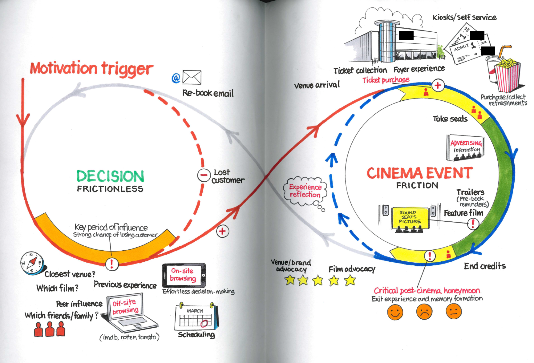
An infinity loop showing the customer journey of someone buying a cinema ticket and watching a film.

Cinema Experience Loop.

This is the first of an occasional series of explorations into my previous work. I’ll stay light on the reasons only to say that I’ve been clearing out some paperwork and rather than hang on to old documents I thought I’d scan them, creating a digital record (portfolio?) and have the opportunity to explore them in public.

First up is this hand-illustrated experience loop that looks at the ways in which we come to think about buying a cinema ticket and watching a film. Full disclosure this is a commissioned illustration based on my original sketches. I’d love to be that neat but, for a pitch, it needed a draughtsman’s hand.

So, we start on the left side with a motivation trigger. What makes a prospective cinema-goer interested? We imply that a decision to watch something has already been made and this circle investigates the processes being made to identify why the customer chooses this particular cinema (brand). The early phase of influence is all about holding on to a customer that could easily flip to a different venue or decide not to go at all if there is friction in the process of determining a match between film, scheduling and the booking experience. This period, from a creative perspective, opened up lots of discussion around what the on-site and off-site experiences are and how they increase motivation or add friction. How does, for example, the role of review sites like Rotten Tomatoes or, frankly, Google, impact on the linear nature of this flow. How might the (ahem) cadence of this part of the process change depending on whether you’re looking for the next few hours or in the next week?

We looked at the impact of losing a prospect at this point. How might we encourage them back into the decision and consideration phase? We might think about creative ways to re-target and the requirement to have a technical solution in place that identifies those people that are dropping out of the process.

By contrast, the process of attending the cinema is explored on the right-hand side. This is where we looked to add a little friction, slow it down and engage the customer to embed a brand experience that is memorable. Creatively we wanted to introduce ideas around the venue arrival, recognition of the customer at point-of-sale and the personalisation of the foyer experience. How might we influence that crucial ‘take your seats’ phase, where your sense of anticipation is at its peak and where you’re most receptive to the little moments of delight that make the brand stand out?

The film itself is the green section, not much we can do here. This was largely out of our brand’s control. They could deliver exceptional sound and visuals – technology and seating design that was a cut above, but this was out of the purview of our pitch. At the end of the film, the opportunity to embed a great memory is significant. Kahneman talks of the effect of a crashing cymbal at the end of an orchestral score and this is the analogous moment, in more candid terms: don’t fuck it up. To this end we had the opportunity to discuss the rating or review of the experience on exit and the supporting of advocacy, finding creative ways to build on that classic behaviour of walking out of the cinema excitedly chattering about what you’ve just seen – how could this, for example, be broadcast more immediately so that it might influence people in the decision phase?

Finally, there’s a period of reflection. A little later than that foyer exit, perhaps in the day or so after the event where the brand has an opportunity to deepen the memory and connection of the experience with reward, follow-up and loyalty options that potentially build on the momentum and retain the cinema goer within the brand’s orbit such that any future decision to view is even more likely to result in a return to our client’s site and location.

As an exercise, this was a classic customer journey analysis and was the result of deep, intensive thinking and research during a pitch. It’s the tip of a strategic iceberg and was visually the framework which we used to introduce and anchor the creative ideas we presented. It was a demonstration to our client that we thought about the role of loyalty, of the critical touchpoints and potential leaks. We could highlight the interventions we had designed: exceptionally easy booking and film discovery, a personalised welcome and pre-booked refreshments, an effortless review-and-share interaction.

I’m sure it can be critiqued and holes identified. It’s pitch material and therefore hardly the most intensively researched and finessed work – not like you might do with a multi-year client, but I’m proud of what it allowed us to present and the manner in which it demonstrates that UX can borrow from service design principles to add essential context to the flows, screens and interactions we design and present.

Get in the comments on the blog/LinkedIn and let me know what you think. More of this sort of thing soon come.


Tagged , , , , , , ,

Customer Service Isn’t Rocket Science

Last year at dConstruct in Brighton, Kelly Goto (in a rather rushed, though charming, presentation) mentioned that we were reaching a point where user experiences were now, generally speaking, easy-enough to use. Not brilliant in most cases, but at a sufficient baseline that it was hard to find atrocious examples of  user experience.

Perhaps in North America. I recently went to Canada for the first time in many years and was instantly reminded on my first night there with Deb and Naomi, that the tipping-culture of the colonies is such that customer service is just consistently better. The simple motivating economics of working for tips begets a better experience. Here, not so much.[Be warned, what follows is a definite White Whine/First World Problem].

Stovax for example. I’ll try and keep this short. 2 Years ago we had a wood burning stove installed. I bought it online to save money, I had it installed by a local company. I think it now needs a service. I think this because I’m risk-averse and conscious that there are things like CO2 that can leak (possibly fatally) if not checked.

So, I start the process of trying to get it serviced. I start with the manufacturer, using their site to locate authorised resellers and service agents in my area. That was painless, their site allows me to see those offering service too, so I don’t need to bother retail-only outlets. But then it unravels. Each shop I emailed said they wouldn’t do it. Nobody would come out for a small fee to make a potential future customer happy. It begs the question why they would even say they were service agents. I got short shrift from all of them:

Galleon Fireplaces in Surbiton (Stovax’s preferred retailer) – Would not service a stove, despite it being less than 2 miles from their store, as it was not purchased from them. But they never responded to my email asking, I had to call in to be told, bluntly. In fact in all the dealings I’ve ever had with them to buy accessories they’ve been incredibly surly and rude on the phone and in-store.

EcoFires in Fleet – Despite selling us the stove, and despite several emails, Peter Hillier and Phillip Edwards never responded to my enquiry at all.

The Original Grate Expectations – Did respond by email but would not service a stove they didn’t install [despite me being told by Stovax they would].

The Fireplace Shop, Guildford – Neither Max nor anyone at the shop ever responded to my email

Croydon Mechanical & Electrical Service – Never responded to my email.

Cast Iron Fireplace Company – Listed on HETAS as a service agent for stoves yet Maureen was quick to respond to me to say “we do not carry out any servicing”, when I pointed out that they’re listed as such, she passed the buck and said it was not their site and they’d simple ‘suggest they change their wording’.

Kindle Stoves – Teddington, Did respond and Clare actually explained why they wouldn’t take on a small job like that during their peak installation season, providing some financial justification and pointing me at a possible solution.

By this point I was exasperated and chased it up with Stovax pointing out that its dealer network was failing customers. And yet again, it’s just a poor generic response.

It took [edit]17 days to respond to my email and when they did they simply said they don’t service (I wasn’t asking them to), then saying their dealers do (well, they say they do but they don’t). It took another 12 days after I replied that they said [paraphrased] ‘not our problem, blame the retailers’ and in doing so were entirely not bothered that I was unhappy and that their product was unusable. Instead they just blindly pointed me at more retailers that I’d have to ring/email. They passed the buck and instead acted as a reluctant and largely unhelpful directory service. In the end it was nearly a month after my original website enquiry that the chain of emails with Stovax Customer enquiries ended without a single apology for the delay in responding, the poor service from the dealer network they rely on or an acknowledgement that their emails had all the human tone of an automaton. Their website still suggests the same retailers. And this from a company that paid one of their directors nearly £500k in 2010.

Email customer service has allowed the agents to filter and respond in their own time, to not have to listen to a frustrated customer and to hide behind anonymity and stock responses.

What I just don’t get is that it’s not hard:

1. Respond quickly – email isn’t an excuse to sit on a problem until you can be bothered to get round to it, if you don’t have the time, employ more staff, change your working practises, don’t make the customer bear the burden.

2. Be personal – stock responses feel horribly generic. Named customer service representatives are much much better, it helps customers feel they they are being treated as a human being.

3. Always, always offer a solution – Several of the emails from the retailers and the manufacturer basically just stated the situation ‘we can’t help’ missing the irony that this itself is not helpful. Even if you can’t help, try to offer a solution where somebody else can so that the customer can at least associate you with some goodwill.

This stuff seems so obvious, common courtesy, manners even. Sadly, to suggest we’ve reached a baseline of good experience in the face of evidence like this is naive in my opinion. Small British business like those above you would think would be chasing every customer tail going in a time of financial prudence. Instead they’re sitting-on and mismanaging communications with potential new sources of revenue. They’re now in a situation where their reputation for at least one customer is permanently online, searchable and on-record as a bad one.

I’ve never had a strong urge to run a small business but I’d like to think that, if I did, I’d at least manage the customer experience from sale to service a damn site better than most of this lot.

UPDATE 17:57 25/Jan: Credit where it’s due, I have heard already this afternoon from Alun Williams at HETAS (industry regulator) and Stovax both of whom have be conciliatory and, in the case of the latter, are investigating.

Tagged , , , , ,

Apple Stores: Experience Design = Great. Reality = Aaagh!

Rory Cellan-Jones writes over at the BBC dot.Rory blog today about the emergence of the Microsoft facsimile of the Apple retail store experience. I contend that we shouldn’t fawn too much over the Cupertino firm’s success here.

I am an Apple fan, albeit one without the disposable cash to have actually bought one of their computers. I have bought several iPods and my iPhone at the Apple retail store. My local store is Kingston [photo: a typical Saturday] and I suspect this store is representative of their mall units in the UK. It’s wonderfully designed inside with clear experience design – the analysis of which is covered well here. The reality is that the store is incredibly popular and consequentially the experience takes a pounding. I’d love to spend time browsing the Apple TV interface and discovering if the paucity of content has improved to the point that I might buy one. But I can’t because on a Saturday I’m lucky if after 5 minutes of trying I have actually managed to get near it. There are lots of teenagers who have absolutely no intention of purchasing nor the money to do so but they’re in the store in their hundreds. They stand two-three deep around £1500 machines taking photos of their faces and warping them, updating their Facebook status’ “in the Apl str, LOL” and generally cooling my enthusiasm for the brand.

Of course I can see that these teenage browsers are prospects themselves in a few years’ time or – through their parents’ wallets – in the near future. I’m not really attempting to make an assessment of the financial success of the Apple store (for which a selection of financials need to be considered). What I am really trying to draw attention to is that we are often a little too quick to wax on about such experiences without actually thinking them through by actually experiencing it. This means ethnographic reporting following a field trip out to the store with a given sequence of tasks to perform/observe. A report under these conditions would surely reveal more about the service experience than the  blind hyperbole of jumping on that jolly popular bandwagon.

Tagged , , ,