Why Christmas shopping feels hostile, and why ‘catalogue commerce’ makes it worse.
December always brings the same rituals. Sitting in front of a website with a sense of mild dread. The kind one reserves for using a train station toilet, or getting into the coffee queue after parkrun. The intended tasks isn’t difficult or unpleasant in theory, just buy something thoughtful for someone you care about, but Christmas shopping always manages to feel like cognitive trench warfare. Retailers would have it as “the season of gifting”, the rest of us call it, problem solving with a shot glass of Baileys.
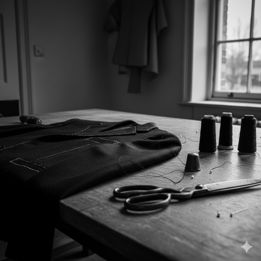
So, for some context, let’s go back to a couple of of weeks ago when I was trying to get myself a replacement down jacket. A bit like when I was trying to get Jo some new Asics, this wasn’t an extravagant task. It wasn’t even particularly interesting. Just a bit of a like-for-like replacement for a much-abused Rab. All I needed was a sub expedition-grade jacket. Black, simple. I know my sizes, I know I needed about 850+ fill power and I was ambivalent about much else. I had a shortlist of brands I like. But dozens of models, filters that are inconsistent across brands, categories that mean nothing to people outside of the industry and a product hierarchy that is the baffling output of a Content Management System (CMS) that’s been operated by a chimp1.
I wasn’t searching as much as performing archaeology. Sifting through layers and brushing off the irrelevant collateral.

In design terms this is what we might call the Gulf of Execution, or as my colleagues and I at Dare liked to call the Experience Gap: the distance between what a human means and what the system is willing to accept. My intent was simple – “warm, minimalist natural down for standing around on platforms, by sports pitches and walking to the pub” – but the interface insisted I drop that down into a dialect of drop-down, checkboxes and jargonist euphemisms. A human request translated into machine-and-catalogue syntax. Little wonder the whole thing feels like a joyless chore.
And Christmas retail only amplifies this.
Every major high street site trots out its annual performance of “Gifts for Her”, a festival of generic filler: candles, scarves, bath sets, socks. The occasional novelty gift set embossed with typography that looks like it was designed at 4pm on a Friday whilst sucking on a fetid vape. It’s all indexed by price bands: “Under £10”, “Under £50”, “Over £250” – as if women are primarily sorted by budget code rather than, say, personality or taste.
No mother wants another hand cream selection.
No thirty-something woman wants coordinated gloves.
No partner wants to receive something that clearly began life as a procurement exercise.
The whole structure is built around the warehouse, not the person. It’s inventory logic masquerading as emotional intelligence. And the moment you notice it, you can’t unsee it: most “gift guides” reveal almost nothing about the recipient and everything about that the retailer wants to shift.
This is the failure baked-into catalogue commerce. It doesn’t matter which brand you pick; the underlying assumption is the same: that human desire can be expressed through filters, and that personality cab be captured in a category label. It’s tidy, rational and optimised. It’s also completely blind as to what makes shopping human in the first place.
Because real gift-buying begins long before the visit to the website. It begins in the cluttered contradictory emotional territory that sits just outside the browser window: What does she already have? What does she love? What has she told me about? What will she pretend to love? What feels thoughtless? What feels too much? What feels like you didn’t think at all (Hint: anything at Boots that comes in a gift box)? Retail ignores all of this and forces you straight into the grid (what we call the Product Listings Page (PLP) ), as if the process were orderly. Spoiler alert, it never is.
This is why Christmas shopping feels hostile. It’s not that the options are universal bad, just that the interface tries to convince you it understands and reflects your mental model when it plainly does not. Handing you a hundred variants of the same filler and expecting conversion gratitude. Somewhere between the filters, the categories and the bath sets you sense the truth: this isn’t built for you. It’s built to organise the warehouse.
Don’t worry though, there’s a better story coming, and the technology to enable it is finally here. But this isn’t the piece for solutions, it’s about naming the problem plainly as it is and without the retail gloss.
Next time I’ll get on to the other half of the picture: the system-level shift that’s going to quietly rewrite the entire experience from how we search to where the journey really begins.
For now its enough to acknowledge the obvious: Christmas shopping isn’t about solving and indecisiveness problem for dumb consumers. It’s a broken model designed around systems that are not built to reflect how people think, feel or choose, especially in December.
Part Two: How agentic solves this, and more.
AI: This piece was assisted with Ai. I used it for the tags, excerpt, the image generation and some very light sub-editing. The ideas, references, and anecdotes were all mine.
- Plot twist. I ended up with the Shackleton Ronne. I browsed online for weeks. I did huge amounts of research and comparison and then I went to the wonderful store on Piccadilly and spoke to a great sales assistant there who worked with me to ensure it was absolutely the right fit and will see me out for prob 5-10 years of use. ↩︎


Too Many Podcasts?
Or, why skipping an episode feels like abandoning a friend.
There’s a particular guilt that comes from skipping ahead in a podcast series. Not the comedian-chats-to-comedian ones, or Desert Island Discs, those you can binge or bin at will. I’m talking about the recurring ones. The talky ones. The ones hosted by people you like, or worse, people you know. Miss a week and you don’t just lose the thread, you lose the right to laugh. The callbacks make no sense. The in-jokes have moved on. You’re no longer in on it.
I’m aware this sounds neurotic. But I’ve stopped listening to several podcasts not because they got worse, but because I missed two episodes and couldn’t face the trauma of catching up. I know I could jump in. I know no one cares. But somehow, I do. It’s the same part of me that keeps unread issues of The Spectator in a stack, muttering, “I’ll start again from the first issue.” That all came about when Jeremy Clarke got ill and I couldn’t bear reading his brilliant column out of sequence, inevitably posthumously.
The problem therefore, I think, is narrative continuity without narrative urgency. Podcasts, like newsletters or Jeremy’s Low Life column, have become serialised companionships. Their UX rewards loyalty, but punishes lapsed affection. It’s a structure built for the always-on, and it assumes you never really leave.
And the volume. The sheer, relentless sprawl of it. Everyone has a podcast now. Kind, intelligent friends. Former colleagues. Distant people I admire. I say this with genuine affection and no small dose of complicity, I write a blog read by literally tens, so I’m not throwing stones from the hilltop. But podcasting’s democratisation has created a landscape where the bar to entry is nil and the bar to quality is… unacknowledged.
This isn’t a snobby defence of old gatekeepers. The best podcasts out there are often the weirder, niche ones. The ones that would never make it past a commissioner’s desk. But that doesn’t mean the friction was all bad. A copywriter at my former agency once said, “Don’t waste the reader’s time.” With podcasts, the time-wasting is part of the premise.
There’s also the question of emotional design. If podcasts are a medium of intimacy, why are the interfaces and audio frequently so transactional? There’s no gentle onboarding for returners. No “here’s what you missed.” No warm “start here.” Just a reverse-chronological list and an assumption that you’ve kept up.
Imagine if books worked like that. Chapter 17 opens with “As we were saying…” and you’re left frantically flipping back (actually, come to think of it, that’s the exact reason why I really started to hate Thursday Murder Club). Or if Netflix removed season recaps because you should’ve been paying attention. It’s not hostile, exactly. Just… indifferent.
So what would better design look like? Perhaps:
Small things. But they matter. Because as much as podcasts masquerade as friends chatting in your ears, they’re still products. And products that ignore re-entry, or punish time away, eventually lose people, not to rage, but to fatigue.
I don’t think we need fewer podcasts. That would be like saying we need fewer books. But we do need better affordances for how people actually consume them: messily, sporadically, guiltily.
We don’t stop listening because we’re bored. We stop because the emotional lift of rejoining feels heavier than just starting something new.
And if you’re wondering whether I’ll catch up on that podcast you recommended last month, the answer is no. I fell behind. And now I can’t remember when his dog died.
AI: This piece was written by me, I did use ChatGPT to sub-edit, help shape the structure, and keep the tone aligned with my voice. The experiences, perspectives, and final edits are mine. AI also produced the tag list, excerpts and image that accompanies it.