After writing about smartphones, parenting, and the slow erosion of moral instinct, I stumbled across a piece that wouldn’t let me go.
Freya India’s “A Time We Never Knew” is, on the face of it, a lament. But not for something tangible, not for a policy or platform or even a particular childhood. It’s a mourning for an idea of childhood. One shaped by distance, longing, and a deep sense that something quietly essential has been lost.
She writes from within the generation often described as digital natives, the ones we, as parents, designers, and the more pretentious cultural observers, keep diagnosing. But what she offers isn’t data. It’s affect. Grief. And reading it, you realise: this isn’t nostalgia. It’s anemoia (a term for the ache we feel for something we never really had). This is a pre-digital adolescence glimpsed only through fiction, photo albums, or the vague warmth of a life not filtered through lenses and likes.
Freya’s piece is moving because it’s not arguing a case. It’s inhabiting one. She shows you what it feels like to have grown up inside a version of it that always felt slightly off.
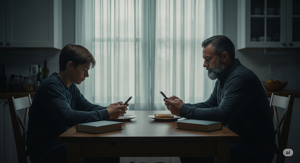
“We never knew friendship before it became keeping up a Snapstreak or using each other like props to look popular on Instagram.”
You can’t optimise your way out of that. No digital literacy workshop or screen-time-tracking feature will undo the sense of being used by your own image, or complicit in someone else’s performance of belonging. That’s not a UX flaw, it’s existential distortion.
I’ve argued (and still believe) that design can play its part and restore rhythm, attention, and emotional fidelity. But Freya’s piece sharpened that for me. It’s not enough to critique what’s broken as so many do with no alternative, we need to take seriously the kind of childhood that’s been lost, and ask: What now?
Not conceptually. Practically. What now?
Here are five places to start; if not to fix things, then to stop making them worse:
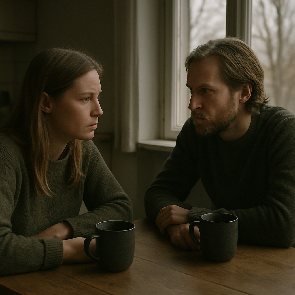
1. Start with the household, not the handset
Stop asking what the app is doing to your kid. Ask what your own habits are modelling. Shared mealtimes won’t solve everything, but they set a tempo. Phone baskets, landlines, analogue clocks, not as statements, but as defaults. Ordinary, visible, repeatable.
2. Make physical things accessible, not aspirational
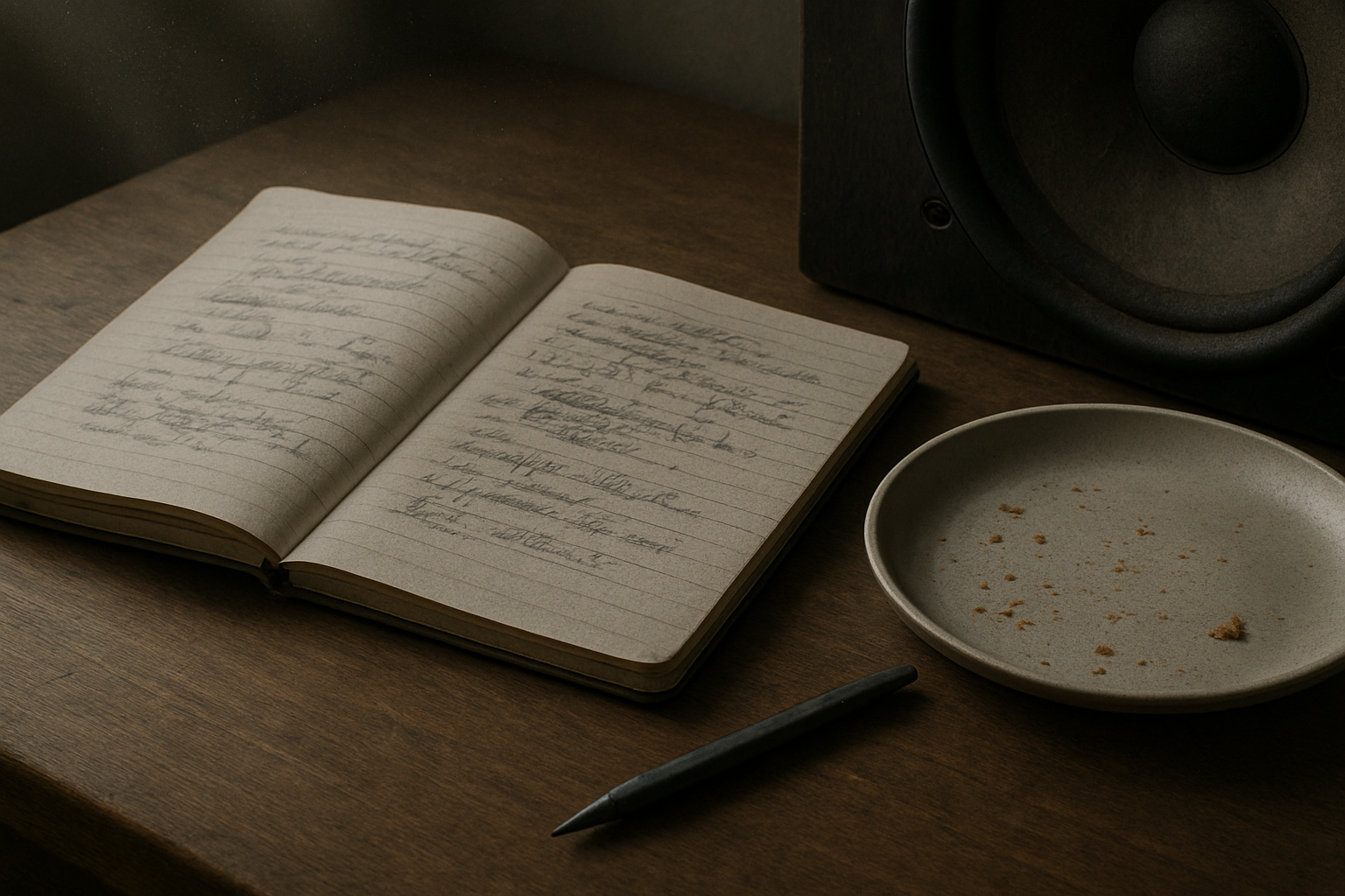
Stationery shops now look like gift boutiques. That’s a design failure. Kids shouldn’t need £38 Moleskines and Bullet journals to feel entitled to write something down. Re-normalise pen and paper without a need for it to looked designed and perfect. Put it on the table. Make it disposable. Used, not treasured.
3. Build spaces for lingering, not passing through
If you’re designing environments, cafes, libraries, waiting rooms, even apps, make them boredom-compatible. Low-stimulus, soft-lit, acoustically calm. Places you can sit without being prompted, pitched to, or processed. Most teens have never known that feeling. In apps this means zero notifications, tapered onboarding, low information density. No autoplay, restful animation.
4. Reclaim awkwardness
Digital fluency has obliterated the slow burn of uncertainty. But life happens in those gaps. If you’re a teacher, don’t fill every silence. If you’re a parent, let the car journey be wordless, let them be bored. Awkwardness isn’t failure it’s part of growing up.
5. Don’t design mindfulness tools. Design fewer distractions
I’ve had enough with breathwork apps and dopamine dashboards. If your platform wants to support mental health, stop inventing new notifications. Introduce blank states. Dead-ends. Hard stops. Have a very high bar for introducing infinite scroll. If the user’s done, say so. Let them leave with #NOFOMO.
In the piece I wrote last month, I framed our dilemma as a kind of middle-class dread, knowing something’s wrong but unsure how to respond without sounding puritanical or panicked. Haidt warns us of the cost of inaction. Burnett warns us not to lose our heads. Freya reminds us what it feels like. And somewhere between their caution, grief, and scepticism, we need to act, not with slogans or screen-time charts, but with work that answers in the way I have above, modelling better rhythms, removing false urgency.
We don’t all need to log-off, we just need to show up offline too, be awkward and occasionally uninteresting.
AI disclaimer: This piece was written by me, but I used ChatGPT to sub-edit, surface research, help shape the structure, and keep the tone aligned with my voice. The experiences, perspectives, and final edits are mine. AI also produced the tag list, excerpts and image that accompanies it.