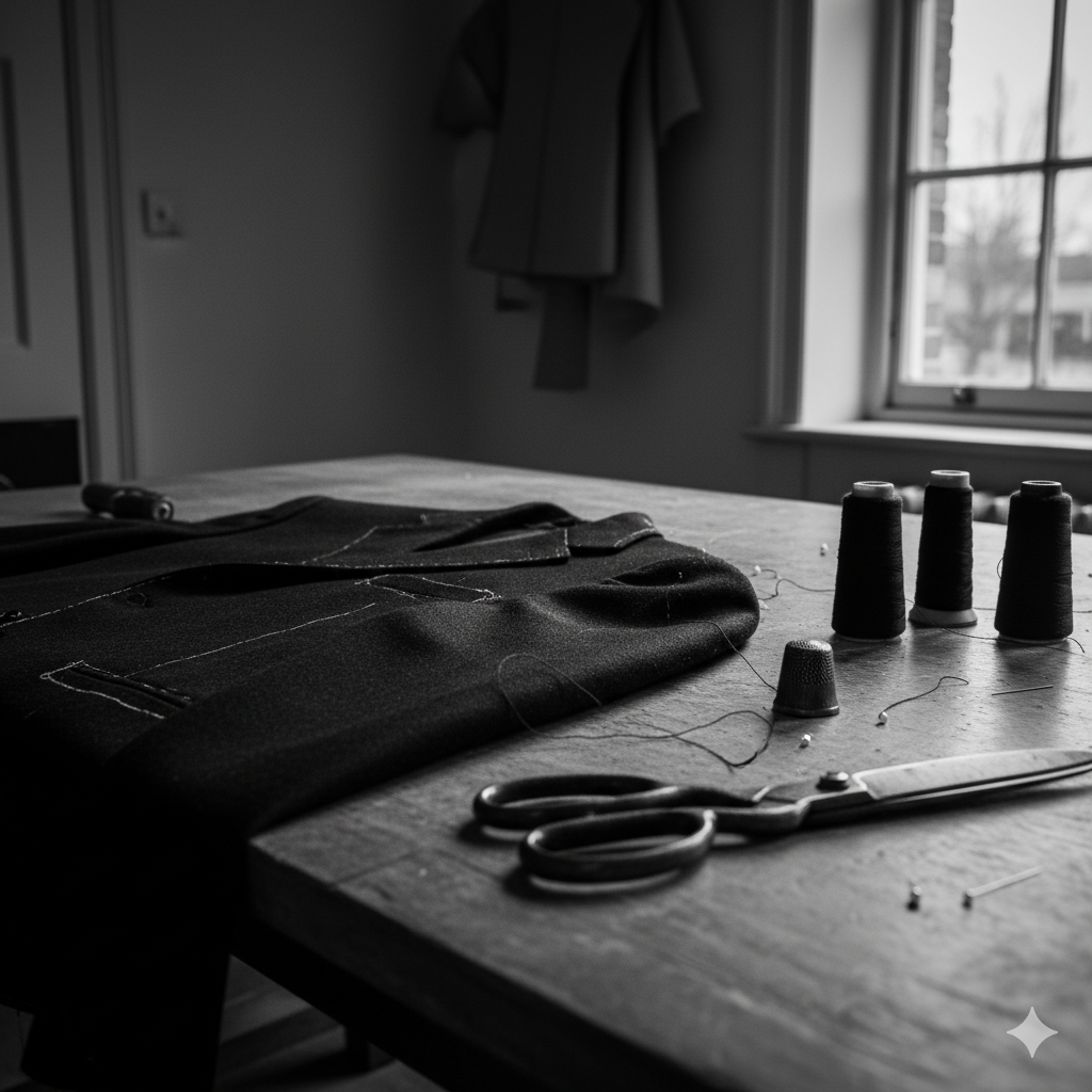
Category Archives: work

Too Many Podcasts?

A man in his early thirties sits at a light wooden desk in a softly lit Scandinavian-style room. He wears a grey jumper and has black headphones resting around his neck. Leaning his head on one hand, he looks at his smartphone, which shows a long list of podcast episodes. On the desk in front of him are a ceramic mug half-filled with tea and a small stack of magazines. The mood is contemplative and slightly weary.
No, I don’t know why the phone is like that either mate. But you get the point. Too many podcasts.

Or, why skipping an episode feels like abandoning a friend.

There’s a particular guilt that comes from skipping ahead in a podcast series. Not the comedian-chats-to-comedian ones, or Desert Island Discs, those you can binge or bin at will. I’m talking about the recurring ones. The talky ones. The ones hosted by people you like, or worse, people you know. Miss a week and you don’t just lose the thread, you lose the right to laugh. The callbacks make no sense. The in-jokes have moved on. You’re no longer in on it.

I’m aware this sounds neurotic. But I’ve stopped listening to several podcasts not because they got worse, but because I missed two episodes and couldn’t face the trauma of catching up. I know I could jump in. I know no one cares. But somehow, I do. It’s the same part of me that keeps unread issues of The Spectator in a stack, muttering, “I’ll start again from the first issue.” That all came about when Jeremy Clarke got ill and I couldn’t bear reading his brilliant column out of sequence, inevitably posthumously.

The problem therefore, I think, is narrative continuity without narrative urgency. Podcasts, like newsletters or Jeremy’s Low Life column, have become serialised companionships. Their UX rewards loyalty, but punishes lapsed affection. It’s a structure built for the always-on, and it assumes you never really leave.

And the volume. The sheer, relentless sprawl of it. Everyone has a podcast now. Kind, intelligent friends. Former colleagues. Distant people I admire. I say this with genuine affection and no small dose of complicity, I write a blog read by literally tens, so I’m not throwing stones from the hilltop. But podcasting’s democratisation has created a landscape where the bar to entry is nil and the bar to quality is… unacknowledged.

This isn’t a snobby defence of old gatekeepers. The best podcasts out there are often the weirder, niche ones. The ones that would never make it past a commissioner’s desk. But that doesn’t mean the friction was all bad. A copywriter at my former agency once said, “Don’t waste the reader’s time.” With podcasts, the time-wasting is part of the premise.

There’s also the question of emotional design. If podcasts are a medium of intimacy, why are the interfaces and audio frequently so transactional? There’s no gentle onboarding for returners. No “here’s what you missed.” No warm “start here.” Just a reverse-chronological list and an assumption that you’ve kept up.

Imagine if books worked like that. Chapter 17 opens with “As we were saying…” and you’re left frantically flipping back (actually, come to think of it, that’s the exact reason why I really started to hate Thursday Murder Club). Or if Netflix removed season recaps because you should’ve been paying attention. It’s not hostile, exactly. Just… indifferent.

So what would better design look like? Perhaps:

  • A podcast player UI that lets hosts flag standalone episodes for returners.
  • A soft re-entry note at the top of an episode: “You don’t need the last three. This one’s its own thing.”
  • A brief recap audio snippet or even a written primer for regulars who’ve been away.

Small things. But they matter. Because as much as podcasts masquerade as friends chatting in your ears, they’re still products. And products that ignore re-entry, or punish time away, eventually lose people, not to rage, but to fatigue.

I don’t think we need fewer podcasts. That would be like saying we need fewer books. But we do need better affordances for how people actually consume them: messily, sporadically, guiltily.

We don’t stop listening because we’re bored. We stop because the emotional lift of rejoining feels heavier than just starting something new.

And if you’re wondering whether I’ll catch up on that podcast you recommended last month, the answer is no. I fell behind. And now I can’t remember when his dog died.

AI: This piece was written by me, I did use ChatGPT to sub-edit, help shape the structure, and keep the tone aligned with my voice. The experiences, perspectives, and final edits are mine. AI also produced the tag list, excerpts and image that accompanies it.

Tagged , , , , , , , ,

The Childhood We Never Knew

A teenage girl with long light brown hair sits alone on a wooden bench in a natural garden at dusk, holding a pen over an open notebook on her lap, with her phone placed screen-down beside her. The scene is softly lit with warm, natural light, surrounded by tall grass and unmanicured foliage.

After writing about smartphones, parenting, and the slow erosion of moral instinct, I stumbled across a piece that wouldn’t let me go.

Freya India’s A Time We Never Knew is, on the face of it, a lament. But not for something tangible, not for a policy or platform or even a particular childhood. It’s a mourning for an idea of childhood. One shaped by distance, longing, and a deep sense that something quietly essential has been lost.

She writes from within the generation often described as digital natives, the ones we, as parents, designers, and the more pretentious cultural observers, keep diagnosing. But what she offers isn’t data. It’s affect. Grief. And reading it, you realise: this isn’t nostalgia. It’s anemoia (a term for the ache we feel for something we never really had). This is a pre-digital adolescence glimpsed only through fiction, photo albums, or the vague warmth of a life not filtered through lenses and likes.

Freya’s piece is moving because it’s not arguing a case. It’s inhabiting one. She shows you what it feels like to have grown up inside a version of it that always felt slightly off.

“We never knew friendship before it became keeping up a Snapstreak or using each other like props to look popular on Instagram.”

You can’t optimise your way out of that. No digital literacy workshop or screen-time-tracking feature will undo the sense of being used by your own image, or complicit in someone else’s performance of belonging. That’s not a UX flaw, it’s existential distortion.

I’ve argued (and still believe) that design can play its part and restore rhythm, attention, and emotional fidelity. But Freya’s piece sharpened that for me. It’s not enough to critique what’s broken as so many do with no alternative, we need to take seriously the kind of childhood that’s been lost, and ask: What now?

Not conceptually. Practically. What now?

Here are five places to start; if not to fix things, then to stop making them worse:

1. Start with the household, not the handset

Stop asking what the app is doing to your kid. Ask what your own habits are modelling. Shared mealtimes won’t solve everything, but they set a tempo. Phone baskets, landlines, analogue clocks, not as statements, but as defaults. Ordinary, visible, repeatable.

2. Make physical things accessible, not aspirational

Stationery shops now look like gift boutiques. That’s a design failure. Kids shouldn’t need £38 Moleskines and Bullet journals to feel entitled to write something down. Re-normalise pen and paper without a need for it to looked designed and perfect. Put it on the table. Make it disposable. Used, not treasured.

3. Build spaces for lingering, not passing through

If you’re designing environments, cafes, libraries, waiting rooms, even apps, make them boredom-compatible. Low-stimulus, soft-lit, acoustically calm. Places you can sit without being prompted, pitched to, or processed. Most teens have never known that feeling. In apps this means zero notifications, tapered onboarding, low information density. No autoplay, restful animation.

4. Reclaim awkwardness

Digital fluency has obliterated the slow burn of uncertainty. But life happens in those gaps. If you’re a teacher, don’t fill every silence. If you’re a parent, let the car journey be wordless, let them be bored. Awkwardness isn’t failure it’s part of growing up.

5. Don’t design mindfulness tools. Design fewer distractions

I’ve had enough with breathwork apps and dopamine dashboards. If your platform wants to support mental health, stop inventing new notifications. Introduce blank states. Dead-ends. Hard stops. Have a very high bar for introducing infinite scroll. If the user’s done, say so. Let them leave with #NOFOMO.

In the piece I wrote last month, I framed our dilemma as a kind of middle-class dread, knowing something’s wrong but unsure how to respond without sounding puritanical or panicked. Haidt warns us of the cost of inaction. Burnett warns us not to lose our heads. Freya reminds us what it feels like. And somewhere between their caution, grief, and scepticism, we need to act, not with slogans or screen-time charts, but with work that answers in the way I have above, modelling better rhythms, removing false urgency.

We don’t all need to log-off, we just need to show up offline too, be awkward and occasionally uninteresting.

AI disclaimer: This piece was written by me, but I used ChatGPT to sub-edit, surface research, help shape the structure, and keep the tone aligned with my voice. The experiences, perspectives, and final edits are mine. AI also produced the tag list, excerpts and image that accompanies it.

Tagged , , , , , , , ,

Why UK Kids Can’t Have Bank Accounts Before Six – And Why That’s Silly

A close-up, hyper-realistic photo shows a wooden piggy bank with a coin slot on its back and a coin partially inserted. The piggy bank is positioned next to a smartphone displaying a children's banking app with icons for savings goals and coin graphics. To the right of the phone is a neatly folded stack of pastel-colored baby clothes, including a small pair of knitted booties, with a Vinted parcel label and barcode clearly visible. The scene is illuminated by soft, natural light, creating a muted, editorial feel.

Here’s a sentence that shouldn’t exist: our two-year-old has a savings pot inside her eleven-year-old brother’s bank account.

Not because we’re trying to confuse HMRC or because we’ve discovered some fintech hack that’s too good to share. Simply because no UK bank will give her an account until she turns six, and when she does, it will still be hamstrung by limits that assume every child’s money arrives in neat, predictable chunks from a parent’s allowance.

The set-up is simple. We sell her old clothes and toys on Vinted. It’s honest, traceable money, every transaction recorded by a platform that has its own anti–money laundering checks baked in. The items avoid landfill. The proceeds go to her future self. It’s the kind of wholesome circular economy PR departments love to posture about. And yet the only way to park that money somewhere with her name on it (sort of) is to create a ‘pot’ inside her brother’s Rooster account.

This is not a problem the Financial Conduct Authority asked the banks to solve. There is no specific regulation that says under-sixes cannot have a bank account. This is a product design decision, dressed up in safeguarding logic. NatWest’s own Rooster service told me:

We’ve had to introduce limits, with these limits created and set at what we believe is a generous amount for a child’s pocket money app… We recommend that you make fewer larger top-ups in the month, and then boost the money over as often as you like.Katie, 15.AUG.25

The logic, if you squint, is that transaction caps stop laundering. But laundering what, exactly? In our case: a baby’s outgrown sleepsuits. The “10 loads a month” cap on Rooster is not cumulative-value–driven (the actual pound-limit is much higher). It’s a blunt instrument, applied as though fewer transactions automatically means less risk.

In reality, this isn’t about AML at all. It’s about the convenience of enforcing one simple rule across the board rather than designing for the messy reality of modern family finances:

  • Parents with irregular incomes.
  • Blended households with multiple contributors.
  • Ad-hoc earnings from resale platforms.
  • Grandparents who send £5 here and there for birthdays or because they saw a cute jumper in M&S.

Under the current design, the system doesn’t distinguish between proceeds from a second-hand pushchair and proceeds from illicit activity. The compliance blanket is thrown equally over both.

The result: we’ve built a workaround. Her ‘earnings’ from Vinted go into his account, into her pot, under our management. One day, in about four years, we’ll withdraw the lot and hand it to her. Which is absurd, not least because we’ll have to move it in fewer than ten transactions to avoid tripping the same rules all over again.

If we were serious about aligning banking with real life, we’d have:

  1. A from-birth, save-only account – visible in the parent’s banking app, locked against spending, able to receive small, traceable contributions from approved sources.
  2. Transaction rules shaped by value and source, not arbitrary counts.
  3. A seamless graduation path at age six to a junior current account with a card and spending controls.

The point is not to hand toddlers contactless cards. It’s to start building the habits, and the visibility, early. Money in, money saved, money safe. The actual ‘banking’ part should be the least absurd bit of that equation.

This piece was written and fact checked by me and then sub-edited with the assistance of AI. The image was rendered by Gemini and excerpt, ALT tag were AI generated.

Tagged , , , , , , , , , , , , , , ,

You’ve Booked the Flight. Now Feed the Cat.

Or, What a Ryanair journey map taught me about real UX.

There’s a type of interface that shows up on Dribbble every few months: flight check-ins, boarding passes, baggage-tracking dashboards. Always slick. Always serene. The UI equivalent of cucumber water.

Most of them start at Choose your seat and end at Enjoy your flight. Which is tidy. But also nonsense.

A few years ago, I worked on a project for Ryanair. I drew out a journey map (with pens, natch), not the polished, stakeholder-pleasing kind, but something closer to the real emotional terrain of travel. One that began well before the confirmation screen. One that started, in fact, with the cat.

Because booking a flight isn’t a clean beginning. By the time anyone taps “Book now,” they’ve already trawled five sites, tried to align half-term dates with the one cousin who replies to group chats, checked weather reports, and googled “Do I need a visa for Croatia?” even though they’re flying to Naples.

Life admin, not travel ambition, is what usually kicks things off. That’s where the journey begins.

The diagram traced everything from that fraught pre-booking stretch through to the post-trip hangover, highlighting the emotional and logistical clutter that most airline UX avoids. Not because it isn’t there, but because it’s messy. And mess doesn’t fit neatly into a product roadmap.

There’s the bit after you book, when nothing much happens, except everything might. The vague unease when no one’s confirmed your seats. The passive-aggressive alert that “something has changed” in your itinerary, but you’re left to figure out what. The nervous rechecking of emails. The slow panic over cabin bag dimensions.

Then comes the day itself. A spike in interaction. The printer runs out of ink. You’re stood at Departures at 6:30am trying to download Peppa Pig episodes with 4% battery and no signal. Your toddler’s hungry. Your partner’s tense. And you’re still wondering if you packed the Calpol.

And yet… this is the brand moment. Not the glossy UI, not the neat API integration. Just this: the knot in your stomach, the uncharged phone, the boarding pass you can’t pull up without a connection.

The map tried to capture that. Not to romanticise it, but to acknowledge it.

Even on the return leg, the friction isn’t over. Passport queues. Lost luggage. The existential despair of a train replacement service. You get home, open a week’s worth of mail, find a parking fine, trip over a stray shoe from the hasty departure packing, and realise you didn’t leave anything for the cat-sitter.

Most journey maps stop at wheels-up. Ours didn’t. Because experience doesn’t follow a clean arc. It loops, it stutters, it sags in the middle. Thoughtful UX understands that.

A tired parent, dressed in a dark winter coat with a fur-lined hood, stands in a dimly lit Swedish airport baggage claim area late at night. They are looking down at their phone, which shows a 4% battery icon. To their left, a child sleeps soundly in a dark grey stroller. A large, dark suitcase tilts precariously next to the parent, appearing as though it might fall. In the background, an empty luggage carousel stretches out, with a few other suitcases scattered on it. Further back, blurred figures of other travelers are visible, and the warm glow of a vending machine can be seen on the far left. The overall atmosphere is one of exhaustion and quiet resignation.

Of course, Ryanair won’t build an app that books your pet-sitter or packs plug adapters. But this kind of messy map reveals where the brand can quietly show up—not with a feature, but with timing, tone, and the rare dignity of being understood.

Maybe that’s a 6-sheet in the departure lounge that says “Still cheaper than therapy.” Maybe it’s an email that clears, not clouds. Maybe it’s an in-seat comm that drops the marketing voice for once and just says: “Made it. Welcome back.”

Even for Ryanair, in fact especially for Ryanair, those moments can build memory, trust, and repeat business. Because no one remembers the boarding pass. They remember how they felt when the wheels touched down, the keys were missing, and the cat looked at them with contempt.

You’re not designing for delight. You’re designing for 4% battery, no signal, and a queue that won’t move. That’s where memory lives. And maybe loyalty too.

AI disclosure: This piece was written with the assistance of AI, used strictly as an editorial and thinking partner. All ideas, edits, and final phrasing are mine. ALT text and tagging were also generated with AI support.

Tagged , , , , , , , , , , , , , , , , , , ,

The quiet panic of parenting in a digital world

A moody, hyperrealistic photograph shows a teenage boy and an older man, presumably his father, sitting across from each other at a wooden kitchen table in muted, late afternoon light. Both are absorbed in their smartphones, their heads bowed. A single slice of toast on a white plate sits in front of the father, while two closed books are stacked near the boy. The light filters softly through sheer curtains behind them, illuminating a quiet, timeless kitchen. The scene evokes a sense of mutual disconnection and the quiet ache of modern life.

When I was around 15, I’d get into trouble for calling a girl I was ‘seeing’ after 9pm on the house phone. I remember the jeopardy when her dad answered. It wasn’t just awkward, it felt catastrophic in that very teenage sense. There was no texting, no soft-launching your feelings via Reels. If you wanted to reach someone, you reached their entire household. Privacy was negotiated in real time, and a cordless phone allowing you to slink off to a private corner was borderline futuristic.

I mention this not to romanticise a pre-digital age but to mark a boundary: I don’t truly understand what it’s like to grow up now. Not really.

We’ve been told, often with good reason, that today’s teenagers are in trouble. Jonathan Haidt calls them the “anxious generation”, a cohort rewired by phones and social media. Since around 2012, adolescent mental health (especially among girls) has deteriorated alarmingly. Haidt blames the smartphone: a device that didn’t just enter childhood but, frankly, annexed it. The evidence is worrying, declines in sleep, attention, face-to-face connection. An uptick in self-harm, anxiety, emotional exhaustion. The argument isn’t hysterical. It lands.

But Dean Burnett suggests we’ve misdiagnosed the patient. The panic, he argues, isn’t just in the teens, it’s in us. The parents, the teachers, the adults nervously refreshing headlines while peeking at their own screen time stats. According to Burnett, much of this alarm stems from a mix of generational disorientation (a kind of collective unease that what we grew up with is no longer relevant), recurring moral panic, and good old-fashioned ignorance. We didn’t grow up with these tools, so we assume they’re harmful. We project. We catastrophise. We fear what we don’t fluently use.

The result is a pervasive sense of being at a loss. Some parents clamp down, banning apps, enforcing rigid rules on screen-time that feel increasingly arbitrary. Others detach, paralysed by the sheer bloody complexity of it all. But the most common response that I pick up from parents around me is probably the most human: low-level dread wrapped in middle-class guilt. We don’t really understand what our kids are doing, but we feel complicit anyway.

And then, just as we start to piece together a measured response, “Right! phone-free supper time!”, delayed access, schools running digital literacy workshops, the next threat pops up. Welcome to Whack-a-Mole Parenting. Just as the cultural tide begins to turn on one device, another rises, this time more subtle, more embedded, more seductive.

A recent Substack essay by Cal Newport took this from another angle. Reflecting on Ezra Klein’s critique of The Anxious Generation debate, he argued that we’ve become so beholden to statistical validation that we’ve lost touch with our own moral instinct. That rings uncomfortably true. We don’t just hesitate to act, we hesitate to know. When it comes to phones and parenting, our sense of what’s right is so often deferred, diluted, or apologised for.

Take me, for example. I ask ChatGPT more (personal) questions, now than I ever asked Google. Some are practical: how to structure an email, what to cook with these leftovers, when should I plant out these seeds. But others are… not. I’ve caught myself consulting it about health worries, internal dilemmas, parenting doubts, things I wouldn’t bring up at dinner, or even necessarily with my family, my friends. Because it remembers. Because it adapts. Because it flatters you by bending to your will.

And this is me: a reasonably grounded adult with (I hope) a steady compass and a mild allergy to digital hysteria. Yet even I find it maddeningly addictive. Not the technology itself, but the relation. The illusion of being known, helped, mirrored. I can only imagine how powerful this is for a 14-year-old who isn’t just seeking answers but identity.

So the question isn’t whether smartphones are making kids anxious. They are, in some ways. But the deeper story is that we’re all overwhelmed by the sheer pace of paradigm shifts. We can’t metabolise one tech wave before the next hits us in the face.

What Would Good Design Do?

This is where design comes in. Not as damage limitation, but hopefully as orientation. The best design doesn’t just solve problems. It asks better questions. Like: what rhythms support attention? What thresholds help people feel held, not hijacked? How can digital relationships exist without replacing the real ones?

The design problem is not abstract. It’s visible everywhere. Think of Snapstreaks – a design mechanism that rewards compulsive interaction with digital trophies. Or TikTok’s For You page – a personalised feed of videos that TikTok’s algorithm thinks you’ll be interested in, which notoriously appears to learn vulnerability faster than it learns taste. These aren’t neutral tools. They’re attention economies wired for compulsion, not care. If you’re a parent watching this unfold, it’s not just confusing, it’s existential.

Anna Dahlström, a UX designer and storyteller I trust deeply, put it like this: We need to design this—not as a roadmap, but as the future we want our kids and their kids to live in.”

A brief aside here: Earlier this year, OpenAI’s Sam Altman and LoveFrom’s Jony Ive announced a collaboration to create a physical device for the “AI age.” They talked about daily rhythms, calm interfaces, emotional connection. And while their vision sounds noble, it also confirms the underlying anxiety: that our tools are no longer just functional, they’re emotional infrastructure. If anything, their announcement makes this conversation more urgent. Because the question isn’t whether the tech will be beautifully built. It’s whether it will reflect what matters.

That means not just critiquing the addictiveness of AI companions, but imagining something better. Less extractive. More human. Here’s what that might look like (after an hour of making notes this morning):

  • Design for pause, not push. Platforms should default to stillness, not stimulation. Kill the endless scroll. e.g. “You’ve seen it all, for now” or opening to a prompt rather than a firehose of dopamine content, or making ‘like’ less of a tap and more of a hold, restricted to just a few per day. Default to a quiet mode after 20 mins. Ask a user “why are you sharing this?”
  • Design for self-awareness. Don’t just track engagement. Track how users feel when they leave. Make reflection part of the loop. e.g. “How did that make you feel?”, reporting this along with screen time weekly reports. An in-app emotion metric that algorithmically analyses your interaction cadence, scroll patterns, message tone.
  • Design for companionship, not substitution. If AI is going to listen, let it redirect. Let it nudge us toward real conversations, not just simulated ones. e.g. “This sounds important. Have you considered talk to [name]?” or helping the user plan social activities, remember dates or conversation starters.

The tools aren’t going away. But the way we design them can still reflect care, pace, and conscience. That’s not a nostalgic idea, it’s a classic UX problem and one worth solving.

Coda

When I was a teenager, the phone was something you had to ask permission to use. Now, it’s something we all struggle to put down. Maybe the answer isn’t more rules or fewer apps. Maybe it’s knowing what to do with ourselves in the quiet space that’s left when the screen goes dark.

That’s where design still has a role to play, instead of locking us out, it guides us home.

AI disclaimer: This piece was written by me, but I used ChatGPT to sub-edit, surface research, help shape the structure, and keep the tone aligned with my voice. The experiences, perspectives, and final edits are mine. AI also produced the tag list, excerpts and image that accompanies it.

Tagged , , , , , , , , , , , , , , , , ,

Why the Future of Driving Needs to Feel More Human

A deep metallic green Porsche 911 Targa with gold wheels drives through a sunlit, winding country road in late spring. The right-hand-drive car features a Swedish number plate. A grey-haired British man in his late 40s, wearing a dark jacket, is behind the wheel. A tall, blonde woman sits beside him. The road is dry with light dust rising from the tyres, and long shadows stretch across the tarmac. Mature hedgerows and soft green fields frame the scene in warm golden light.
Some couples go to B&Q. Others recalibrate their marriage on a B-road in June.

I recently got back from a couple of days away in Norfolk with a close friend who also loves his driving. We set out on a fantastic loop from Aylsham through Fakenham, Wells, and Cley – brilliant roads, good sightlines, measured effort, and our own playlists accompanying the sweat on the wheel and the red-hot calipers. It’s been seven years since we did something similar in Scotland on the North Coast 500, and while I’ve found a few roads round me in Surrey where I’ve had flashes of the same joy, doing it in perfect weather with a good friend is different. It’s memorable, visceral, and deeply satisfying.

Aside: The Horkey Kitchen at Bawdeswell is a worth stopping off point.

That trip reminded me what modern driving risks forgetting: rhythm, concentration, the way a great road stretches you just enough to feel vividly, physically present. A truth utterly ignored by the automotive press, which seems fixated on a frictionless future. Autonomy. Electrification. Over-the-air updates. The car, once a machine, is now a platform. A node on a smart grid. Another screen to poke and personalise. And if the future is to be believed, it’ll be a contactless glide from A to B – your vehicle knowing where you’re going, what mood you’re in, and curating the ambient playlist accordingly. Comforting, perhaps. But is that the future we really want?

Because here’s what happens when you flatten a journey into data points and strip the human out. You lose the sweat, the skill, the subtle joy of being in tune. What the current automotive vision tends to forget is this: flow beats frictionless. Every time.

Driving at its best is not about arrival. It’s about engagement. If you’ve ever taken the long way home just because the road was dry, the light was low and the playlist was perfect, you’ll know exactly what I mean.

Let’s be fair: 95% of driving is perfunctory. School runs. Trips to the tip. Visiting family. Airport drop-offs. Just get me there, and do it efficiently. That’s what satnavs are for, and they’re brilliant at it.

But just as we crave a real meal after a week of cobbled-together dinners, we also need room for the drives that feel like something. That remind us we’re not just being carried – we’re in it. That’s what this is about: reserving space for the exceptional.

Because flow isn’t just a productivity state. It’s the embodied feeling of rightness. An experience that draws on physical skill, real-time interpretation, being attuned to your environment. Strip that away, and something vanishes.

You can bolt as many sensors to the bumper as you like – flow isn’t something a car detects. It’s something a driver feels. But here’s the thing: technology doesn’t have to kill flow. It can co-create it.

The current HMI (Human-Machine Interface) paradigm presents a false binary. Either the driver is in control, or the system is. But there’s a third, more human path: co-piloting. Not Microsoft Clippy with a steering wheel, but a system attuned to how you want to feel on this drive. A route with rhythm. Camber. Flow. Roads that reward precision and tempo. Effort that meets intent.

When ease becomes the only design goal, something essential gets lost. And we’ve already seen what that looks like: In one eerily prescient experiment, researchers gave households a free chauffeur for 60 hours a week1 – as if driverless tech had already arrived. Public transport use plummeted. Total miles driven rose by 60%. Among retirees, it more than doubled. Why? Because friction disappeared. People sent cars to pick up friends, ran errands just because they could, and stopped weighing up whether a trip was worth it.

When mobility becomes passive, we don’t do less. We just do less meaningfully. Journeys blur. Movement becomes background noise. The vehicle ceases to be a site of agency or expression – it’s just another box we sit in while life happens elsewhere.

And that’s before we reckon with de-skilling. Driving draws on real-time judgement and physical awareness most of us rarely use elsewhere. Spatial reasoning. Risk calibration. Micro-adjustment. Automate that, and we don’t just lose control. We lose fluency.

Despite this, the appetite for engaged driving hasn’t gone – it’s just become more selective. The very existence of niche markets for classic cars, track days, and driving experiences proves it. That’s why designing for joy matters even more.

But this sits awkwardly alongside a cultural drift towards a one-size-fits-all mobility model – where driving is seen as a problem to solve, not a pleasure to preserve. It’s become unfashionable in some circles to even admit you enjoy it. As if to love driving is to reveal something suspect. But not all movement is equal. The same road can be a chore or a joy. It depends who’s driving, and why.

This shift in perception also affects how we measure success. The metrics used to justify infrastructure (usually based on time saved) miss the point. The real value lies in access gained, experiences unlocked, the long way round.

As behavioural economists have shown, effort often creates meaning. In a world of ‘frictionless’ experiences, friction can signal intention, depth, care.

Technology and craft, when designed with that richer journey in mind, can support and amplify, rather than replace. Like a great chef or a sound designer, it should highlight what matters and let the rest recede.

Imagine:

  • Edge AI that reads your rhythm.
  • Haptics that sharpen attention without nagging.
  • Context-aware routes that change with the light, and the sky.

This emphasis on the physical and the intentional becomes even more crucial because the more we strip away, the more we’ll crave moments that remind us we still exist – bodily, skilfully, viscerally.

Especially in a world where younger generations increasingly see driving as a chore, or opt out altogether, the ones who do drive will be those who want to. That makes the case for joy-built design even stronger.

Because let’s be honest: the real enemy of joy on the road isn’t speed limits or EV ranges or even other drivers. It’s waste. Wasted road. Wasted time. Wasted potential for a moment of synchronicity between human, machine, and landscape.

If the future of automotive is to feel like anything at all – if it’s to be more than a Netflix-enabled transportation pod – we need to stop designing for the eradication of friction, and start designing for the restoration of rhythm.

Not just arrival. But aliveness.

AI Disclosure: This piece was written with the assistance of AI, used as an editorial and thinking partner. All ideas, edits, and final phrasing are mine. Image creation was by AI, natch – ALT text included. Excerpt and tag lists were also optimised for best practice

  1. The study has its limitations of course. It took place in the US where driving is end-to-end whereas Europeans focus is on automation for the last-mile and the public transport is sufficiently better to expect more inertia in behaviour ↩︎

Tagged , , , , , , , , , , , , , , , , , , ,

We Don’t Know How to Argue Any More

We’ve just established that perfection is a bit of a con. That smoothness and polish can feel synthetic, that flaws, handled well, make things real. That was true of design. It’s true of parenting. And it’s true of conversation.

So let’s apply the same logic to how we talk to each other. Especially when we disagree.

Because somewhere along the way, we’ve forgotten how to argue.

Not the red-faced, festive episode of EastEnders kind. Not the long, finger-pointy online threads ending in a half-hearted “do better.” I mean real disagreement. The sort where two people actually try to figure something out, not just dig trenches and hold the line.

Everyone talks about “civil discourse” now, as if etiquette is the issue. But most of that still sounds performative. What I miss are arguments with friction and humility. Ones where both sides know they might walk away changed. Where doubt isn’t seen as a weakness but a sign you’re still listening.

We’re a long way from that now.

Many years ago, I was in the school debating society, travelling around Kent in numerous competitions, even appearing at Westminster School and later representing the University of York up at Durham, where, amusingly, my debating partner was supposed to be Jonathan Isaby, a well-known Conservative voice. However, he mysteriously never showed up until the competition was over. But the principle was simple: listen, engage, persuade. Not demolish. Not deflect. Just make your case, and be ready to refine it when someone made a better one.

Somewhere along the way, we swapped that for something else.

Now, we reward the ‘gotcha’ moment. Certainty is treated like strength. Doubt is weakness. If you admit you’re unsure (or worse, that you’ve changed your mind) it’s seen as a loss of face. We’re so busy performing our identities that we’ve lost the ability to revise our thinking. It’s tiring. And it’s stagnating us.

You see it in culture, in politics, in everyday conversations. People don’t talk to win understanding anymore, they talk to stay on brand.

I’ve done it too. I argued hard for Brexit. Believed in it. Spoke up for it. Framed it as independence, as a chance to reimagine things, to step away from bloated bureaucracy and do things differently. I meant it. I still think the instincts weren’t all wrong.

But the outcome? Messy. Fragmented. Slower than promised. And ultimately, let’s be honest, not the reset we sold ourselves. The deals didn’t arrive. The country didn’t come together. The optimism curdled into something else. That was hard to admit. Still is. But it’s true.

And what’s the alternative? Digging in forever? Pretending clarity is betrayal?

I’m not interested in performative U-turns. But I am interested in being the sort of person who can say, “I’ve reconsidered”. And hearing someone else say it, without pouncing.

You can blame social media for this shift if you want. The outrage economy. And yes, that’s part of it. But it goes deeper. We’ve built entire identities around never backing down but it’s not brave, it’s brittle.

Changing your mind is not a flaw. It’s a feature. Same as in design. Same as in writing. Same as in life. You revise because you care. You argue because you want to know more, not because you just want to be right.

We don’t need more hot takes. We need cooler heads. Conversations that can hold heat without boiling over.

So next time you’re mid-argument (online, in a pub, at home) ask yourself: Am I here to win? Or am I here to learn something?

Because only one of those has a destination and frankly, I’d like to get somewhere.

I used AI to assist with this post. Specifically to help generate the excerpt, tags, image prompt, and to refine the structure and rhythm of the piece in my own tone of voice.

Tagged , , , , , , , , , , , , , , , ,

The Pram in the Hallway: Why Distraction Isn’t the Enemy of UX Design

A softly lit hallway in a Scandinavian home with pale oak flooring and unvarnished wooden bannisters. A black Thule Urban Glide 2 buggy is positioned near the stairs, slightly in the way but undisturbed. On the floor lie a single child’s beige shoe and an open picture book. A wool jumper is draped casually over the bannister. The walls are off-white, and natural morning light fills the space. The scene feels unstyled and honest, capturing the quiet residue of family life.

This is the third in an accidental series of essays about design, constraint, and real life. The first explored ownership and editing, the second mapped those principles onto systems thinking. This one’s about the myth of the uninterrupted workspace, and what raising small humans has taught me about creative process, product integrity, and emotional design.

Last week I was catching up on some unplayed podcasts and heard Marina and Richard mention the Cyril Connolly line: “There is no more sombre enemy of good art than the pram in the hallway.” It’s a tidy little number but, like a lot of pithy mid-century takes, it doesn’t hold up brilliantly under daylight. So, as I continue to navigate our Thule buggy at the foot of the stairs, I thought I’d take a 2025 view.

It’s not just the casual misogyny (though yes, there’s that). It’s the deeper implication: that creativity requires retreat. That meaningful work, especially in design, happens at hushed desks; free of crumbs, notifications, or anyone yelling “Shoooooesies.”

This idea still carries weight in design and UX culture. You see it in reverent desk photos on Instagram and podcast guests earnestly waffling on about ‘flow state’, as though uninterrupted focus were the only path to quality. But what if that’s backwards? What if the mess of real life (parenting, caregiving, the emotional admin of being human) doesn’t dilute our creativity, but sharpens it?

Parenting compresses time like nothing else. Afternoons vanish. Tasks bleed into one another. The illusion of ‘ideal working conditions’ gets quietly shelved between snack prep and bedtime logistics. And yet, in those gaps, between drop-offs and Teams pings, on walks to see the cows, while fishing blueberries out of cardigans, some of the sharpest thinking gets done. Not in spite of distraction, but because of it.

Writers like Stephanie Merritt and Jude Rogers have spoken to this: how urgency and containment recalibrate creative priorities. You triage ideas fast. Half-baked ones don’t survive. The good ones clarify themselves under pressure.

In UX, we talk a lot about constraint as a catalyst. Creativity thrives on boundaries. But we rarely apply that logic to ourselves. Parenthood doesn’t just add constraints, it shifts your perspective. You’re no longer thinking about the user. You’re living with one. Or two. One tantrumming in the hallway, the other arguing about their Prep.

Design culture still clings to the myth of the monastic workspace: noise-cancelling headphones, immaculate desk setups, flow-state rituals. As though life must be suspended for work to begin. But most of the things we design are for people whose lives don’t pause. Parents in mid-tantrum. Carers juggling logistics. People buying insurance, ordering groceries, trying to rebook a dentist while coaxing a child (back) into trousers.

We design for frictionless experience, yet fetishise workflows that rely on silence. On having both hands free and the truth is: proximity to real life doesn’t dilute our design work. It deepens it.

You stop wasting time on polish and start noticing what actually matters. You develop an emotional radar: spotting friction, pre-empting dead ends, sensing what might quietly delight (or indeed quietly break) someone. And as I wrote recently, perfection has become a tell. In a world of generative smoothness, what we trust is the textured, the slightly improvised, the things made while someone was also making lunch.

Most importantly, you stop designing for personas. You start designing for real humans, chaotic, distracted, interrupted. The same kind of people we talked about when designing for enough. The kind who don’t need more features. They need clarity. Mercy. A digital space that behaves well under pressure.

Creativity and caregiving aren’t in conflict. In fact, it’s often caregiving that teaches us how to notice. To prioritise. To mean it.

This piece was edited with the help of AI, to shape rhythm, reference tone, and trim the fat. The excerpt, tagging and image were the result of carefully considered AI prompts. The words and arguments are mine. The tempo is deliberate. The polish is, therefore, human.

Tagged , , , , , , , , , , , , , ,

The Doughnut Is the Point

A pale Scandinavian hallway with a single raincoat hanging and boots below, lit by soft daylight. Calm and quietly intentional.

There’s a jacket hanging by the door in my house that I haven’t cleaned in two winters. A Stutterheim. Patina-stained cotton lining, scuffed hems, smells faintly of trains home. It’s not there for effect. It’s there because it does the job, and does it well. Keeps me dry, holds its own in a cold wind, and feels like continuity. Like something I’d pass on.

I think about that jacket sometimes when I work on digital products.

Because that jacket belongs in the doughnut. Not the jam-filled kind, the one drawn up by economist Kate Raworth. A model for living that rejects the old story of perpetual growth. (Aside: I came across Kate after listening to her talking with Wendell Berry on an old Start The Week. I’d gone on a recommendation from a friend to listen to Wendell Berry but it was Kate’s words which stood out).

In her diagram, the inner ring marks the essentials everyone should have access to: housing, education, dignity. The outer ring is the ecological ceiling: carbon, biodiversity, planetary boundaries. The goal is to stay in the middle. A safe and just space for humanity. Not too little. Not too much.

If that sounds like the Swedish concept of lagom, it is, except Raworth turns the cultural instinct into an economic framework. Lagom is what you feel in a table spread done right. The doughnut is how you design a city, or a system, to honour that logic at scale.

I like that the analogy might be in the Scandi larder: leftovers, carefully labelled. No waste, no lack. Just enough. The doughnut was already there, sitting quietly behind the knäckebröd.

And it maps cleanly onto UX.

The inner ring is what users genuinely need: clarity, trust, human-scale interaction. The outer ring is where the harm begins: deceptive patterns, compulsive loops, the kind of design that counts your seconds, not your needs. The good space, the space between, is where most digital products ought to live. Few do.

I’ve sat in rooms where product success was measured in taps and minutes. “More engagement,” someone would say, as the design team quietly recalibrated the interface to make it just sticky enough. I once worked on a platform where the proudest achievement was a spike in repeat logins. But when you zoomed out, those logins weren’t signs of confidence, they were symptoms of anxiety. People checking their accounts too often, not because the experience was smooth, but because the world wasn’t.

The real win would’ve been a design so clear, so calmly informative, so self-contained that users didn’t feel the need to check at all. But that wouldn’t have shown up on the dashboard. So we built noise instead. Goodhart’s Law anyone?

Doughnut thinking asks: what if we stopped designing for addiction and started designing for enough?

That principle runs through how I live. I’m not a minimalist, but I edit constantly. I favour things with integrity, materials that soften over time, ceramics that stack properly, garden tools that can be sharpened and passed on. When I write, I do so in iA Writer not because it’s clever, but because it clears the room. No distractions. Just text, gently weighted. A space with boundaries. A space that respects my focus. The writing comes better that way, less like performance, more like sorting the drawers in your head.

Same goes for the shelves at home. They hold only what earns its place. Books we’ve read. Things we actually use. Jackets that walk. Nothing there for the feed. Just our curated, persistent things.

Raworth talks about moving from extractive to regenerative economies. I think homes can be regenerative too, giving back emotionally, energetically, even ecologically, if you can. They absorb chaos. Offer rhythm. Ask less from you over time.

What does that actually look like?

There are just enough chairs for the family and the odd visitor. You can find a corkscrew without rummaging. There’s PIR lighting that flicks on as you walk from the landing to the bathroom at night. The house soaks up the mess. Fewer decisions when you’re tired. You can sit down without having to clear a pile of crap off the sofa. You can find your bloody keys.

It offers rhythm because your day moves more smoothly. And it asks less of you because it doesn’t make you work just to function.

My old boss used to moan that he couldn’t do a simple task at home because, to do that, he first had to find the tool. To find the tool, he had to get into the garage. He couldn’t get into the garage because the door was jammed. And on it went. That’s the opposite of regenerative. That’s a house that’s extracting energy from you just to stand still.

I wrote recently about the psychology of our stuff—the emotional residue it carries, the complexity it adds, the space it quietly swallows. The art of owning less isn’t about minimalism. It’s about clarity. About asking not ‘is this useful?’ but ‘is this mine to carry?’ That same lens applies here. Whether it’s a shelf, a digital feature, or a mental habit, we need to ask: is this giving something back? Or is it just squatting in the system?

And if that principle holds for homes, it can hold for digital spaces too. Interfaces, when well-designed, have the same potential, not just to serve, but to settle. To restore a little order. To give back time, attention, clarity. The question in both cases is not just what they contain – but how they behave when no one’s watching. Do they hold their shape under pressure? Or do they reveal they were only ever designed for the demo?

That’s what I try to bring into my UX work. Not scale for its own sake, but structure. Not novelty, but fidelity. In one recent project, we reduced a sprawling mass of order summary calculations by half. It had grown lopsided: multiple totals, stacked qualifiers, contradictory line logic. It looked thorough but made people pause. Double-check. Drop off.

We didn’t cut because someone asked us to. We cut because the excess wasn’t helping anyone. The business didn’t love it at first, there was concern we’d sacrificed transparency. But the users did. Completion held. Conversion held. No one missed the clutter.

You don’t need to call it Doughnut Economics. You don’t even need the diagram. Just ask: is this too much, or just enough? Is it serving someone, or keeping them circling?

I’m learning the same rules apply emotionally. The inner ring is what I need to function: rhythm, ritual, some quiet between the noisy pulses of family life. The outer ring is burnout, distraction, the endless need to ‘improve’. If I stay within those boundaries, wake early, behave deliberately, write when the coffee’s still hot – I do better work. I’m a steadier father. Less reactive. More intact.

We’ve built systems that confuse excess for success. But maybe the most humane thing we can do now is not build something. Or build something simpler. Or design the thing so well it doesn’t need us anymore.

Like the coat. You don’t notice it most days. But when the rain starts, you’re glad it’s there. And when you finally pass it on, it still fits someone else.

This piece was refined using AI. I used it to generate the image prompt, the tags, the excerpt, and to help sub-edit the copy while keeping my tone intact. The ideas, references, and rhythm are mine. The tools just cleared the room.

Tagged , , , , , , , , , , , , , ,

The Art of Owning Less: A Manifesto for a Simpler Life

“A photo-realistic, wide-angle shot of a minimalist, industrial-style room. At its centre stands a mid-century wooden table holding a vintage shoebox of old photographs and a neatly folded wool jumper. Soft sunlight streams diagonally through a tall warehouse-style window, casting warm light across the bare concrete floor. A single linen armchair sits off-centre, turned away, suggesting recent human presence. The scene is calm, curated, and quietly reflective.

We are drowning in stuff. Not because we need it, or even want it, but because we’re conditioned to accept that accumulation equals progress. The shelf groaning under unread books. The kitchen drawers overflowing with gadgets of single, niche utility. The wardrobe packed with ‘just in case’ items for situations that will never arise. We are not only possessed by our possessions, we’re buried under them.

Minimalism, at its best, is not about an aesthetic. It is not an Instagram-perfect arrangement of neutral-toned objects, nor the breathless fervour of bin-bagging everything you own because an influencer told you to. It is, simply, about knowing what you have and choosing to have less of it.

The Great Clothing Cull

I have watched every episode of Sort Your Life Out. Stacey Solomon and Dilly are the nation’s best mates, empathetic therapists disguised as decluttering gurus. They don’t arrive, Kondo-like, with mystical pronouncements about joy. Instead, they open up a warehouse, making you confront your past in a clinically lit aircraft hangar, and then gently shame you into ditching 99 odd socks, 2,000 greetings cards, and a spoon collection that could fill the drawers at Blenheim Palace.

It is the perfect decluttering show because it understands the British psyche. Where American organisation porn offers up pristine linen-clad perfection (hello Duchess Sussex), SYLI makes people sort their stuff in hoodies and leggings, exhausted and occasionally tearful, before finally seeing it all artfully categorised in a set of MDF storage solutions. But the key is this: it works. When Stacey’s crew is on your side, urging you to let go, you listen. She is not just helping people tidy up, she is their therapist, helping them face their own histories, attachments, and deeply ingrained anxieties about waste, memory, and identity.

I have recently paid someone (not Stacey) to come and help me sift through the detritus of my past: the things my parents couldn’t bring themselves to throw out when they cleared their loft, the remnants of a flat fire where possessions had already been forcibly edited down to a fragile minimum. And yet, still, there is more. So much more. Three house moves later, I’ve used each relocation as an excuse to cut back even further, paring things down to the essentials. But I needed this lady’s detachment from all that past, a task none of my family could have done with the necessary emotional distance required.

The wardrobe, a microcosm of the wider problem, is a particularly cruel landscape of regret. The clobber that fit a different physical version of me, a me that went out more. The memory-laden jumper you will never wear again but feel unable to part with. The shoes bought for a life you simply do not live. We keep these things not because they serve us, but because they whisper to our guilt, our shame, our aspirations. A curated wardrobe isn’t (just) about looking good, it’s about dressing with clarity, wearing only things that make you feel yourself, and being free from the burden of choice paralysis.

Let’s be frank: no one needs more than two tea towels, two sets of bed linen, and five pens. And yet, the natural order of modern life is to acquire. But if we follow the principles of good curation (the ruthless discernment of museum conservators) we begin to ask the right questions. Not ‘is this useful?’, because almost everything is potentially useful. But: Does this belong in my collection? Does it contribute meaningfully to my life? If I were choosing afresh, would I buy it again?

The Swedish Death Cleaning Perspective

There is a rather beautiful, if slightly morbid, Scandinavian tradition called döstädning – Swedish Death Cleaning. The principle is simple: do not leave your clutter for others to deal with when you are gone. Live lightly so as not to burden those left behind. It is a concept I think about often as the people around me age and I see what I’d be burdening my kids with. The weight of inheritance, not in money or property, but in boxes of ‘important’ things that, in reality, were just never thrown away.

Glenn Adamson, in How to Curate (Just About) Anything, argues that past the tidying stage, a more capacious process awaits when we curate. To curate is to care for, to actively maintain rather than merely accumulate. It’s a conscious approach to ownership that applies as much to possessions as it does to the books we choose to keep, the tools we use, the spaces we inhabit. The museum metaphor is useful: a curator doesn’t ask if an object is interesting in isolation but whether it adds something valuable to the collection as a whole. This is the mindset that makes for a lived-in, personalised home, rather than just a sterile, thoughtless minimalist, emptier one.

Melissa Norberg, in How to Have Less Stuff, touches on the psychology behind our attachment to things. She agrees that possessions often carry emotional weight, representing past selves, aspirations, or anxieties about the future. If you’ve ever held onto a stack of unread magazines (hello my pile of the stunning Road Rat), convinced that one day you’ll work through them, you know the feeling. But as Adamson reminds us, keeping something present in your awareness doesn’t mean keeping it physically, it means keeping it alive in your mental space.

The Digital Declutter: A Different Kind of Clutter

Of course, physical clutter is just one part of the problem. If my wardrobe has been whittled down to a sharp, functional selection, my Mac is the opposite: a sprawling archive of files, downloads, half-finished projects and forgotten PDFs, all strewn across the digital ether.

Here, though, the challenge isn’t one of tripping over stuff, which is why Stacey never gets involved, it’s the sheer complexity of filtering through it all and making the right judgments. Does it even matter, when storage is effectively infinite? Unlike a teetering stack of books or an overstuffed wardrobe, a bloated hard drive won’t physically intrude on my space. But the real problem in the digital world isn’t just what to delete, it’s what to retrieve, and how to retrieve it when I actually need it.

My Google inbox, for example, is a graveyard of correspondence stretching back over 20 years. And yet, every so often, a search dredges up an email that provides some vital context, a forgotten thread of a past conversation suddenly relevant again. Last week I called up the hotel I stayed at in Stockholm in 2016 for a friend of mine. The digital hoarder in me justifies keeping everything, because what if? But what if the problem isn’t too much data, but too little clarity? What if I’ve reached the point where I don’t even know what I have?

The real digital tidy-up isn’t about mass deletion, but smarter organisation. Tagging instead of mindless foldering. Search over structure. Curating a system where the past is accessible, but not overwhelming. After all, what use is owning less if I can’t actually find what matters? It goes without saying almost that AI and machine learning will be game-changing here.

Conclusion: The Art of Living With Less

This is why I now own fewer clothes than I ever have. It is why I keep only the books I truly covet. It is why my kitchen is free of pointless single-use utensils that promise efficiency but deliver only clutter. Living with less is a conscious act, not a sacrifice. It is an escape from the tyranny of choice, the stress of mess, and the dull headache of ownership.

Marie Kondo asked us if our things ‘spark joy’. I think a better question is: Does this deserve space in my life? And if the answer is no, we must learn to let it go.

Let us stop hoarding for the past, or stockpiling for an imagined future. Let us live in the space we have, unburdened. The art of owning less is, in the end, the art of living more.

AI disclosure: This piece was written by me, but I used AI to help refine the copy, generate the image, and nudge the tone into shape. Think of it as a sub-editor with better memory and no ego.

Tagged , , , , , , , , , , , , , , , , , , ,