Tag Archives: human-centred design

Christmas Shopping Observations, Part Two

What happens when the system finally learns to listen.

Last week in Part One, I described why Christmas shopping feels hostile, why even the most basic purchase turns into a strange performance of archaeology, jargon and filters masquerading as understanding. The real problem wasn’t the products but the machinery. The fiction that a PLP grid is somehow an acceptable translation layer between human intent and retail stock.

This week is the other half of the story: the thing that replaces it.

Because the truth is, we’ve spent twenty years designing for systems that never deserved that level of obedience. We pretended the homepage was the grand entrance, the digital lobby with its scented candles and seasonal banners. We treated it like the flagship store: polished, high-stakes, endlessly debated at internal stakeholder meetings. Meanwhile, almost no one arrived through it, or if they did, they were there for a split second. Most people dropped in sideways, via Google, a WhatsApp link, an email, or a moment of panic at 11 p.m. The homepage was the UX and UI theatre we performed for ourselves and our clients.

Agentic systems make that fiction impossible to sustain. They don’t care about your reception desk and your neatly prioritised way finding. They don’t even see it. They take what you mean, “something thoughtful, about forty quid, she hates clutter, nothing scented” and drop you straight into the one, tiny corner of the site where the decision will live or die. A place that, inconveniently, most retailers still treat as a functional afterthought: the product-detail page.

A minimalist Scandinavian study at dusk, softly lit by a small desk lamp. Snow falls outside the window. On the wooden desk sits an open laptop showing a clean product page with only a few curated gift suggestions. A small, neatly wrapped present rests beside it, suggesting a calm, intentional shopping experience rather than the usual frantic grid of options.
A glimpse of the future: no endless grids, no filters, no festive panic, just a system that actually starts where you are.

The PDP becomes the real front door because in an agentic journey the start isn’t a place, it’s a sentence.

This is where that old inventory-obsessed model buckles. Catalogue commerce was built on the premise that customers begin at the top and drill down. Agentic commerce begins at intent and works sideways. The sitemap is your fiction, not theirs. The system no longer needs your categories. It needs your clarity.

Be under no illusion though, this ain’t easy. This only works if the agent can explain itself. When a system gives you two options instead of two hundred, you need to know why. Not academically, emotionally. Why this jacket and not the other one? Why this feels like her. Why this fits your mental model of who she is. The explanation is the reassurance loop. Without it, the whole thing becomes another opaque machine; efficient, yes, but untrustworthy in all the ways that matter.

And then there’s the serendipity problem. Efficiency is addictive, but clinical. If we strip out every detour, we drain the pleasure along with the friction. The answer isn’t a return to the grid; it’s controlled looseness. A suggestion or two just off-axis. Something adjacent. Not twelve rows of “you may also like” tat, just enough to keep the experience human. Discovery without the search-and-filter trauma.

None of this is a theoretical exercise for me. I genuinely spent years trying to push natural-language intent into car retail at JLR, long before the technology was mature enough to meet the ambition. I saw how people really shopped: not by wheelbase or trim code, but by anxiety, context, and use-case. “Capable in the mud.” “Seven-seater that doesn’t look ridiculous.” “Can get all the family crap in it for Cornwall, without a roof box.” All perfectly rational human requests – treated as nonsense by the old machinery. The ideas weren’t wrong. They were simply early.

Now the technology has finally caught up. And with it, the entire structure of how we design retail subtly shifts. From catalogue to conversation. From homepage theatre to product truth. From filters to language. From the warehouse to the person.

None of this saves Christmas, of course. But it does save us from the annual pantomime of pretending that people enjoy buying gifts and products more generally through a system that refuses to understand how they think or consume any of the deeper context that matters. The future isn’t more choice. It isn’t more filters. It isn’t even more intelligence.

It’s fit.

Fit between intent and suggestion.
Fit between the context you’re in and the thing you’re shown.
Fit between the human messiness of December and the machinery that finally stops treating you like a clumsy clinical user story.

Christmas shopping isn’t a test of skill. It’s a test of whether the system knows how to listen. And for the first time in a long time, it might.

AI: This piece was assisted with Ai. I used it for the tags, the post excerpt, image generation and some sub-editing. Ideas, references, and anecdotes are all mine.

Tagged , , , , , , , , , , , , , , , , , , , ,

Christmas Shopping Observations, Part One.

Why Christmas shopping feels hostile, and why ‘catalogue commerce’ makes it worse.

December always brings the same rituals. Sitting in front of a website with a sense of mild dread. The kind one reserves for using a train station toilet, or getting into the coffee queue after parkrun. The intended tasks isn’t difficult or unpleasant in theory, just buy something thoughtful for someone you care about, but Christmas shopping always manages to feel like cognitive trench warfare. Retailers would have it as “the season of gifting”, the rest of us call it, problem solving with a shot glass of Baileys.

So, for some context, let’s go back to a couple of of weeks ago when I was trying to get myself a replacement down jacket. A bit like when I was trying to get Jo some new Asics, this wasn’t an extravagant task. It wasn’t even particularly interesting. Just a bit of a like-for-like replacement for a much-abused Rab. All I needed was a sub expedition-grade jacket. Black, simple. I know my sizes, I know I needed about 850+ fill power and I was ambivalent about much else. I had a shortlist of brands I like. But dozens of models, filters that are inconsistent across brands, categories that mean nothing to people outside of the industry and a product hierarchy that is the baffling output of a Content Management System (CMS) that’s been operated by a chimp1.

I wasn’t searching as much as performing archaeology. Sifting through layers and brushing off the irrelevant collateral.

A narrow, snow-dusted street in Stockholm’s Gamla Stan on a muted December afternoon. Warm ochre buildings rise on either side as bundled-up shoppers walk away from the camera. Soft shop-window lights and minimalist Christmas displays glow against the cold, creating a calm, human-scale contrast to typical frantic holiday retail.
The Christmas shopping we think we’re doing, before the dropdown menus, filters, and “Gifts for Her” pages slap us back into reality.


In design terms this is what we might call the Gulf of Execution, or as my colleagues and I at Dare liked to call the Experience Gap: the distance between what a human means and what the system is willing to accept. My intent was simple – “warm, minimalist natural down for standing around on platforms, by sports pitches and walking to the pub” – but the interface insisted I drop that down into a dialect of drop-down, checkboxes and jargonist euphemisms. A human request translated into machine-and-catalogue syntax. Little wonder the whole thing feels like a joyless chore.

And Christmas retail only amplifies this.

Every major high street site trots out its annual performance of “Gifts for Her”, a festival of generic filler: candles, scarves, bath sets, socks. The occasional novelty gift set embossed with typography that looks like it was designed at 4pm on a Friday whilst sucking on a fetid vape. It’s all indexed by price bands: “Under £10”, “Under £50”, “Over £250” – as if women are primarily sorted by budget code rather than, say, personality or taste.

No mother wants another hand cream selection.
No thirty-something woman wants coordinated gloves.
No partner wants to receive something that clearly began life as a procurement exercise.

The whole structure is built around the warehouse, not the person. It’s inventory logic masquerading as emotional intelligence. And the moment you notice it, you can’t unsee it: most “gift guides” reveal almost nothing about the recipient and everything about that the retailer wants to shift.

This is the failure baked-into catalogue commerce. It doesn’t matter which brand you pick; the underlying assumption is the same: that human desire can be expressed through filters, and that personality cab be captured in a category label. It’s tidy, rational and optimised. It’s also completely blind as to what makes shopping human in the first place.

Because real gift-buying begins long before the visit to the website. It begins in the cluttered contradictory emotional territory that sits just outside the browser window: What does she already have? What does she love? What has she told me about? What will she pretend to love? What feels thoughtless? What feels too much? What feels like you didn’t think at all (Hint: anything at Boots that comes in a gift box)? Retail ignores all of this and forces you straight into the grid (what we call the Product Listings Page (PLP) ), as if the process were orderly. Spoiler alert, it never is.

This is why Christmas shopping feels hostile. It’s not that the options are universal bad, just that the interface tries to convince you it understands and reflects your mental model when it plainly does not. Handing you a hundred variants of the same filler and expecting conversion gratitude. Somewhere between the filters, the categories and the bath sets you sense the truth: this isn’t built for you. It’s built to organise the warehouse.

Don’t worry though, there’s a better story coming, and the technology to enable it is finally here. But this isn’t the piece for solutions, it’s about naming the problem plainly as it is and without the retail gloss.

Next time I’ll get on to the other half of the picture: the system-level shift that’s going to quietly rewrite the entire experience from how we search to where the journey really begins.

For now its enough to acknowledge the obvious: Christmas shopping isn’t about solving and indecisiveness problem for dumb consumers. It’s a broken model designed around systems that are not built to reflect how people think, feel or choose, especially in December.

Part Two: How agentic solves this, and more.

AI: This piece was assisted with Ai. I used it for the tags, excerpt, the image generation and some very light sub-editing. The ideas, references, and anecdotes were all mine.

  1. Plot twist. I ended up with the Shackleton Ronne. I browsed online for weeks. I did huge amounts of research and comparison and then I went to the wonderful store on Piccadilly and spoke to a great sales assistant there who worked with me to ensure it was absolutely the right fit and will see me out for prob 5-10 years of use. ↩︎

Tagged , , , , , , , , , , , , , , , , , , , ,

The world doesn’t need another post on Ai and creativity, but here’s one anyway

Apropos of nothing, I keep circling back to Bjarke Ingels’ throwaway observation he shared recently on Instagram about Ai prompting feeling a bit like briefing a team. You describe an intention, something comes back, you adjust. Anyone who’s spent time in a design or strategy studio recognises that scenario instantly, the loose sketch of an idea, the return volley, the shrug, the “maybe try it with less… erm whatever that is.” It felt like it was a nice clean analogy and I was nodding along.

But a studio isn’t a stochastic mirror. It’s a small society of taste and memory. People remember your last terrible idea. Someone raises an eyebrow when a line of copy looks off or a Figma file has gone fully feral. Someone else brings up the project you swore you’d never repeat. The feedback loop is human, textured, occasionally bruising. There’s judgement, shared reference points, work blue-tac’d up on the walls and a quiet sense of “let’s not embarrass ourselves again.”

This is where Ingels’ analogy starts to wobble. When you brief a human, you’re drawing on their judgement, experience, and the unspoken etiquette of a team. When you brief Ai, it behaves nothing like a junior designer and everything like a very confident autocomplete. It gives you the shape of participation without the substance. A colleague can resist you, encourage you to slow you down, challenge the premise. A (poorly prompted) model can’t. It just accelerates whatever direction you gesture toward, even when said direction is wafer thin.

And that, dear reader, is the seduction.

You type a mood, an intention, a half-formed thought, and it hands you an almost-finished artefact that looks uncannily like something you might have made if you’d only had more time or fewer meetings. The danger isn’t metaphysical (“is it creative?” please f- off, of course it is, have you actually looked up the definition of creative?1). The danger is how easy it becomes to confuse fluency with thought.

In my view, craft survives when you know what good feels like before you’ve picked up the pen or clicked New Document. And that’s the bit people don’t want to hear. The reasoning, the taste, the internal guardrails — they’re all invisible, they take years. Instead we’ve bred a culture (particularly evident on LinkedIn) where commentary stands in for competence, and Ai’s instant coherence makes that substitution feel almost legitimate.

I’m genuinely unmoved by the theological wrangling over whether Ai creates. If it’s parrot or Picasso. It’s a probabilistic parlour trick. What matters is simpler: whether the person using it can spot when the output stops making sense and is in fact bullshitting. Shallow but shiny. A calculator is harmless until someone who never learned to add starts doing the accounts. As the kids say “Same energy”.

Used properly, Ai is a fast way to think aloud, and as a sole practitioner, it’s become one of my favourite ways to work. It’s my pressure valve. A drafting companion. It pushes out variations I’d never have the patience to make by hand. But it only works because I already have a decades long sense of structure and gut instinct, the bit that quietly mutters “nope, that’s wrong”, or more accurately “what the actual fuck?” before I can articulate why. Without that, the tool becomes the teacher, and its blind spots become your worldview. I keep thinking about graduates walking straight into roles heavily emboldened by Ai before their judgement has even started to calcify and in that sense it’s a bit like giving a BMW M3 to someone who’s just passed their test. The horsepower arrives long before the skill that stops you putting in a hedge.

This is why the creative and consultancy industries feel brittle. So many people want the polished thought without the unglamorous labour that gives it heft. They want the sketch without the sketching. The judgement without the years that make judgement possible. And Ai, obliging thing that it is, makes that performance look convincing enough to fool the untrained eye, and sometimes even the trained one.

None of this makes the technology good or bad. It just makes it pretty shouty. And once a tool starts talking back, the responsibility shifts to the person holding it. Which is really just to say: the work doesn’t get better because the software is clever. It gets better because someone in the room still knows what good feels like.

AI: This piece was assisted with Ai. I used it for the tags, excerpt, the image generation and a little sub-editing. The ideas, references, and anecdotes were, however all mine.

  1. If you want the long version of why the question “Is Ai creative?” is a trap, Lisa Talia Moretti does a tidy job of dismantling it. She walks through the mess of competing definitions, points out the extent of human labour and data sit behind every so-called “creative” output, and ends up arguing that generative Ai is better understood as a medium than a tool. ↩︎
Tagged , , , , , , , , , , , , ,

The cult of the worthy garden

In The Times yesterday, as we descend into a storm-filled few days of autumn, there was a little glimpse of Spring ’26: the line-up for the RHS Chelsea Flower Show in May. Britain’s annual proof that we can still grow things even if we can’t quite govern them. Every year the press release reads a little more like a mindfulness pamphlet, hope, resilience, healing through nature. May’s line-up is depressingly familiar: Parkinson’s, asthma, gynaecological cancer – each of course exquisitely planted, each designed to make one feel faintly guilty for not being ill yourself (or worse, triggering the health anxiety you fight almost daily).

This is far from a dig (!) at the designers. They’re extraordinary – and the reason I return year after year. Some of the most inventive visual thinkers and horticultural artisans in the country. You could hand them a brief about midlife ennui and they’d produce something quietly transcendental. But notwithstanding this world-class craft, the culture that surrounds them (the commissioners, sponsors and curators, the gushing BBC scripts for reverent narrators describing the “healing”) rather wrings the joy out of horticulture. And, I might argue, severs the connection from our own plots where we aren’t putting in corten steels laser-etched with messages from sympathy cards sent to Grandma when Grandad died.

For the last decade, Chelsea has sounded less like a flower show and more like a group therapy retreat funded by Coutts and serving South African rosé. Every garden, sine qua non, must mean something. Every sponsor must emote through the plant list and recycled-paper design statement. The law firms are at it too, Corporate Britain has discovered mortality and it must keep workshopping it.

Aerial view of the Campaign to Protect Rural England – On the Edge show garden designed by Sarah Eberle for the RHS Chelsea Flower Show. The design features a circular, sunken seating area bordered by curved dry-stone walls, a reflective black water bowl at its centre, and densely planted perimeters of trees, shrubs, and wildflowers in green and white tones. The layout creates a naturalistic, enclosed sanctuary with winding paths and layered planting that evoke the edge of a woodland or coastal landscape.
Particularly looking forward to Sarah Eberle’s return to Main Avenue — one of the few 2026 show gardens with a brief that feels refreshingly light of touch.

Of course, a sombre brief needn’t make a sombre garden. Most of these designers still find moments of light and sometimes even laughter amid the gravity, that’s their genius, natch. But the problem is saturation. When every garden carries a diagnosis, the cumulative effect is numbing at best and quietly oppressive at worst. You can admire the craft, the planting, the colour, and still feel the weight of mortality pressing against the rope fence. One or two gardens about illness are moving; a dozen and it starts to feel like palliative care with mottled sunlight. The tragedy therefore isn’t in the planting, it’s in the packaging. Even when a designer finds joy, the institution rushes in to label it therapy.

Ten years ago (and perhaps I misremember) you might have had one or two charity gardens, their presence was powerful precisely because of that juxtaposition. Now almost every plot is tied to a medical condition, social cause or climate anxiety. The messaging has become so homogeneous it borders on satire: “healing,” “hope,” “resilience,” the RHS bingo card of benevolence. The poignancy cancels itself out among a cacophony of good intentions, white noise amid the frothy borders and swept pavers.

Of course these causes matter; it’s simply that the monoculture of worthiness leaves little room for unfettered joy. The very people (RHS members and the paying public) say it outright in the comments: “God forbid we could just have lovely, liveable gardens.” Others confess they no longer bother going, the crowds, cost and piety becoming too much of a hurdle to clear just to enjoy the flora. It makes one wonder whether the charities have done a cost-benefit analysis on being yet another earnest voice in a field of them.

A while back I wrote about human-centred garden design, the idea that landscapes should serve the people who live in them, not the narratives imposed upon them. I still believe that. But the pendulum has swung from self-expression to self-help. Designers stopped building for themselves, only to start building for someone’s trauma instead. The irony is that true human-centred design, the kind practised by Zetterman, Pearson, Wilkinson or Nordfjell, already is healing, precisely because it doesn’t insist on it. Their shared language of calm geometry, natural materiality and measured restraint gives people space to feel, rather than instructing them what to feel, elegant evidence that joy and contemplation can coexist without a press release or a prime-time TV walkthrough to explain it. A well-made garden gives you peace without telling you you’re broken.

Every so often, something still slips through, a garden like 2025’s Monty’s Radio 2 Dog Garden plot, joyous, affectionate, full of warmth, and you remember how good Chelsea can be when it drops the self-consciousness and simply revels in life.

If I were a bank or a law firm with money to spend, I’d commission rebellion: a garden about the thrill of travel, the dynamism of the next generation, the sheer optimism of growth. Not a metaphor. Not a manifesto. Just a riot of clever planting that exists because it can.

Because all beautiful gardens are healing. They always have been. They don’t need to say they’re healing; they just are. And that’s the point the RHS seems to have forgotten – that beauty itself is the therapy. If the great British flower show can’t find joy in flowers any more, if every petal must carry a moral story, then perhaps it’s not resilience we need, but relief.

Come on, RHS. Lighten up.

Tagged , , , , , , , , , , , , , , , , , , , ,

Predictive Luxury: When the Algorithm Decides You’re Worth It

The paradox of modern luxury is that the more precisely it knows us, the less we seem to want it.
AI-driven personalisation flatters our taste so efficiently that desire itself begins to flatten. You open an app and there it is – the jacket you’d half-imagined, or the playlist that mirrors your mood before you’ve named it. The system anticipates, arranges, and completes. It feels frictionless, even generous.

But when everything fits this neatly, what’s left to reach for? Desire once depended on a perceptible gap, the space between wanting and getting. Now that gap has been optimised away. We no longer aspire; we’re simply anticipated.

Behind that easy charm sits a machinery, an industry, of prediction. Every scroll, hover, and hesitation becomes a confession. From these micro-gestures, the algorithm builds a probabilistic portrait: accurate enough to sell to, not to know.

This is predictive luxury – the luxury of convenience. It packages aspiration for the mass-affluent, translating status into data. The product is still expensive, but the experience is engineered for scale: “exclusive” taste delivered by statistical consensus. What once required discernment now arrives pre-approved.

To be clear, this isn’t curation. It’s correlation. Your discernment becomes the weighted average of everyone who clicked before you. Luxury houses once guarded their ateliers; now they guard their datasets. What was once stitched by hand is now inferred by pattern.

The shift sounds harmless until you notice what it removes.
Aspiration (the slow, self-defining kind) relies on uncertainty. We learned our taste through trial, boredom, and even embarrassment. Those edges are gone. There’s no risk in going to the restaurant where the algorithm has all but booked you the table. The algorithm keeps our preferences in a holding pattern, replaying what we’ve already confirmed, always within one standard deviation of safety.

The Predictive Plateau: a system that sells us the most probable choice, not the most interesting one. Left unchecked, it narrows the collective palate. As I argued in Luxury UX: Beyond Veneer, lasting equity comes from structure and restraint, not surface gloss. The real risk for luxury brands isn’t technological obsolescence but aesthetic homogeneity, a market trained to prefer the median.

Prediction is never neutral. Behind every act of personalisation sits a hierarchy of visibility, whom the machine believes is worth showing first. The more data you surrender, the clearer your silhouette in its model; those who resist become statistical ghosts.

There’s a quiet economics to this. By automating inequality, the algorithm devalues any form of wealth it cannot quantify or identify. The ultimate luxury, then, is to disappear from the data entirely, to operate through introductions, word of mouth, and private networks. The truly exclusive product is the one the algorithm cannot find, let alone recommend.

And yet there’s still one lever left: intentionality. The deliberate pause before purchase. The refusal to click “similar items”. The act of finding something the algorithm couldn’t possibly have foreseen. In a world of predictive luxury, this is not passive rebellion but an active aesthetic stance, a luxury of choice by will.

The smartest brands will design for this intentionality, not against it. They’ll reintroduce or retain friction as a feature: the waitlist, the mandatory consultation, the garment that demands to be felt. These are not inefficiencies but signals of depth, proof that the experience values attention over automation.

For all its precision, predictive luxury leaves a vacuum at the top. Once algorithms have colonised the middle (the mass-affluent market chasing “smart” recommendations), genuine exclusivity must move elsewhere. Increasingly, it drifts back to what machines can’t do: interpretation, eccentricity, the unrepeatable judgement of people who know.

That’s where true luxury now lives, in human-centred unpredictability. The ultra-wealthy and the culturally literate aren’t rejecting technology; they’re augmenting it. Data may light the runway, but the finale still belongs to the artisan, the editor, the quietly idiosyncratic expert who can surprise you in ways no model can.

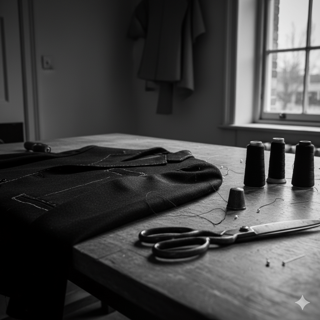
Close-up of a tailor’s worktable lit by soft natural light, showing thread spools, scissors, and a half-finished jacket with a visible imperfect seam — an image symbolising human craftsmanship and intentional imperfection in contrast to algorithmic precision.

British luxury has long understood this. Our best exports – Savile Row, Bentley Mulliner, McQueen, Hockney, Grayson Perry – thrive on that narrow line between discipline and disobedience. Their genius isn’t efficiency but editing: knowing when to break symmetry, when to leave the imperfect seam that proves a hand was there. The imperfect seam is a brand’s deliberate investment in unscalable production – the final, physical proof of value when all scalable processes have been commoditised. Curation, as I’ve argued before, isn’t collection. It’s the art of choosing what not to automate.

The challenge for brands now is to build value not through correlation but through judgement. To shift from efficiency to experience, from prediction to anti-prediction. Their next digital frontier isn’t better personalisation; it’s deliberate unpredictability, the algorithm that refuses to close the loop. Designing such friction isn’t romantic contrarianism; it’s the only sustainable strategy for generating new forms of scarcity, and with them, price elasticity.

Because in an economy obsessed with knowing what comes next, the rarest thing a brand can offer is the pleasure of not knowing, of being surprised, seen, and momentarily off-script. That’s the new exclusivity. That’s predictive luxury, undone.

Acknowledgements: This piece was partly inspired by Antonia Hock’s recent post on invisibility and the next era of ultra-luxury.

AI: This piece was refined with AI, for the image prompt, tags, excerpt, and a little sub-editing. The ideas, references, and rhythm are mine. You can still see my hand.

Tagged , , , , , , , , , , , , , , , , , , ,

You’ve Booked the Flight. Now Feed the Cat.

Or, What a Ryanair journey map taught me about real UX.

There’s a type of interface that shows up on Dribbble every few months: flight check-ins, boarding passes, baggage-tracking dashboards. Always slick. Always serene. The UI equivalent of cucumber water.

Most of them start at Choose your seat and end at Enjoy your flight. Which is tidy. But also nonsense.

A few years ago, I worked on a project for Ryanair. I drew out a journey map (with pens, natch), not the polished, stakeholder-pleasing kind, but something closer to the real emotional terrain of travel. One that began well before the confirmation screen. One that started, in fact, with the cat.

Because booking a flight isn’t a clean beginning. By the time anyone taps “Book now,” they’ve already trawled five sites, tried to align half-term dates with the one cousin who replies to group chats, checked weather reports, and googled “Do I need a visa for Croatia?” even though they’re flying to Naples.

Life admin, not travel ambition, is what usually kicks things off. That’s where the journey begins.

The diagram traced everything from that fraught pre-booking stretch through to the post-trip hangover, highlighting the emotional and logistical clutter that most airline UX avoids. Not because it isn’t there, but because it’s messy. And mess doesn’t fit neatly into a product roadmap.

There’s the bit after you book, when nothing much happens, except everything might. The vague unease when no one’s confirmed your seats. The passive-aggressive alert that “something has changed” in your itinerary, but you’re left to figure out what. The nervous rechecking of emails. The slow panic over cabin bag dimensions.

Then comes the day itself. A spike in interaction. The printer runs out of ink. You’re stood at Departures at 6:30am trying to download Peppa Pig episodes with 4% battery and no signal. Your toddler’s hungry. Your partner’s tense. And you’re still wondering if you packed the Calpol.

And yet… this is the brand moment. Not the glossy UI, not the neat API integration. Just this: the knot in your stomach, the uncharged phone, the boarding pass you can’t pull up without a connection.

The map tried to capture that. Not to romanticise it, but to acknowledge it.

Even on the return leg, the friction isn’t over. Passport queues. Lost luggage. The existential despair of a train replacement service. You get home, open a week’s worth of mail, find a parking fine, trip over a stray shoe from the hasty departure packing, and realise you didn’t leave anything for the cat-sitter.

Most journey maps stop at wheels-up. Ours didn’t. Because experience doesn’t follow a clean arc. It loops, it stutters, it sags in the middle. Thoughtful UX understands that.

A tired parent, dressed in a dark winter coat with a fur-lined hood, stands in a dimly lit Swedish airport baggage claim area late at night. They are looking down at their phone, which shows a 4% battery icon. To their left, a child sleeps soundly in a dark grey stroller. A large, dark suitcase tilts precariously next to the parent, appearing as though it might fall. In the background, an empty luggage carousel stretches out, with a few other suitcases scattered on it. Further back, blurred figures of other travelers are visible, and the warm glow of a vending machine can be seen on the far left. The overall atmosphere is one of exhaustion and quiet resignation.

Of course, Ryanair won’t build an app that books your pet-sitter or packs plug adapters. But this kind of messy map reveals where the brand can quietly show up—not with a feature, but with timing, tone, and the rare dignity of being understood.

Maybe that’s a 6-sheet in the departure lounge that says “Still cheaper than therapy.” Maybe it’s an email that clears, not clouds. Maybe it’s an in-seat comm that drops the marketing voice for once and just says: “Made it. Welcome back.”

Even for Ryanair, in fact especially for Ryanair, those moments can build memory, trust, and repeat business. Because no one remembers the boarding pass. They remember how they felt when the wheels touched down, the keys were missing, and the cat looked at them with contempt.

You’re not designing for delight. You’re designing for 4% battery, no signal, and a queue that won’t move. That’s where memory lives. And maybe loyalty too.

AI disclosure: This piece was written with the assistance of AI, used strictly as an editorial and thinking partner. All ideas, edits, and final phrasing are mine. ALT text and tagging were also generated with AI support.

Tagged , , , , , , , , , , , , , , , , , , ,

The Pram in the Hallway: Why Distraction Isn’t the Enemy of UX Design

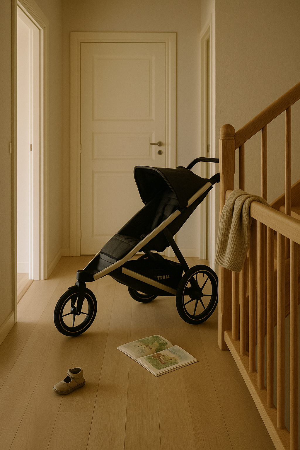
A softly lit hallway in a Scandinavian home with pale oak flooring and unvarnished wooden bannisters. A black Thule Urban Glide 2 buggy is positioned near the stairs, slightly in the way but undisturbed. On the floor lie a single child’s beige shoe and an open picture book. A wool jumper is draped casually over the bannister. The walls are off-white, and natural morning light fills the space. The scene feels unstyled and honest, capturing the quiet residue of family life.

This is the third in an accidental series of essays about design, constraint, and real life. The first explored ownership and editing, the second mapped those principles onto systems thinking. This one’s about the myth of the uninterrupted workspace, and what raising small humans has taught me about creative process, product integrity, and emotional design.

Last week I was catching up on some unplayed podcasts and heard Marina and Richard mention the Cyril Connolly line: “There is no more sombre enemy of good art than the pram in the hallway.” It’s a tidy little number but, like a lot of pithy mid-century takes, it doesn’t hold up brilliantly under daylight. So, as I continue to navigate our Thule buggy at the foot of the stairs, I thought I’d take a 2025 view.

It’s not just the casual misogyny (though yes, there’s that). It’s the deeper implication: that creativity requires retreat. That meaningful work, especially in design, happens at hushed desks; free of crumbs, notifications, or anyone yelling “Shoooooesies.”

This idea still carries weight in design and UX culture. You see it in reverent desk photos on Instagram and podcast guests earnestly waffling on about ‘flow state’, as though uninterrupted focus were the only path to quality. But what if that’s backwards? What if the mess of real life (parenting, caregiving, the emotional admin of being human) doesn’t dilute our creativity, but sharpens it?

Parenting compresses time like nothing else. Afternoons vanish. Tasks bleed into one another. The illusion of ‘ideal working conditions’ gets quietly shelved between snack prep and bedtime logistics. And yet, in those gaps, between drop-offs and Teams pings, on walks to see the cows, while fishing blueberries out of cardigans, some of the sharpest thinking gets done. Not in spite of distraction, but because of it.

Writers like Stephanie Merritt and Jude Rogers have spoken to this: how urgency and containment recalibrate creative priorities. You triage ideas fast. Half-baked ones don’t survive. The good ones clarify themselves under pressure.

In UX, we talk a lot about constraint as a catalyst. Creativity thrives on boundaries. But we rarely apply that logic to ourselves. Parenthood doesn’t just add constraints, it shifts your perspective. You’re no longer thinking about the user. You’re living with one. Or two. One tantrumming in the hallway, the other arguing about their Prep.

Design culture still clings to the myth of the monastic workspace: noise-cancelling headphones, immaculate desk setups, flow-state rituals. As though life must be suspended for work to begin. But most of the things we design are for people whose lives don’t pause. Parents in mid-tantrum. Carers juggling logistics. People buying insurance, ordering groceries, trying to rebook a dentist while coaxing a child (back) into trousers.

We design for frictionless experience, yet fetishise workflows that rely on silence. On having both hands free and the truth is: proximity to real life doesn’t dilute our design work. It deepens it.

You stop wasting time on polish and start noticing what actually matters. You develop an emotional radar: spotting friction, pre-empting dead ends, sensing what might quietly delight (or indeed quietly break) someone. And as I wrote recently, perfection has become a tell. In a world of generative smoothness, what we trust is the textured, the slightly improvised, the things made while someone was also making lunch.

Most importantly, you stop designing for personas. You start designing for real humans, chaotic, distracted, interrupted. The same kind of people we talked about when designing for enough. The kind who don’t need more features. They need clarity. Mercy. A digital space that behaves well under pressure.

Creativity and caregiving aren’t in conflict. In fact, it’s often caregiving that teaches us how to notice. To prioritise. To mean it.

This piece was edited with the help of AI, to shape rhythm, reference tone, and trim the fat. The excerpt, tagging and image were the result of carefully considered AI prompts. The words and arguments are mine. The tempo is deliberate. The polish is, therefore, human.

Tagged , , , , , , , , , , , , , ,

The Doughnut Is the Point

A pale Scandinavian hallway with a single raincoat hanging and boots below, lit by soft daylight. Calm and quietly intentional.

There’s a jacket hanging by the door in my house that I haven’t cleaned in two winters. A Stutterheim. Patina-stained cotton lining, scuffed hems, smells faintly of trains home. It’s not there for effect. It’s there because it does the job, and does it well. Keeps me dry, holds its own in a cold wind, and feels like continuity. Like something I’d pass on.

I think about that jacket sometimes when I work on digital products.

Because that jacket belongs in the doughnut. Not the jam-filled kind, the one drawn up by economist Kate Raworth. A model for living that rejects the old story of perpetual growth. (Aside: I came across Kate after listening to her talking with Wendell Berry on an old Start The Week. I’d gone on a recommendation from a friend to listen to Wendell Berry but it was Kate’s words which stood out).

In her diagram, the inner ring marks the essentials everyone should have access to: housing, education, dignity. The outer ring is the ecological ceiling: carbon, biodiversity, planetary boundaries. The goal is to stay in the middle. A safe and just space for humanity. Not too little. Not too much.

If that sounds like the Swedish concept of lagom, it is, except Raworth turns the cultural instinct into an economic framework. Lagom is what you feel in a table spread done right. The doughnut is how you design a city, or a system, to honour that logic at scale.

I like that the analogy might be in the Scandi larder: leftovers, carefully labelled. No waste, no lack. Just enough. The doughnut was already there, sitting quietly behind the knäckebröd.

And it maps cleanly onto UX.

The inner ring is what users genuinely need: clarity, trust, human-scale interaction. The outer ring is where the harm begins: deceptive patterns, compulsive loops, the kind of design that counts your seconds, not your needs. The good space, the space between, is where most digital products ought to live. Few do.

I’ve sat in rooms where product success was measured in taps and minutes. “More engagement,” someone would say, as the design team quietly recalibrated the interface to make it just sticky enough. I once worked on a platform where the proudest achievement was a spike in repeat logins. But when you zoomed out, those logins weren’t signs of confidence, they were symptoms of anxiety. People checking their accounts too often, not because the experience was smooth, but because the world wasn’t.

The real win would’ve been a design so clear, so calmly informative, so self-contained that users didn’t feel the need to check at all. But that wouldn’t have shown up on the dashboard. So we built noise instead. Goodhart’s Law anyone?

Doughnut thinking asks: what if we stopped designing for addiction and started designing for enough?

That principle runs through how I live. I’m not a minimalist, but I edit constantly. I favour things with integrity, materials that soften over time, ceramics that stack properly, garden tools that can be sharpened and passed on. When I write, I do so in iA Writer not because it’s clever, but because it clears the room. No distractions. Just text, gently weighted. A space with boundaries. A space that respects my focus. The writing comes better that way, less like performance, more like sorting the drawers in your head.

Same goes for the shelves at home. They hold only what earns its place. Books we’ve read. Things we actually use. Jackets that walk. Nothing there for the feed. Just our curated, persistent things.

Raworth talks about moving from extractive to regenerative economies. I think homes can be regenerative too, giving back emotionally, energetically, even ecologically, if you can. They absorb chaos. Offer rhythm. Ask less from you over time.

What does that actually look like?

There are just enough chairs for the family and the odd visitor. You can find a corkscrew without rummaging. There’s PIR lighting that flicks on as you walk from the landing to the bathroom at night. The house soaks up the mess. Fewer decisions when you’re tired. You can sit down without having to clear a pile of crap off the sofa. You can find your bloody keys.

It offers rhythm because your day moves more smoothly. And it asks less of you because it doesn’t make you work just to function.

My old boss used to moan that he couldn’t do a simple task at home because, to do that, he first had to find the tool. To find the tool, he had to get into the garage. He couldn’t get into the garage because the door was jammed. And on it went. That’s the opposite of regenerative. That’s a house that’s extracting energy from you just to stand still.

I wrote recently about the psychology of our stuff—the emotional residue it carries, the complexity it adds, the space it quietly swallows. The art of owning less isn’t about minimalism. It’s about clarity. About asking not ‘is this useful?’ but ‘is this mine to carry?’ That same lens applies here. Whether it’s a shelf, a digital feature, or a mental habit, we need to ask: is this giving something back? Or is it just squatting in the system?

And if that principle holds for homes, it can hold for digital spaces too. Interfaces, when well-designed, have the same potential, not just to serve, but to settle. To restore a little order. To give back time, attention, clarity. The question in both cases is not just what they contain – but how they behave when no one’s watching. Do they hold their shape under pressure? Or do they reveal they were only ever designed for the demo?

That’s what I try to bring into my UX work. Not scale for its own sake, but structure. Not novelty, but fidelity. In one recent project, we reduced a sprawling mass of order summary calculations by half. It had grown lopsided: multiple totals, stacked qualifiers, contradictory line logic. It looked thorough but made people pause. Double-check. Drop off.

We didn’t cut because someone asked us to. We cut because the excess wasn’t helping anyone. The business didn’t love it at first, there was concern we’d sacrificed transparency. But the users did. Completion held. Conversion held. No one missed the clutter.

You don’t need to call it Doughnut Economics. You don’t even need the diagram. Just ask: is this too much, or just enough? Is it serving someone, or keeping them circling?

I’m learning the same rules apply emotionally. The inner ring is what I need to function: rhythm, ritual, some quiet between the noisy pulses of family life. The outer ring is burnout, distraction, the endless need to ‘improve’. If I stay within those boundaries, wake early, behave deliberately, write when the coffee’s still hot – I do better work. I’m a steadier father. Less reactive. More intact.

We’ve built systems that confuse excess for success. But maybe the most humane thing we can do now is not build something. Or build something simpler. Or design the thing so well it doesn’t need us anymore.

Like the coat. You don’t notice it most days. But when the rain starts, you’re glad it’s there. And when you finally pass it on, it still fits someone else.

This piece was refined using AI. I used it to generate the image prompt, the tags, the excerpt, and to help sub-edit the copy while keeping my tone intact. The ideas, references, and rhythm are mine. The tools just cleared the room.

Tagged , , , , , , , , , , , , , ,

Striving for Imperfection: Why Flaws Make Things Feel Real

Perfection has become a tell. Too smooth, too balanced, too… AI. In a world of generative everything, we’ve reached a strange inflection point: human-centred design now demands imperfection, not as a flaw, but as a feature.

Because friction is fidelity. And too much polish starts to smell synthetic.

When Random Doesn’t Feel Random

Apple’s original shuffle algorithm was mathematically pure, each track had an equal chance of playing. But users complained. It didn’t feel random. Why? Because true randomness includes clumps, repetitions, patterns that seem suspect. A couple of U2 tracks in a row and suddenly the algorithm was “broken.”

So Apple redesigned it to be less random, so that it would seem more random. Illusion of imperfection, engineered.

It’s the same with LLMs. Outputs that are too balanced, too polished, ring false to human ears. We need to start prompt-engineering flaws into our copy, because believability demands mess.

Breath Marks and Broken Grammar

I have a playlist I use to test audio (car stereos, headphones, my hi-fi separates). Not for punch or clarity. For something else. For breath, for scratches, for the hiss of it all. Those tiny artefacts left in because they mattered. Because someone chose to keep them.

Same applies to writing. I’ve airbrushed things too, of course I have. Smoothed over copy that should have stung a little. A good sub-editor knows when to let a clause run ragged. When tidiness would kill the tone. And when grammar should yield to cadence. On LinkedIn, where polish often passes for credibility, that kind of mess is rare, although the smell of all that polish is punget.

The Pratfall Effect, Real Beauty

The Pratfall Effect teaches us that we trust people (and brands) more when they’re good and a little flawed. A genius who spills coffee. A leader who admits doubt. We warm to it.

Brands have learned this too. Dove’s Real Beauty Playbook (developed by Unilever) resonates because it shows unedited reality: pimples, pores, and all. At a recent session in London, Bianca Mack (WongDoody) reminded us of the campaign’s emotional resonance and shared new research on how people respond to AI-generated images and the labelling thereof.

But who decides when an image is ‘too perfect’? That wasn’t clear.

One crucial gap: that research didn’t appear to distinguish between image types. As I explored in my previous piece, “The Complexity and Nuance in Human-Centred Design: Beyond the ‘Average’ User” (Nov 2023), we don’t experience products or content generically, we interpret them through the lens of context, emotional expectations, and domain norms. We tolerate gloss on cars and watches. But we demand scars and breath in human faces.

Against the Plinth: Notes from JLR

When I led UX at AccentureSong for Jaguar Land Rover, we had this tension constantly. The art directors wanted visual purity: architecture that gleamed, cars posed like sculpture, not vehicles. But my team pushed back. We knew that real customers didn’t experience their Range Rover on a plinth. They experienced it on wet roads, in dim light, with children kicking the back seat. Our interfaces and imagery needed to feel lived in, not gallery-lit.

There was always a pull between the pristine and the plausible. Between the brand fantasy and the user reality. The best work came when we embraced the rough edge.

This picks up the argument I made in “The Complexity and Nuance in Human-Centred Design”, that designing for an average user strips out useful extremes. Here, it’s visual: perfection may be aesthetic, but it’s not trustworthy.

Prompt Engineering with Bruises

If you’re using LLMs for writing, design, or strategy, you’ll notice: the cleaner it reads, the less it lands. That might sound odd, but the flaws make it human.

Try this instead:

  • Prompt for contradiction: “Add a small, unresolved tension.”
  • Prompt for failure: “Include a misstep or wrong decision.”
  • Prompt for tone: “Make this sound slightly defensive.”

These aren’t weaknesses. They’re realism. They’re humanity.

You don’t say it’s real, you show it.

Which brings us back to humans. We now have a new role: not just creators, but curators of believability. If you let a model spit out 800 words of polished perfection and ship it unchecked, don’t be surprised if your readers scroll past. They know what machine-made sounds like.

In Bianca’s research, people wanted to know when something was AI-generated, but perhaps more importantly, we want to know someone’s checked it. Because a watermark is more than a label. It’s a sign of judgement.

Just as we caveat car ads, ‘closed course’, ‘professional driver’, we’re now being asked to signal artifice across digital domains. Not to apologise for it, but to own it.

It’s not easy. As an industry we’re conditioned to edit out blemishes, not protect them. Maybe we’ve all just got too good at pretending we know what authenticity looks like.

Closing

Perfection doesn’t reassure. It can repel. If you want something to feel real, it needs to breathe. To blink. To bruise. In a world of frictionless content, the rough edge is where trust begins.

This isn’t a stylistic preference. It’s a principle.

AI was used to sub-edit this piece according to my personal tone of voice guidelines, it was also used to generate the cover image, WordPress excerpt, tagging recommendations and tighten the LinkedIn tease for it.

Tagged , , , , , , , , , , , , , ,