Category Archives: work

I promise this is the last time I’ll mention it

Just a little note to readers new and old that we* won our first award for myFry last night at the Media Guardian Innovation awards. It was nominated in the Mobile App category alongside the well-known iHobo work (which won two other awards last night).

You’ll probably already have seen my thoughts on my time developing the app at Dare, and they still ring true today. Even though I still read the odd critical comment (and then assume it’s naive criticism) the truth is, as the awards recognised and Stephen himself states here – it fundamentally challenges the notion of linear reading for certain texts and it – more than many other alternative digital readers – understood the culture and physical environmental context in which this book would be read.

And that, said Pooh, is that.

—–

* – Dare, Stefanie Posavec & Penguin

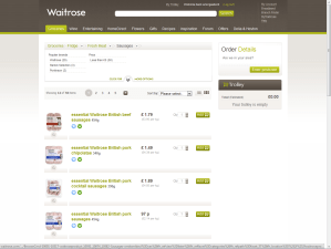
The Waitrose Redesign: Perspective Required

This week eConsultancy’s report on the apparent usability calamity of the new Waitrose site has been widely shared: “New Waitrose website panned by users“. People queued up to take pot shots at this aspirational brand, criticising a range of issues from taxonomy, speed and the apparent non-disclosure of prices.

Several cried-out “why wasn’t this tested?” “didn’t listen to users” and so-on and so forth. Compounding the issue was the revelation that the design ‘cost £10 million’.

An unmitigated disaster eh? Well no, not in my opinion. Firstly I think that the £10m issue is swaying a lot of bad publicity. The general public, and this is not to patronise, simply do not understand the price of design (c.f. Olympics 2012 logo). I don’t understand the price of building a new bridge, or anti-retroviral drugs and I don’t presume to tell the people in those industries that the cost of such things is too much. For some reason, the great British public assume that design work is just a 17 year old with photoshop tinkering about. It completely misses the point that work like this involves high levels of expertise in visual design, logistics, accountancy, information systems, security, project management and so-on. It’s massive, it’s expensive stuff. You might re-design a local dentist’s website for £1000 but really this isn’t even vaguely comparable.

Secondly, it does actually work. To claim it’s “not fit for purpose … beyond fixing” is bonkers. Show me the evidence that no-one is shopping on the site, that the usage is down that average basket sizes are down etc. etc. I suspect you would find the opposite [EDIT 25.March: Orders are in-fact up by 34% on the previous site, according to The Guardian]. Yes, there are problems. Some of the nomenclature and taxonomy is a little unconventional. Sally pointed out that browsing freezer products was done by brand and not by type, that seems peculiarly specific. Most users would at least like a choice to filter by meal, by category (fish, poultry, ready-meal, dessert) and so on. Other glaring errors include the (now fixed) inability to identify sizes or quantities of items like milk and meat.

And then there’s the speed. The speed it’s rendering is not great. I’m no developer so can only speculate that it could be either an interface layer issue or one related to pulling items out of the eCommerce catalogue (the back-end). To the consumer this distinction is irrelevant, it just takes time and time-precious consumers get understandably narky. Fixing the speed is critical to the perception of performance.

It infuriates me to suggest that this wasn’t thought about or tested. In our industry with so much money at stake it is inconceivable to think it wasn’t tested in some way at several points throughout the process. It was designed in part by some very talented user-centred people and the fact that certain elements have been included (drop-down category breadcrumbs) suggest a user-experience designer’s hand. The key is whether the user-testing was sufficiently rigorous, sufficiently real-world and sufficiently analysed to feed back into the design process.

Interactions which are causing the most concern include long-lists – the heavy duty users at home doing > £100 shops with many items. In these scenarios they are likely to be juggling multiple threads of activity: searching for goods, ticking them off a paper list, popping to and from the kitchen, considering recipes and so on. Keeping as much of the action (‘add to basket’) transparent at the same time as the browse activity is a tricky ask. Often user-testing is done in a lab with a user isolated from the context in which they normally perform their activity. It’s not a real shop, it’s a simulated list and the observations you will make will subsequently be quite false.

Work like this is so dependant on context that it needs to be stress-tested in real-world situations. It means sample shoppers using a staging-version of the site or a high-fidelity prototype to do their normal shopping routine. It might have happened here, I speculate that it probably didn’t.

I rememeber Catriona Campbell of Foviance telling me once of some ethnography work done for Tesco where they observed online shoppers ordering in bulk from their value range. Actually observing the users in their homes showed that these were consolidated orders for their community where one person acted as a distributor from a single paid-for delivery. Insight like this rarely comes from a two-way mirror, eyetracking and a moderator.

Returning to the Waitrose site, i’d urge you not to get caught in the hype but to actually use the site. The majority of  problems cited on the forum seem to be resolvable coding/performance issues, not fundamental interface design issues. By which I mean buttons not working as intended, technical errors and so-on.  The remaining issues surround a nostalgia for old site features like the jotter. I’ve seen this sort of thing before when a quirky feature barely anyone used gets removed the one or two people who did use it take to the web to complain.

I’m not saying it’s brilliant, it clearly needs work but I just personally feel the need to call for some calm and reflection in light of the fact that passionately user-centred people would have been involved in this and working with the very best of intentions albeit perhaps without the backup to see it through to final development or the support of adequate contextual user-tests.

Tagged , , , , ,

Experience Planning

I decided to have a bit of a break from Twitter (and Facebook) and to revert to the long-copy pleasures of full-fat blogs. To this end I have downloaded Reeder for my iPhone, fired-up my Instapaper archives and am eschewing the free papers on the commute home with the intention to read more about the things I used to read about.

A corollary to this will hopefully be a refreshed attention to my own blog and to the joy of writing again. Though I’ve read too many blogs in the past that have a post that reads: “Am blogging again, hope to blog more, watch this space!” … and that’s the last or penultimate dusty entry. So, no promises, none at all.

Before I dismiss the microblog for the aforementioned hiatus I did just want to highlight a link I found via Anne Czerniak’s stream: David Friedman’s Twitter Thesaurus. The function of David’s thesaurus is to provide alternative, succinct variants of the words you would write if you didn’t have a 140 character limit. It seems like just the sort of thing that verbose writers like myself would like to see added as a contextual add-in to desktop and mobile twitter clients, a bit like bit.ly does for url shortening.

Experience Planning (aka. Experience Design)
My ‘new’ job title is Experience Lead. This is in part due to Dare‘s merger with MCBD and the fact that not only do I now have sight of digital work, I have an occasional role to play in designing and consulting in offline experiences and service design. Whilst we have an adorable presentation deck that covers-off what Experience Planning is (in the context of Dare), much like my This is IA tumblr, I find it helpful to describe what we do with examples of what it is to design experiences (and not just websites).

Virgin Atlantic
Ever noticed that the lighting spectrum on airplanes leaves you looking rather palid, almost green and nauseous? The chaps at Virgin America have and consequentially installed a scheme with a varying light spectrum that reflects the prevailing destination timezone and external light conditions – even the mood of the passengers at key ‘touchpoints’ in the journey, viz :  “[the lighting is] in a ‘theatrical mood’ prior to departure. When you walk down the jet bridge, you see the purple glow of the mood lighting, and it hopefully excites you…” “…people have an emotional and physiological response to lighting. So we decided to shift the colour of our cabin lights during the course of flight. They’re associated with time of day outside or ambient light outside. If you’re flying by day and heading in to dusk, it will reflect the light level outside. It’s less jarring” – Adam Wells, Virgin America [Source: Budget TravelTravel Innovators“]

Disney
As experiences go, Disney have mastered many at their attractions around the world but queueing provides a constant target for designers with a remit to increase enjoyment at any cost. Innovations here are increasingly rare but often involve psychology (see David Maister’s article from many years ago). In this article from the New York Times late last year, Brooks Barnes details some of the cute operational armoury the experts at Disney can deploy:

  • A nerve centre with wait-time monitoring in real-time.
  • The ability to ramp up ride throughput by, for example, deploying more boats on the Pirates of the Caribbean ride.
  • The authority to re-deploy their character talent to the queues so that Goofy can take kids’ minds off the interminable wait.
  • Induce significant crowd shifts by initiating a pop-up parade: “Move it! Shake It! Shift It!” which nudges people to the less populated area.
  • Attention to operational detail to open more kiosks or cash registers, hand out menus and so-on.

Such interventions pervade in a culture of exceptional customer experience. Leaving room for staff to innovate and react in this way ensures that, collectively, the impression and memories users are left with are both positive and lasting. And memories are what all decent experience designers are after.

I got asked recently to write a piece on what might be considered a good opportunity for marketeers tired of the existing promotion calendar. I took an opportunity to assert that I think the marketing communications industry has for too long focussed on the acquisition part of the courtship of consumers. I think we have a great opportunity to work harder to continue to persuade throughout the life cycle – to promote retention with some ‘wow experiences. Working with tools like memory, serendipity, ephemera, transience and humanised language and interaction. All of which are just fancy words which are my attempts to intellectualise the stuff that Disney (v. supra) do so intuitively.

Perhaps I haven’t wrapped this post up quite the way I would normally like to, but these, dear reader, are my thoughts in flux about how I currently think about Experience Planning and the directions which interest me.

Footnote: This post was composed a few weeks ago during a spell when I wasn’t on Facebook or posting regularly on Twitter. I have returned to both sites since then but am significantly less active. I hope.


Tagged , , , , , ,

smörgåsbord choice cuts (vi)

Today was a watershed. I visited Scandinavian Kitchen for fikka for the first time since Anna left us. It was lonely. I got asked if I spoke Norweigan, I don’t, but takk som spør. Here are the things I’ve been thinking and reading about recently:

Persuasive Design
Almost everyone in the advertising and marketing world reads PSFK so perhaps this isn’t new to anybody reading this blog but occasionally we all miss stuff. In Finland at less-busy intersections, a little proximity sensor detects the presence of pedestrians and alerts other road-users with a little light. It’s a great nudge to help with nighttime road safety.

Again, from PSFK, this little chart from Leo Burnett is worth a look as they attempt to represent behavioural archetypes in simplified form.

Human Computer Interaction
Saneel Radia writing on BBH Labs‘ blog dug up a great little piece from David Bryant at Google where tells a compelling tale about the rise of the Human Operating System. It’s an often over-looked element of the success of some of the most lauded devices and innovations in recent years, that by using humanised nuances that trigger limbic responses, the designers have made products that simply feel more human and instinctive. Thinking about what might be dismissed as interaction frivolity, behaviours like inertia, resistance, sliding, bumping, flying and so on are of profound importance.

Related to that thought, but worthy of more exploration at a later point, is a piece by Joshua Allen on “Transience” (UX Magazine) and another one by Suzanne Ginsburg (also at UX Magazine) on “The Evolution of Discoverability“.

Design Pattern
Jason over at Signal vs. Noise has piqued my interest with this charming transfer of inspiration. I’ll let him tell you the story of how a notice on a rest-stop booth on a recent journey challenged 37 Signals to re imagine the FAQ. As someone with a love-hate relationship with the FAQ (though mainly hate) it might just be a new pattern to appropriate from the marvellously fresh-feeling 37 Signals showcase.

Restaurant Websites
Mark Hurst found a nice piece on the Boston Globe site which popped-up in my Good Experience feed yesterday. I often cite menu-design as an example that choice architecture is nothing new and better-understood by restaurateurs the world over than many people paid to be in the persuasion industry. It concerns the fact the restaurant websites are often atrociously designed pieces of design-wank, portfolio pieces for one-man-band flash designers. (The BG article doesn’t use the term wank though, more’s the pity).

The Oatmeal gloriously lampoons the practise but please do read the post at Good Experience as Mark’s appropriately gutted (ahem) the Boston piece for us.

Crowd Mapping
It’s not a new thing to do but I was new to me. Anne Czernek drew my flighty attention to a Google-sponsored “ladies mapping party” in Kenya. Here 70 educated and not-so educated community members lent their hands to populating, correcting and otherwise improving the state of their local community’s map at Nairobi’s iHub last month.  It’s easy to think sometimes that with enough people and enough time that crowd-sourced knowledge like this just happens but occasionally you just need to get a lot of people in a room and give it a bit of a kick in the proverbials. These Kenyan ladies did just that.

Have a great weekend.

A very special persuasion brief

Screengrab of the OpenIDEO brief

As an advocate of the trendy field of behavioural economics & persuasive psychology, it’s rather humbling to read a brief that plays in this space but is a little more worthy than trying to get people to spend a little more. Open IDEO have posted their latest brief:

How might we increase the number of registered bone marrow donors to help save more lives?”

For all the right reasons anyone with a creative interest in the field of persuasion should take a look and start sketching. The basics are explained eloquently in this YouTube clip. For my part, this is the reason I haven’t joined the the register is pathetically:

1. I once heard/read that the donation process is incredibly painful
2. I one heard/read that the donation process leaves you immuno-supressed for some time.
3. The small number of registered donors means it’s much more likely your marrow will be called upon

But I know, without out ever having been in the position, that if I or close family needed marrow I would be out campaigning hard to get people to sign up and I would of course submit my own marrow.  It’s a big challenge, a worthy one and one where the answers elude me right now. I shall follow this with keen interest.

Tagged , , , , ,

Apple Stores: Experience Design = Great. Reality = Aaagh!

Rory Cellan-Jones writes over at the BBC dot.Rory blog today about the emergence of the Microsoft facsimile of the Apple retail store experience. I contend that we shouldn’t fawn too much over the Cupertino firm’s success here.

I am an Apple fan, albeit one without the disposable cash to have actually bought one of their computers. I have bought several iPods and my iPhone at the Apple retail store. My local store is Kingston [photo: a typical Saturday] and I suspect this store is representative of their mall units in the UK. It’s wonderfully designed inside with clear experience design – the analysis of which is covered well here. The reality is that the store is incredibly popular and consequentially the experience takes a pounding. I’d love to spend time browsing the Apple TV interface and discovering if the paucity of content has improved to the point that I might buy one. But I can’t because on a Saturday I’m lucky if after 5 minutes of trying I have actually managed to get near it. There are lots of teenagers who have absolutely no intention of purchasing nor the money to do so but they’re in the store in their hundreds. They stand two-three deep around £1500 machines taking photos of their faces and warping them, updating their Facebook status’ “in the Apl str, LOL” and generally cooling my enthusiasm for the brand.

Of course I can see that these teenage browsers are prospects themselves in a few years’ time or – through their parents’ wallets – in the near future. I’m not really attempting to make an assessment of the financial success of the Apple store (for which a selection of financials need to be considered). What I am really trying to draw attention to is that we are often a little too quick to wax on about such experiences without actually thinking them through by actually experiencing it. This means ethnographic reporting following a field trip out to the store with a given sequence of tasks to perform/observe. A report under these conditions would surely reveal more about the service experience than the  blind hyperbole of jumping on that jolly popular bandwagon.

Tagged , , ,

Brands as Placebos


Placebo! by Akácio S. [ /photographyk ], on Flickr

There’s something quite lazy in blogging about a blog post that someone wrote about someone else’s blog post. But I think that it’s less lazy than having a blog and not blogging. And, in my meagre defence, I do have a proper post up my draft.

Besides, the post comes from Nick, a clever chap who I work with (more accurately underneath) at Dare. And it concerns that trendy Behavioural Economics stuff. The long and short of it is that placebos are hugely powerful things and if you take the idea of a placebo and apply it to a brand you can see the power of branding and experience bias on the apparent efficacy and tolerance of products and services. Take a look-see at Nick’s post (itself a reference of the original work by the Geary Institute)

Tagged , , ,

The Obsolescence Treadmill (feat. Nike Mayfly)

Nike Mayfly

Nike Mayfly by moleitau, on Flickr

Followers of my public streams will be aware that I am engaged on a 16-week training programme* to run the Virgin London Marathon on April 17th. This does rather mean that much of my waking moments are preoccupied with all things running. Occasionally my vocational and extra curricular interests collide, as is the case here with the Nike Bowerman Mayfly running shoe.

Alerted to its existence via Matt Jones’ concise post on the Berg blog, I started to think a little more about what this does to strengthen my opinion of Nike‘s marketing function as one that just gets the psychology of the runner.

It may be stating the obvious to some, but Nike aren’t just a manufacturer of sportswear. Their heritage shows a healthy track record (ahem) of producing products based on solid insight within the running community. In the case of the Mayfly this is insight that runners are want to wear their shoes for too long. The ramifications of this are not inconsiderable: worn-down shoes lead to poor form and consequentially impact-related injuries. In addition, enthusiastic amateur runners may well own multiple pairs of shoes aligned to particular conditions: trail, track and asphalt surfaces for example. Keeping track (again…) of the kilometres out through each pair of shoes is a challenge.

In the case of the Mayfly we have a £20 shoe with a tight limit on their effective usage; you get just 100km wear out of them. A planned obsolescence. The shoes have been designed with a tight engineering tolerance such that their performance is notably degraded once the user (runner) exceeds 100km. This fact isn’t hidden, it’s considered a selling point and the shoes themselves feature a manual odometer for you to clock up the km run on the side as an aide memoir and perhaps badge of intent to fellow runners.

So, what’s happening here, isn’t this just a trick to get us to buy more shoes more often? The cynic might suggest so, but let me suggest:

Scarcity: We are a little biased toward placing greater value on items that have a obvious limitation … the scarcity of the distance you can run in these shoes ensure you use them for only the right conditions (e.g. track running) and not perhaps as your daily runner – they’re your best pair.

Anxiety: Nike have form here – Nike+ on your headphones counts you up to the mid-point and then down to the end point of your run, increasing the performance anxiety. The same ticking clock is at work in these shoes, from the moment you put them on you’re running them into the ground. Of course this is nothing new – all shoes wear out – but these shoes makes it notably more explicit.

Reactance: When faced with a limit we’re rather prone to reacting against it (see anxiety above and consider the effect this has on performance). Does this limit actually challenge the runner to exceed it faster, sooner by covering the mileage at a greater pace or running more often? Mayfly runners might find themselves running harder and faster as consequence. There is little in life that is a simple and free as going running, by placing a limit on such a libertarian behaviour the reaction – if largely subconscious – could be profound.

I’ll concede that this might all be a case of me over-thinking a rather crude marketing strategy – planned obsolescence is nothing new after all – and that instead of positive reactance, consumers might actually react by seeing the limit as a weakness in Nike‘s durability and applicability to their sport. An analogous example might be the restrictions printer manufactures placed on their low usage and non-refillable ink cartridges. Indeed, one of the most significant issues that Nike will face is possibility that consumer watchdogs may deem the practise simply unethical. Perhaps in defence of this – and the inevitable environmental criticism – the shoes have been designed to be recycled by the responsible owner.

For the moment I am happy to continue with the upgrade treadmill of my (Asics) shoes on a 500km cycle which (at a current weekly effort of 30km+) should just see me through the 16 weeks.

John

* – Training programme via the wonderful Sam Murphy from her seminal work Marathon & Half Marathon: From Start to Finish

Tagged , ,

Olympic Arena: Experience Architecture

Not all my good links, insights and thoughts are lifted off the Twittersphere. Despite having my eyes on over 1000 people now, this little gem came from my brother. He’s had his nose in a few forums, tracking the progress of our developing city – notably the skyscrapers and Olympic village – and he drew my attention to this work in the East End.

The handball arena is finished…. tumbleweed….

Which is kinda my point. It’s a beautiful wee building, clad in copper and with top-spec light-wells in the ceiling but it’s for a sport that has a pretty fringe interest at least in the UK (in spite of efforts) and it’s global popularity is a moot point. Perhaps because of this, the inclusion in the 2012 games in London means that the organisers might fear a repeat of the empty seats we saw in Beijing and have uncovered an innovative solution which also adds a legacy benefit for a stadium unlikely to get capacity crowds easily.

Coloured seats. It’s already used at the Estádio Municipal de Aveiro, Portugal and now it’s in the  Handball Arena, the idea being that – even when partly occupied – the stadium looks more full as glaring solid blocks of coloured seating are not visible. The consequence is that the stadium for players and fans feels more atmospheric in low-crowd situations. It’s just simply good experience design that makes use of our visual attention biases.

As a footnote, the arena will also be used for modern pentathlon events.

> Mark Small’s blog article on 2012 Entrepreneurial designs
> The 2012 update: Handball arena nears completion

Tagged , , ,

Nike’s social fitness enhancements suffer from an Achilles heel


A view of the Nike+ profile homepage for smorgasbord

Nike's attempt at social fitness has an Achilles heel

For the poor, unfortunate souls that follow my musings on Twitter and Facebook it will be rather apparent that I am training to run a marathon this year. Each time I return from one of my sessions I synchronise my iPod with Nike+ and the data from that effort is shared across my social networks. It’s probably a little annoying for people as it is issued as a mindless broadcast but it is important to me to share it with certain people within my friendship group – there is proof that sharing accomplishments like this with your peers makes it significantly more likely that you maintain the motivation to continue. It’s a topic for another post maybe, but it would be nice to exclude certain people from seeing the postings without relying on them to block it. In any event, I think sharing my marathon training is a lot more meaningful and socially acceptable than telling someone that I’ve just bought some chickens on Farmville or that I’ve checked into my local Subway. [NB. I do not use Farmville or 4square].

My beef isn’t so much with this posting behaviour but rather Nike’s desire to incrementally enhance their Nike+ offering without fixing the core functionality on which it relies. To take a step back, let’s look briefly at the tracking and personal data movement. I wrote some time ago (post now deleted sadly) about the rise of personal data logging and how it was peverse, though not unwelcome, that we were seeking data on the most basic elements of our daily lives. Running is a simple endeavour, yet we are now surrounded with an array of methods to track our activity; just as a quick snapshot:

Garmin
Garmin’s Forerunner and similar personal GPS devices track your runs and display the core data in a personal profile page that can easily be shared.

Runkeeper, Mapmyrun, Endomondo
Similar to the Garmin implementation – these are often smartphone apps that use GPS to track your runs. Some integrate with Polar or ANT heart rate monitor straps to overlay cardiovascular data (so, ‘effort’) on the route and pace (‘output’).  These seem to be the most popular in my social media stream at least, if I go to the Runkeeper site it even tells me directly which of my friends are using it.

Nike+, Adidas miCoach
Both sportswear giants have their own systems – Nike were first with their iPod-integrated solution and as Adidas have moved on, their focus has been on realtime coaching as opposed to ex post facto analysis. But, as we will see, Nike+ is not a simple universe…

Others
Of course there are loads more – Timex, Samsung … almost every smartphone and sports timer company have something and there are a bunch of opensource implementations too.

So, to return to Nike+ (since it is the system I use), let’s understand a little more about the offering.

Nike+ and iPod: At it’s most basic, your iPod forms the user-interface to a system that uses a shoe-based sensor to track your stride length and establish a distance run, with all the additional statistics around pace and time. This implementation varies on the age of the iPod and the additional equipment (e.g. heart rate strap). Synchronising your iPod after the run uploads the data to the Nike+ site.

Nike+ and iPhone: There are two implementations here, a native application that does little more than the iPod version above, and then the Nike+ GPS app – a free download which uses GPS tracking to trace your runs and – because it’s connected to the web – additionally allows friends to cheer you on via Facebook comments.

Nike+ GPS sportswatch: The latest development showed-off at CES this winter, a wristwatch powered by TomTom to rival the Garmin offering, taking the basic GPS functionality of the iPhone app and simplifying this to a watch interface at the same time as integrating with heart rate data.

The fact is, this product offering is now more than a little confusing. As an iPhone user I am able to track my run using any of the free apps from Runkeeper, mapmyrun Nike+, Adidas and so on. As an iPod user I may also use my Nike+ shoe sensor. So, I sort of need a reason to use one service over any other. The decision needs to be made based on a few things: Which device gives me the best data? Which device is least hassle (bulk, user-interface) and, crucially, Which device/service are my peers using?

Before the smartphone app trend it was a given that most people were using Nike+ or, possibly, Garmin. Nevertheless it was still tricky to find friends using the service and then compare your efforts. With the wider marketplace it’s even harder as people sign-up for a service, use it and move on. To try and differentiate their service and encourage participation, Nike + continue to innovate. Recently they launched Nike+ Tag – the premise is simple, runners have to avoid being “it” by beating their friends to longer runs, faster speeds or getting up and running earlier in the day.

The trouble with this – and the many other connected challenges on Nike+ – is that they are predicated on having a (wide) circle of friends using the system. In the case of tag, your friends also need to have the particular app and, as we have seen, many may simply have one of the other Nike+ devices. Unfortunately (and after several lengthy paragraphs we are finally at the point of the post) the system for finding friends is fatally flawed. Nike seem to have a long-standing problem with the friend search function within Nike+ on Gmail. Unlike numerous other sites, you cannot import other social network friends only search for signed-up friends via Gmail (which doesn’t work) or by using the native search (which won’t discover your friends if they’re profiles are set to private – which is the default). The end result is that despite having 700-odd people in my Twitter contacts, a hundred or so in Gmail and 300+ in Facebook, without being able to scan for them I have found a grand total of about 6 on Nike+ and most of those are infrequent, lapsed runners. Tag, despite being exciting and well-considered, is all but useless to me (I’m not the only one).

It makes no sense to me that you would build a service that relies on the motivation and challenges of friends and then have such a limited social connection engine. I am quite sure this isn’t the intent but the lack of attention to fixing the technical problems with it jars somewhat with the attention to rolling out new features that rely upon friendship. It all smacks of the same criticisms that continue to face Apple’s Ping:

“Without importing existing networks from Twitter or Facebook (inviting friends through Apple Mail is not enough), there’s a significant investment of time needed to set Ping up. Now social networking is more mature, there’s less appetite for putting in that groundwork – and why should we have to when our networks already exist?” – Jemima Kiss on Ping (Guardian2 ix 2010)

It is peculiar that at least the connection to post my output works largely flawlessly, runs are posted automatically to twitter and Facebook with a near 100% success rate. It’s a touch disappointing then that the simplicity of the service that  first attracted me has been replaced with a complexity in offering designed to retain me (via unsolicited feature-creep) is so hamstrung by fundamental technical flaws that I crave a more simple, socially-integrated solution that increasingly looks likely to exist amongst Nike’s competitors instead.


For the record, my Nike+ profile is smorgasbord, please drop by and be my mate.