This week I had the pleasure of presenting to our Planning department at Dare and, whilst it’s not a new topic to many readers of this blog, it’s certainly rather popular – in fact, one could say this tool is sine qua non to the kit-bag of any Experience or Strategic planner in the advertising industry. And so it came to pass that I spent 45 minutes talking about seduction.
Firstly I’d like to express my thanks to Stephen P. Anderson without whom much of this presentation would not have existed. It was inspired and informed by his excellent book Seductive Interaction Design which is currently trading at an excellent price on Amazon in paperback & Kindle editions.
I presented not in terms of rules or mere anecdotes but tried to provide practical examples of where we have been and could be seduced into acting on – and this is important – hitherto-unexplored motivations. I chunked the slides into a series of moments in our encounters:
Aesthetics
From the utilitarian beauty of Google and Craigslist, to the the viscocity of the Apple iOS and taking in examples such as the role of female faces in encouraging ‘LiveChat’ encounters, I hope my audience could see the value in paying attention to what our experiences look like and what this says about our brands and the memories users take with them.
Tease
The ‘Stop Looking at my bottom‘ line on Innocent smoothies was a good example of being playful in seducing people, I’m sure there are plenty of quirky examples of this sort of stuff digitally. Sadly many of these are Error 404 pages that – if we’re good our jobs – our users shouldn’t see very often. After writing the presentation I came across this great example of copy on an Ocado email which represents a playful tease. Then there’s more obvious playful activities like the randomising functions you find on Wikipedia, Google’s Lucky button and so-on. Though few will ever beat Ben Fold’s Ode to Merton chat roulette.
I always like the anecdote that Apple had to make their random function on the iPod less random in order for it to feel more random.
“As humans, when we come across random clusters we naturally superimpose a pattern. We instinctively project an order on the chaos. It’s part of our psychological make-up. For example, when the iPod first came out and people started to use the shuffle feature, which plays songs in a random order, many people complained that it didn’t work. They said that too often songs from the same album, or the same artist, came up one after another. Yet that’s what randomness does – it creates counter-intuitively dense clusters.
‘We’re making it (the shuffle) less random to make it feel more random’: Apple CEO Steve Jobs changed the feature on the iPod after complaints from users In response to complaints from users, Jobs changed the programming behind the feature: ‘We’re making it (the shuffle) less random to make it feel more random.’ In other words, each new song now has to be significantly different from what came before, so as to conform to our expectation of randomness. Which isn’t really random at all.” – Alex Bellos
Then it was nice chance to show how figuring out and being stimulated by patterns can create compelling interfaces – which clearly meant reminding people of my award-winning work with Stefanie Posavec on myFry. I talk a lot about intentional friction when reminding people that user-centred design isn’t always about simplicity. After all, we all love a good poka-yoke, and so a bit of mystery like the Hot Wheels mystery car or the don’t open reward envelope is another example of intentionally making life (achievably) difficult in order to deepen the sense of engagement.
I closed this section by talking about how Cityville and Good Reads are great examples of interactions that allow users to play and be themselves, expressing themselves and their creativity. Cityville is a much bigger topic in terms of (eugh I hate this term) gamification which I didn’t have time to go into.
Subtleties
As Stephen points out, it’s all well and good talking about CityVille and Innocent and seeing how fun brands can apply such approaches but what about when you’re dealing with a major financial services provider? It’s important to demonstrate that you don’t need to change the copy throughout your site or develop a game but rather just look at the little moments that make a difference in terms of perception and play to our existing biases. The classic Leventhal, Singer & Jones (1965) study at Yale led me in to showing two coffee loyalty cards for Cafe Gibbo. Both needed 10 stamps to achieve a free cup but one had the first two (of 12) stamped whilst the other was simply 10 blank circles. I asked the group to think about the behaviour that might result if the former card was stamped in front of you by a staff member who looked like they were doing you a favour whether that sense of reciprocity would be a sufficient nudge to you continuing to use that card. Perhaps it would. Pointing out that our decisions are not always economically perfect (both cards had the same economic effort to complete them) was important in establishing our irrationality.

Which would you be more likely to complete?
Of course this kind of stuff is nothing new to people in the hospitality industry; salting (or seeding) the tip jar, applying choice architecture to restaurant menus, this kind of thing shows the history of the real world application of persuasive techniques. techniques we consumers readily accept as fair game. In restaurants it might even be as minor as putting a glass seeded with an empty monkey nut shell next to the dish of unopened kernels to suggest where to put one’s waste. On the web we see the value of order bias in the fact that Google and SEO companies makes a living from people clicking the first thing they see on the search results page and that having something visually promoted has a powerful effect.
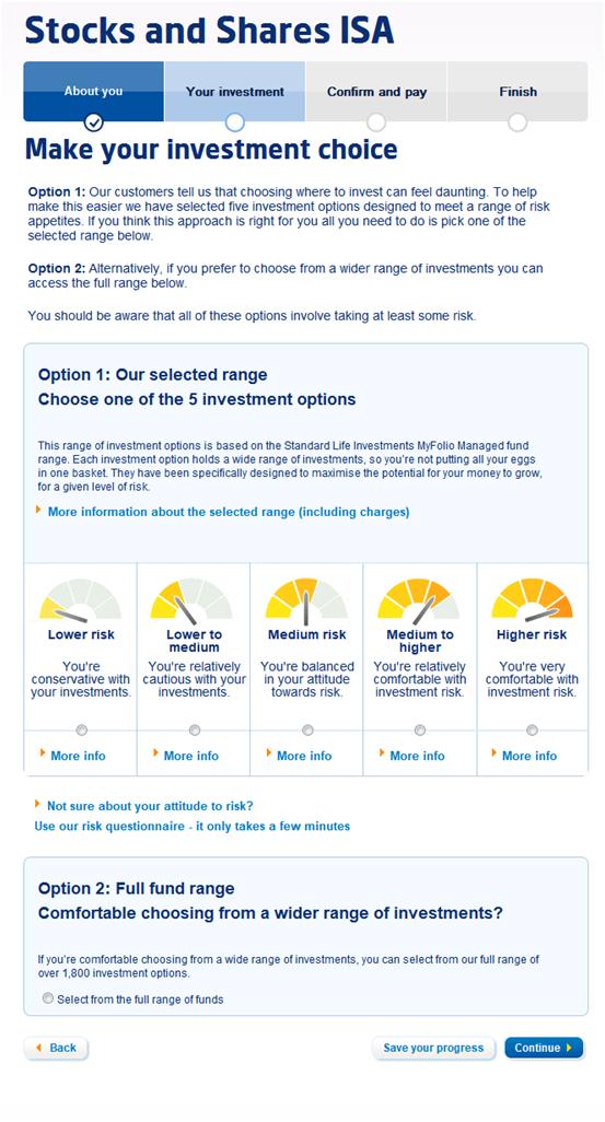
Here I showed our own bit of choice architecture where we reduced the overwhelming choice offered by Standard Life’s Investment ISA to present 5 ‘bundled’ simple choice offers on the application form. Option one is to take one of these pre-packaged solutions, Option two [the ‘experts’ choice] was to select from a supermarket of funds. Not only did we hierarchically structure the page to promote the path of least resistance, but we used strong visuals and human-centred introspective copy: “Comfortable choosing from a wider range?”.

Making choices easier
Even something as simple as Facebook showing you the friends you will lose touch with when you deactivate your account is a clear example of using loss aversion (our tendency to disproportionally value things we have above those we do not) reciprocity (your friends have shared their information with you..) and social proofs (everyone else is here) to – in their case – significantly reduce the number of deactivations per year. A few words about the power of emotionally intelligent signage and hopefully the point was made, this doesn’t need to be massive.
I couldn’t resist pointing out the classic HCI logic in the goal-architecture that means you get your card back at the ATM before your cash so that you don’t walk off with money and forget your card if the sequence was the other way around. A simple sequence decision.
Making a commitment
To close my 45 minutes I wanted to touch on how making people do something different for a second, a few minutes even, can be incredibly powerful but that long-lasting behavioural change is incredibly difficult and complex. Perspective and influence over time from the herd and an array of variables means that designing such solutions is fraught with challenges. Though I didn’t mention it at the time I have talked before about my relationship with my energy supplier. Having used an energy monitor and post-usage data I was able to reduce the amount of gas and electricity I used at home, but after a while I realised I wasn’t getting any better. I’d reached a plateau in savings, all my devices were low energy or used at their most efficient settings and so-on. I lost interest and stopped looking at the monitor or my reports. My usage crept back up. The classic YoYo seen in dieters and addictive behaviour like smoking.
It’s not enough to take these examples above and apply them to solutions as varied as increasing up-sell on insurance products, shifting metallic paint on new car configurations, moving people to a different mobile tariff, quitting smoking or eating more fruit and veg. Each instance requires a deep understanding of the specific problem, it’s motivators and triggers.
Which seemed a perfect time to call on Fogg. Running out of time now so if you want to know more about the application of behaviour change then do seek out these useful kits:
Finally,
In the coming months I hope to be able to share with you some of the excellent work my team (Aarti Dhodia and Tom Harle) have been producing to bring behavioural influence to an exciting service to be launched by one of Dare’s clients. Until then, I hope you find inspiration and enjoyment in the examples here.


