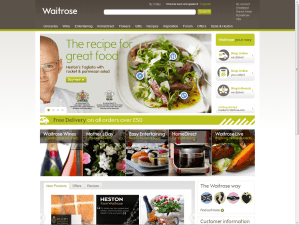
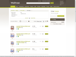
This week eConsultancy’s report on the apparent usability calamity of the new Waitrose site has been widely shared: “New Waitrose website panned by users“. People queued up to take pot shots at this aspirational brand, criticising a range of issues from taxonomy, speed and the apparent non-disclosure of prices.
Several cried-out “why wasn’t this tested?” “didn’t listen to users” and so-on and so forth. Compounding the issue was the revelation that the design ‘cost £10 million’.
An unmitigated disaster eh? Well no, not in my opinion. Firstly I think that the £10m issue is swaying a lot of bad publicity. The general public, and this is not to patronise, simply do not understand the price of design (c.f. Olympics 2012 logo). I don’t understand the price of building a new bridge, or anti-retroviral drugs and I don’t presume to tell the people in those industries that the cost of such things is too much. For some reason, the great British public assume that design work is just a 17 year old with photoshop tinkering about. It completely misses the point that work like this involves high levels of expertise in visual design, logistics, accountancy, information systems, security, project management and so-on. It’s massive, it’s expensive stuff. You might re-design a local dentist’s website for £1000 but really this isn’t even vaguely comparable.
Secondly, it does actually work. To claim it’s “not fit for purpose … beyond fixing” is bonkers. Show me the evidence that no-one is shopping on the site, that the usage is down that average basket sizes are down etc. etc. I suspect you would find the opposite [EDIT 25.March: Orders are in-fact up by 34% on the previous site, according to The Guardian]. Yes, there are problems. Some of the nomenclature and taxonomy is a little unconventional. Sally pointed out that browsing freezer products was done by brand and not by type, that seems peculiarly specific. Most users would at least like a choice to filter by meal, by category (fish, poultry, ready-meal, dessert) and so on. Other glaring errors include the (now fixed) inability to identify sizes or quantities of items like milk and meat.
And then there’s the speed. The speed it’s rendering is not great. I’m no developer so can only speculate that it could be either an interface layer issue or one related to pulling items out of the eCommerce catalogue (the back-end). To the consumer this distinction is irrelevant, it just takes time and time-precious consumers get understandably narky. Fixing the speed is critical to the perception of performance.
It infuriates me to suggest that this wasn’t thought about or tested. In our industry with so much money at stake it is inconceivable to think it wasn’t tested in some way at several points throughout the process. It was designed in part by some very talented user-centred people and the fact that certain elements have been included (drop-down category breadcrumbs) suggest a user-experience designer’s hand. The key is whether the user-testing was sufficiently rigorous, sufficiently real-world and sufficiently analysed to feed back into the design process.
Interactions which are causing the most concern include long-lists – the heavy duty users at home doing > £100 shops with many items. In these scenarios they are likely to be juggling multiple threads of activity: searching for goods, ticking them off a paper list, popping to and from the kitchen, considering recipes and so on. Keeping as much of the action (‘add to basket’) transparent at the same time as the browse activity is a tricky ask. Often user-testing is done in a lab with a user isolated from the context in which they normally perform their activity. It’s not a real shop, it’s a simulated list and the observations you will make will subsequently be quite false.
Work like this is so dependant on context that it needs to be stress-tested in real-world situations. It means sample shoppers using a staging-version of the site or a high-fidelity prototype to do their normal shopping routine. It might have happened here, I speculate that it probably didn’t.
I rememeber Catriona Campbell of Foviance telling me once of some ethnography work done for Tesco where they observed online shoppers ordering in bulk from their value range. Actually observing the users in their homes showed that these were consolidated orders for their community where one person acted as a distributor from a single paid-for delivery. Insight like this rarely comes from a two-way mirror, eyetracking and a moderator.
Returning to the Waitrose site, i’d urge you not to get caught in the hype but to actually use the site. The majority of problems cited on the forum seem to be resolvable coding/performance issues, not fundamental interface design issues. By which I mean buttons not working as intended, technical errors and so-on. The remaining issues surround a nostalgia for old site features like the jotter. I’ve seen this sort of thing before when a quirky feature barely anyone used gets removed the one or two people who did use it take to the web to complain.
I’m not saying it’s brilliant, it clearly needs work but I just personally feel the need to call for some calm and reflection in light of the fact that passionately user-centred people would have been involved in this and working with the very best of intentions albeit perhaps without the backup to see it through to final development or the support of adequate contextual user-tests.


Good article man, it’s unfortunate for those involved in the UX work to be caught up in this, but surely someone has to take responsibility? The fact is that the ‘public’ respond to certain events or designs well and less well to others. I appreciate that you’re calling for balance and that is undoubtedly correct, but to a certain extent there’s no smoke without fire. I’d love to hear a blog from those involved in the project so we can all learn from what happened.
“Chris Sainsbury”? Really?
As to the original blog entry, I’m going to disagree a little. Online grocery shopping is not like other online shopping. It is a chore to be got over with as quickly as possible. The shoppers don’t want change to the websites; they want improvements in fulfilment, for the deliveries to be cheaper, the product shelf-life to be longer, the food to be “better”. Changing the website UI brings zero benefit to them.
So change has to be about making it easier for new customers. Removing the jotter – essentially a multi-search entry tool – cannot be said to make it easier!
I do agree Mike, to a point 🙂
The fulfilment improvements are much wanted; quality produce selected, efficient deliveries, elongated shelf-life and so-on. However, it’s not right to say that “changing the website UI brings zero benefit to them“. How could it not (assuming it is done correctly) bring benefit? There is much to do in grocery shopping experience design to improve the way products are visualised, selected, searched-for and so on. Not to mention UI enhancements that would need to be made to tie-in with new fulfilment propositions such as desired best-before dates or improved delivery options (smaller delivery windows etc.) Of course these fulfilment proposition improvements are reliant on the necessary operational elements being in place beforehand.
And as for the jotter, I’d still like to see the pre-redesign data that demonstrated it was a much-used feature before I suggested it was a valuable part of a future interface 🙂