Author Archives: John Gibbard

Predictive Luxury: When the Algorithm Decides You’re Worth It

The paradox of modern luxury is that the more precisely it knows us, the less we seem to want it.
AI-driven personalisation flatters our taste so efficiently that desire itself begins to flatten. You open an app and there it is – the jacket you’d half-imagined, or the playlist that mirrors your mood before you’ve named it. The system anticipates, arranges, and completes. It feels frictionless, even generous.

But when everything fits this neatly, what’s left to reach for? Desire once depended on a perceptible gap, the space between wanting and getting. Now that gap has been optimised away. We no longer aspire; we’re simply anticipated.

Behind that easy charm sits a machinery, an industry, of prediction. Every scroll, hover, and hesitation becomes a confession. From these micro-gestures, the algorithm builds a probabilistic portrait: accurate enough to sell to, not to know.

This is predictive luxury – the luxury of convenience. It packages aspiration for the mass-affluent, translating status into data. The product is still expensive, but the experience is engineered for scale: “exclusive” taste delivered by statistical consensus. What once required discernment now arrives pre-approved.

To be clear, this isn’t curation. It’s correlation. Your discernment becomes the weighted average of everyone who clicked before you. Luxury houses once guarded their ateliers; now they guard their datasets. What was once stitched by hand is now inferred by pattern.

The shift sounds harmless until you notice what it removes.
Aspiration (the slow, self-defining kind) relies on uncertainty. We learned our taste through trial, boredom, and even embarrassment. Those edges are gone. There’s no risk in going to the restaurant where the algorithm has all but booked you the table. The algorithm keeps our preferences in a holding pattern, replaying what we’ve already confirmed, always within one standard deviation of safety.

The Predictive Plateau: a system that sells us the most probable choice, not the most interesting one. Left unchecked, it narrows the collective palate. As I argued in Luxury UX: Beyond Veneer, lasting equity comes from structure and restraint, not surface gloss. The real risk for luxury brands isn’t technological obsolescence but aesthetic homogeneity, a market trained to prefer the median.

Prediction is never neutral. Behind every act of personalisation sits a hierarchy of visibility, whom the machine believes is worth showing first. The more data you surrender, the clearer your silhouette in its model; those who resist become statistical ghosts.

There’s a quiet economics to this. By automating inequality, the algorithm devalues any form of wealth it cannot quantify or identify. The ultimate luxury, then, is to disappear from the data entirely, to operate through introductions, word of mouth, and private networks. The truly exclusive product is the one the algorithm cannot find, let alone recommend.

And yet there’s still one lever left: intentionality. The deliberate pause before purchase. The refusal to click “similar items”. The act of finding something the algorithm couldn’t possibly have foreseen. In a world of predictive luxury, this is not passive rebellion but an active aesthetic stance, a luxury of choice by will.

The smartest brands will design for this intentionality, not against it. They’ll reintroduce or retain friction as a feature: the waitlist, the mandatory consultation, the garment that demands to be felt. These are not inefficiencies but signals of depth, proof that the experience values attention over automation.

For all its precision, predictive luxury leaves a vacuum at the top. Once algorithms have colonised the middle (the mass-affluent market chasing “smart” recommendations), genuine exclusivity must move elsewhere. Increasingly, it drifts back to what machines can’t do: interpretation, eccentricity, the unrepeatable judgement of people who know.

That’s where true luxury now lives, in human-centred unpredictability. The ultra-wealthy and the culturally literate aren’t rejecting technology; they’re augmenting it. Data may light the runway, but the finale still belongs to the artisan, the editor, the quietly idiosyncratic expert who can surprise you in ways no model can.

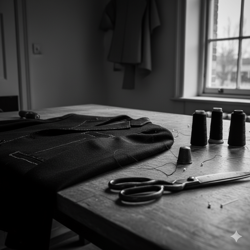
Close-up of a tailor’s worktable lit by soft natural light, showing thread spools, scissors, and a half-finished jacket with a visible imperfect seam — an image symbolising human craftsmanship and intentional imperfection in contrast to algorithmic precision.

British luxury has long understood this. Our best exports – Savile Row, Bentley Mulliner, McQueen, Hockney, Grayson Perry – thrive on that narrow line between discipline and disobedience. Their genius isn’t efficiency but editing: knowing when to break symmetry, when to leave the imperfect seam that proves a hand was there. The imperfect seam is a brand’s deliberate investment in unscalable production – the final, physical proof of value when all scalable processes have been commoditised. Curation, as I’ve argued before, isn’t collection. It’s the art of choosing what not to automate.

The challenge for brands now is to build value not through correlation but through judgement. To shift from efficiency to experience, from prediction to anti-prediction. Their next digital frontier isn’t better personalisation; it’s deliberate unpredictability, the algorithm that refuses to close the loop. Designing such friction isn’t romantic contrarianism; it’s the only sustainable strategy for generating new forms of scarcity, and with them, price elasticity.

Because in an economy obsessed with knowing what comes next, the rarest thing a brand can offer is the pleasure of not knowing, of being surprised, seen, and momentarily off-script. That’s the new exclusivity. That’s predictive luxury, undone.

Acknowledgements: This piece was partly inspired by Antonia Hock’s recent post on invisibility and the next era of ultra-luxury.

AI: This piece was refined with AI, for the image prompt, tags, excerpt, and a little sub-editing. The ideas, references, and rhythm are mine. You can still see my hand.

Tagged , , , , , , , , , , , , , , , , , , ,

Making a Dent

The word itself is plain enough. A dent is what you notice on your car after some clumsy berk has parked too closely and biffed their door into yours. It’s a mark, a bruise, a reminder that force was applied – and something yielded. In English it comes from the same (ahem) root as tooth*. A bite-mark on the surface of things.

Somewhere along the way though it was promoted. No longer just damage, it became ambition. “Make a dent in the universe,” said Steve Jobs, and since then entrepreneurs have repeated the phrase as if the only worthwhile mark is a cosmic one. The dent as disruption, scale, transformation. Anything less is failure.

But the smaller dents are the ones that stay with you. It might have been the teacher who insisted (as one of mine did) that you should all learn the famous Hamlet soliloquy. Or it’s the neighbour who always walked their dog and said hello at the same time every. single. day. The colleague who set out all the chairs just-so before an important client pitch. None of these altered the universe, yet all left their trace. They changed the shape of memory.

I wrote recently on Facebook about how I think of my own father. He was never one for speeches or grand lessons, but I recall often the steady choreography of ordinary competence and reliability: how he chained the door and set the house alarm each night, how he did the family sums on the dining table, how his handwriting looked like copperplate. To a child, these things mattered. They were evidence of his authority, of order. They left their mark, quietly but permanently.

A close-up of a butter knife spreading butter on half a bagel, placed on a plain ceramic plate on a wooden table with a linen cloth. A child’s small hand rests nearby, watching quietly.
The smallest rituals are noticed. Even a bagel, even the buttering.

Years later, on a beach holiday, I read The Five People You Meet in Heaven. Its premise stuck: you pass through life leaving marks on people you barely notice, and they on you. The scale of influence is hidden, but no less profound for it.

My sister knows this now. She works in a primary school and (again, recently) received a thank-you so personal it landed hard, parents saying she was unforgettable in their child’s life. I shot back: “You’ve made a dent.” The phrase had lodged in my head decades earlier from a boss ** in the early 2000s (he must have picked it up from Jobs). Back then it sounded like a corporate battle cry. In her case it was entirely different: personal and resonant at a human scale.

The same pattern plays out in reverse: not just what we do to others, but how they take it in and echo it. You see younger eyes taking in far more than you intended, in my case, with my son. The joke repeated, the mannerism borrowed, the odd seriousness with which a child observes how a bagel is buttered. It is flattering and unnerving in equal measure. You realise you are denting the surface whether you mean to or not.

This is why the Jobsian version rings hollow. It’s not the universe waiting to be dented. People are. And the dents that matter are not the ones scaled up for shareholders or history books, but the grooves worn into habit and recollection. They accumulate into something like folklore.

A dent, after all, is both damage and record. It tells you that contact occurred, that someone was here, that effort was made. The question is not whether we leave dents, we all do, but whether they are the sort of impressions others are glad to carry.

Perhaps that is enough. To dent memory. To be felt after the fact, in the small rituals and rhythms that survive us. Jobs aimed for galaxies. Most of us work closer to home, and the marks we make are no less real for it.

* hat tip to Leigh Thomas who always loved to expand on the etymology of words in her speeches to our agency. That is her dent on me.

** hat tip too to Darren Cornish who influenced me heavily on what customer experience really should and could be.

AI: This piece was written by me, and this time I used ChatGPT lightly as a sub-editor to smooth out some repetition and find the odd ragged grammar. The experiences, perspectives and final edits are mine. AI also produced the tag list, excerpt and, obv. the image that accompanies it.

Tagged , , , , , , , , , , , ,

The Loyalty Programme That Forgot How Parenthood Works

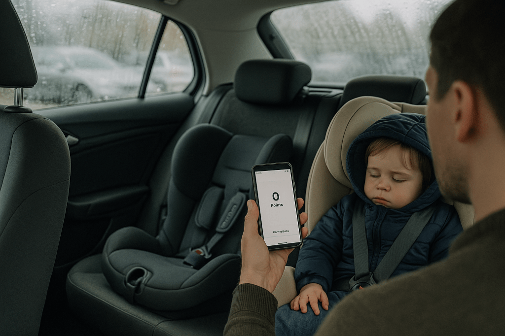
A parent stands by the open rear door of a family car on a rainy day, checking their phone which shows a zero loyalty points balance, while two Cybex child car seats are visible in the back on with a sleeping toddler in it.
Ten years, three seats, still loyal. The app says otherwise.

I’ve been through the Cybex catalogue more than once. Our son (2014) graduated seat by seat. Our daughter (2023) reset the cycle. That’s two children, multiple seats, a base, plus the odd accessory. All dutifully registered with Cybex’s Club, a loyalty scheme that promises free shipping, birthday treats, “exclusive offers” , y’know, the usual garnish.

This isn’t a flex. Cybex is high-end stuff, and we bought it because I lost a friend and his son in a dreadful car accident years ago and I became obsessed with buying the very best. That said …

Here’s how loyalty actually played out:

  • Jul-Sep 2023 — I registered three products: Cloud T (baby seat), Base T (for same), Sol Z-fix (Child’s booster). About 136 points earned.
  • Nov 2023 — a 100-point “bonus” dropped.
  • Summer–Autumn 2024 — the slow bleed: –45, –86, –5, –100. By the end of the year, the balance was gone. I saw the expiry warnings, but they were irrelevant – I didn’t need new products at that point.
  • Sep 2025 — I came back for our daughter’s next seat, the Sirona. Logged in before checkout: 0 points. Of course, after paying the account lit up with +150 “bonus”.

So the scheme doesn’t reward loyalty at all (beyond ‘free postage’). It rewards the purchase you’ve just made. A pat on the back after you’ve handed over your card.

I think you see where I’m going though, the deeper flaw is structural. Car seats don’t follow marketing calendars; they follow biology. Parents buy in long arcs: infant to toddler, toddler to child, every two to four years. A one-year expiry is a guaranteed wipeout. The cadence of childhood doesn’t match the cadence of a CRM dashboard.

What would a loyalty scheme look like if it took parenthood seriously?

  • Milestones – reward the upgrade points: newborn → toddler → child → booster.
  • Moments – top-ups on birthdays or product anniversaries, nudges to check fittings and sizes/weights, effectively MOT-style safety checks.
  • Upgrade triggers – automatic credits seeded ahead of the next seat, not after it.
  • Accessories and cover — redeemable on spare covers, pads, travel bags. Or fold them into warranty extensions — the things parents actually use between major purchases.
  • Recycling – the chronic gap. Car seats can’t be resold, gifting feels reckless, and regulations block obvious reuse. A scheme could collect and recycle them responsibly, with credits back for doing the right thing.
  • Family pooling — roll credits across siblings so value doesn’t die with one child’s cycle.

None of that is radical. It just respects the rhythm of a family’s life.

Instead, the experience feels like bait and switch: promises on the front page, expiry in the small print. Which is clever if the goal is data capture, catastrophic if the goal is trust.

Of course, I still bought the Sirona. Safety and product quality trump irritation. But the goodwill is thinner now. The wider lesson is simple: if your model ignores the customer’s real timeline, you’re not building loyalty. You’re designing disappointment.

Tagged , , , , , , , , , ,

Luxury UX beyond veneer: structure as brand equity

Split illustration in muted tones: on the left, a sleek SUV fades into static on a computer configurator screen; on the right, a calm hotel lobby with warm wood panelling, guests moving easily, and luggage arriving without fuss. The contrast shows polish versus structure, with luxury defined by order and rhythm rather than surface gloss.
Luxury isn’t in the chrome or the marble, it’s in whether the flow holds together without a fuss.

Luxury brands spend fortunes on surface. The right serif typeface. The right depth of cream on a website background. The right stock gsm on the brochure. Product renders with depth of field and lighting artefacts. But luxury UX cannot stop at veneer. If the underlying structure is clumsy, if journeys collapse into confusion or friction, then no amount of polish will hold that illusion.

The truth is that structure itself carries brand equity. The way a digital product is architected, how steps are ordered, how rules are introduced, how decisions are simplified, does more to signal competence and care than a thousand pixels of perfected pack shots. At Jaguar Land Rover we learned that millions of pounds of glossy configurator rendering and photoshoots is wasted if the journey collapses under its own contradictions.

When veneer is not enough

Consider that car configurator (I know I’ve been there before). The surface details may be flawless: chrome toggles, cinematic photography and transitions, elegant typography. Yet if the underlying structure forces a prospective customer through contradictory options, backtracking, or endless reloads, the brand is weakened. The luxury dissolves. Instead of modernity, the prospect experiences muddle. Instead of trust, they feel doubt.

Luxury is clarity disguised as ease. It is the sense that someone has already edited the path, made the trade-offs, and left you with decisions that feel not just coherent but inevitable. That coherence is structural. It is information architecture, not simple brand varnish.

Structure as invisible luxury

In regulated sectors, be it finance, healthcare, mobility, the stakes are higher still. Here, the user must feel that the product knows where it is going. A well-structured flow reassures not only through compliance but through a designed rhythm: disclosure followed by choice, choice followed by confirmation. In finance, disclosure sequencing is as much brand equity as trust marks in the footer. At Aviva, I saw how form ordering and timing mattered more than any banner, ad or brand flourish: get it wrong and trust collapses, get it right and the entire flow feels humane.

    This isn’t just true for luxury. At parkrun, where we were engaged to think about participant and volunteer profiles, the brand moment wasn’t surface polish but whether participants could find a barcode or book a roster slot without friction. There are quieter sectors away from money and luxe, but the principle holds: structure carries the brand.

    Hospitality and the British lens

    Top-end hospitality has always understood that structure outlasts surface. A hotel lobby isn’t luxury because of materials and furnishings alone; it’s luxury because check-in is peaceful, calming, effortless, because luggage appears without fuss, because the guest never feels unwillingly abandoned. The choreography, the sequencing of service, is the brand. Digital is no different. Done well, it is hospitality by other means.

    And here, for me, Britishness adds something. Where continental, EMEA or American luxury can lean toward performance, grand gestures, overt pampering, British luxury often communicates through understatement. Polished restraint. A dry nod over a champagne cascade and a platter of Dubai chocolate. That sensibility, translated into UX, means editing with discipline: fewer options, quieter confirmations, a flow that carries the user forward without ever drawing attention to itself. Not austere, not joyless. Just less show, more order.

    Brand equity in restraint

    A luxury brand earns equity not just through what it offers, but through what it withholds. The best experiences show judgement in what not to display, what not to demand, where to pause. Luxury isn’t ensured by the liberal application of gloss. Sheen can be appropriated, copied, imitated overnight. What endures is structure: the edits, the sequencing, the courage to strip things back until only what matters remains.

    When the experience lands with this quiet integrity, the user may never notice the scaffolding beneath. But they will feel the brand in the unbroken rhythm of moving forward without friction. That is luxury UX beyond veneer, luxury as restraint, stewardship, clarity. A quiet moral order and the calm assurance that polish and structure belong together if the experience is to endure.

    AI: This piece was written by me. I used ChatGPT as a sub-editor to keep tone aligned with my voice. The experiences, perspectives and final edits are mine. AI also produced the tag list, excerpt and image that accompanies it.

    Tagged , , , , , , , , , , , , ,

    Life’s Too Short to Scrape the Lurpak. But Maybe That’s the Point

    A nearly empty white Lurpak butter tub with a stainless steel knife inside sits on a light wooden kitchen countertop. Beside it is a small ceramic plate scattered with toast crumbs. Soft daylight falls from the left, casting gentle shadows across the minimalist, muted interior with wooden furniture and a blurred potted plant in the background.
    Life’s too short to be buttering existential crises out of a plastic tub.

    This morning I found myself scraping the bottom of a Lurpak tub.

    A white, gently bowing receptacle with just enough residual butter to tease the knife, but not enough to make it worth the effort. And yet, there I was: wrist contorted, scraping sideways, skimming over craters of cold margarine laminate, determined to liberate one last smear.

    For toast.

    I paused, mid-scrape, and felt the creeping absurdity of it all. Why do we do this? This frugal choreography. This dignified desperation. Is it habit? Shame? Some Protestant hangover of moral rectitude that equates waste with weakness?

    Or is it worse than that, is it training?

    A kind of domesticated eco-asceticism, learned not out of genuine conviction but out of decades of thinly veiled moral instruction. Don’t waste. Save scraps. Rinse your yoghurt pots. Aspire to net zero in all things, including pleasure. Butter, it turns out, is not neutral.

    I don’t want to be the kind of man who scrapes the last dregs of butter from the corners of a tub. It feels small. Slightly emasculating. A man reduced to margarine management. And yet, aren’t these the very values we claim to admire? Moderation. Responsibility. The quiet dignity of thrift.

    There’s a strange modern tension here: the aesthetic of abundance, paired with the rituals of restraint. Middle-class frugality presented as virtue. A lifestyle of minimalism, yes, but premium minimalism. We don’t waste Lurpak because it costs £4.50 a tub. Because we bought the “Spreadable” version as a treat and now feel complicit in dairy decadence.

    But scratch deeper and it’s not really about the butter at all.

    It’s about effort. It’s about where we place it. We pour our energies into small, containable acts of domestic diligence because the larger systems feel untouchable. We cannot fix politics, housing, the climate, or the cultural entropy of our time, but by God, can we finish a tub of butter.

    And maybe that’s OK. Maybe part of surviving modern life is choosing the scale at which we can still act meaningfully, however trivial it seems. Scraping the butter is absurd. But so is most of life, and at least this kind of absurdity ends with warm toast.

    Still, I didn’t finish it. I threw the tub away, started a new one, and felt a small thrill of liberation.

    No one applauds the man who knows when to stop scraping. But they should.

    Tagged , , , , , , , , , , , , , , , , ,

    So the Hallway Shuts Up About It

    A quiet, lived-in Edwardian kitchen with soft natural light streaming through large sash windows. A brushed chrome tap stands over a deep white Belfast sink, set into pale wooden cabinets with faded cream tiling above. A worn oak table with mismatched wooden chairs sits in the centre of the room. To the right, a slightly scuffed stainless steel Maytag fridge and an old gas cooker are tucked into the corner. The space feels unstyled, with muted grey and off-white tones, and subtle signs of use but no clutter. The mood is still and contemplative, as if someone has just stepped out.
    When you renovate every other room and the kitchen starts looking at you like it knows it’s next.

    We’ve been doing up the house. Nothing dramatic, just the slow, financially ruinous crawl from upstairs to down. Bedrooms first. Then bathrooms. Then the living room. And now the kitchen (inherited from the previous owners) is sulking. Every time I walk into it, I swear the tiling looks a shade more shabby-shite 2006.

    It’s not that much is broken. Except the tired Maytag fridge freezer, a burner that doesn’t ignite and the sink tap leaks, oh and the ruinously-expensive-to-repair-out-of-warranty Miele dishwasher. It’s just been… outclassed. Like turning up to a wedding in M&S when your wife’s in The Row.

    And this irritates me, because I’d quite like to think I live with a bit of restraint. I’ve written before about resisting the upgrade spiral. About not living like a man permanently preparing for an estate agent’s photoshoot. But it turns out that once you start, the rest of the house doesn’t politely wait its turn, it stages a coup.

    The formal name for this, according to Rory Sutherland, is the Diderot Effect. You buy one nice thing and everything else starts to look shit by comparison. Diderot got a red dressing gown and ended up replacing half his house. We bought a fancy shower mixer and now the kitchen tap feels like it came out of a skip.

    Which is how we end up here. Discussing a kitchen renovation because although it’s neither urgent, nor falling apart, it’s because the surrounding rooms have raised the bar to a level our sad little units can’t clear. And I hate myself for it. Because I also know that if we do go ahead, the new kitchen will make the hallway feel dingy, and the garden and patio will look lazy and provincial, and so on until we die or go bankrupt.

    And yet, this is the maddening bit, I also know we’ll probably do it. It’s not vanity. We don’t want quartz or fluted wood or some comically oversized kitchen island, we just want to stop thinking about it. To be able to walk through the space without mentally adding it to a list.

    It’s the tyranny of the unfinished, the psychological admin of rooms and spaces you haven’t yet dealt with.

    There is, of course, a way to dodge all this. You could adopt the Sutherland doctrine and buy a 16th century house. One of those glorious old piles that look better because they’re full of crap. But we don’t live in a Tudor house. We live in an Edwardian semi in Surrey where any attempt at minimalism makes the place look like a probate sale, and maximalism makes it look like you’re an edgy creative that’s gone mad on Etsy.

    So here we are. Planning a kitchen. Not for resale. Not for guests. Not even for ourselves, really. Just so the hallway shuts up about it.

    AI: This piece was, as ever, written by me. I used ChatGPT to sub-edit, and keep the tone aligned with my voice. The experiences, perspectives, and final edits are mine. AI also produced the tag list, excerpts and image that accompanies it.

    Tagged , , , , , , , , , , , , , , , , , ,

    Too Many Podcasts?

    A man in his early thirties sits at a light wooden desk in a softly lit Scandinavian-style room. He wears a grey jumper and has black headphones resting around his neck. Leaning his head on one hand, he looks at his smartphone, which shows a long list of podcast episodes. On the desk in front of him are a ceramic mug half-filled with tea and a small stack of magazines. The mood is contemplative and slightly weary.
    No, I don’t know why the phone is like that either mate. But you get the point. Too many podcasts.

    Or, why skipping an episode feels like abandoning a friend.

    There’s a particular guilt that comes from skipping ahead in a podcast series. Not the comedian-chats-to-comedian ones, or Desert Island Discs, those you can binge or bin at will. I’m talking about the recurring ones. The talky ones. The ones hosted by people you like, or worse, people you know. Miss a week and you don’t just lose the thread, you lose the right to laugh. The callbacks make no sense. The in-jokes have moved on. You’re no longer in on it.

    I’m aware this sounds neurotic. But I’ve stopped listening to several podcasts not because they got worse, but because I missed two episodes and couldn’t face the trauma of catching up. I know I could jump in. I know no one cares. But somehow, I do. It’s the same part of me that keeps unread issues of The Spectator in a stack, muttering, “I’ll start again from the first issue.” That all came about when Jeremy Clarke got ill and I couldn’t bear reading his brilliant column out of sequence, inevitably posthumously.

    The problem therefore, I think, is narrative continuity without narrative urgency. Podcasts, like newsletters or Jeremy’s Low Life column, have become serialised companionships. Their UX rewards loyalty, but punishes lapsed affection. It’s a structure built for the always-on, and it assumes you never really leave.

    And the volume. The sheer, relentless sprawl of it. Everyone has a podcast now. Kind, intelligent friends. Former colleagues. Distant people I admire. I say this with genuine affection and no small dose of complicity, I write a blog read by literally tens, so I’m not throwing stones from the hilltop. But podcasting’s democratisation has created a landscape where the bar to entry is nil and the bar to quality is… unacknowledged.

    This isn’t a snobby defence of old gatekeepers. The best podcasts out there are often the weirder, niche ones. The ones that would never make it past a commissioner’s desk. But that doesn’t mean the friction was all bad. A copywriter at my former agency once said, “Don’t waste the reader’s time.” With podcasts, the time-wasting is part of the premise.

    There’s also the question of emotional design. If podcasts are a medium of intimacy, why are the interfaces and audio frequently so transactional? There’s no gentle onboarding for returners. No “here’s what you missed.” No warm “start here.” Just a reverse-chronological list and an assumption that you’ve kept up.

    Imagine if books worked like that. Chapter 17 opens with “As we were saying…” and you’re left frantically flipping back (actually, come to think of it, that’s the exact reason why I really started to hate Thursday Murder Club). Or if Netflix removed season recaps because you should’ve been paying attention. It’s not hostile, exactly. Just… indifferent.

    So what would better design look like? Perhaps:

    • A podcast player UI that lets hosts flag standalone episodes for returners.
    • A soft re-entry note at the top of an episode: “You don’t need the last three. This one’s its own thing.”
    • A brief recap audio snippet or even a written primer for regulars who’ve been away.

    Small things. But they matter. Because as much as podcasts masquerade as friends chatting in your ears, they’re still products. And products that ignore re-entry, or punish time away, eventually lose people, not to rage, but to fatigue.

    I don’t think we need fewer podcasts. That would be like saying we need fewer books. But we do need better affordances for how people actually consume them: messily, sporadically, guiltily.

    We don’t stop listening because we’re bored. We stop because the emotional lift of rejoining feels heavier than just starting something new.

    And if you’re wondering whether I’ll catch up on that podcast you recommended last month, the answer is no. I fell behind. And now I can’t remember when his dog died.

    AI: This piece was written by me, I did use ChatGPT to sub-edit, help shape the structure, and keep the tone aligned with my voice. The experiences, perspectives, and final edits are mine. AI also produced the tag list, excerpts and image that accompanies it.

    Tagged , , , , , , , ,

    The Wonderful Trick of Memory

    This morning I watched Richard E. Grant talk about his late wife Joan. Four years gone, he said, but what his mind serves up now isn’t the frailty of her last months, but her in good health.

    “The wonderful trick of memory means that we now remember her in full health rather than the last 8 months of her Life.”

    And he’s right, it is a trick, but not sleight-of-hand. Psychologists have know of this bias for decades. Negative emotions tied to autobiographical memories fade quicker than positive ones. It’s called the fading affect bias. Your mind isn’t erasing facts, it’s acting like a producer in the studio, quietly turning down the volume on the anguish while letting the warmth keep playing at full volume.

    Other processes chime in. Every time we recall a memory it’s rewritten, not replayed. That’s reconsolidation, and it means memories get smudged and softened, sometimes in our favour. Trauma therapists use this to their advantage, nudging one’s recall toward less damaging associations. In grief, the brain seems to do it on its own, substituting the image of the person in decline for the person as they really were. Not denial. Not repression. A form of mercy.

    I’ve had a rough few years myself, different terrain, not bereavement. But I’ve clung to the old adage that time heals. It turns out that isn’t just Pollyanna sentimentality: it’s neurology. The sting dulls, the good bits endure. The mind edits.

    Yet (Grant aside) scroll through the socials or (even the trad press) and you’d think the brain is a broken appliance needing constant external servicing. Talking therapies, sound baths, mindfulness apps (with subscriptions, natch). So. Much. Talking. All while PTSD headlines insist almost the opposite, that memory is a cement block dragging lives under.

    Of course, trauma can lock memory in its raw, searing form. That’s the clinical exception. But for the rest of us, maybe the task isn’t endless intervention? Maybe it’s a lighter hand. Trusting that our brains are, on balance, fairly decent editors. That focussing on the good, replaying and re-storifying it, gives it more weight in the archive. I’m taking a leap here but perhaps Richard E. Grant didn’t “work through” those final months. He simply outlived their dominance.

    There’s something oddly hopeful in that. Not a quick fix, not an app notification or a breathlessly titled self-help paperback, but a reminder that forgetting is not failure, it’s function. Memory is a museum curator, and sometimes the exhibition changes.

    AI disclaimer: This piece was written by me, but I used ChatGPT to sub-edit, check and surface study references, and keep the tone aligned with my voice. The experiences, perspectives, and final edits are mine. AI also produced the tag list, excerpts and image that accompanies it.

    Tagged , , , , , , , , , ,

    The Childhood We Never Knew

    A teenage girl with long light brown hair sits alone on a wooden bench in a natural garden at dusk, holding a pen over an open notebook on her lap, with her phone placed screen-down beside her. The scene is softly lit with warm, natural light, surrounded by tall grass and unmanicured foliage.

    After writing about smartphones, parenting, and the slow erosion of moral instinct, I stumbled across a piece that wouldn’t let me go.

    Freya India’s A Time We Never Knew is, on the face of it, a lament. But not for something tangible, not for a policy or platform or even a particular childhood. It’s a mourning for an idea of childhood. One shaped by distance, longing, and a deep sense that something quietly essential has been lost.

    She writes from within the generation often described as digital natives, the ones we, as parents, designers, and the more pretentious cultural observers, keep diagnosing. But what she offers isn’t data. It’s affect. Grief. And reading it, you realise: this isn’t nostalgia. It’s anemoia (a term for the ache we feel for something we never really had). This is a pre-digital adolescence glimpsed only through fiction, photo albums, or the vague warmth of a life not filtered through lenses and likes.

    Freya’s piece is moving because it’s not arguing a case. It’s inhabiting one. She shows you what it feels like to have grown up inside a version of it that always felt slightly off.

    “We never knew friendship before it became keeping up a Snapstreak or using each other like props to look popular on Instagram.”

    You can’t optimise your way out of that. No digital literacy workshop or screen-time-tracking feature will undo the sense of being used by your own image, or complicit in someone else’s performance of belonging. That’s not a UX flaw, it’s existential distortion.

    I’ve argued (and still believe) that design can play its part and restore rhythm, attention, and emotional fidelity. But Freya’s piece sharpened that for me. It’s not enough to critique what’s broken as so many do with no alternative, we need to take seriously the kind of childhood that’s been lost, and ask: What now?

    Not conceptually. Practically. What now?

    Here are five places to start; if not to fix things, then to stop making them worse:

    1. Start with the household, not the handset

    Stop asking what the app is doing to your kid. Ask what your own habits are modelling. Shared mealtimes won’t solve everything, but they set a tempo. Phone baskets, landlines, analogue clocks, not as statements, but as defaults. Ordinary, visible, repeatable.

    2. Make physical things accessible, not aspirational

    Stationery shops now look like gift boutiques. That’s a design failure. Kids shouldn’t need £38 Moleskines and Bullet journals to feel entitled to write something down. Re-normalise pen and paper without a need for it to looked designed and perfect. Put it on the table. Make it disposable. Used, not treasured.

    3. Build spaces for lingering, not passing through

    If you’re designing environments, cafes, libraries, waiting rooms, even apps, make them boredom-compatible. Low-stimulus, soft-lit, acoustically calm. Places you can sit without being prompted, pitched to, or processed. Most teens have never known that feeling. In apps this means zero notifications, tapered onboarding, low information density. No autoplay, restful animation.

    4. Reclaim awkwardness

    Digital fluency has obliterated the slow burn of uncertainty. But life happens in those gaps. If you’re a teacher, don’t fill every silence. If you’re a parent, let the car journey be wordless, let them be bored. Awkwardness isn’t failure it’s part of growing up.

    5. Don’t design mindfulness tools. Design fewer distractions

    I’ve had enough with breathwork apps and dopamine dashboards. If your platform wants to support mental health, stop inventing new notifications. Introduce blank states. Dead-ends. Hard stops. Have a very high bar for introducing infinite scroll. If the user’s done, say so. Let them leave with #NOFOMO.

    In the piece I wrote last month, I framed our dilemma as a kind of middle-class dread, knowing something’s wrong but unsure how to respond without sounding puritanical or panicked. Haidt warns us of the cost of inaction. Burnett warns us not to lose our heads. Freya reminds us what it feels like. And somewhere between their caution, grief, and scepticism, we need to act, not with slogans or screen-time charts, but with work that answers in the way I have above, modelling better rhythms, removing false urgency.

    We don’t all need to log-off, we just need to show up offline too, be awkward and occasionally uninteresting.

    AI disclaimer: This piece was written by me, but I used ChatGPT to sub-edit, surface research, help shape the structure, and keep the tone aligned with my voice. The experiences, perspectives, and final edits are mine. AI also produced the tag list, excerpts and image that accompanies it.

    Tagged , , , , , , , ,

    Why UK Kids Can’t Have Bank Accounts Before Six – And Why That’s Silly

    A close-up, hyper-realistic photo shows a wooden piggy bank with a coin slot on its back and a coin partially inserted. The piggy bank is positioned next to a smartphone displaying a children's banking app with icons for savings goals and coin graphics. To the right of the phone is a neatly folded stack of pastel-colored baby clothes, including a small pair of knitted booties, with a Vinted parcel label and barcode clearly visible. The scene is illuminated by soft, natural light, creating a muted, editorial feel.

    Here’s a sentence that shouldn’t exist: our two-year-old has a savings pot inside her eleven-year-old brother’s bank account.

    Not because we’re trying to confuse HMRC or because we’ve discovered some fintech hack that’s too good to share. Simply because no UK bank will give her an account until she turns six, and when she does, it will still be hamstrung by limits that assume every child’s money arrives in neat, predictable chunks from a parent’s allowance.

    The set-up is simple. We sell her old clothes and toys on Vinted. It’s honest, traceable money, every transaction recorded by a platform that has its own anti–money laundering checks baked in. The items avoid landfill. The proceeds go to her future self. It’s the kind of wholesome circular economy PR departments love to posture about. And yet the only way to park that money somewhere with her name on it (sort of) is to create a ‘pot’ inside her brother’s Rooster account.

    This is not a problem the Financial Conduct Authority asked the banks to solve. There is no specific regulation that says under-sixes cannot have a bank account. This is a product design decision, dressed up in safeguarding logic. NatWest’s own Rooster service told me:

    We’ve had to introduce limits, with these limits created and set at what we believe is a generous amount for a child’s pocket money app… We recommend that you make fewer larger top-ups in the month, and then boost the money over as often as you like.Katie, 15.AUG.25

    The logic, if you squint, is that transaction caps stop laundering. But laundering what, exactly? In our case: a baby’s outgrown sleepsuits. The “10 loads a month” cap on Rooster is not cumulative-value–driven (the actual pound-limit is much higher). It’s a blunt instrument, applied as though fewer transactions automatically means less risk.

    In reality, this isn’t about AML at all. It’s about the convenience of enforcing one simple rule across the board rather than designing for the messy reality of modern family finances:

    • Parents with irregular incomes.
    • Blended households with multiple contributors.
    • Ad-hoc earnings from resale platforms.
    • Grandparents who send £5 here and there for birthdays or because they saw a cute jumper in M&S.

    Under the current design, the system doesn’t distinguish between proceeds from a second-hand pushchair and proceeds from illicit activity. The compliance blanket is thrown equally over both.

    The result: we’ve built a workaround. Her ‘earnings’ from Vinted go into his account, into her pot, under our management. One day, in about four years, we’ll withdraw the lot and hand it to her. Which is absurd, not least because we’ll have to move it in fewer than ten transactions to avoid tripping the same rules all over again.

    If we were serious about aligning banking with real life, we’d have:

    1. A from-birth, save-only account – visible in the parent’s banking app, locked against spending, able to receive small, traceable contributions from approved sources.
    2. Transaction rules shaped by value and source, not arbitrary counts.
    3. A seamless graduation path at age six to a junior current account with a card and spending controls.

    The point is not to hand toddlers contactless cards. It’s to start building the habits, and the visibility, early. Money in, money saved, money safe. The actual ‘banking’ part should be the least absurd bit of that equation.

    This piece was written and fact checked by me and then sub-edited with the assistance of AI. The image was rendered by Gemini and excerpt, ALT tag were AI generated.

    Tagged , , , , , , , , , , , , , , ,