Luxury brands spend fortunes on surface. The right serif typeface. The right depth of cream on a website background. The right stock gsm on the brochure. Product renders with depth of field and lighting artefacts. But luxury UX cannot stop at veneer. If the underlying structure is clumsy, if journeys collapse into confusion or friction, then no amount of polish will hold that illusion.
The truth is that structure itself carries brand equity. The way a digital product is architected, how steps are ordered, how rules are introduced, how decisions are simplified, does more to signal competence and care than a thousand pixels of perfected pack shots. At Jaguar Land Rover we learned that millions of pounds of glossy configurator rendering and photoshoots is wasted if the journey collapses under its own contradictions.
When veneer is not enough
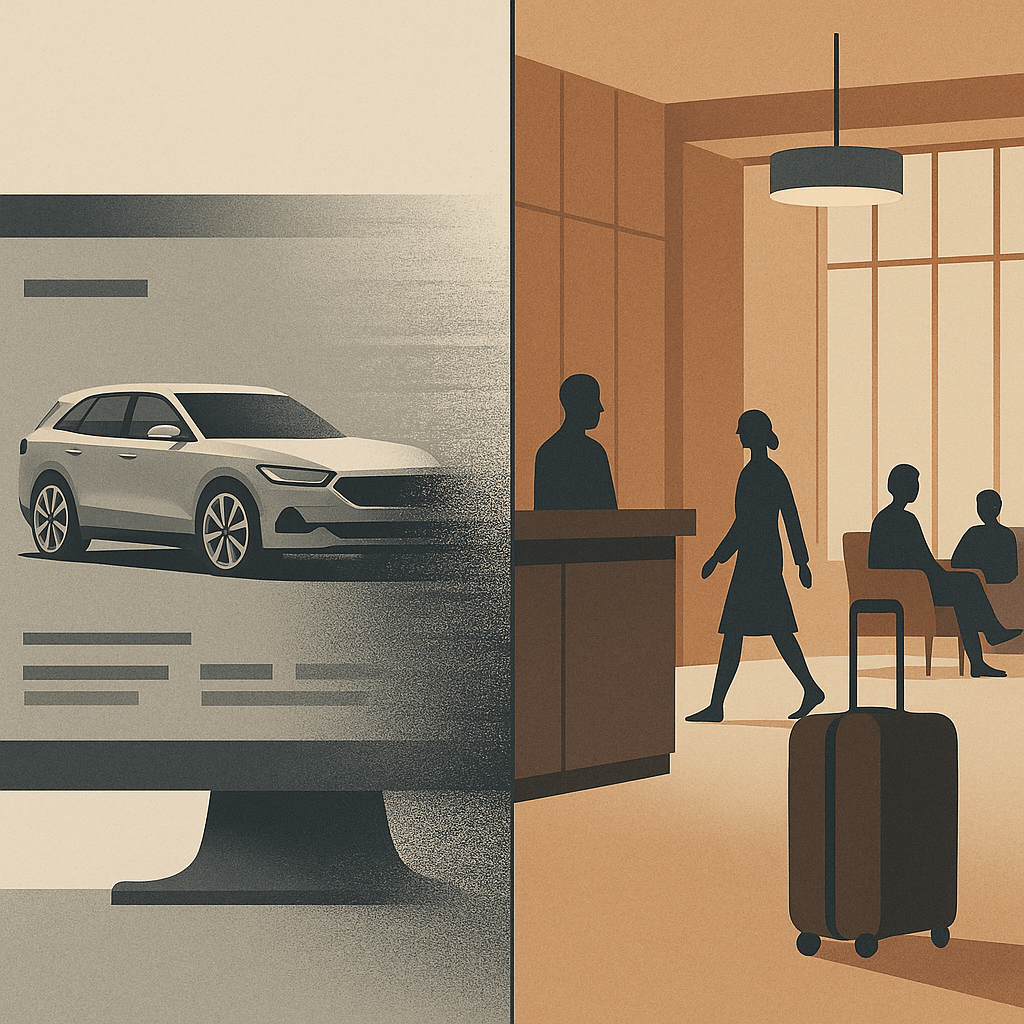
Consider that car configurator (I know I’ve been there before). The surface details may be flawless: chrome toggles, cinematic photography and transitions, elegant typography. Yet if the underlying structure forces a prospective customer through contradictory options, backtracking, or endless reloads, the brand is weakened. The luxury dissolves. Instead of modernity, the prospect experiences muddle. Instead of trust, they feel doubt.
Luxury is clarity disguised as ease. It is the sense that someone has already edited the path, made the trade-offs, and left you with decisions that feel not just coherent but inevitable. That coherence is structural. It is information architecture, not simple brand varnish.
Structure as invisible luxury
In regulated sectors, be it finance, healthcare, mobility, the stakes are higher still. Here, the user must feel that the product knows where it is going. A well-structured flow reassures not only through compliance but through a designed rhythm: disclosure followed by choice, choice followed by confirmation. In finance, disclosure sequencing is as much brand equity as trust marks in the footer. At Aviva, I saw how form ordering and timing mattered more than any banner, ad or brand flourish: get it wrong and trust collapses, get it right and the entire flow feels humane.
This isn’t just true for luxury. At parkrun, where we were engaged to think about participant and volunteer profiles, the brand moment wasn’t surface polish but whether participants could find a barcode or book a roster slot without friction. There are quieter sectors away from money and luxe, but the principle holds: structure carries the brand.
Hospitality and the British lens
Top-end hospitality has always understood that structure outlasts surface. A hotel lobby isn’t luxury because of materials and furnishings alone; it’s luxury because check-in is peaceful, calming, effortless, because luggage appears without fuss, because the guest never feels unwillingly abandoned. The choreography, the sequencing of service, is the brand. Digital is no different. Done well, it is hospitality by other means.
And here, for me, Britishness adds something. Where continental, EMEA or American luxury can lean toward performance, grand gestures, overt pampering, British luxury often communicates through understatement. Polished restraint. A dry nod over a champagne cascade and a platter of Dubai chocolate. That sensibility, translated into UX, means editing with discipline: fewer options, quieter confirmations, a flow that carries the user forward without ever drawing attention to itself. Not austere, not joyless. Just less show, more order.
Brand equity in restraint
A luxury brand earns equity not just through what it offers, but through what it withholds. The best experiences show judgement in what not to display, what not to demand, where to pause. Luxury isn’t ensured by the liberal application of gloss. Sheen can be appropriated, copied, imitated overnight. What endures is structure: the edits, the sequencing, the courage to strip things back until only what matters remains.
When the experience lands with this quiet integrity, the user may never notice the scaffolding beneath. But they will feel the brand in the unbroken rhythm of moving forward without friction. That is luxury UX beyond veneer, luxury as restraint, stewardship, clarity. A quiet moral order and the calm assurance that polish and structure belong together if the experience is to endure.
AI: This piece was written by me. I used ChatGPT as a sub-editor to keep tone aligned with my voice. The experiences, perspectives and final edits are mine. AI also produced the tag list, excerpt and image that accompanies it.


Too Many Podcasts?
Or, why skipping an episode feels like abandoning a friend.
There’s a particular guilt that comes from skipping ahead in a podcast series. Not the comedian-chats-to-comedian ones, or Desert Island Discs, those you can binge or bin at will. I’m talking about the recurring ones. The talky ones. The ones hosted by people you like, or worse, people you know. Miss a week and you don’t just lose the thread, you lose the right to laugh. The callbacks make no sense. The in-jokes have moved on. You’re no longer in on it.
I’m aware this sounds neurotic. But I’ve stopped listening to several podcasts not because they got worse, but because I missed two episodes and couldn’t face the trauma of catching up. I know I could jump in. I know no one cares. But somehow, I do. It’s the same part of me that keeps unread issues of The Spectator in a stack, muttering, “I’ll start again from the first issue.” That all came about when Jeremy Clarke got ill and I couldn’t bear reading his brilliant column out of sequence, inevitably posthumously.
The problem therefore, I think, is narrative continuity without narrative urgency. Podcasts, like newsletters or Jeremy’s Low Life column, have become serialised companionships. Their UX rewards loyalty, but punishes lapsed affection. It’s a structure built for the always-on, and it assumes you never really leave.
And the volume. The sheer, relentless sprawl of it. Everyone has a podcast now. Kind, intelligent friends. Former colleagues. Distant people I admire. I say this with genuine affection and no small dose of complicity, I write a blog read by literally tens, so I’m not throwing stones from the hilltop. But podcasting’s democratisation has created a landscape where the bar to entry is nil and the bar to quality is… unacknowledged.
This isn’t a snobby defence of old gatekeepers. The best podcasts out there are often the weirder, niche ones. The ones that would never make it past a commissioner’s desk. But that doesn’t mean the friction was all bad. A copywriter at my former agency once said, “Don’t waste the reader’s time.” With podcasts, the time-wasting is part of the premise.
There’s also the question of emotional design. If podcasts are a medium of intimacy, why are the interfaces and audio frequently so transactional? There’s no gentle onboarding for returners. No “here’s what you missed.” No warm “start here.” Just a reverse-chronological list and an assumption that you’ve kept up.
Imagine if books worked like that. Chapter 17 opens with “As we were saying…” and you’re left frantically flipping back (actually, come to think of it, that’s the exact reason why I really started to hate Thursday Murder Club). Or if Netflix removed season recaps because you should’ve been paying attention. It’s not hostile, exactly. Just… indifferent.
So what would better design look like? Perhaps:
Small things. But they matter. Because as much as podcasts masquerade as friends chatting in your ears, they’re still products. And products that ignore re-entry, or punish time away, eventually lose people, not to rage, but to fatigue.
I don’t think we need fewer podcasts. That would be like saying we need fewer books. But we do need better affordances for how people actually consume them: messily, sporadically, guiltily.
We don’t stop listening because we’re bored. We stop because the emotional lift of rejoining feels heavier than just starting something new.
And if you’re wondering whether I’ll catch up on that podcast you recommended last month, the answer is no. I fell behind. And now I can’t remember when his dog died.
AI: This piece was written by me, I did use ChatGPT to sub-edit, help shape the structure, and keep the tone aligned with my voice. The experiences, perspectives, and final edits are mine. AI also produced the tag list, excerpts and image that accompanies it.