The bit that mattered was never the screen.
Take this example. You’re looking to buy a used car. You shortlist three cars and start nudging the finance up and down. Nothing dramatic, just enough to see what an additional £30 a month buys you. A slightly newer plate perhaps. Fewer miles. A bit more punch, or practicality.
Then you click through to a retailer. Your shortlist disappears. Your modelled finance examples disappear. You’re on a blank form, being asked questions your behaviour has already answered. Nothing failed in any obvious way. The system simply dropped the ball precisely at the point it needed to hang on to it.
That is still how a great deal of digital experience works.
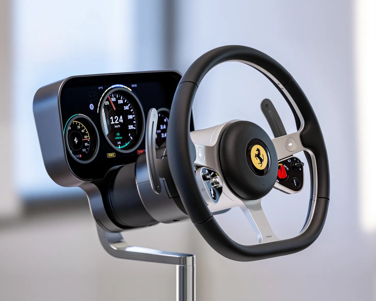
You can now generate a respectable interface in seconds, in Figma Make or hell even Gemini. It’ll be clean, structured, and broadly acceptable. Enough hierarchy to feel coherent, enough restraint to avoid embarrassment. It looks like design, which is why people are getting carried away and, frankly, why people are being laid off.
There is too a growing belief that interfaces are becoming fluid. Instead of designing fixed screens, we define components and let agents assemble the right interface on demand. Ask for something, get a form. No navigation, no structure, just translate intent directly into interaction.
Concepts like this are gaining column inches, conference talks and LinkedIn views because they’re brief and intelligible. However, as soon as the interaction extends beyond that moment, the weaknesses become apparent. Context isn’t carried forward properly. Earlier decisions aren’t respected. The system produces something plausible but slightly off, and the user ends up repairing it, effectively doing the work we’d hoped to have eliminated. The surface has improved. The underlying behaviour hasn’t.
Over the past eight weeks, I’ve been working through a Human–Computer Interaction and AI course with the University of Cambridge (Advance Online), and it has been mildly uncomfortable in the way good things often are. It stripped things back to a version of UX that feels almost unfashionable: define the problem before you touch a solution; model the system in terms of what it actually does, not how it looks; decide where control sits between human and machine and how that moves about; draw a boundary and accept responsibility for what happens inside it; then prove the thing works rather than just assuming it does.
As I worked through the modules, it was charmingly familiar and obvious that none of this was new. It just hasn’t been particularly visible for a while. The industry has been busy polishing UI surfaces and calling it progress. AI hasn’t changed that per se, but has made the gap harder to ignore. You can now generate something that looks finished without having done any of the thinking that would make it hold together.
That’s also why a lot of current AI design work feels slightly misplaced, and why the obsession with UI product designers irritates me. There are people doing very good work on interfaces and component systems. Zander Whitehurst is one of them, and they look excellent. But that work sits downstream of where the real difficulty now is. You can refine the surface as much as you like; if the system doesn’t carry intent, it won’t survive contact with actual use.
The “democratisation of design” line doesn’t stand up to the faintest scrutiny. Sure, more people can produce interfaces, and there’s been a lifting of all boats in terms of aesthetics. That’s true. Almost none of those interfaces are grounded in any understanding of what the user is actually trying to do. They meet a baseline. They look competent. They solve very little.
What has been democratised is production.
The discipline that underpins it, the work of defining what matters, what to surface, what to hide, what to carry forward, and where the system should stop and ask, has not been automated. It has been skipped.
The shift to intent-based interaction makes that gap more obvious. You are no longer stepping through a process one action at a time. You state an outcome, and the system attempts to get you there. That changes the shape of the problem. The system has to interpret intent, apply constraints, decide what to do next, and show enough of its reasoning that you can tell whether it has misunderstood you. When it gets that wrong, it doesn’t look like a broken interface. It looks like a reasonable answer that doesn’t quite fit, which is both harder to spot and harder to recover from.
This is where the work is moving.
If interfaces can be assembled on demand, the value shifts into what sits behind them: how intent is captured, how memory is handled, what the system is allowed to assume, when it must ask, and how it behaves when it reaches the edge of its understanding.
Friction becomes part of that. For routine actions, speed is fine. For anything with consequence, removing every pause produces something that feels smooth and behaves carelessly. A system that never slows you down also never asks you to think.
There is a second effect that is easier to miss. If the system does more of the execution, the user does less of the thinking that used to go with it. Over time, that changes behaviour. Trade-offs become less visible. Assumptions go unchallenged. Outputs are accepted because they look plausible..
You end up with users who are comfortable approving things they don’t fully understand.
The risk here isn’t replacement. It’s avoidance. If the problem isn’t defined, if the constraints aren’t understood, if the system isn’t designed to carry intent across time, then the speed of output doesn’t help. It just produces more surface, faster, over the same unresolved issues.
That is already visible. The used car journey doesn’t fail because the interface is ugly. It fails because no one took responsibility for the whole. The same pattern is now being reproduced with better tools and more convincing output.
If that continues, the work doesn’t disappear.
It just gets left to the user.
AI: I used ChatGPT to tidy up some grammar and I used Gemini to pick some holes in the piece to strengthen the arguments.