There’s a very British idea, popularised for a certain generation by mid-00s Top Gear, that you simply shouldn’t be seen running. While Clarkson would hurl a Ferrari at the Alps and Hammond would squeal, James May absolutely wouldn’t “leg it” through a station on television. The joke only worked because it sat on an older social rule: hurrying is vulgar; being in control is a virtue; arriving on time is the outward sign of having your life vaguely together.
It isn’t wholly true, of course. Any weekday at rush hour will show you people going like stabbed rats through the barriers to catch the seemingly only service to Guildford in the next hour. But the sentiment matters, because it explains what a station clock is really for. It isn’t there to decorate the concourse and look great on design renders. It’s there to let you preserve one’s dignity while still making the train.
And that’s why the new national railway clock redesign (unveiled in October 2025) is such an interesting failure. On the surface it’s excellent: it uses Rail Alphabet 2, Margaret Calvert’s updated typeface, digitised by Henrik Kubel, and it’s been delivered by Design Bridge and Partners as the first national update in decades. It’s legible, high contrast, and properly British in the best sense: quietly authoritative. The hands and numerals look like they belong to an infrastructure system rather than a lifestyle brand.
Then you look for the seconds.
In the new design, the traditional seconds hand is replaced by an animated version of the double-arrow logo. It splits and moves around the rim on two red tracks, meeting at the 12 and the 6 every 30 seconds. It’s clever. It’s kinetic. It’s also a very specific choice about what kind of information the most visible clock in the system should prioritise.
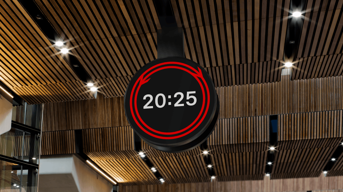
It’s worth being precise about the scope of the complaint here. Seconds haven’t been abolished from the railway. In stations, they can still be available in places where they truly matter operationally, on platform screens and in platform contexts. The issue is that the big “master” clocks, that is to say the concourse clock, the exterior clock, the one you can see from across the hall, have chosen to make seconds less instantly legible, right at the point where humans make their first, most consequential decisions.
Because a station clock isn’t décor. It’s a contract between passenger and system.
A public clock in a transit hub is the final arbiter between the system’s schedule and your autonomy. When there’s a tight connection, when platform numbers change, when the train is somewhere over there with the doors open and you’re deciding whether to jog or accept defeat with dignity, the clock is the one thing that’s meant to be beyond interpretation. You don’t need it to have a vibe. You need it to be right—and to be readable at a glance, from a distance, while moving.
The traditional sweeping seconds hand gives you linear, active information. It’s not just “the time”; it’s the rate at which your margin is shrinking. You can glance once and know, without thinking, whether you have 75 seconds of brisk walking or 15 seconds of that un-British sprint.
The new clock asks something different of you. The seconds are still there, technically, but they’re encoded as movement you have to read. A person now has to decode a logo’s behaviour under pressure in a concourse already full of stimuli: screens, announcements, people drifting into your path with a wheelie case, the whole theatre of urgent politeness. Where a seconds hand was a data point, the animated mark becomes a small task. That task is a cost. And in a station, costs are paid in stress.
The 17:22 Runner
Consider the 17:22 runner at Waterloo: you hit the concourse at 17:20:45, bag strap slipping, the smell of victuals you don’t have time to buy, and you need one piece of information: how much time is left before your decision becomes irreversible. Not an approximate sense of now. Not a calm impression of punctuality. A countdown.
A conventional clock gives you that instantly because you already know how to read it. An animated rim cue forces you to observe the rate of change. That’s fine when you’re admiring the clock from a distance; it’s unhelpful when you’re trying to decide whether running will be safe, or even worth the social embarrassment. Uncertainty multiplies stress. It also drives worse choices. People misjudge, dash late, squeeze through doors, and take risks because the system refused to hand them the most basic ingredient of rational behaviour: precise time, early enough to act on it.
“Yes, but John the platform shows seconds” isn’t the rebuttal people think it is. By the time you’re on the platform, you’ve already committed. The concourse is where you decide whether you even have a chance, which route through the station you’ll take, whether to stop and check a board, whether to abandon the sprint and save yourself the indignity. The master clock is the one you can see before you commit to direction. That’s precisely why it matters that this clock has become interpretive.
A clock that makes you watch it for longer is a clock that’s failed its job.
Inclusive design, and the point where it gets misapplied
The public defence for removing a traditional seconds hand has been framed in inclusive design terms: reduce visual clutter; lower cognitive load; create a calmer centrepiece in a visually noisy environment; consult accessibility experts; ensure legibility for neurodivergent and visually impaired passengers. Some of that is solid. High contrast, proportion, and type are genuine wins. Rail Alphabet 2 looks built for this.
But inclusive design doesn’t mean deleting information. It means structuring it.
In UX terms, the answer to noise is hierarchy: make core information dominant and secondary information available without demanding attention. A well-designed seconds hand is background data until it becomes foreground data. You can ignore it when you’ve got slack time; you can rely on it when you don’t. The design choice here replaces a familiar, instantly legible secondary signal with an abstract one that requires interpretation at exactly the moment users least want interpretation.
Even if you accept the intention, the interaction cost is being paid by the wrong person. The domestic traveller with plenty of time and a Soduku in Swindon can enjoy the calm. The time-poor traveller (often the one juggling childcare, shift work, awkward connections) and the general friction of British public life, gets the burden of decoding.
It seems this is the recurring pattern in modern service design: smoothing the interface for people with margin and pushing the remaining complexity onto those without it.
Precision as theatre: the Swiss counterpoint
If you want proof that precision can be humane rather than harsh, Switzerland has already done the case study for you. The SBB clock is iconic for a reason. Its red seconds hand completes a circuit in 58.5 seconds and pauses for 1.5 at the 12. That movement isn’t decoration. It’s a synchronisation signal for dispatch1 and a trust signal for passengers. It tells you, without a word, that the system is coherent and the public time is shared.
The Swiss obsess over the second because they understand the relationship between granularity and trust. The more precisely a system can tell you what’s happening, the less you have to fill the gaps with anxiety. Precision reduces drama.
The British redesign moves in the opposite direction. It doesn’t deny time; it aestheticises it. It turns the master clock into something closer to a brand artefact: an, admittedly handsome, graphic identity with a reassuring rhythm. The result is a timepiece that feels contemporary while quietly stepping back from its core civic purpose.
Active information to passive vigilance
There’s a useful parallel in the removal of old split-flap departure boards. The clack of the tiles was a kind of haptic affordance; it announced itself. It pulled your attention at the moment something changed. Modern digital screens are silent and passive. They don’t summon you; you have to keep checking them. The burden of vigilance moves from the system to the person.
This clock is part of the same drift. By replacing an instantly readable seconds hand with motion you must interpret, the clock becomes less of an arbiter and more of a piece of wall art. It undeniably looks better and increases cohesiveness across the rail estate. It works worse at the moments that actually matter.
Seconds still exist elsewhere in the network. That’s the point. The railway has kept precision where it’s operationally necessary, then softened it where it’s socially authoritative. Calm should be the outcome of a system that runs with surgical precision. It shouldn’t be manufactured by making the most public-facing clock in the building slightly less precise, slightly less immediate, and slightly more about how the railway would like time to feel.
AI: I used AI for the tags, the excerpt, and a light sub-edit. The ideas, references, observations, and anecdotes are mine.
- The hand only restarts when it receives an electrical “minute pulse” from a central master clock. This ensures that every clock across the entire Swiss network (from Geneva to St. Gallen) synchronises the turn of the minute to the exact same millisecond. It’s a happy accident that this technical constraint has left to a better end result for users. ↩︎