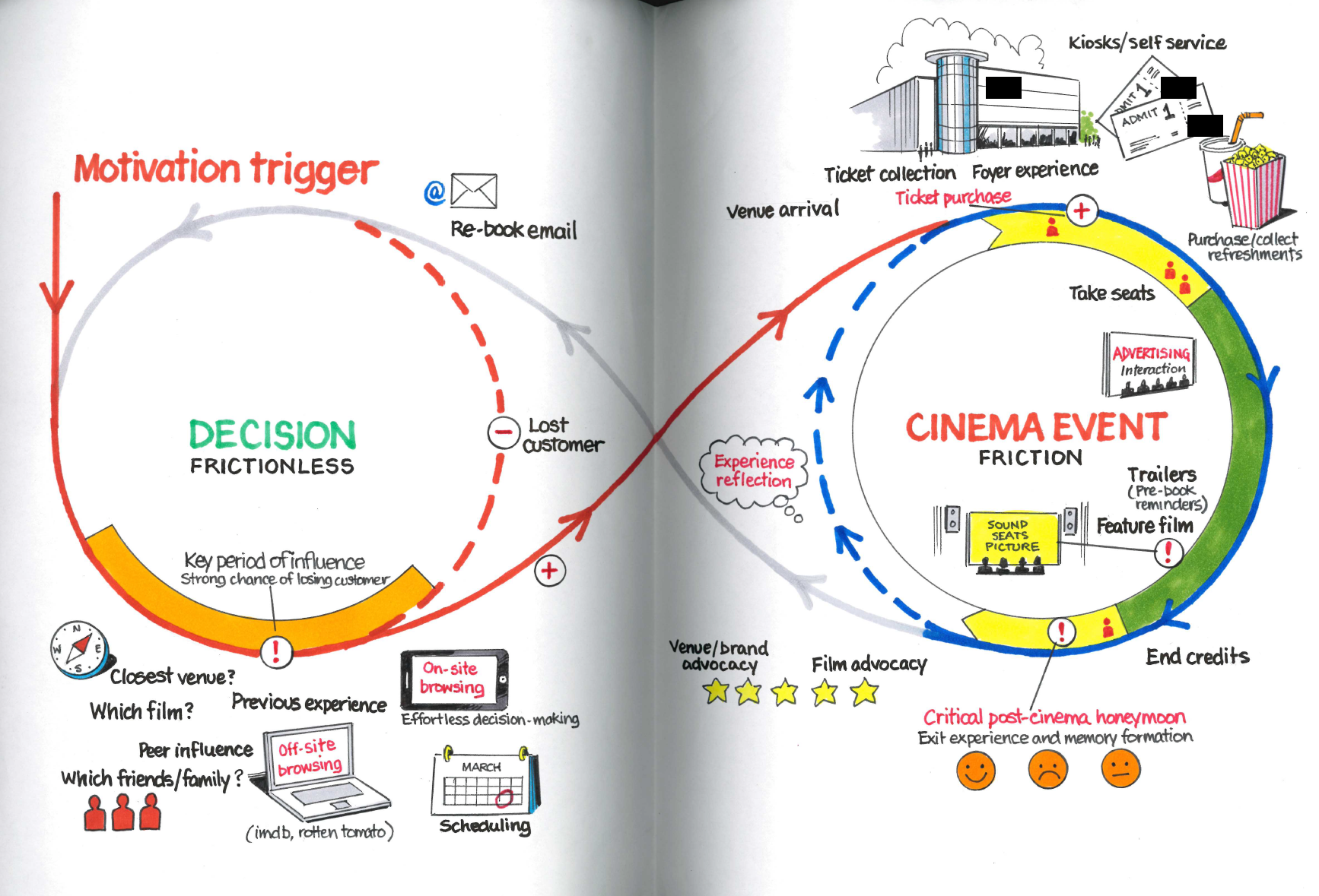
Cinema Experience Loop.
This is the first of an occasional series of explorations into my previous work. I’ll stay light on the reasons only to say that I’ve been clearing out some paperwork and rather than hang on to old documents I thought I’d scan them, creating a digital record (portfolio?) and have the opportunity to explore them in public.
First up is this hand-illustrated experience loop that looks at the ways in which we come to think about buying a cinema ticket and watching a film. Full disclosure this is a commissioned illustration based on my original sketches. I’d love to be that neat but, for a pitch, it needed a draughtsman’s hand.
So, we start on the left side with a motivation trigger. What makes a prospective cinema-goer interested? We imply that a decision to watch something has already been made and this circle investigates the processes being made to identify why the customer chooses this particular cinema (brand). The early phase of influence is all about holding on to a customer that could easily flip to a different venue or decide not to go at all if there is friction in the process of determining a match between film, scheduling and the booking experience. This period, from a creative perspective, opened up lots of discussion around what the on-site and off-site experiences are and how they increase motivation or add friction. How does, for example, the role of review sites like Rotten Tomatoes or, frankly, Google, impact on the linear nature of this flow. How might the (ahem) cadence of this part of the process change depending on whether you’re looking for the next few hours or in the next week?
We looked at the impact of losing a prospect at this point. How might we encourage them back into the decision and consideration phase? We might think about creative ways to re-target and the requirement to have a technical solution in place that identifies those people that are dropping out of the process.
By contrast, the process of attending the cinema is explored on the right-hand side. This is where we looked to add a little friction, slow it down and engage the customer to embed a brand experience that is memorable. Creatively we wanted to introduce ideas around the venue arrival, recognition of the customer at point-of-sale and the personalisation of the foyer experience. How might we influence that crucial ‘take your seats’ phase, where your sense of anticipation is at its peak and where you’re most receptive to the little moments of delight that make the brand stand out?
The film itself is the green section, not much we can do here. This was largely out of our brand’s control. They could deliver exceptional sound and visuals – technology and seating design that was a cut above, but this was out of the purview of our pitch. At the end of the film, the opportunity to embed a great memory is significant. Kahneman talks of the effect of a crashing cymbal at the end of an orchestral score and this is the analogous moment, in more candid terms: don’t fuck it up. To this end we had the opportunity to discuss the rating or review of the experience on exit and the supporting of advocacy, finding creative ways to build on that classic behaviour of walking out of the cinema excitedly chattering about what you’ve just seen – how could this, for example, be broadcast more immediately so that it might influence people in the decision phase?
Finally, there’s a period of reflection. A little later than that foyer exit, perhaps in the day or so after the event where the brand has an opportunity to deepen the memory and connection of the experience with reward, follow-up and loyalty options that potentially build on the momentum and retain the cinema goer within the brand’s orbit such that any future decision to view is even more likely to result in a return to our client’s site and location.
As an exercise, this was a classic customer journey analysis and was the result of deep, intensive thinking and research during a pitch. It’s the tip of a strategic iceberg and was visually the framework which we used to introduce and anchor the creative ideas we presented. It was a demonstration to our client that we thought about the role of loyalty, of the critical touchpoints and potential leaks. We could highlight the interventions we had designed: exceptionally easy booking and film discovery, a personalised welcome and pre-booked refreshments, an effortless review-and-share interaction.
I’m sure it can be critiqued and holes identified. It’s pitch material and therefore hardly the most intensively researched and finessed work – not like you might do with a multi-year client, but I’m proud of what it allowed us to present and the manner in which it demonstrates that UX can borrow from service design principles to add essential context to the flows, screens and interactions we design and present.
Get in the comments on the blog/LinkedIn and let me know what you think. More of this sort of thing soon come.
