Tag Archives: Design Thinking

Predictive Luxury: When the Algorithm Decides You’re Worth It

The paradox of modern luxury is that the more precisely it knows us, the less we seem to want it.
AI-driven personalisation flatters our taste so efficiently that desire itself begins to flatten. You open an app and there it is – the jacket you’d half-imagined, or the playlist that mirrors your mood before you’ve named it. The system anticipates, arranges, and completes. It feels frictionless, even generous.

But when everything fits this neatly, what’s left to reach for? Desire once depended on a perceptible gap, the space between wanting and getting. Now that gap has been optimised away. We no longer aspire; we’re simply anticipated.

Behind that easy charm sits a machinery, an industry, of prediction. Every scroll, hover, and hesitation becomes a confession. From these micro-gestures, the algorithm builds a probabilistic portrait: accurate enough to sell to, not to know.

This is predictive luxury – the luxury of convenience. It packages aspiration for the mass-affluent, translating status into data. The product is still expensive, but the experience is engineered for scale: “exclusive” taste delivered by statistical consensus. What once required discernment now arrives pre-approved.

To be clear, this isn’t curation. It’s correlation. Your discernment becomes the weighted average of everyone who clicked before you. Luxury houses once guarded their ateliers; now they guard their datasets. What was once stitched by hand is now inferred by pattern.

The shift sounds harmless until you notice what it removes.
Aspiration (the slow, self-defining kind) relies on uncertainty. We learned our taste through trial, boredom, and even embarrassment. Those edges are gone. There’s no risk in going to the restaurant where the algorithm has all but booked you the table. The algorithm keeps our preferences in a holding pattern, replaying what we’ve already confirmed, always within one standard deviation of safety.

The Predictive Plateau: a system that sells us the most probable choice, not the most interesting one. Left unchecked, it narrows the collective palate. As I argued in Luxury UX: Beyond Veneer, lasting equity comes from structure and restraint, not surface gloss. The real risk for luxury brands isn’t technological obsolescence but aesthetic homogeneity, a market trained to prefer the median.

Prediction is never neutral. Behind every act of personalisation sits a hierarchy of visibility, whom the machine believes is worth showing first. The more data you surrender, the clearer your silhouette in its model; those who resist become statistical ghosts.

There’s a quiet economics to this. By automating inequality, the algorithm devalues any form of wealth it cannot quantify or identify. The ultimate luxury, then, is to disappear from the data entirely, to operate through introductions, word of mouth, and private networks. The truly exclusive product is the one the algorithm cannot find, let alone recommend.

And yet there’s still one lever left: intentionality. The deliberate pause before purchase. The refusal to click “similar items”. The act of finding something the algorithm couldn’t possibly have foreseen. In a world of predictive luxury, this is not passive rebellion but an active aesthetic stance, a luxury of choice by will.

The smartest brands will design for this intentionality, not against it. They’ll reintroduce or retain friction as a feature: the waitlist, the mandatory consultation, the garment that demands to be felt. These are not inefficiencies but signals of depth, proof that the experience values attention over automation.

For all its precision, predictive luxury leaves a vacuum at the top. Once algorithms have colonised the middle (the mass-affluent market chasing “smart” recommendations), genuine exclusivity must move elsewhere. Increasingly, it drifts back to what machines can’t do: interpretation, eccentricity, the unrepeatable judgement of people who know.

That’s where true luxury now lives, in human-centred unpredictability. The ultra-wealthy and the culturally literate aren’t rejecting technology; they’re augmenting it. Data may light the runway, but the finale still belongs to the artisan, the editor, the quietly idiosyncratic expert who can surprise you in ways no model can.

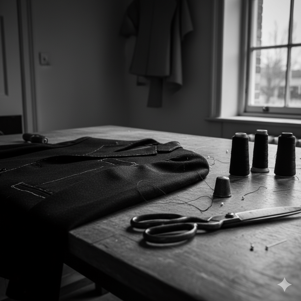
Close-up of a tailor’s worktable lit by soft natural light, showing thread spools, scissors, and a half-finished jacket with a visible imperfect seam — an image symbolising human craftsmanship and intentional imperfection in contrast to algorithmic precision.

British luxury has long understood this. Our best exports – Savile Row, Bentley Mulliner, McQueen, Hockney, Grayson Perry – thrive on that narrow line between discipline and disobedience. Their genius isn’t efficiency but editing: knowing when to break symmetry, when to leave the imperfect seam that proves a hand was there. The imperfect seam is a brand’s deliberate investment in unscalable production – the final, physical proof of value when all scalable processes have been commoditised. Curation, as I’ve argued before, isn’t collection. It’s the art of choosing what not to automate.

The challenge for brands now is to build value not through correlation but through judgement. To shift from efficiency to experience, from prediction to anti-prediction. Their next digital frontier isn’t better personalisation; it’s deliberate unpredictability, the algorithm that refuses to close the loop. Designing such friction isn’t romantic contrarianism; it’s the only sustainable strategy for generating new forms of scarcity, and with them, price elasticity.

Because in an economy obsessed with knowing what comes next, the rarest thing a brand can offer is the pleasure of not knowing, of being surprised, seen, and momentarily off-script. That’s the new exclusivity. That’s predictive luxury, undone.

Acknowledgements: This piece was partly inspired by Antonia Hock’s recent post on invisibility and the next era of ultra-luxury.

AI: This piece was refined with AI, for the image prompt, tags, excerpt, and a little sub-editing. The ideas, references, and rhythm are mine. You can still see my hand.

Tagged , , , , , , , , , , , , , , , , , , ,

You’ve Booked the Flight. Now Feed the Cat.

Or, What a Ryanair journey map taught me about real UX.

There’s a type of interface that shows up on Dribbble every few months: flight check-ins, boarding passes, baggage-tracking dashboards. Always slick. Always serene. The UI equivalent of cucumber water.

Most of them start at Choose your seat and end at Enjoy your flight. Which is tidy. But also nonsense.

A few years ago, I worked on a project for Ryanair. I drew out a journey map (with pens, natch), not the polished, stakeholder-pleasing kind, but something closer to the real emotional terrain of travel. One that began well before the confirmation screen. One that started, in fact, with the cat.

Because booking a flight isn’t a clean beginning. By the time anyone taps “Book now,” they’ve already trawled five sites, tried to align half-term dates with the one cousin who replies to group chats, checked weather reports, and googled “Do I need a visa for Croatia?” even though they’re flying to Naples.

Life admin, not travel ambition, is what usually kicks things off. That’s where the journey begins.

The diagram traced everything from that fraught pre-booking stretch through to the post-trip hangover, highlighting the emotional and logistical clutter that most airline UX avoids. Not because it isn’t there, but because it’s messy. And mess doesn’t fit neatly into a product roadmap.

There’s the bit after you book, when nothing much happens, except everything might. The vague unease when no one’s confirmed your seats. The passive-aggressive alert that “something has changed” in your itinerary, but you’re left to figure out what. The nervous rechecking of emails. The slow panic over cabin bag dimensions.

Then comes the day itself. A spike in interaction. The printer runs out of ink. You’re stood at Departures at 6:30am trying to download Peppa Pig episodes with 4% battery and no signal. Your toddler’s hungry. Your partner’s tense. And you’re still wondering if you packed the Calpol.

And yet… this is the brand moment. Not the glossy UI, not the neat API integration. Just this: the knot in your stomach, the uncharged phone, the boarding pass you can’t pull up without a connection.

The map tried to capture that. Not to romanticise it, but to acknowledge it.

Even on the return leg, the friction isn’t over. Passport queues. Lost luggage. The existential despair of a train replacement service. You get home, open a week’s worth of mail, find a parking fine, trip over a stray shoe from the hasty departure packing, and realise you didn’t leave anything for the cat-sitter.

Most journey maps stop at wheels-up. Ours didn’t. Because experience doesn’t follow a clean arc. It loops, it stutters, it sags in the middle. Thoughtful UX understands that.

A tired parent, dressed in a dark winter coat with a fur-lined hood, stands in a dimly lit Swedish airport baggage claim area late at night. They are looking down at their phone, which shows a 4% battery icon. To their left, a child sleeps soundly in a dark grey stroller. A large, dark suitcase tilts precariously next to the parent, appearing as though it might fall. In the background, an empty luggage carousel stretches out, with a few other suitcases scattered on it. Further back, blurred figures of other travelers are visible, and the warm glow of a vending machine can be seen on the far left. The overall atmosphere is one of exhaustion and quiet resignation.

Of course, Ryanair won’t build an app that books your pet-sitter or packs plug adapters. But this kind of messy map reveals where the brand can quietly show up—not with a feature, but with timing, tone, and the rare dignity of being understood.

Maybe that’s a 6-sheet in the departure lounge that says “Still cheaper than therapy.” Maybe it’s an email that clears, not clouds. Maybe it’s an in-seat comm that drops the marketing voice for once and just says: “Made it. Welcome back.”

Even for Ryanair, in fact especially for Ryanair, those moments can build memory, trust, and repeat business. Because no one remembers the boarding pass. They remember how they felt when the wheels touched down, the keys were missing, and the cat looked at them with contempt.

You’re not designing for delight. You’re designing for 4% battery, no signal, and a queue that won’t move. That’s where memory lives. And maybe loyalty too.

AI disclosure: This piece was written with the assistance of AI, used strictly as an editorial and thinking partner. All ideas, edits, and final phrasing are mine. ALT text and tagging were also generated with AI support.

Tagged , , , , , , , , , , , , , , , , , , ,

The Art of Owning Less: A Manifesto for a Simpler Life

“A photo-realistic, wide-angle shot of a minimalist, industrial-style room. At its centre stands a mid-century wooden table holding a vintage shoebox of old photographs and a neatly folded wool jumper. Soft sunlight streams diagonally through a tall warehouse-style window, casting warm light across the bare concrete floor. A single linen armchair sits off-centre, turned away, suggesting recent human presence. The scene is calm, curated, and quietly reflective.

We are drowning in stuff. Not because we need it, or even want it, but because we’re conditioned to accept that accumulation equals progress. The shelf groaning under unread books. The kitchen drawers overflowing with gadgets of single, niche utility. The wardrobe packed with ‘just in case’ items for situations that will never arise. We are not only possessed by our possessions, we’re buried under them.

Minimalism, at its best, is not about an aesthetic. It is not an Instagram-perfect arrangement of neutral-toned objects, nor the breathless fervour of bin-bagging everything you own because an influencer told you to. It is, simply, about knowing what you have and choosing to have less of it.

The Great Clothing Cull

I have watched every episode of Sort Your Life Out. Stacey Solomon and Dilly are the nation’s best mates, empathetic therapists disguised as decluttering gurus. They don’t arrive, Kondo-like, with mystical pronouncements about joy. Instead, they open up a warehouse, making you confront your past in a clinically lit aircraft hangar, and then gently shame you into ditching 99 odd socks, 2,000 greetings cards, and a spoon collection that could fill the drawers at Blenheim Palace.

It is the perfect decluttering show because it understands the British psyche. Where American organisation porn offers up pristine linen-clad perfection (hello Duchess Sussex), SYLI makes people sort their stuff in hoodies and leggings, exhausted and occasionally tearful, before finally seeing it all artfully categorised in a set of MDF storage solutions. But the key is this: it works. When Stacey’s crew is on your side, urging you to let go, you listen. She is not just helping people tidy up, she is their therapist, helping them face their own histories, attachments, and deeply ingrained anxieties about waste, memory, and identity.

I have recently paid someone (not Stacey) to come and help me sift through the detritus of my past: the things my parents couldn’t bring themselves to throw out when they cleared their loft, the remnants of a flat fire where possessions had already been forcibly edited down to a fragile minimum. And yet, still, there is more. So much more. Three house moves later, I’ve used each relocation as an excuse to cut back even further, paring things down to the essentials. But I needed this lady’s detachment from all that past, a task none of my family could have done with the necessary emotional distance required.

The wardrobe, a microcosm of the wider problem, is a particularly cruel landscape of regret. The clobber that fit a different physical version of me, a me that went out more. The memory-laden jumper you will never wear again but feel unable to part with. The shoes bought for a life you simply do not live. We keep these things not because they serve us, but because they whisper to our guilt, our shame, our aspirations. A curated wardrobe isn’t (just) about looking good, it’s about dressing with clarity, wearing only things that make you feel yourself, and being free from the burden of choice paralysis.

Let’s be frank: no one needs more than two tea towels, two sets of bed linen, and five pens. And yet, the natural order of modern life is to acquire. But if we follow the principles of good curation (the ruthless discernment of museum conservators) we begin to ask the right questions. Not ‘is this useful?’, because almost everything is potentially useful. But: Does this belong in my collection? Does it contribute meaningfully to my life? If I were choosing afresh, would I buy it again?

The Swedish Death Cleaning Perspective

There is a rather beautiful, if slightly morbid, Scandinavian tradition called döstädning – Swedish Death Cleaning. The principle is simple: do not leave your clutter for others to deal with when you are gone. Live lightly so as not to burden those left behind. It is a concept I think about often as the people around me age and I see what I’d be burdening my kids with. The weight of inheritance, not in money or property, but in boxes of ‘important’ things that, in reality, were just never thrown away.

Glenn Adamson, in How to Curate (Just About) Anything, argues that past the tidying stage, a more capacious process awaits when we curate. To curate is to care for, to actively maintain rather than merely accumulate. It’s a conscious approach to ownership that applies as much to possessions as it does to the books we choose to keep, the tools we use, the spaces we inhabit. The museum metaphor is useful: a curator doesn’t ask if an object is interesting in isolation but whether it adds something valuable to the collection as a whole. This is the mindset that makes for a lived-in, personalised home, rather than just a sterile, thoughtless minimalist, emptier one.

Melissa Norberg, in How to Have Less Stuff, touches on the psychology behind our attachment to things. She agrees that possessions often carry emotional weight, representing past selves, aspirations, or anxieties about the future. If you’ve ever held onto a stack of unread magazines (hello my pile of the stunning Road Rat), convinced that one day you’ll work through them, you know the feeling. But as Adamson reminds us, keeping something present in your awareness doesn’t mean keeping it physically, it means keeping it alive in your mental space.

The Digital Declutter: A Different Kind of Clutter

Of course, physical clutter is just one part of the problem. If my wardrobe has been whittled down to a sharp, functional selection, my Mac is the opposite: a sprawling archive of files, downloads, half-finished projects and forgotten PDFs, all strewn across the digital ether.

Here, though, the challenge isn’t one of tripping over stuff, which is why Stacey never gets involved, it’s the sheer complexity of filtering through it all and making the right judgments. Does it even matter, when storage is effectively infinite? Unlike a teetering stack of books or an overstuffed wardrobe, a bloated hard drive won’t physically intrude on my space. But the real problem in the digital world isn’t just what to delete, it’s what to retrieve, and how to retrieve it when I actually need it.

My Google inbox, for example, is a graveyard of correspondence stretching back over 20 years. And yet, every so often, a search dredges up an email that provides some vital context, a forgotten thread of a past conversation suddenly relevant again. Last week I called up the hotel I stayed at in Stockholm in 2016 for a friend of mine. The digital hoarder in me justifies keeping everything, because what if? But what if the problem isn’t too much data, but too little clarity? What if I’ve reached the point where I don’t even know what I have?

The real digital tidy-up isn’t about mass deletion, but smarter organisation. Tagging instead of mindless foldering. Search over structure. Curating a system where the past is accessible, but not overwhelming. After all, what use is owning less if I can’t actually find what matters? It goes without saying almost that AI and machine learning will be game-changing here.

Conclusion: The Art of Living With Less

This is why I now own fewer clothes than I ever have. It is why I keep only the books I truly covet. It is why my kitchen is free of pointless single-use utensils that promise efficiency but deliver only clutter. Living with less is a conscious act, not a sacrifice. It is an escape from the tyranny of choice, the stress of mess, and the dull headache of ownership.

Marie Kondo asked us if our things ‘spark joy’. I think a better question is: Does this deserve space in my life? And if the answer is no, we must learn to let it go.

Let us stop hoarding for the past, or stockpiling for an imagined future. Let us live in the space we have, unburdened. The art of owning less is, in the end, the art of living more.

AI disclosure: This piece was written by me, but I used AI to help refine the copy, generate the image, and nudge the tone into shape. Think of it as a sub-editor with better memory and no ego.

Tagged , , , , , , , , , , , , , , , , , , ,

Amazon’s UX: Why Customers Ignore the Chaos

Amazon’s interface is a mess. Everyone knows it, doesn’t matter if you’re in the industry or you just use it to buy lightbulbs, the odd book and some fancy Tupperware. It’s the digital equivalent of a hoarder’s house, clutter everywhere. A friend of mine once memorably described looking for something as like “rummaging through a warehouse with a torch”, but [she does it because] “I know the bloody thing I want is in there somewhere”. On any given part of the site there’s inexplicable stacks of unrelated items, and a sense that at any moment, something might fall on you. My particular hate are sponsored listings, intruding like pushy sales reps with their irrelevant nonsense while you’re on the way to buy the actual thing you searched for (although sometimes the actual thing turns out to be a not-quite-there copy from some random far-east factory). Genuine customer reviews also get buried under an avalanche of SEO-stuffed nonsense, and yet, dear reader… here I am, ordering 90% of what I buy from Amazon. And you do too.

However frustrating the experience, it isn’t bad enough to drive people away. Fast delivery, sheer product choice, and a checkout process so frictionless it should be flagged with Gamble Aware. All of this outweighs the UX sins.

So, Does UX Even Matter?

It is a question worth asking. If a platform’s core proposition is so compelling, with cheap prices, instant gratification and no meaningful alternative, does the user experience really determine success? Or does it just need to be functional enough?

The Amazon Conundrum

Armchair critics love to dissect Amazon’s UX. In the dark corners of the UGC web, Reddit threads are full of users raging against the chaotic interface. Tech journos lament the aggressive Prime pushing, the pay-to-win search results. On paper, it’s a usability horror show. But let’s be clear, Amazon isn’t neglecting UX. It employs entire teams of UX designers, researchers, and engineers who are constantly refining the experience. Not to make it more elegant, but to make it better at selling things. If adding another sponsored listing increases revenue, they’ll do it. In 2022 alone, Amazon made over $31 billion from its advertising business, largely driven by these placements, making it a core part of their revenue model (Vox). If customers still find something to buy despite the friction, then as far as Amazon is concerned, the system is working just fine. The difficulty we have as UXers is understanding and reconciling this. Because we see ‘Sponsored’ listings trump the actual best-result search listing we say “This is wrong, users hate this!” but somewhere deep in Amazon HQ is the data to say, “You know what, they actually don’t, and here’s some more $” (EcommerceFuel and others provide further context on how Amazon’s sponsored listings work and why they persist). The same logic applies to other blunt instruments like relentless pop-ups (deeply irritating but demonstrably effective at nudging hesitant users into making a decision) and those blinking, anxiety-inducing countdown timers all over that Instagram brand’s shop aren’t there by accident either.

When UX Takes a Back Seat

Of course, Amazon is hardly alone. Plenty of other sites with objectively terrible UX remain dominant because their value proposition is simply stronger than the frustration they cause:

  • Booking.com drowns you in pop-ups and ‘Only 1 left at this price!’ warnings. Yet its vast selection and competitive pricing make it impossible to ignore.
  • British Airways’ website looks and feels like it’s been trapped in 2009, but people still book flights because, they will always believe the brand stands for something British and the pilots are the best trained and most decent in the skies.
  • Vinted The latest upstart eCommerce brand is having a runaway success in the UK but this is absolutely down to the simplified sell-send logistics and payment process, and definitely not to the bloody awful filtering and product exploration UX (seven different ways to filter on Ralph Lauren sweaters anyone?).
  • GP surgery websites, National Rail, car park booking systems, there’s a vast ecosystem of poorly designed necessities that survive because users effectively have no choice or poorly rationalise their value/essentialism.

This phenomenon isn’t anecdotal or lost on UX thinkers. As David C. Wyld argues in The Endless Battle Against Bad UX, poor usability is pervasive in major companies, and fixing it isn’t always a top priority. Similarly, The World is Running on Bad UI (Michal Malewicz) notes how many essential services and platforms operate on clunky, outdated interfaces yet remain functionally irreplaceable. Their insights reinforce the central argument here: bad UX doesn’t necessarily mean bad business.

The Captive Audience Factor

The obvious point here is that there is a difference between platforms like Amazon, where the UX is frustrating but functional, and services where users are stuck with whatever’s available. The difference with Government portals, legacy corporate systems, anything remotely tied to infrastructure is that these things aren’t just designed badly; they are fundamentally unmotivated to improve.

It’s not even a matter of UX being ignored (again, plenty of these organisations are populated by skilled and well-meaning design folks), it’s often a mix of limited budgets, outdated tech stacks, bureaucracy (many hands), and the sheer pain and complexity of rebuilding something that’s been patched together over decades.

The same logic applies to countless internal systems in large organisations, where usability takes a backseat to bureaucratic inertia and legacy technology. Everyone grumbles about it, but change is slow, and innovation rarely prioritises the dull but essential parts of work life. Just as no one is investing to replace the office microwave that’s been there since the turn of the millennium, so we continue to suffer through whatever shitey interface we’re given.

The Reluctance to Overhaul

Could Amazon wholesale overhaul its UX if it wanted to? Technically, yes. But would it be worth it? Probably not. The site is a sprawling ecosystem of millions of products, channels and third-party sellers, advertising deals, and logistics chains. Trying to impose a sleek, minimalist interface would mean unpicking the very mechanics that drive sales at an enormous cost.

The same goes for other massive platforms. The bigger and more layered a system becomes, the harder (read more expensive) it is to rebuild from the ground up. This is exactly the scenario I described in The Local Maximum Problem, where businesses become trapped in cycles of micro-optimisation rather than taking bold steps toward meaningful UX improvements. Businesses, especially ones as enormous and entrenched as Amazon, often optimise for small, short-term gains instead of taking the risk of a complete overhaul. They’ve reached a peak where micro-adjustments keep the machine running, even if they don’t solve fundamental UX flaws. Redesigning from scratch is a leap into the unknown, and when the current setup is still printing money, who would take that risk? Maybe they update a search filter. Maybe they tweak the layout slightly. But the underlying experience remains a Frankenstein’s monster of competing priorities.

So, Does UX Matter?

Yes, but not in the way purists would like to believe. Good UX reduces friction, increases trust, and improves efficiency, but it doesn’t always dictate whether people use a platform. When the value proposition is strong enough, users will tolerate a lot.

The idealistic view is that platforms should improve out of respect for their users. But what do you think? Have you ever abandoned a platform because of its terrible UX, or do you find yourself sticking with frustrating experiences because the value proposition is just too strong? Perhaps if people keep clicking, why fix what isn’t broken?

Tagged , , , , , , , , , , , , ,