Tag Archives: experience design

You’ve Booked the Flight. Now Feed the Cat.

Or, What a Ryanair journey map taught me about real UX.

There’s a type of interface that shows up on Dribbble every few months: flight check-ins, boarding passes, baggage-tracking dashboards. Always slick. Always serene. The UI equivalent of cucumber water.

Most of them start at Choose your seat and end at Enjoy your flight. Which is tidy. But also nonsense.

A few years ago, I worked on a project for Ryanair. I drew out a journey map (with pens, natch), not the polished, stakeholder-pleasing kind, but something closer to the real emotional terrain of travel. One that began well before the confirmation screen. One that started, in fact, with the cat.

Because booking a flight isn’t a clean beginning. By the time anyone taps “Book now,” they’ve already trawled five sites, tried to align half-term dates with the one cousin who replies to group chats, checked weather reports, and googled “Do I need a visa for Croatia?” even though they’re flying to Naples.

Life admin, not travel ambition, is what usually kicks things off. That’s where the journey begins.

The diagram traced everything from that fraught pre-booking stretch through to the post-trip hangover, highlighting the emotional and logistical clutter that most airline UX avoids. Not because it isn’t there, but because it’s messy. And mess doesn’t fit neatly into a product roadmap.

There’s the bit after you book, when nothing much happens, except everything might. The vague unease when no one’s confirmed your seats. The passive-aggressive alert that “something has changed” in your itinerary, but you’re left to figure out what. The nervous rechecking of emails. The slow panic over cabin bag dimensions.

Then comes the day itself. A spike in interaction. The printer runs out of ink. You’re stood at Departures at 6:30am trying to download Peppa Pig episodes with 4% battery and no signal. Your toddler’s hungry. Your partner’s tense. And you’re still wondering if you packed the Calpol.

And yet… this is the brand moment. Not the glossy UI, not the neat API integration. Just this: the knot in your stomach, the uncharged phone, the boarding pass you can’t pull up without a connection.

The map tried to capture that. Not to romanticise it, but to acknowledge it.

Even on the return leg, the friction isn’t over. Passport queues. Lost luggage. The existential despair of a train replacement service. You get home, open a week’s worth of mail, find a parking fine, trip over a stray shoe from the hasty departure packing, and realise you didn’t leave anything for the cat-sitter.

Most journey maps stop at wheels-up. Ours didn’t. Because experience doesn’t follow a clean arc. It loops, it stutters, it sags in the middle. Thoughtful UX understands that.
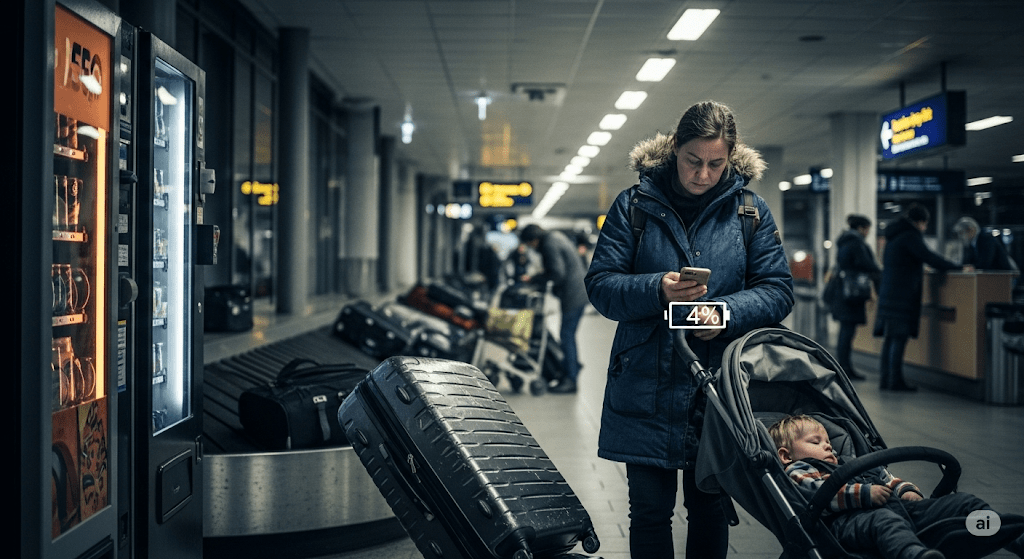
A tired parent, dressed in a dark winter coat with a fur-lined hood, stands in a dimly lit Swedish airport baggage claim area late at night. They are looking down at their phone, which shows a 4% battery icon. To their left, a child sleeps soundly in a dark grey stroller. A large, dark suitcase tilts precariously next to the parent, appearing as though it might fall. In the background, an empty luggage carousel stretches out, with a few other suitcases scattered on it. Further back, blurred figures of other travelers are visible, and the warm glow of a vending machine can be seen on the far left. The overall atmosphere is one of exhaustion and quiet resignation.

Of course, Ryanair won’t build an app that books your pet-sitter or packs plug adapters. But this kind of messy map reveals where the brand can quietly show up—not with a feature, but with timing, tone, and the rare dignity of being understood.

Maybe that’s a 6-sheet in the departure lounge that says “Still cheaper than therapy.” Maybe it’s an email that clears, not clouds. Maybe it’s an in-seat comm that drops the marketing voice for once and just says: “Made it. Welcome back.”

Even for Ryanair, in fact especially for Ryanair, those moments can build memory, trust, and repeat business. Because no one remembers the boarding pass. They remember how they felt when the wheels touched down, the keys were missing, and the cat looked at them with contempt.

You’re not designing for delight. You’re designing for 4% battery, no signal, and a queue that won’t move. That’s where memory lives. And maybe loyalty too.

AI disclosure: This piece was written with the assistance of AI, used strictly as an editorial and thinking partner. All ideas, edits, and final phrasing are mine. ALT text and tagging were also generated with AI support.
Tagged , , , , , , , , , , , , , , , , , , ,

Experience design is rocket science

Back in January I posted an assertion that customer service isn’t hard to do. Sometimes I leave people wondering why I get paid a nice salary to pontificate on this stuff as it’s all pretty easy and largely the articulation of common sense. It’s the same argument I used to hear when telling people about the ‘obvious’ results of academic psychology studies. It’s easy to start believing this stuff and even though certain designs and designers are lauded for their pursuit of the obvious, others are called out as snake oil salesmen. Krug‘s done a nice line in books that make it plain how simple this all is.

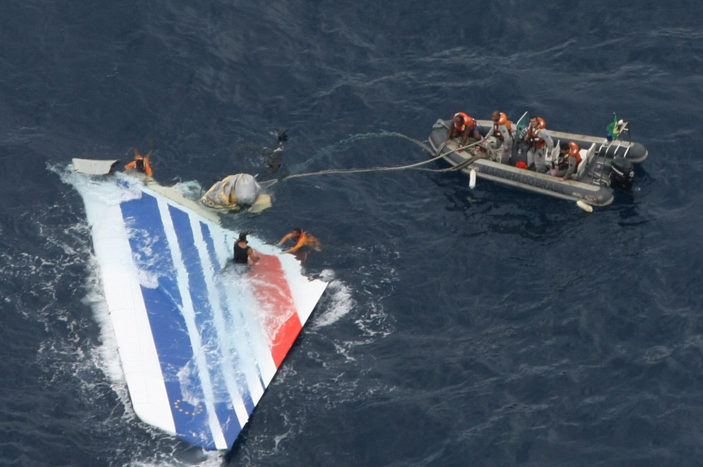
This week, however I read two important posts. The first being from Harry Brignull, Senior UX at Brighton’s Clearleft. In his posts (slides and notes) he explores the mistakes he and the team made on the way to delivering the successful app experience for The Week. It rang true to read of his frustrations as blindingly obvious interface and navigation elements were wilfully ignored by apparently stupid users. How I nodded along recalling my recent experience with Treejack when my simple and straightforward site architecture for a major British institution was exposed as confusing and muddling one to users in a 500-person remote test. The second post, far more important and sobering, was the analysis of the last moments of Air France flight  447 (Popular Mechanics and Telegraph articles). With the recover of the various voice & data recorders a clearer picture of what happened on the flight deck emerged but, crucially, why the pilots behaved the way they did in the face of apparently obvious warnings and information has proved both incredibly complex and rather contentious.

This is where cognitive psychologists, engineers and really incredibly talented people are earning their crust. Analysing, exploring, experimenting and evaluating the hugely complex elements at work when we interact with systems. Our irrationality and unpredictability are being explored in light hearted ways as we persuasionists are asked to design new campaigns and digital experiences but when these forces work against us in catastrophic ways it causes us to pause and remember our colleagues and peers’ role in solving these riddles.

I might not be designing an error-proofed flight deck any time soon but I think it’s about time I stopped underselling our value quite so much. The work we do is complicated and rewarding, whether it’s saving lives, producing a digital magazine or shifting some more products. One of the final persuaders for me to transition from psychology to HCI was James Reason’s book Human Error and my course under Dr. Phillip Quinlan at York where we explored a variety of complex scenarios leading to catastrophic human error. Understanding the part designers had to play in helping us protect us from ourselves was a strong motivator. The book still sits on my shelf and I would heartily recommend it to anyone in this business.

Tagged , , , , , , ,

Experience Planning

I decided to have a bit of a break from Twitter (and Facebook) and to revert to the long-copy pleasures of full-fat blogs. To this end I have downloaded Reeder for my iPhone, fired-up my Instapaper archives and am eschewing the free papers on the commute home with the intention to read more about the things I used to read about.

A corollary to this will hopefully be a refreshed attention to my own blog and to the joy of writing again. Though I’ve read too many blogs in the past that have a post that reads: “Am blogging again, hope to blog more, watch this space!” … and that’s the last or penultimate dusty entry. So, no promises, none at all.

Before I dismiss the microblog for the aforementioned hiatus I did just want to highlight a link I found via Anne Czerniak’s stream: David Friedman’s Twitter Thesaurus. The function of David’s thesaurus is to provide alternative, succinct variants of the words you would write if you didn’t have a 140 character limit. It seems like just the sort of thing that verbose writers like myself would like to see added as a contextual add-in to desktop and mobile twitter clients, a bit like bit.ly does for url shortening.

Experience Planning (aka. Experience Design)
My ‘new’ job title is Experience Lead. This is in part due to Dare‘s merger with MCBD and the fact that not only do I now have sight of digital work, I have an occasional role to play in designing and consulting in offline experiences and service design. Whilst we have an adorable presentation deck that covers-off what Experience Planning is (in the context of Dare), much like my This is IA tumblr, I find it helpful to describe what we do with examples of what it is to design experiences (and not just websites).

Virgin Atlantic
Ever noticed that the lighting spectrum on airplanes leaves you looking rather palid, almost green and nauseous? The chaps at Virgin America have and consequentially installed a scheme with a varying light spectrum that reflects the prevailing destination timezone and external light conditions – even the mood of the passengers at key ‘touchpoints’ in the journey, viz :  “[the lighting is] in a ‘theatrical mood’ prior to departure. When you walk down the jet bridge, you see the purple glow of the mood lighting, and it hopefully excites you…” “…people have an emotional and physiological response to lighting. So we decided to shift the colour of our cabin lights during the course of flight. They’re associated with time of day outside or ambient light outside. If you’re flying by day and heading in to dusk, it will reflect the light level outside. It’s less jarring” – Adam Wells, Virgin America [Source: Budget TravelTravel Innovators“]

Disney
As experiences go, Disney have mastered many at their attractions around the world but queueing provides a constant target for designers with a remit to increase enjoyment at any cost. Innovations here are increasingly rare but often involve psychology (see David Maister’s article from many years ago). In this article from the New York Times late last year, Brooks Barnes details some of the cute operational armoury the experts at Disney can deploy:

  • A nerve centre with wait-time monitoring in real-time.
  • The ability to ramp up ride throughput by, for example, deploying more boats on the Pirates of the Caribbean ride.
  • The authority to re-deploy their character talent to the queues so that Goofy can take kids’ minds off the interminable wait.
  • Induce significant crowd shifts by initiating a pop-up parade: “Move it! Shake It! Shift It!” which nudges people to the less populated area.
  • Attention to operational detail to open more kiosks or cash registers, hand out menus and so-on.

Such interventions pervade in a culture of exceptional customer experience. Leaving room for staff to innovate and react in this way ensures that, collectively, the impression and memories users are left with are both positive and lasting. And memories are what all decent experience designers are after.

I got asked recently to write a piece on what might be considered a good opportunity for marketeers tired of the existing promotion calendar. I took an opportunity to assert that I think the marketing communications industry has for too long focussed on the acquisition part of the courtship of consumers. I think we have a great opportunity to work harder to continue to persuade throughout the life cycle – to promote retention with some ‘wow experiences. Working with tools like memory, serendipity, ephemera, transience and humanised language and interaction. All of which are just fancy words which are my attempts to intellectualise the stuff that Disney (v. supra) do so intuitively.

Perhaps I haven’t wrapped this post up quite the way I would normally like to, but these, dear reader, are my thoughts in flux about how I currently think about Experience Planning and the directions which interest me.

Footnote: This post was composed a few weeks ago during a spell when I wasn’t on Facebook or posting regularly on Twitter. I have returned to both sites since then but am significantly less active. I hope.


Tagged , , , , , ,