When I was around 15, I’d get into trouble for calling a girl I was ‘seeing’ after 9pm on the house phone. I remember the jeopardy when her dad answered. It wasn’t just awkward, it felt catastrophic in that very teenage sense. There was no texting, no soft-launching your feelings via Reels. If you wanted to reach someone, you reached their entire household. Privacy was negotiated in real time, and a cordless phone allowing you to slink off to a private corner was borderline futuristic.
I mention this not to romanticise a pre-digital age but to mark a boundary: I don’t truly understand what it’s like to grow up now. Not really.
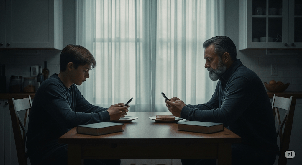
We’ve been told, often with good reason, that today’s teenagers are in trouble. Jonathan Haidt calls them the “anxious generation”, a cohort rewired by phones and social media. Since around 2012, adolescent mental health (especially among girls) has deteriorated alarmingly. Haidt blames the smartphone: a device that didn’t just enter childhood but, frankly, annexed it. The evidence is worrying, declines in sleep, attention, face-to-face connection. An uptick in self-harm, anxiety, emotional exhaustion. The argument isn’t hysterical. It lands.
But Dean Burnett suggests we’ve misdiagnosed the patient. The panic, he argues, isn’t just in the teens, it’s in us. The parents, the teachers, the adults nervously refreshing headlines while peeking at their own screen time stats. According to Burnett, much of this alarm stems from a mix of generational disorientation (a kind of collective unease that what we grew up with is no longer relevant), recurring moral panic, and good old-fashioned ignorance. We didn’t grow up with these tools, so we assume they’re harmful. We project. We catastrophise. We fear what we don’t fluently use.
The result is a pervasive sense of being at a loss. Some parents clamp down, banning apps, enforcing rigid rules on screen-time that feel increasingly arbitrary. Others detach, paralysed by the sheer bloody complexity of it all. But the most common response that I pick up from parents around me is probably the most human: low-level dread wrapped in middle-class guilt. We don’t really understand what our kids are doing, but we feel complicit anyway.
And then, just as we start to piece together a measured response, “Right! phone-free supper time!”, delayed access, schools running digital literacy workshops, the next threat pops up. Welcome to Whack-a-Mole Parenting. Just as the cultural tide begins to turn on one device, another rises, this time more subtle, more embedded, more seductive.
A recent Substack essay by Cal Newport took this from another angle. Reflecting on Ezra Klein’s critique of The Anxious Generation debate, he argued that we’ve become so beholden to statistical validation that we’ve lost touch with our own moral instinct. That rings uncomfortably true. We don’t just hesitate to act, we hesitate to know. When it comes to phones and parenting, our sense of what’s right is so often deferred, diluted, or apologised for.
Take me, for example. I ask ChatGPT more (personal) questions, now than I ever asked Google. Some are practical: how to structure an email, what to cook with these leftovers, when should I plant out these seeds. But others are… not. I’ve caught myself consulting it about health worries, internal dilemmas, parenting doubts, things I wouldn’t bring up at dinner, or even necessarily with my family, my friends. Because it remembers. Because it adapts. Because it flatters you by bending to your will.
And this is me: a reasonably grounded adult with (I hope) a steady compass and a mild allergy to digital hysteria. Yet even I find it maddeningly addictive. Not the technology itself, but the relation. The illusion of being known, helped, mirrored. I can only imagine how powerful this is for a 14-year-old who isn’t just seeking answers but identity.
So the question isn’t whether smartphones are making kids anxious. They are, in some ways. But the deeper story is that we’re all overwhelmed by the sheer pace of paradigm shifts. We can’t metabolise one tech wave before the next hits us in the face.
What Would Good Design Do?
This is where design comes in. Not as damage limitation, but hopefully as orientation. The best design doesn’t just solve problems. It asks better questions. Like: what rhythms support attention? What thresholds help people feel held, not hijacked? How can digital relationships exist without replacing the real ones?
The design problem is not abstract. It’s visible everywhere. Think of Snapstreaks – a design mechanism that rewards compulsive interaction with digital trophies. Or TikTok’s For You page – a personalised feed of videos that TikTok’s algorithm thinks you’ll be interested in, which notoriously appears to learn vulnerability faster than it learns taste. These aren’t neutral tools. They’re attention economies wired for compulsion, not care. If you’re a parent watching this unfold, it’s not just confusing, it’s existential.
Anna Dahlström, a UX designer and storyteller I trust deeply, put it like this: “We need to design this—not as a roadmap, but as the future we want our kids and their kids to live in.”
A brief aside here: Earlier this year, OpenAI’s Sam Altman and LoveFrom’s Jony Ive announced a collaboration to create a physical device for the “AI age.” They talked about daily rhythms, calm interfaces, emotional connection. And while their vision sounds noble, it also confirms the underlying anxiety: that our tools are no longer just functional, they’re emotional infrastructure. If anything, their announcement makes this conversation more urgent. Because the question isn’t whether the tech will be beautifully built. It’s whether it will reflect what matters.
That means not just critiquing the addictiveness of AI companions, but imagining something better. Less extractive. More human. Here’s what that might look like (after an hour of making notes this morning):
- Design for pause, not push. Platforms should default to stillness, not stimulation. Kill the endless scroll. e.g. “You’ve seen it all, for now” or opening to a prompt rather than a firehose of dopamine content, or making ‘like’ less of a tap and more of a hold, restricted to just a few per day. Default to a quiet mode after 20 mins. Ask a user “why are you sharing this?”
- Design for self-awareness. Don’t just track engagement. Track how users feel when they leave. Make reflection part of the loop. e.g. “How did that make you feel?”, reporting this along with screen time weekly reports. An in-app emotion metric that algorithmically analyses your interaction cadence, scroll patterns, message tone.
- Design for companionship, not substitution. If AI is going to listen, let it redirect. Let it nudge us toward real conversations, not just simulated ones. e.g. “This sounds important. Have you considered talk to [name]?” or helping the user plan social activities, remember dates or conversation starters.
The tools aren’t going away. But the way we design them can still reflect care, pace, and conscience. That’s not a nostalgic idea, it’s a classic UX problem and one worth solving.
Coda
When I was a teenager, the phone was something you had to ask permission to use. Now, it’s something we all struggle to put down. Maybe the answer isn’t more rules or fewer apps. Maybe it’s knowing what to do with ourselves in the quiet space that’s left when the screen goes dark.
That’s where design still has a role to play, instead of locking us out, it guides us home.
AI disclaimer: This piece was written by me, but I used ChatGPT to sub-edit, surface research, help shape the structure, and keep the tone aligned with my voice. The experiences, perspectives, and final edits are mine. AI also produced the tag list, excerpts and image that accompanies it.
