Or, What a Ryanair journey map taught me about real UX.
There’s a type of interface that shows up on Dribbble every few months: flight check-ins, boarding passes, baggage-tracking dashboards. Always slick. Always serene. The UI equivalent of cucumber water.
Most of them start at Choose your seat and end at Enjoy your flight. Which is tidy. But also nonsense.
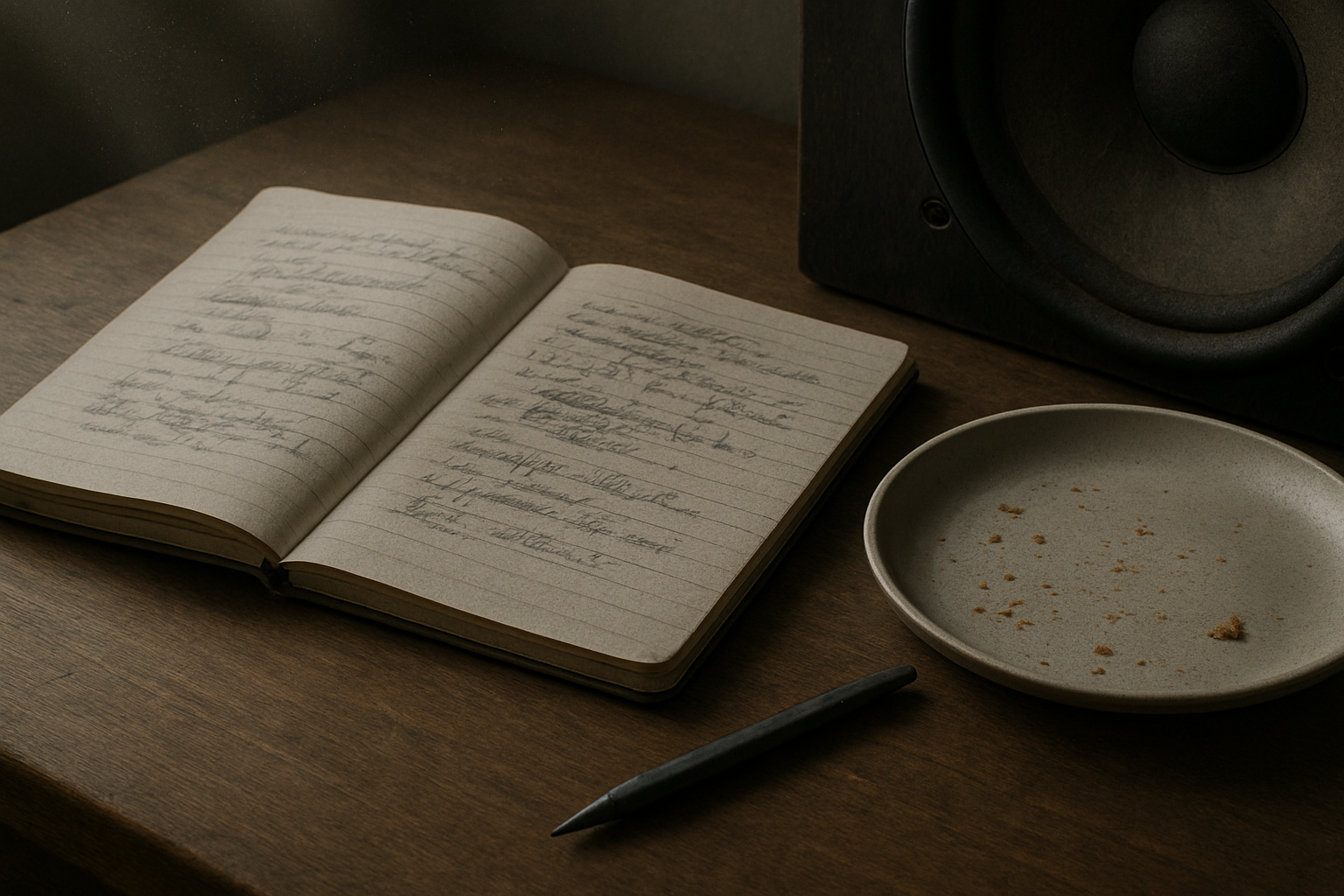
A few years ago, I worked on a project for Ryanair. I drew out a journey map (with pens, natch), not the polished, stakeholder-pleasing kind, but something closer to the real emotional terrain of travel. One that began well before the confirmation screen. One that started, in fact, with the cat.
Because booking a flight isn’t a clean beginning. By the time anyone taps “Book now,” they’ve already trawled five sites, tried to align half-term dates with the one cousin who replies to group chats, checked weather reports, and googled “Do I need a visa for Croatia?” even though they’re flying to Naples.
Life admin, not travel ambition, is what usually kicks things off. That’s where the journey begins.
The diagram traced everything from that fraught pre-booking stretch through to the post-trip hangover, highlighting the emotional and logistical clutter that most airline UX avoids. Not because it isn’t there, but because it’s messy. And mess doesn’t fit neatly into a product roadmap.
There’s the bit after you book, when nothing much happens, except everything might. The vague unease when no one’s confirmed your seats. The passive-aggressive alert that “something has changed” in your itinerary, but you’re left to figure out what. The nervous rechecking of emails. The slow panic over cabin bag dimensions.
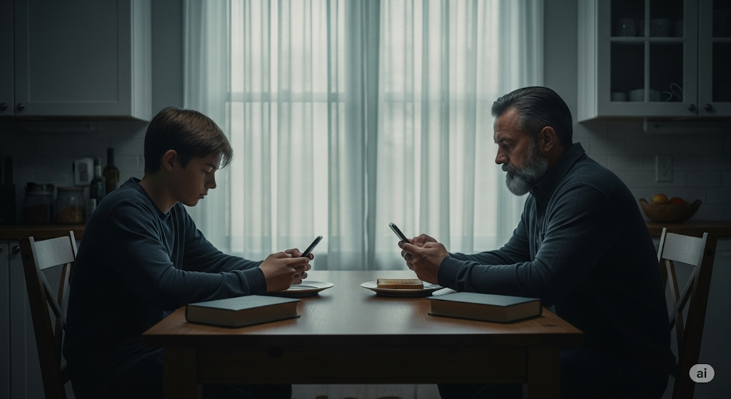
Then comes the day itself. A spike in interaction. The printer runs out of ink. You’re stood at Departures at 6:30am trying to download Peppa Pig episodes with 4% battery and no signal. Your toddler’s hungry. Your partner’s tense. And you’re still wondering if you packed the Calpol.
And yet… this is the brand moment. Not the glossy UI, not the neat API integration. Just this: the knot in your stomach, the uncharged phone, the boarding pass you can’t pull up without a connection.
The map tried to capture that. Not to romanticise it, but to acknowledge it.
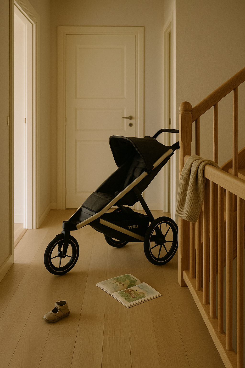
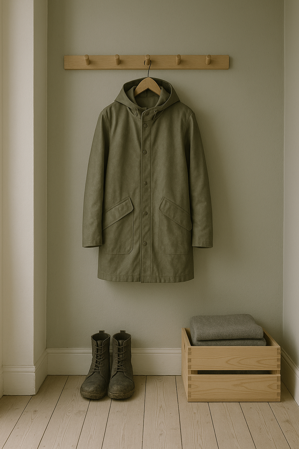
Even on the return leg, the friction isn’t over. Passport queues. Lost luggage. The existential despair of a train replacement service. You get home, open a week’s worth of mail, find a parking fine, trip over a stray shoe from the hasty departure packing, and realise you didn’t leave anything for the cat-sitter.
Most journey maps stop at wheels-up. Ours didn’t. Because experience doesn’t follow a clean arc. It loops, it stutters, it sags in the middle. Thoughtful UX understands that.

Of course, Ryanair won’t build an app that books your pet-sitter or packs plug adapters. But this kind of messy map reveals where the brand can quietly show up—not with a feature, but with timing, tone, and the rare dignity of being understood.
Maybe that’s a 6-sheet in the departure lounge that says “Still cheaper than therapy.” Maybe it’s an email that clears, not clouds. Maybe it’s an in-seat comm that drops the marketing voice for once and just says: “Made it. Welcome back.”
Even for Ryanair, in fact especially for Ryanair, those moments can build memory, trust, and repeat business. Because no one remembers the boarding pass. They remember how they felt when the wheels touched down, the keys were missing, and the cat looked at them with contempt.
You’re not designing for delight. You’re designing for 4% battery, no signal, and a queue that won’t move. That’s where memory lives. And maybe loyalty too.
AI disclosure: This piece was written with the assistance of AI, used strictly as an editorial and thinking partner. All ideas, edits, and final phrasing are mine. ALT text and tagging were also generated with AI support.