Tag Archives: UX design

The Childhood We Never Knew

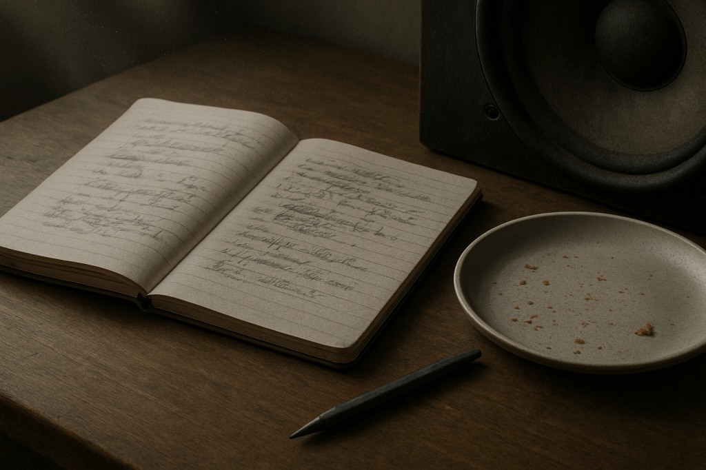
A teenage girl with long light brown hair sits alone on a wooden bench in a natural garden at dusk, holding a pen over an open notebook on her lap, with her phone placed screen-down beside her. The scene is softly lit with warm, natural light, surrounded by tall grass and unmanicured foliage.

After writing about smartphones, parenting, and the slow erosion of moral instinct, I stumbled across a piece that wouldn’t let me go.

Freya India’s A Time We Never Knew is, on the face of it, a lament. But not for something tangible, not for a policy or platform or even a particular childhood. It’s a mourning for an idea of childhood. One shaped by distance, longing, and a deep sense that something quietly essential has been lost.

She writes from within the generation often described as digital natives, the ones we, as parents, designers, and the more pretentious cultural observers, keep diagnosing. But what she offers isn’t data. It’s affect. Grief. And reading it, you realise: this isn’t nostalgia. It’s anemoia (a term for the ache we feel for something we never really had). This is a pre-digital adolescence glimpsed only through fiction, photo albums, or the vague warmth of a life not filtered through lenses and likes.

Freya’s piece is moving because it’s not arguing a case. It’s inhabiting one. She shows you what it feels like to have grown up inside a version of it that always felt slightly off.

“We never knew friendship before it became keeping up a Snapstreak or using each other like props to look popular on Instagram.”

You can’t optimise your way out of that. No digital literacy workshop or screen-time-tracking feature will undo the sense of being used by your own image, or complicit in someone else’s performance of belonging. That’s not a UX flaw, it’s existential distortion.

I’ve argued (and still believe) that design can play its part and restore rhythm, attention, and emotional fidelity. But Freya’s piece sharpened that for me. It’s not enough to critique what’s broken as so many do with no alternative, we need to take seriously the kind of childhood that’s been lost, and ask: What now?

Not conceptually. Practically. What now?

Here are five places to start; if not to fix things, then to stop making them worse:

1. Start with the household, not the handset

Stop asking what the app is doing to your kid. Ask what your own habits are modelling. Shared mealtimes won’t solve everything, but they set a tempo. Phone baskets, landlines, analogue clocks, not as statements, but as defaults. Ordinary, visible, repeatable.

2. Make physical things accessible, not aspirational

Stationery shops now look like gift boutiques. That’s a design failure. Kids shouldn’t need £38 Moleskines and Bullet journals to feel entitled to write something down. Re-normalise pen and paper without a need for it to looked designed and perfect. Put it on the table. Make it disposable. Used, not treasured.

3. Build spaces for lingering, not passing through

If you’re designing environments, cafes, libraries, waiting rooms, even apps, make them boredom-compatible. Low-stimulus, soft-lit, acoustically calm. Places you can sit without being prompted, pitched to, or processed. Most teens have never known that feeling. In apps this means zero notifications, tapered onboarding, low information density. No autoplay, restful animation.

4. Reclaim awkwardness

Digital fluency has obliterated the slow burn of uncertainty. But life happens in those gaps. If you’re a teacher, don’t fill every silence. If you’re a parent, let the car journey be wordless, let them be bored. Awkwardness isn’t failure it’s part of growing up.

5. Don’t design mindfulness tools. Design fewer distractions

I’ve had enough with breathwork apps and dopamine dashboards. If your platform wants to support mental health, stop inventing new notifications. Introduce blank states. Dead-ends. Hard stops. Have a very high bar for introducing infinite scroll. If the user’s done, say so. Let them leave with #NOFOMO.

In the piece I wrote last month, I framed our dilemma as a kind of middle-class dread, knowing something’s wrong but unsure how to respond without sounding puritanical or panicked. Haidt warns us of the cost of inaction. Burnett warns us not to lose our heads. Freya reminds us what it feels like. And somewhere between their caution, grief, and scepticism, we need to act, not with slogans or screen-time charts, but with work that answers in the way I have above, modelling better rhythms, removing false urgency.

We don’t all need to log-off, we just need to show up offline too, be awkward and occasionally uninteresting.

AI disclaimer: This piece was written by me, but I used ChatGPT to sub-edit, surface research, help shape the structure, and keep the tone aligned with my voice. The experiences, perspectives, and final edits are mine. AI also produced the tag list, excerpts and image that accompanies it.
Tagged , , , , , , , ,

Why the Future of Driving Needs to Feel More Human

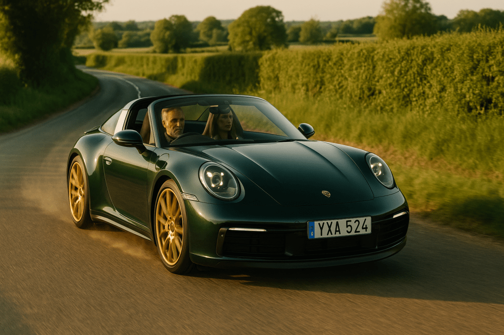
A deep metallic green Porsche 911 Targa with gold wheels drives through a sunlit, winding country road in late spring. The right-hand-drive car features a Swedish number plate. A grey-haired British man in his late 40s, wearing a dark jacket, is behind the wheel. A tall, blonde woman sits beside him. The road is dry with light dust rising from the tyres, and long shadows stretch across the tarmac. Mature hedgerows and soft green fields frame the scene in warm golden light.
Some couples go to B&Q. Others recalibrate their marriage on a B-road in June.

I recently got back from a couple of days away in Norfolk with a close friend who also loves his driving. We set out on a fantastic loop from Aylsham through Fakenham, Wells, and Cley – brilliant roads, good sightlines, measured effort, and our own playlists accompanying the sweat on the wheel and the red-hot calipers. It’s been seven years since we did something similar in Scotland on the North Coast 500, and while I’ve found a few roads round me in Surrey where I’ve had flashes of the same joy, doing it in perfect weather with a good friend is different. It’s memorable, visceral, and deeply satisfying.

Aside: The Horkey Kitchen at Bawdeswell is a worth stopping off point.

That trip reminded me what modern driving risks forgetting: rhythm, concentration, the way a great road stretches you just enough to feel vividly, physically present. A truth utterly ignored by the automotive press, which seems fixated on a frictionless future. Autonomy. Electrification. Over-the-air updates. The car, once a machine, is now a platform. A node on a smart grid. Another screen to poke and personalise. And if the future is to be believed, it’ll be a contactless glide from A to B – your vehicle knowing where you’re going, what mood you’re in, and curating the ambient playlist accordingly. Comforting, perhaps. But is that the future we really want?

Because here’s what happens when you flatten a journey into data points and strip the human out. You lose the sweat, the skill, the subtle joy of being in tune. What the current automotive vision tends to forget is this: flow beats frictionless. Every time.

Driving at its best is not about arrival. It’s about engagement. If you’ve ever taken the long way home just because the road was dry, the light was low and the playlist was perfect, you’ll know exactly what I mean.

Let’s be fair: 95% of driving is perfunctory. School runs. Trips to the tip. Visiting family. Airport drop-offs. Just get me there, and do it efficiently. That’s what satnavs are for, and they’re brilliant at it.

But just as we crave a real meal after a week of cobbled-together dinners, we also need room for the drives that feel like something. That remind us we’re not just being carried – we’re in it. That’s what this is about: reserving space for the exceptional.

Because flow isn’t just a productivity state. It’s the embodied feeling of rightness. An experience that draws on physical skill, real-time interpretation, being attuned to your environment. Strip that away, and something vanishes.

You can bolt as many sensors to the bumper as you like – flow isn’t something a car detects. It’s something a driver feels. But here’s the thing: technology doesn’t have to kill flow. It can co-create it.

The current HMI (Human-Machine Interface) paradigm presents a false binary. Either the driver is in control, or the system is. But there’s a third, more human path: co-piloting. Not Microsoft Clippy with a steering wheel, but a system attuned to how you want to feel on this drive. A route with rhythm. Camber. Flow. Roads that reward precision and tempo. Effort that meets intent.

When ease becomes the only design goal, something essential gets lost. And we’ve already seen what that looks like: In one eerily prescient experiment, researchers gave households a free chauffeur for 60 hours a week1 – as if driverless tech had already arrived. Public transport use plummeted. Total miles driven rose by 60%. Among retirees, it more than doubled. Why? Because friction disappeared. People sent cars to pick up friends, ran errands just because they could, and stopped weighing up whether a trip was worth it.

When mobility becomes passive, we don’t do less. We just do less meaningfully. Journeys blur. Movement becomes background noise. The vehicle ceases to be a site of agency or expression – it’s just another box we sit in while life happens elsewhere.

And that’s before we reckon with de-skilling. Driving draws on real-time judgement and physical awareness most of us rarely use elsewhere. Spatial reasoning. Risk calibration. Micro-adjustment. Automate that, and we don’t just lose control. We lose fluency.

Despite this, the appetite for engaged driving hasn’t gone – it’s just become more selective. The very existence of niche markets for classic cars, track days, and driving experiences proves it. That’s why designing for joy matters even more.

But this sits awkwardly alongside a cultural drift towards a one-size-fits-all mobility model – where driving is seen as a problem to solve, not a pleasure to preserve. It’s become unfashionable in some circles to even admit you enjoy it. As if to love driving is to reveal something suspect. But not all movement is equal. The same road can be a chore or a joy. It depends who’s driving, and why.

This shift in perception also affects how we measure success. The metrics used to justify infrastructure (usually based on time saved) miss the point. The real value lies in access gained, experiences unlocked, the long way round.

As behavioural economists have shown, effort often creates meaning. In a world of ‘frictionless’ experiences, friction can signal intention, depth, care.

Technology and craft, when designed with that richer journey in mind, can support and amplify, rather than replace. Like a great chef or a sound designer, it should highlight what matters and let the rest recede.

Imagine:

  • Edge AI that reads your rhythm.
  • Haptics that sharpen attention without nagging.
  • Context-aware routes that change with the light, and the sky.

This emphasis on the physical and the intentional becomes even more crucial because the more we strip away, the more we’ll crave moments that remind us we still exist – bodily, skilfully, viscerally.

Especially in a world where younger generations increasingly see driving as a chore, or opt out altogether, the ones who do drive will be those who want to. That makes the case for joy-built design even stronger.

Because let’s be honest: the real enemy of joy on the road isn’t speed limits or EV ranges or even other drivers. It’s waste. Wasted road. Wasted time. Wasted potential for a moment of synchronicity between human, machine, and landscape.

If the future of automotive is to feel like anything at all – if it’s to be more than a Netflix-enabled transportation pod – we need to stop designing for the eradication of friction, and start designing for the restoration of rhythm.

Not just arrival. But aliveness.

AI Disclosure: This piece was written with the assistance of AI, used as an editorial and thinking partner. All ideas, edits, and final phrasing are mine. Image creation was by AI, natch – ALT text included. Excerpt and tag lists were also optimised for best practice

  1. The study has its limitations of course. It took place in the US where driving is end-to-end whereas Europeans focus is on automation for the last-mile and the public transport is sufficiently better to expect more inertia in behaviour ↩︎

Tagged , , , , , , , , , , , , , , , , , , ,

The Pram in the Hallway: Why Distraction Isn’t the Enemy of UX Design

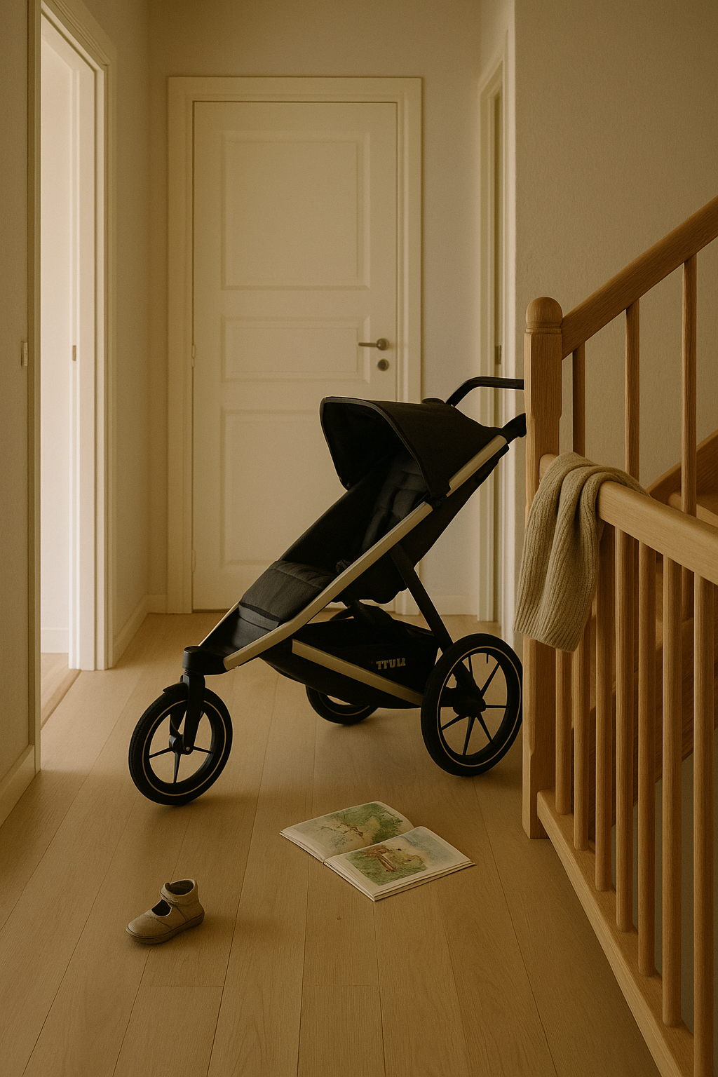
A softly lit hallway in a Scandinavian home with pale oak flooring and unvarnished wooden bannisters. A black Thule Urban Glide 2 buggy is positioned near the stairs, slightly in the way but undisturbed. On the floor lie a single child’s beige shoe and an open picture book. A wool jumper is draped casually over the bannister. The walls are off-white, and natural morning light fills the space. The scene feels unstyled and honest, capturing the quiet residue of family life.

This is the third in an accidental series of essays about design, constraint, and real life. The first explored ownership and editing, the second mapped those principles onto systems thinking. This one’s about the myth of the uninterrupted workspace, and what raising small humans has taught me about creative process, product integrity, and emotional design.

Last week I was catching up on some unplayed podcasts and heard Marina and Richard mention the Cyril Connolly line: “There is no more sombre enemy of good art than the pram in the hallway.” It’s a tidy little number but, like a lot of pithy mid-century takes, it doesn’t hold up brilliantly under daylight. So, as I continue to navigate our Thule buggy at the foot of the stairs, I thought I’d take a 2025 view.

It’s not just the casual misogyny (though yes, there’s that). It’s the deeper implication: that creativity requires retreat. That meaningful work, especially in design, happens at hushed desks; free of crumbs, notifications, or anyone yelling “Shoooooesies.”

This idea still carries weight in design and UX culture. You see it in reverent desk photos on Instagram and podcast guests earnestly waffling on about ‘flow state’, as though uninterrupted focus were the only path to quality. But what if that’s backwards? What if the mess of real life (parenting, caregiving, the emotional admin of being human) doesn’t dilute our creativity, but sharpens it?

Parenting compresses time like nothing else. Afternoons vanish. Tasks bleed into one another. The illusion of ‘ideal working conditions’ gets quietly shelved between snack prep and bedtime logistics. And yet, in those gaps, between drop-offs and Teams pings, on walks to see the cows, while fishing blueberries out of cardigans, some of the sharpest thinking gets done. Not in spite of distraction, but because of it.

Writers like Stephanie Merritt and Jude Rogers have spoken to this: how urgency and containment recalibrate creative priorities. You triage ideas fast. Half-baked ones don’t survive. The good ones clarify themselves under pressure.

In UX, we talk a lot about constraint as a catalyst. Creativity thrives on boundaries. But we rarely apply that logic to ourselves. Parenthood doesn’t just add constraints, it shifts your perspective. You’re no longer thinking about the user. You’re living with one. Or two. One tantrumming in the hallway, the other arguing about their Prep.

Design culture still clings to the myth of the monastic workspace: noise-cancelling headphones, immaculate desk setups, flow-state rituals. As though life must be suspended for work to begin. But most of the things we design are for people whose lives don’t pause. Parents in mid-tantrum. Carers juggling logistics. People buying insurance, ordering groceries, trying to rebook a dentist while coaxing a child (back) into trousers.

We design for frictionless experience, yet fetishise workflows that rely on silence. On having both hands free and the truth is: proximity to real life doesn’t dilute our design work. It deepens it.

You stop wasting time on polish and start noticing what actually matters. You develop an emotional radar: spotting friction, pre-empting dead ends, sensing what might quietly delight (or indeed quietly break) someone. And as I wrote recently, perfection has become a tell. In a world of generative smoothness, what we trust is the textured, the slightly improvised, the things made while someone was also making lunch.

Most importantly, you stop designing for personas. You start designing for real humans, chaotic, distracted, interrupted. The same kind of people we talked about when designing for enough. The kind who don’t need more features. They need clarity. Mercy. A digital space that behaves well under pressure.

Creativity and caregiving aren’t in conflict. In fact, it’s often caregiving that teaches us how to notice. To prioritise. To mean it.

This piece was edited with the help of AI, to shape rhythm, reference tone, and trim the fat. The excerpt, tagging and image were the result of carefully considered AI prompts. The words and arguments are mine. The tempo is deliberate. The polish is, therefore, human.

Tagged , , , , , , , , , , , , , ,

The Doughnut Is the Point

A pale Scandinavian hallway with a single raincoat hanging and boots below, lit by soft daylight. Calm and quietly intentional.

There’s a jacket hanging by the door in my house that I haven’t cleaned in two winters. A Stutterheim. Patina-stained cotton lining, scuffed hems, smells faintly of trains home. It’s not there for effect. It’s there because it does the job, and does it well. Keeps me dry, holds its own in a cold wind, and feels like continuity. Like something I’d pass on.

I think about that jacket sometimes when I work on digital products.

Because that jacket belongs in the doughnut. Not the jam-filled kind, the one drawn up by economist Kate Raworth. A model for living that rejects the old story of perpetual growth. (Aside: I came across Kate after listening to her talking with Wendell Berry on an old Start The Week. I’d gone on a recommendation from a friend to listen to Wendell Berry but it was Kate’s words which stood out).

In her diagram, the inner ring marks the essentials everyone should have access to: housing, education, dignity. The outer ring is the ecological ceiling: carbon, biodiversity, planetary boundaries. The goal is to stay in the middle. A safe and just space for humanity. Not too little. Not too much.

If that sounds like the Swedish concept of lagom, it is, except Raworth turns the cultural instinct into an economic framework. Lagom is what you feel in a table spread done right. The doughnut is how you design a city, or a system, to honour that logic at scale.

I like that the analogy might be in the Scandi larder: leftovers, carefully labelled. No waste, no lack. Just enough. The doughnut was already there, sitting quietly behind the knäckebröd.

And it maps cleanly onto UX.

The inner ring is what users genuinely need: clarity, trust, human-scale interaction. The outer ring is where the harm begins: deceptive patterns, compulsive loops, the kind of design that counts your seconds, not your needs. The good space, the space between, is where most digital products ought to live. Few do.

I’ve sat in rooms where product success was measured in taps and minutes. “More engagement,” someone would say, as the design team quietly recalibrated the interface to make it just sticky enough. I once worked on a platform where the proudest achievement was a spike in repeat logins. But when you zoomed out, those logins weren’t signs of confidence, they were symptoms of anxiety. People checking their accounts too often, not because the experience was smooth, but because the world wasn’t.

The real win would’ve been a design so clear, so calmly informative, so self-contained that users didn’t feel the need to check at all. But that wouldn’t have shown up on the dashboard. So we built noise instead. Goodhart’s Law anyone?

Doughnut thinking asks: what if we stopped designing for addiction and started designing for enough?

That principle runs through how I live. I’m not a minimalist, but I edit constantly. I favour things with integrity, materials that soften over time, ceramics that stack properly, garden tools that can be sharpened and passed on. When I write, I do so in iA Writer not because it’s clever, but because it clears the room. No distractions. Just text, gently weighted. A space with boundaries. A space that respects my focus. The writing comes better that way, less like performance, more like sorting the drawers in your head.

Same goes for the shelves at home. They hold only what earns its place. Books we’ve read. Things we actually use. Jackets that walk. Nothing there for the feed. Just our curated, persistent things.

Raworth talks about moving from extractive to regenerative economies. I think homes can be regenerative too, giving back emotionally, energetically, even ecologically, if you can. They absorb chaos. Offer rhythm. Ask less from you over time.

What does that actually look like?

There are just enough chairs for the family and the odd visitor. You can find a corkscrew without rummaging. There’s PIR lighting that flicks on as you walk from the landing to the bathroom at night. The house soaks up the mess. Fewer decisions when you’re tired. You can sit down without having to clear a pile of crap off the sofa. You can find your bloody keys.

It offers rhythm because your day moves more smoothly. And it asks less of you because it doesn’t make you work just to function.

My old boss used to moan that he couldn’t do a simple task at home because, to do that, he first had to find the tool. To find the tool, he had to get into the garage. He couldn’t get into the garage because the door was jammed. And on it went. That’s the opposite of regenerative. That’s a house that’s extracting energy from you just to stand still.

I wrote recently about the psychology of our stuff—the emotional residue it carries, the complexity it adds, the space it quietly swallows. The art of owning less isn’t about minimalism. It’s about clarity. About asking not ‘is this useful?’ but ‘is this mine to carry?’ That same lens applies here. Whether it’s a shelf, a digital feature, or a mental habit, we need to ask: is this giving something back? Or is it just squatting in the system?

And if that principle holds for homes, it can hold for digital spaces too. Interfaces, when well-designed, have the same potential, not just to serve, but to settle. To restore a little order. To give back time, attention, clarity. The question in both cases is not just what they contain – but how they behave when no one’s watching. Do they hold their shape under pressure? Or do they reveal they were only ever designed for the demo?

That’s what I try to bring into my UX work. Not scale for its own sake, but structure. Not novelty, but fidelity. In one recent project, we reduced a sprawling mass of order summary calculations by half. It had grown lopsided: multiple totals, stacked qualifiers, contradictory line logic. It looked thorough but made people pause. Double-check. Drop off.

We didn’t cut because someone asked us to. We cut because the excess wasn’t helping anyone. The business didn’t love it at first, there was concern we’d sacrificed transparency. But the users did. Completion held. Conversion held. No one missed the clutter.

You don’t need to call it Doughnut Economics. You don’t even need the diagram. Just ask: is this too much, or just enough? Is it serving someone, or keeping them circling?

I’m learning the same rules apply emotionally. The inner ring is what I need to function: rhythm, ritual, some quiet between the noisy pulses of family life. The outer ring is burnout, distraction, the endless need to ‘improve’. If I stay within those boundaries, wake early, behave deliberately, write when the coffee’s still hot – I do better work. I’m a steadier father. Less reactive. More intact.

We’ve built systems that confuse excess for success. But maybe the most humane thing we can do now is not build something. Or build something simpler. Or design the thing so well it doesn’t need us anymore.

Like the coat. You don’t notice it most days. But when the rain starts, you’re glad it’s there. And when you finally pass it on, it still fits someone else.

This piece was refined using AI. I used it to generate the image prompt, the tags, the excerpt, and to help sub-edit the copy while keeping my tone intact. The ideas, references, and rhythm are mine. The tools just cleared the room.

Tagged , , , , , , , , , , , , , ,

Striving for Imperfection: Why Flaws Make Things Feel Real

Perfection has become a tell. Too smooth, too balanced, too… AI. In a world of generative everything, we’ve reached a strange inflection point: human-centred design now demands imperfection, not as a flaw, but as a feature.

Because friction is fidelity. And too much polish starts to smell synthetic.

When Random Doesn’t Feel Random

Apple’s original shuffle algorithm was mathematically pure, each track had an equal chance of playing. But users complained. It didn’t feel random. Why? Because true randomness includes clumps, repetitions, patterns that seem suspect. A couple of U2 tracks in a row and suddenly the algorithm was “broken.”

So Apple redesigned it to be less random, so that it would seem more random. Illusion of imperfection, engineered.

It’s the same with LLMs. Outputs that are too balanced, too polished, ring false to human ears. We need to start prompt-engineering flaws into our copy, because believability demands mess.

Breath Marks and Broken Grammar

I have a playlist I use to test audio (car stereos, headphones, my hi-fi separates). Not for punch or clarity. For something else. For breath, for scratches, for the hiss of it all. Those tiny artefacts left in because they mattered. Because someone chose to keep them.

Same applies to writing. I’ve airbrushed things too, of course I have. Smoothed over copy that should have stung a little. A good sub-editor knows when to let a clause run ragged. When tidiness would kill the tone. And when grammar should yield to cadence. On LinkedIn, where polish often passes for credibility, that kind of mess is rare, although the smell of all that polish is punget.

The Pratfall Effect, Real Beauty

The Pratfall Effect teaches us that we trust people (and brands) more when they’re good and a little flawed. A genius who spills coffee. A leader who admits doubt. We warm to it.

Brands have learned this too. Dove’s Real Beauty Playbook (developed by Unilever) resonates because it shows unedited reality: pimples, pores, and all. At a recent session in London, Bianca Mack (WongDoody) reminded us of the campaign’s emotional resonance and shared new research on how people respond to AI-generated images and the labelling thereof.

But who decides when an image is ‘too perfect’? That wasn’t clear.

One crucial gap: that research didn’t appear to distinguish between image types. As I explored in my previous piece, “The Complexity and Nuance in Human-Centred Design: Beyond the ‘Average’ User” (Nov 2023), we don’t experience products or content generically, we interpret them through the lens of context, emotional expectations, and domain norms. We tolerate gloss on cars and watches. But we demand scars and breath in human faces.

Against the Plinth: Notes from JLR

When I led UX at AccentureSong for Jaguar Land Rover, we had this tension constantly. The art directors wanted visual purity: architecture that gleamed, cars posed like sculpture, not vehicles. But my team pushed back. We knew that real customers didn’t experience their Range Rover on a plinth. They experienced it on wet roads, in dim light, with children kicking the back seat. Our interfaces and imagery needed to feel lived in, not gallery-lit.

There was always a pull between the pristine and the plausible. Between the brand fantasy and the user reality. The best work came when we embraced the rough edge.

This picks up the argument I made in “The Complexity and Nuance in Human-Centred Design”, that designing for an average user strips out useful extremes. Here, it’s visual: perfection may be aesthetic, but it’s not trustworthy.

Prompt Engineering with Bruises

If you’re using LLMs for writing, design, or strategy, you’ll notice: the cleaner it reads, the less it lands. That might sound odd, but the flaws make it human.

Try this instead:

  • Prompt for contradiction: “Add a small, unresolved tension.”
  • Prompt for failure: “Include a misstep or wrong decision.”
  • Prompt for tone: “Make this sound slightly defensive.”

These aren’t weaknesses. They’re realism. They’re humanity.

You don’t say it’s real, you show it.

Which brings us back to humans. We now have a new role: not just creators, but curators of believability. If you let a model spit out 800 words of polished perfection and ship it unchecked, don’t be surprised if your readers scroll past. They know what machine-made sounds like.

In Bianca’s research, people wanted to know when something was AI-generated, but perhaps more importantly, we want to know someone’s checked it. Because a watermark is more than a label. It’s a sign of judgement.

Just as we caveat car ads, ‘closed course’, ‘professional driver’, we’re now being asked to signal artifice across digital domains. Not to apologise for it, but to own it.

It’s not easy. As an industry we’re conditioned to edit out blemishes, not protect them. Maybe we’ve all just got too good at pretending we know what authenticity looks like.

Closing

Perfection doesn’t reassure. It can repel. If you want something to feel real, it needs to breathe. To blink. To bruise. In a world of frictionless content, the rough edge is where trust begins.

This isn’t a stylistic preference. It’s a principle.

AI was used to sub-edit this piece according to my personal tone of voice guidelines, it was also used to generate the cover image, WordPress excerpt, tagging recommendations and tighten the LinkedIn tease for it.

Tagged , , , , , , , , , , , , , ,