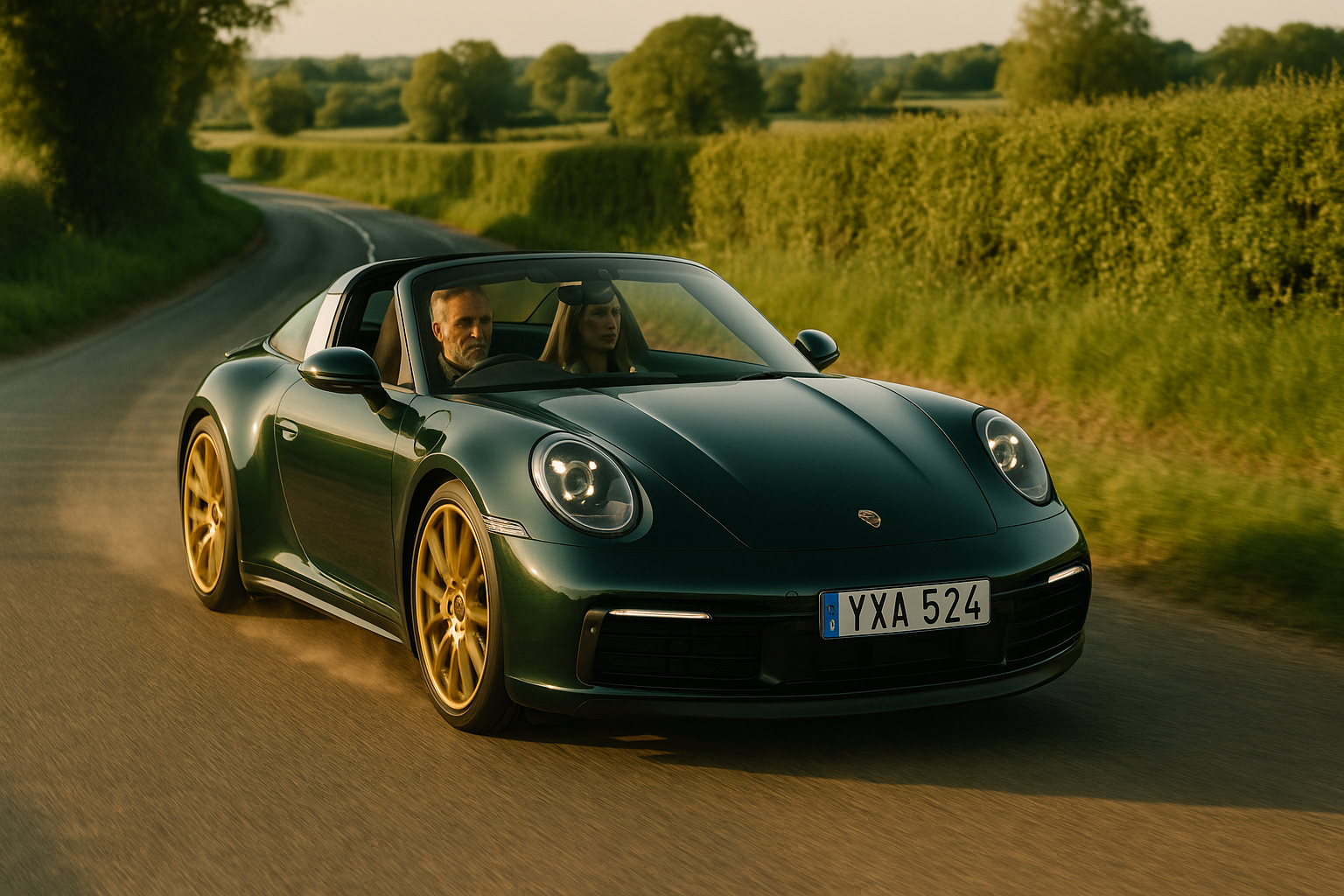
When everything is falling apart around you, but you’ve accepted that Bing is just… Bing.
It’s 5:47 AM. You’ve been wrenched from sleep by a tiny, sticky hand slapping your face. Your crime? Not waking up before the toddler. Bleary-eyed, you stumble downstairs, pop on Bing in a desperate bid for ten minutes of peace, and – congratulations! – you’ve made a terrible mistake.
Because Bing is not a break. It’s emotional guerrilla warfare disguised as children’s television. A relentless cycle of mild disasters, narrated by pure, undiluted toddler whinge. And parents, trapped in its slow, syrupy clutches, are left questioning their life choices.
At first, Bing seems like a sweet, low-stakes show about a rabbit child navigating the small traumas of everyday life. And that’s true, if by “navigating,” we mean “flailing headlong into catastrophe over incidents as minor as a dropped ice cream.”
Developmental psychologists call this emotional mirroring: a way for toddlers to see their own feelings validated on screen. Lovely in theory. In practice, it means you, the long-suffering adult, are subjected to twenty full minutes of Bing catastrophising about a balloon. Or yoghurt. Or the unbearable injustice of having to share.
Toddlers see themselves. Parents see a replay of their actual Tuesday morning. We don’t need Bing to remind us how excruciating it is when a small, irrational dictator loses their mind over the wrong-coloured spoon. We were there. We lived it. We cleaned up the spoon-related carnage. We need a break.
Enter Flop, Patron Saint of Impossible Patience
Then there’s Flop, Bing’s eternal, unnervingly calm carer. If you’ve ever thought, I should be more like Flop, congratulations. You are now burdened with a brand-new source of parental guilt.
Because Flop never sighs. Flop never raises his voice. Flop watches Bing make the same godforsaken mistake for the seventeenth time that week and responds only with gentle understanding.
If I reacted to my child smearing peanut butter into their hair with a serene “Ah, peanut butter. It’s no big thing,” I would be swiftly clubbed to death by my fellow parents.
Flop isn’t a role model. He’s a fantasy construct of saintly patience. And he is the reason so many of us sit, seething in the glow of CBeebies, knowing in our hearts that we will never achieve his level of Zen.
Meanwhile, Bing makes a mess. Bing refuses to listen. And yet, nothing happens. No time-outs. No firm words. No hint of consequence beyond a gentle discussion of feelings.
The Cult of Gentle Parenting
This is intentional. Bing is built on a constructivist approach to learning, where children explore mistakes safely, absorbing the lesson without fear of punishment.
Lovely, right?
Sure. Except in real life, when a toddler empties an entire box of cereal onto the floor while maintaining furious eye contact, they need more than a kind discussion about oats. They need to help clean it up. They need to understand that some mistakes have consequences beyond personal emotional growth.
At the very least, they need to stop f-ing smirking.
The Bing Paradox: Well-Made, Deeply Infuriating
To be fair, Bing isn’t some half-baked accident of children’s television. It’s an Emmy-winning, heavily researched, beautifully animated show, based on books by Ted Dewan and shaped by years of child psychology expertise.
Mikael Shields, the guy who helped bring us Teletubbies and Wallace & Gromit, says Bing is meant to teach emotional resilience. And model conflict resolution. For parents.
Which is all very admirable.
But here’s the problem. We don’t particularly want a lecture in emotional resilience when we’re one rabbit crisis away from pouring a large Waitrose red.
That’s what Bluey gets right. It respects both the toddler and the exhausted adult watching alongside them. It gives us light and shade. It offers moments of humour and self-awareness, winking at the reality of parenting while still making space for childhood wonder.
Bing, on the other hand, commits so fully to the toddler experience that it leaves parents stranded, silent, passive witnesses to yet another yoghurt-related meltdown. And while that’s certainly realistic, it’s not exactly soothing.
Just The One Episode, Yeah?
So no, parents aren’t wrong to loathe Bing. It’s not just the whining, or the flailing, or the slow, excruciating dissection of minor toddler crises.
It’s that Bing asks us to relive our own parenting nightmares without offering us an ounce of relief.
Another Bing-induced crisis and I’m invoicing CBeebies for psychological distress.
AI disclosure: This post used AI to help generate the image, select blog tags, craft the excerpt, and sub-edit the text to match my tone of voice.
There’s a jacket hanging by the door in my house that I haven’t cleaned in two winters. A Stutterheim. Patina-stained cotton lining, scuffed hems, smells faintly of trains home. It’s not there for effect. It’s there because it does the job, and does it well. Keeps me dry, holds its own in a cold wind, and feels like continuity. Like something I’d pass on.
I think about that jacket sometimes when I work on digital products.
Because that jacket belongs in the doughnut. Not the jam-filled kind, the one drawn up by economist Kate Raworth. A model for living that rejects the old story of perpetual growth. (Aside: I came across Kate after listening to her talking with Wendell Berry on an old Start The Week. I’d gone on a recommendation from a friend to listen to Wendell Berry but it was Kate’s words which stood out).
In her diagram, the inner ring marks the essentials everyone should have access to: housing, education, dignity. The outer ring is the ecological ceiling: carbon, biodiversity, planetary boundaries. The goal is to stay in the middle. A safe and just space for humanity. Not too little. Not too much.
If that sounds like the Swedish concept of lagom, it is, except Raworth turns the cultural instinct into an economic framework. Lagom is what you feel in a table spread done right. The doughnut is how you design a city, or a system, to honour that logic at scale.
I like that the analogy might be in the Scandi larder: leftovers, carefully labelled. No waste, no lack. Just enough. The doughnut was already there, sitting quietly behind the knäckebröd.
And it maps cleanly onto UX.
The inner ring is what users genuinely need: clarity, trust, human-scale interaction. The outer ring is where the harm begins: deceptive patterns, compulsive loops, the kind of design that counts your seconds, not your needs. The good space, the space between, is where most digital products ought to live. Few do.
I’ve sat in rooms where product success was measured in taps and minutes. “More engagement,” someone would say, as the design team quietly recalibrated the interface to make it just sticky enough. I once worked on a platform where the proudest achievement was a spike in repeat logins. But when you zoomed out, those logins weren’t signs of confidence, they were symptoms of anxiety. People checking their accounts too often, not because the experience was smooth, but because the world wasn’t.
The real win would’ve been a design so clear, so calmly informative, so self-contained that users didn’t feel the need to check at all. But that wouldn’t have shown up on the dashboard. So we built noise instead. Goodhart’s Law anyone?
Doughnut thinking asks: what if we stopped designing for addiction and started designing for enough?
That principle runs through how I live. I’m not a minimalist, but I edit constantly. I favour things with integrity, materials that soften over time, ceramics that stack properly, garden tools that can be sharpened and passed on. When I write, I do so in iA Writer not because it’s clever, but because it clears the room. No distractions. Just text, gently weighted. A space with boundaries. A space that respects my focus. The writing comes better that way, less like performance, more like sorting the drawers in your head.
Same goes for the shelves at home. They hold only what earns its place. Books we’ve read. Things we actually use. Jackets that walk. Nothing there for the feed. Just our curated, persistent things.
Raworth talks about moving from extractive to regenerative economies. I think homes can be regenerative too, giving back emotionally, energetically, even ecologically, if you can. They absorb chaos. Offer rhythm. Ask less from you over time.
What does that actually look like?
There are just enough chairs for the family and the odd visitor. You can find a corkscrew without rummaging. There’s PIR lighting that flicks on as you walk from the landing to the bathroom at night. The house soaks up the mess. Fewer decisions when you’re tired. You can sit down without having to clear a pile of crap off the sofa. You can find your bloody keys.
It offers rhythm because your day moves more smoothly. And it asks less of you because it doesn’t make you work just to function.
My old boss used to moan that he couldn’t do a simple task at home because, to do that, he first had to find the tool. To find the tool, he had to get into the garage. He couldn’t get into the garage because the door was jammed. And on it went. That’s the opposite of regenerative. That’s a house that’s extracting energy from you just to stand still.
I wrote recently about the psychology of our stuff—the emotional residue it carries, the complexity it adds, the space it quietly swallows. The art of owning lessisn’t about minimalism. It’s about clarity. About asking not ‘is this useful?’ but ‘is this mine to carry?’ That same lens applies here. Whether it’s a shelf, a digital feature, or a mental habit, we need to ask: is this giving something back? Or is it just squatting in the system?
And if that principle holds for homes, it can hold for digital spaces too. Interfaces, when well-designed, have the same potential, not just to serve, but to settle. To restore a little order. To give back time, attention, clarity. The question in both cases is not just what they contain – but how they behave when no one’s watching. Do they hold their shape under pressure? Or do they reveal they were only ever designed for the demo?
That’s what I try to bring into my UX work. Not scale for its own sake, but structure. Not novelty, but fidelity. In one recent project, we reduced a sprawling mass of order summary calculations by half. It had grown lopsided: multiple totals, stacked qualifiers, contradictory line logic. It looked thorough but made people pause. Double-check. Drop off.
We didn’t cut because someone asked us to. We cut because the excess wasn’t helping anyone. The business didn’t love it at first, there was concern we’d sacrificed transparency. But the users did. Completion held. Conversion held. No one missed the clutter.
You don’t need to call it Doughnut Economics. You don’t even need the diagram. Just ask: is this too much, or just enough? Is it serving someone, or keeping them circling?
I’m learning the same rules apply emotionally. The inner ring is what I need to function: rhythm, ritual, some quiet between the noisy pulses of family life. The outer ring is burnout, distraction, the endless need to ‘improve’. If I stay within those boundaries, wake early, behave deliberately, write when the coffee’s still hot – I do better work. I’m a steadier father. Less reactive. More intact.
We’ve built systems that confuse excess for success. But maybe the most humane thing we can do now is not build something. Or build something simpler. Or design the thing so well it doesn’t need us anymore.
Like the coat. You don’t notice it most days. But when the rain starts, you’re glad it’s there. And when you finally pass it on, it still fits someone else.
This piece was refined using AI. I used it to generate the image prompt, the tags, the excerpt, and to help sub-edit the copy while keeping my tone intact. The ideas, references, and rhythm are mine. The tools just cleared the room.
We are drowning in stuff. Not because we need it, or even want it, but because we’re conditioned to accept that accumulation equals progress. The shelf groaning under unread books. The kitchen drawers overflowing with gadgets of single, niche utility. The wardrobe packed with ‘just in case’ items for situations that will never arise. We are not only possessed by our possessions, we’re buried under them.
Minimalism, at its best, is not about an aesthetic. It is not an Instagram-perfect arrangement of neutral-toned objects, nor the breathless fervour of bin-bagging everything you own because an influencer told you to. It is, simply, about knowing what you have and choosing to have less of it.
The Great Clothing Cull
I have watched every episode of Sort Your Life Out. Stacey Solomon and Dilly are the nation’s best mates, empathetic therapists disguised as decluttering gurus. They don’t arrive, Kondo-like, with mystical pronouncements about joy. Instead, they open up a warehouse, making you confront your past in a clinically lit aircraft hangar, and then gently shame you into ditching 99 odd socks, 2,000 greetings cards, and a spoon collection that could fill the drawers at Blenheim Palace.
It is the perfect decluttering show because it understands the British psyche. Where American organisation porn offers up pristine linen-clad perfection (hello Duchess Sussex), SYLI makes people sort their stuff in hoodies and leggings, exhausted and occasionally tearful, before finally seeing it all artfully categorised in a set of MDF storage solutions. But the key is this: it works. When Stacey’s crew is on your side, urging you to let go, you listen. She is not just helping people tidy up, she is their therapist, helping them face their own histories, attachments, and deeply ingrained anxieties about waste, memory, and identity.
I have recently paid someone (not Stacey) to come and help me sift through the detritus of my past: the things my parents couldn’t bring themselves to throw out when they cleared their loft, the remnants of a flat fire where possessions had already been forcibly edited down to a fragile minimum. And yet, still, there is more. So much more. Three house moves later, I’ve used each relocation as an excuse to cut back even further, paring things down to the essentials. But I needed this lady’s detachment from all that past, a task none of my family could have done with the necessary emotional distance required.
The wardrobe, a microcosm of the wider problem, is a particularly cruel landscape of regret. The clobber that fit a different physical version of me, a me that went out more. The memory-laden jumper you will never wear again but feel unable to part with. The shoes bought for a life you simply do not live. We keep these things not because they serve us, but because they whisper to our guilt, our shame, our aspirations. A curated wardrobe isn’t (just) about looking good, it’s about dressing with clarity, wearing only things that make you feel yourself, and being free from the burden of choice paralysis.
Let’s be frank: no one needs more than two tea towels, two sets of bed linen, and five pens. And yet, the natural order of modern life is to acquire. But if we follow the principles of good curation (the ruthless discernment of museum conservators) we begin to ask the right questions. Not ‘is this useful?’, because almost everything is potentially useful. But: Does this belong in my collection? Does it contribute meaningfully to my life? If I were choosing afresh, would I buy it again?
The Swedish Death Cleaning Perspective
There is a rather beautiful, if slightly morbid, Scandinavian tradition called döstädning – Swedish Death Cleaning. The principle is simple: do not leave your clutter for others to deal with when you are gone. Live lightly so as not to burden those left behind. It is a concept I think about often as the people around me age and I see what I’d be burdening my kids with. The weight of inheritance, not in money or property, but in boxes of ‘important’ things that, in reality, were just never thrown away.
Glenn Adamson, in How to Curate (Just About) Anything, argues that past the tidying stage, a more capacious process awaits when we curate. To curate is to care for, to actively maintain rather than merely accumulate. It’s a conscious approach to ownership that applies as much to possessions as it does to the books we choose to keep, the tools we use, the spaces we inhabit. The museum metaphor is useful: a curator doesn’t ask if an object is interesting in isolation but whether it adds something valuable to the collection as a whole. This is the mindset that makes for a lived-in, personalised home, rather than just a sterile, thoughtless minimalist, emptier one.
Melissa Norberg, in How to Have Less Stuff, touches on the psychology behind our attachment to things. She agrees that possessions often carry emotional weight, representing past selves, aspirations, or anxieties about the future. If you’ve ever held onto a stack of unread magazines (hello my pile of the stunning Road Rat), convinced that one day you’ll work through them, you know the feeling. But as Adamson reminds us, keeping something present in your awareness doesn’t mean keeping it physically, it means keeping it alive in your mental space.
The Digital Declutter: A Different Kind of Clutter
Of course, physical clutter is just one part of the problem. If my wardrobe has been whittled down to a sharp, functional selection, my Mac is the opposite: a sprawling archive of files, downloads, half-finished projects and forgotten PDFs, all strewn across the digital ether.
Here, though, the challenge isn’t one of tripping over stuff, which is why Stacey never gets involved, it’s the sheer complexity of filtering through it all and making the right judgments. Does it even matter, when storage is effectively infinite? Unlike a teetering stack of books or an overstuffed wardrobe, a bloated hard drive won’t physically intrude on my space. But the real problem in the digital world isn’t just what to delete, it’s what to retrieve, and how to retrieve it when I actually need it.
My Google inbox, for example, is a graveyard of correspondence stretching back over 20 years. And yet, every so often, a search dredges up an email that provides some vital context, a forgotten thread of a past conversation suddenly relevant again. Last week I called up the hotel I stayed at in Stockholm in 2016 for a friend of mine. The digital hoarder in me justifies keeping everything, because what if? But what if the problem isn’t too much data, but too little clarity? What if I’ve reached the point where I don’t even know what I have?
The real digital tidy-up isn’t about mass deletion, but smarter organisation. Tagging instead of mindless foldering. Search over structure. Curating a system where the past is accessible, but not overwhelming. After all, what use is owning less if I can’t actually find what matters? It goes without saying almost that AI and machine learning will be game-changing here.
Conclusion: The Art of Living With Less
This is why I now own fewer clothes than I ever have. It is why I keep only the books I truly covet. It is why my kitchen is free of pointless single-use utensils that promise efficiency but deliver only clutter. Living with less is a conscious act, not a sacrifice. It is an escape from the tyranny of choice, the stress of mess, and the dull headache of ownership.
Marie Kondo asked us if our things ‘spark joy’. I think a better question is: Does this deserve space in my life? And if the answer is no, we must learn to let it go.
Let us stop hoarding for the past, or stockpiling for an imagined future. Let us live in the space we have, unburdened. The art of owning less is, in the end, the art of living more.
AI disclosure:This piece was written by me, but I used AI to help refine the copy, generate the image, and nudge the tone into shape. Think of it as a sub-editor with better memory and no ego.
I’ve been on a career break since November. For the first time in years, I’ve moved at the same speed as my own community. I’ve dropped off at Scouts and nursery, sat in waiting rooms for doctors and dentists, queued at the post office. I’ve watched the builders’ vans come and go, the Micras pull up with cleaners, the conversations in cafés and allotments and playgroups unfold in a hundred different tongues and tempos. And yes, I’ve got older. My parents are reflecting. And I’ve started to reflect too.
It starts with something you didn’t realise you’d miss. A sandwich from my old Fitzrovia café favourite, The Daley Bread, warm, under a fiver. The musty tang of a church hall where the windows rarely get opened. A pub that had been quietly open for 140 years, now covered in armoured window shutters and graffiti, but still with the chalkboard ‘What’s On’ by the front door, clinging on like it remembers something.
None of these moments ever asked to be remembered. That’s why they lasted.
When Queen Elizabeth II died, something snapped. Not just a reign, but a rhythm. Not of empire or deference, but of expectation, that the fabric of everyday life, the England of hedges and hymn books and heat-damaged laminated menus on brittle café tables, would hold. That continuity, once taken for granted, would continue.
Now, I’m not sure it has.
At the end of winter, I felt it most clearly in the waiting room of Teddington Memorial Hospital. A red-brick Edwardian building with high ceilings and cloudy glass, whose entrance still hums with a kind of institutional memory. But the waiting room felt… unfamiliar. Around me, a few families who might have stepped out of my childhood. And many more who hadn’t. Different languages, cadences, faiths, mannerisms. No hostility. Just a disconnection. Like arriving late to a meeting and realising everyone else has a different perspective.
And yet, a month or so later I sat in my old school hall at BGS surrounded by seventy mostly grey-haired Old Boys in suits and sang Auld Lang Syne, said grace, and reminisced about our headmaster’s pipe smoke, the tuck shop, and flinging cheese triangles at the walls. Despite our best intentions, I doubt this traditional dinner will be remotely the same in ten years’ time.
That isn’t about race, or even nationality. It’s about rhythm. What felt legible once, now feels opaque. I know that what felt predictable to me may have felt excluding or limited to others. But predictability, even flawed, creates cultural ballast.
I grew up in Wormshill and went to school in Rodmersham, a Kentish village with fewer than 40 pupils. The building was Victorian, the sort that smelt faintly of floor polish and instant, milky coffee. It had a scullery where knees would be patched and cabbage boiled. Thursday nights meant karate club in an old church in Sittingbourne; Sundays were Sunday school. Tuesdays were cubs at the village hall. At camps, we drank weak squash and sang around the fire with an eccentric leader belting out “Ging Gang Gooley”. We had birthday parties at the Beefeater. You got a balloon and a home-made cake and it was all unremarkable. It was meant to be. That was the point.
The pub on the high street smelled of cigarettes and damp bar towels when you walked past on a Saturday morning aged eight. It was still there with the same name when you went in at sixteen. Still there when you came back from uni at twenty-one.
Now, nothing sticks. Even that sandwich shop I loved in the 2010s, The Daley Bread in Fitzrovia, staffed by a lovely working-class London couple, is long gone. Probably turned into something pop-up and forgettable. I don’t so much miss the sandwich. I miss the assumption that it would be there tomorrow.
We’ve replaced endurance with churn. A coffee shop lasts two years if it’s lucky. Pubs close, reopen as “The Lemongrass Thai”, then vanish. Housing estates arrive with names that pretend something was saved, The Pines, Mill Way, The Courtyard. Everything designed to sound like memory without having any.
Some of the erasures feel personal. A genial old neighbour in a 1930s local authority house who clipped his borders with quiet pride and watered the pavement in summer won’t be replaced. There are almshouses in Thames Ditton still holding a kind of timewarp grace – wind chimes, bird feeders, Zimmer frames at the door. But these are remnants, not structures. Continuity lives there, but only in hospice.
It’s why I comment frequently on planning applications now. Not because I think nothing should change. But because the way, and velocity, with which things change feels so incurious. The Café Rouge in Esher (formerly the Orleans Arms) will inevitably be demolished and replaced with another brushed-steel block with clip-on balconies and a vape shop at the bottom. The building was tired, of course it was, ‘nothing special’, unless you happened to have met your spouse there, or cried into a pint after the races at Sandown, or, as I recall, sat with Jo and picked over a difficult argument. Soon its memory will be preserved only in the awkward bend of the pavement.
Polyapes Scout Camp, still rich with woodsmoke and wild scrub, is next. Hemmed in by housing developments that promise a “landscape-led vision” and end with a private driveway named after a tree that never grew there.
Even when reuse is done well, it’s never quite secure. The gym I (should) go to in Long Ditton occupies an old waterworks. You can still feel the ghosts of its past—the workers crossing the cobbles (still visible on the pavement entrance) with rolled-up sleeves. But places like this feel like a reprieve, not a precedent.
Some say it was always thus. That even in 1982, people mourned the loss of the corner shop. Maybe. But they mourned loss. We’re mourning speed. Things didn’t use to disappear before you’d had a chance to learn the barista’s name. A shop might close. But it didn’t become a poke bowl kiosk, then a dog-groomer, then a boarded-up shell all in one electoral cycle.
We don’t inherit places anymore. We iterate them.
Even our rituals have thinned. Colleagues don’t go to the pub after work; they go to the gym. They don’t marry in church with tailcoats and hymns; they book a morning at the registry office, then host a party at a hotel. No criticism. But it means that when the pub closes, or the Scout hut is converted into flats, nothing stands in its place. The cultural function simply vanishes.
Even COVID didn’t give us a unifying story when we thought it would be our 39–45. It could have bound us. It didn’t. We emerged resentful, atomised, and uncommemorated. There are no statues. No ceremonies. Just a sense that it happened, we handled it badly, the pan-banging was cringeworthy, and we’d all rather not mention it. A shared trauma, now quietly redacted.
And yes, there’s the harder part to say. The part you can’t raise without sounding like a closed curtain twitching. I walk through Sittingbourne, Surbiton, or Kingston, or Esher and I don’t recognise what I hear. The shouting of Eastern European builders. The clipped conversations of families I don’t know how to read and who aren’t there for post-office queue small talk. Not hostile. Not impolite. But sharp-edged. Voices I can’t quite tune into—not the words, but the mood beneath them. What feels like cultural drift to me may well feel like arrival to someone else. But it’s the lack of overlap I notice most.
I’ve worked with plenty of diverse people who are diligent and decent and warm. But I still feel unmoored. Because the culture I knew wasn’t defined by skin or origin, it was defined by shared grammar. The knowledge they grew up listening to the same music, eating the same crisps, watching the same Saturday night TV and playing the same games in the park. A tempo. A way of being in public. That’s gone.
And with it, something unspoken: the idea that England could remember itself.
And anyway, it’s not just the voices, it’s the way people move through the world. The delivery riders who weave between cars in summer heat, knees flapping under handlebar skirts, bundled in puffer jackets like it’s February. The SUV parents who inch through the school run with all the urgency of an urban tank convoy, it boils my piss that not one of them waves a bloody thank-you when you let them through. And the vape-sucking driver in the pickup, lunging up onto the kerb to grab six cans of Monster from the Co-Op, to hell with the sight-lines, the pushchair, or the old fella on his walking frame.
There are still traces. Churches with rusted gates and ageing choirs. Pubs with Monday quiz nights and hand pumps. Allotments. Scout groups. Carol services. Street parties with bunting and that weak squash. But they feel more like re-enactments than institutions. More like memory theatre than civic rhythm.
We thought we’d miss the buildings. It turns out we miss the punctuation. The pauses, the greetings, the knowing what came next. When that goes, it’s not just a different place, it’s no place at all.
If your pub still has a snug, go. If the Scout group needs a hand, turn up. If your church still lights candles, show your face. Wave a thank-you if the car waits for you in a gap. If there’s a planning notice on the thing you loved, write the objection. Even if it’s ignored.
Because otherwise, the last trace of it all will be a street name. Something vaguely commemorative. Almshouse Mews. The Glebe. The Old Vicarage Place.
Perfection has become a tell. Too smooth, too balanced, too… AI. In a world of generative everything, we’ve reached a strange inflection point: human-centred design now demands imperfection, not as a flaw, but as a feature.
Because friction is fidelity. And too much polish starts to smell synthetic.
When Random Doesn’t Feel Random
Apple’s original shuffle algorithm was mathematically pure, each track had an equal chance of playing. But users complained. It didn’t feel random. Why? Because true randomness includes clumps, repetitions, patterns that seem suspect. A couple of U2 tracks in a row and suddenly the algorithm was “broken.”
So Apple redesigned it to be less random, so that it would seem more random. Illusion of imperfection, engineered.
It’s the same with LLMs. Outputs that are too balanced, too polished, ring false to human ears. We need to start prompt-engineering flaws into our copy, because believability demands mess.
Breath Marks and Broken Grammar
I have a playlist I use to test audio (car stereos, headphones, my hi-fi separates). Not for punch or clarity. For something else. For breath, for scratches, for the hiss of it all. Those tiny artefacts left in because they mattered. Because someone chose to keep them.
Same applies to writing. I’ve airbrushed things too, of course I have. Smoothed over copy that should have stung a little. A good sub-editor knows when to let a clause run ragged. When tidiness would kill the tone. And when grammar should yield to cadence. On LinkedIn, where polish often passes for credibility, that kind of mess is rare, although the smell of all that polish is punget.
The Pratfall Effect, Real Beauty
The Pratfall Effect teaches us that we trust people (and brands) more when they’re good and a little flawed. A genius who spills coffee. A leader who admits doubt. We warm to it.
Brands have learned this too. Dove’s Real Beauty Playbook (developed by Unilever) resonates because it shows unedited reality: pimples, pores, and all. At a recent session in London, Bianca Mack (WongDoody) reminded us of the campaign’s emotional resonance and shared new research on how people respond to AI-generated images and the labelling thereof.
But who decides when an image is ‘too perfect’? That wasn’t clear.
One crucial gap: that research didn’t appear to distinguish between image types. As I explored in my previous piece, “The Complexity and Nuance in Human-Centred Design: Beyond the ‘Average’ User” (Nov 2023), we don’t experience products or content generically, we interpret them through the lens of context, emotional expectations, and domain norms. We tolerate gloss on cars and watches. But we demand scars and breath in human faces.
Against the Plinth: Notes from JLR
When I led UX at AccentureSong for Jaguar Land Rover, we had this tension constantly. The art directors wanted visual purity: architecture that gleamed, cars posed like sculpture, not vehicles. But my team pushed back. We knew that real customers didn’t experience their Range Rover on a plinth. They experienced it on wet roads, in dim light, with children kicking the back seat. Our interfaces and imagery needed to feel lived in, not gallery-lit.
There was always a pull between the pristine and the plausible. Between the brand fantasy and the user reality. The best work came when we embraced the rough edge.
This picks up the argument I made in “The Complexity and Nuance in Human-Centred Design”, that designing for an average user strips out useful extremes. Here, it’s visual: perfection may be aesthetic, but it’s not trustworthy.
Prompt Engineering with Bruises
If you’re using LLMs for writing, design, or strategy, you’ll notice: the cleaner it reads, the less it lands. That might sound odd, but the flaws make it human.
Try this instead:
Prompt for contradiction: “Add a small, unresolved tension.”
Prompt for failure: “Include a misstep or wrong decision.”
Prompt for tone: “Make this sound slightly defensive.”
These aren’t weaknesses. They’re realism. They’re humanity.
You don’t say it’s real, you show it.
Which brings us back to humans. We now have a new role: not just creators, but curators of believability. If you let a model spit out 800 words of polished perfection and ship it unchecked, don’t be surprised if your readers scroll past. They know what machine-made sounds like.
In Bianca’s research, people wanted to know when something was AI-generated, but perhaps more importantly, we want to know someone’s checked it. Because a watermark is more than a label. It’s a sign of judgement.
Just as we caveat car ads, ‘closed course’, ‘professional driver’, we’re now being asked to signal artifice across digital domains. Not to apologise for it, but to own it.
It’s not easy. As an industry we’re conditioned to edit out blemishes, not protect them. Maybe we’ve all just got too good at pretending we know what authenticity looks like.
Closing
Perfection doesn’t reassure. It can repel. If you want something to feel real, it needs to breathe. To blink. To bruise. In a world of frictionless content, the rough edge is where trust begins.
This isn’t a stylistic preference. It’s a principle.
AI was used to sub-edit this piece according to my personal tone of voice guidelines, it was also used to generate the cover image, WordPress excerpt, tagging recommendations and tighten the LinkedIn tease for it.
The Mayor of London has been urged to “champion relatable, positive male role models” to stop boys being radicalised online, which is exactly the sort of thing you suggest when you’ve already decided not to talk about the real problem.
Instead of facing the collapse of family structures and the chronic absence of fathers in too many boys’ lives, we get a proposal for an information campaign. A Toolkit. A few posters. Maybe Southgate can record a reassuring YouTube video.
Apparently, the hope is that if we churn out enough branded content about ‘healthy masculinity,’ it will somehow fill the gaping hole left by Dad never being there at all. As if boys are just a design challenge, a user group to be nudged away from extremism by better comms.
Of course, and I can’t stress this enough, some fathers should not be in their children’s lives at all. Where there is violence, cruelty or fear, absence is protection. A boy and their mum are better off fatherless than poisoned by a man who teaches him that domination is love. No argument there. None.
But that’s not the majority story.
The real crisis is the steady normalisation of fathers absenting themselves, through neglect, indifference, casual abandonment, and the refusal of politicians to say so, for fear of sounding judgmental.
You don’t fix fatherlessness with a toolkit.
But modern politics is allergic to root causes. Safer to pretend it’s a branding issue. Safer to talk about awareness, feelings, “positive role models.” Anything except the one thing that actually matters: Dads. Ordinary, everyday Dads, who stay, love, protect, and teach, often imperfectly, but crucially.
Until then, you can print all the Toolkits you like and put out the PowerPoints in a special school asssembly. The boys will still go looking for their fathers, and if they don’t find them at home, they’ll find them online.
“We want this to feel seamless … but we also need explicit consent, mandatory disclosures, manual checks, and legal disclaimers.”
Every seasoned designer recognises this paradox. Designing in the grey zone where intuitive user intent meets institutional paranoia; this is the real art of UX. It’s here, away from idealised personas and tidy journey maps, that experienced designers earn their keep.
There’s an invisible brief beneath every customer-focused requirement: a shadow brief shaped by compliance, legal, and operational anxieties. Good designers learn not just to sense this, but to actively probe it. Ignore it, and your project spirals into endless revisions, stakeholder reviews where the work is designed by committee, subtlety is lost; engage it early, and you gain clarity – and allies.
Take pattern fatigue. Users tire of repetitive consent modals, disclaimers, and (in most but not all cases) friction-heavy journeys. Businesses, meanwhile, cling anxiously to these same patterns as safeguards against imagined or real regulatory backlash. But real trust isn’t built through relentless checkbox rituals. It’s earned through clear, respectful experiences that make the necessary feel intentional, not a cover-your-arse afterthought.
Collaboration here isn’t confined to design reviews or user testing, it happens in office kitchen conversations, Teams/Slack channels, and impromptu chats. You learn to engage risk, legal, product, and ops stakeholders early and often, folding their concerns into the design narrative without allowing the process to be swallowed whole.
I don’t just write about this stuff. I’ve done it.
In regulated finance journeys, instead of burying disclosures or making them intrusive, my team always sought to reframe the moment as part of proactive user education, clear, transparent language turned obligatory checkboxes into moments of genuine value.
For an automotive e-commerce flow, this meant legal mandated conspicuously disruptive copy and impenetrable ‘maths stacks’. But by carefully segmenting the messaging and testing contextual placement, the caveats turned into trust-enhancing affirmations rather than flow-breaking interruptions, and those maths stacks became useful summaries of the (complex) product the customer was buying.
Other projects at Aviva and Standard Life involved compliance from day one, not as gatekeepers but co-designers. The result, I hoped users would see, was surprisingly intuitive UX – and a more collaborative approach next time around. Aligning regulatory demands early creates space for creativity rather than stifling it.
Early in my career, it’s fair to say I viewed legal and compliance as blockers (and they saw digital as suspiciously nebulous, much harder to sign off than print). Now, I see them simply as constraints: like network latency, budget, or screen size. And like those, they can be designed-for intelligently and creatively.
Art moves in to Tate St. Ives at street level and must be able to move into the galleries at different levels. (c) Jamie Fobert Architects
I always come back to something Jamie Fobert said about designing Tate St. Ives. Parts of the building were shaped around a core problem: how to get large-scale artworks in, move them through the space, and install them cleanly. Instead of fighting the constraint, they made it central to the solution. Form followed function, but with elegance. That, to me, is how I work with compliance now. Not a hurdle. Just part of the brief.
There was a time when the gym was a pure place. A functional place. You went in, suffered, left. The weight machines were occupied by normal people doing normal things: lifting the weight, putting it down, moving on with their day.The stretching area was a low-ego sanctuary, where the post-menopausal women and men with questionable knees could collectively ignore one another while attempting to salvage some basic mobility.
That was ten years ago.
Now? Now the gym is a stage. It is a theatre of performative masculinity, a TikTok production set, a social experiment in misplaced confidence.
The Era of The Sub-Influencer
There is an insidious new species of gym-goer. You know the type. Not quite an influencer, not quite anonymous, just self-important enough to believe the world needs to see their Romanian deadlifts from three slightly different angles.
They do not train for anything, as such. They train for content. Their tripod is their training partner. You now have to navigate not just the people in the gym but also their carefully-curated camera angles, lest you accidentally wander into someone’s life-changing fitness transformation montage.
Their workouts too are a nonsense. Not a single compound movement in sight. Just an infinite sequence of variations, each with a brand-new wrist strap configuration.
And because they’re influencing, they’re not moving quickly.
Nobody Uses a Machine for Less Than 20 Minutes
There was a time when people would finish a set, wipe the bench, and fuck off. That time is gone. Now, a single incline bench is home to one man, his girlfriend, three resistance bands, a mini tripod, a protein shaker, and the ghosts of everyone else who once hoped to use it.
The three-set rule? Dead. What we have now is nine micro-sets, interspersed with two-minute reflection periods, a quick check of the pump in the mirror, and a series of deeply unsettling vocal self-affirmations.
Children. There Are Children Here.
3 PM.
Thursday.
This is not a time when schoolchildren should be anywhere but school.
And yet, they are here, occupying space, dressed like extras from a Love Island spin-off, attempting to bench weights they have no business even looking at. They should be in PE class, but it seems that PE class has relocated to Nuffield Health, Surbiton.
You watch two 19-year-old men in socks sparring in the functional training zone, boxing gloves on, common sense fully off. You make eye contact with a woman in her 50s trying to do some basic hip mobility exercises in the same area, and there is a mutual understanding. This place is no longer for us.
The Gym Is Now a Financial Illusion
One might assume that a gym with an entry fee north of £80 a month would filter out the worst excesses of the Gen Z energy drink economy. That it would be an enclave of working adults, former athletes, people with mortgage agreements, herbaceous borders and creaking joints.
It is not.
It turns out this Nuffield is part of the modern financial miracle, wherein a generation of people who claim they can’t afford rent somehow have active subscriptions to HelloFresh, Netflix, Gymshark, MyProtein, and a £17-per-day vape habit.
And Yet, I Still Go
I could leave. I could accept that this is no longer my world. That I have been phased out. That the gym, once a place of quiet suffering, is now an open-plan ego festival.
But I won’t.
Because I refuse to let a man in a Under Armour hoodie filming himself doing isometric curls be the reason I surrender my back mobility.
Back in 2009, I reflected on our innate habit of mentally earmarking money, noting:
“If it turned out that I wanted a laptop costing £1,200 and I had £700 in savings and £600 in my current account, I could technically afford that laptop, but I wouldn’t buy it because, in my head, I only had £700 in the allocated savings account.”
This behaviour mirrors the traditional ‘envelope system,’ where individuals physically divided cash into envelopes for specific expenses, ensuring disciplined spending.
Fast forward to 2025, and while cash has largely become a relic, our desire to compartmentalise finances persists. Digital banking has adapted, offering virtual equivalents to these envelopes. For instance, Monzo introduced “Pots,” allowing users to allocate funds for specific goals, while Starling Bank offers “Spaces” for similar purposes. Revolut provides “Vaults” and “Pockets,” enabling users to categorise and manage their money effectively.
However, alongside these advancements, we’ve witnessed an explosion of subscription-based services:
Streaming Services: Netflix, Amazon Prime Video, Disney+, and perhaps that niche platform you trialled and forgot to cancel (hello, History Hit).
Software Subscriptions: Adobe Creative Cloud, Microsoft 365, and various productivity tools.
Lifestyle Boxes: Weekly deliveries of meal kits, razors, supplements, or even socks, because who doesn’t appreciate fresh socks monthly?
These recurring charges, often modest individually, can cumulatively strain our finances, especially when forgotten or underutilised. The convenience of “set it and forget it” often leads to the latter.
While digital banks have empowered users to segment their funds, managing the myriad of subscriptions remains challenging. Most banking apps display transactions chronologically, placing the onus on users to identify recurring payments. Some apps offer features to visualise upcoming direct debits, but proactive management tools remain limited.
To enhance user experience in this subscription-saturated era, banks could implement:
Subscription Dashboards: A dedicated interface highlighting all active subscriptions, their monthly costs, and renewal dates, offering a clear view of recurring expenses.
Smart Notifications: Alerts for impending renewals or price hikes, such as, “Heads up! Your monthly fee for ‘Obscure Streaming Service’ is increasing from £5 to £7 next week.”
Simplified Cancellation: One-click options to terminate unwanted subscriptions directly from the banking app, streamlining the often cumbersome cancellation processes.
AI-Powered Analysis: Tools that analyse usage patterns and suggest downgrades or cancellations, e.g., “We’ve noticed you haven’t logged into ‘Premium Meditation App’ in three months. Consider cancelling to save £10 /month?”
However, a significant challenge lies in the fragmented nature of these subscriptions. Some are direct debits, others are continuous payment authorities linked to cards, and many are managed through platforms like PayPal or the Apple App Store. This dispersion complicates holistic management.
Enter Variable Recurring Payments (VRPs), a feature of open banking that offers more control and transparency than existing payment alternatives. VRPs allow customers to set parameters for recurring payments, such as maximum amount and frequency, providing a more seamless and secure way to manage subscriptions.
While digital envelopes have evolved, so have our spending habits. Banks that acknowledge and adapt to the subscription economy’s nuances can empower users, ensuring our hard-earned money doesn’t silently seep away. Achieving this requires a combination of excellent user experience design and tight integration of open banking standards, allowing a comprehensive view of all our financial commitments. Until then, vigilance across multiple platforms remains essential to maintain financial well-being.
AI disclosure: AI supported background research, analysis of 2009 blog post, minor thematic development, and refining of narrative flow. Image generated using Dall-E.
All final article content, style, and opinions remain solely the author’s own.
Some mistakes happen in a moment. A quick lapse of judgment, an ill-advised decision at 3 a.m., an email sent to Reply All. Others take years, unfolding in slow motion as warning signs are ignored, reasonable objections are silenced, and people in boardrooms nod sagely at their own catastrophic short-sightedness. The mass adoption of touchscreen-only controls in cars falls into the latter category.
Volkswagen has now admitted the error of its ways, vowing that physical buttons are back for good. “We will never, ever make this mistake again,” said their Chief of Design, as if they’d been tricked into it by some mysterious force, rather than actively championing the change.
It raises a bigger question. How did it happen in the first place? How did entire teams of HMI experts, human factors specialists, and UX researchers – people whose literal job is to stop this kind of nonsense – allow it to happen? Were they asleep at the wheel, or were they simply drowned out by design teams infatuated with minimalism and finance teams rubbing their hands at the thought of fewer moving parts?
The answer, of course, is all of the above.
The cult of minimalism, confusing more screens with innovation
At some point in the last decade, car designers decided that buttons were offensive. They cluttered up dashboards. They broke the sainted, uninterrupted lines of modern interior design. Worse, they weren’t futuristic. The ideal was a sleek, unbroken surface, like an iPhone, only larger and more expensive to replace if it b0rked.
This obsession with minimalism went unchecked because it looked fantastic in concept renders. Screens glowing with digital promise, smooth and uninterrupted by the ugliness of function. Never mind that the only reason buttons existed in the first place was that they worked. Never mind that people could reach for a dial without taking their eyes off the road, adjusting the temperature by feel alone, a level of usability that no amount of software updates could replicate.
Rob Tannen, a human-centred design specialist, summed it up recently on LinkedIn: “Fundamentally, the problem with touch-based interfaces is that they aren’t touch-based at all, because they need us to look when using them.” In a moving vehicle, that isn’t just bad design, it’s dangerous.
The significant point here though is that this was not a revelation. UX researchers have known it for years. The car industry had, in fact, already worked this out in the 1980s, which is why it spent decades refining tactile, mechanical controls that allowed drivers to focus on the road and remain at arm’s length. But in their rush to be seen as technologically advanced, OEMs decided to throw that institutional knowledge in the bin.
The accountant’s dream, confusing cost-cutting with innovation
Touchscreens are cheap. They replace dozens of mechanical components with a single panel of glass, a bit of wiring, and some off-the-shelf software. For car manufacturers looking to shave costs wherever possible, it was an irresistible proposition. Instead of painstakingly engineered switches, they could throw everything onto a digital interface and call it an upgrade.
Charles Mauro, a veteran in human factors (HF), called this for what it was: “We only have touch screens in vehicles because such interfaces provide a marketing and sales boost to new cars by lending the impression of ‘high-tech’ and modern feature sets. From HF’s perspective, they remain highly impoverished interfaces.”
In other words, it wasn’t about what was best for the driver. It was about what looked best in a press release.
But removing physical controls isn’t just an inconvenience, it’s actively worse. Simple tasks that once took a split-second, a quick flick of a switch, a half-turn of a dial, became a (painstaking) exercise in menu navigation. Climate control settings buried in submenus. Hazard lights requiring two taps and a prayer. Windscreen wipers accessed through a system designed by someone who apparently lives in the desert (i.e. Tesla).
The real irony? Some of the most expensive, high-end cars, the ones that supposedly define luxury, ended up with the worst interfaces. A £120,000 SUV with a laggy touchscreen that freezes in winter. A luxury saloon where temperature adjustments require you to gesture-swipe on visuals of air vents. The tech-driven future, they said.
The Silicon Valley delusion
Blame Tesla. When the upstart EV brand introduced its monolithic, screen-heavy interior, traditional carmakers panicked. If Tesla was doing it, surely that was the future?
OEMs, desperate not to look outdated, decided they had to copy the software-defined model. Everything should be digital, infinitely updatable, infinitely customisable. Who needs buttons when you can have a dynamically shifting interface?
This was a critical misunderstanding of why Tesla got away with it. Tesla’s approach worked (to an extent) because the entire car was designed around it. But for traditional manufacturers, retrofitting touchscreen interfaces onto vehicles that had been developed with physical controls made for a UX disaster.
The dream was that everything would be intuitive. The reality was that even basic tasks became a chore. Ford, in an attempt to embrace this brave new world, introduced ever larger screens into its cars. The result, as The Verge put it, was predictable: “Surveys have shown growing customer dissatisfaction with in-car tech, especially touchscreen software. People are overwhelmed, and Ford’s response seems to be to add more screens, which is not a guarantee for success.”
The data problem
There’s a particularly dangerous kind of UX research that looks at how often people use controls and decides that if something isn’t used frequently, it should be buried.
This is how Tesla ended up hiding the wiper controls inside a screen menu. Their reasoning? “People don’t use them often.” A brilliant insight in California, somewhat less so if you live somewhere with rain.
This logic led to cars where drivers had to dig through menus for basic functions. The entire point of a car interface is that when you do need something, it should be immediately accessible and context really, really matters. Nobody wants to enter a submenu for demisters when their windscreen is fogging up at 70mph. Auto Express’s report is well worth a read here.
The Return of Sanity
Volkswagen’s public climbdown marks a turning point. Hyundai has followed suit. The backlash has been strong enough that manufacturers are now scrambling to put buttons back in their cars, pretending that they always intended to.
But it wasn’t customer complaints that forced the change. It wasn’t common sense prevailing. It was regulators.
Euro NCAP has mandated that, from 2026, cars will need physical buttons for key functions to qualify for a five-star safety rating. The industry had spent a decade ignoring drivers, but when the threat of lower safety scores loomed, suddenly they rediscovered their enthusiasm for good UX.
Where Do We Go From Here?
The great touchscreen experiment is over. Car interiors are moving back towards hybrid interfaces, a balance of digital and physical that prioritises usability over showroom aesthetics. Manufacturers are rethinking software-defined controls, realising that while over-the-air updates are useful, core functions need permanent, intuitive access.
Most importantly, UX research in automotive needs to be taken seriously again and their voices heard right up the product development and engineering chain. Not just as a box-ticking exercise, but as a genuine guide for what works.
For now, though, it’s a relief to know that the button is making a comeback. It turns out that some of the most futuristic technology in modern cars was there all along.
AI disclosure: Some article research was supported by AI, themes consolidated, article excerpt was AI generated. Article copy entirely author’s own.
Absent Dads, Absent Truth
The Mayor of London has been urged to “champion relatable, positive male role models” to stop boys being radicalised online, which is exactly the sort of thing you suggest when you’ve already decided not to talk about the real problem.
Instead of facing the collapse of family structures and the chronic absence of fathers in too many boys’ lives, we get a proposal for an information campaign. A Toolkit. A few posters. Maybe Southgate can record a reassuring YouTube video.
Apparently, the hope is that if we churn out enough branded content about ‘healthy masculinity,’ it will somehow fill the gaping hole left by Dad never being there at all. As if boys are just a design challenge, a user group to be nudged away from extremism by better comms.
Of course, and I can’t stress this enough, some fathers should not be in their children’s lives at all. Where there is violence, cruelty or fear, absence is protection. A boy and their mum are better off fatherless than poisoned by a man who teaches him that domination is love. No argument there. None.
But that’s not the majority story.
The real crisis is the steady normalisation of fathers absenting themselves, through neglect, indifference, casual abandonment, and the refusal of politicians to say so, for fear of sounding judgmental.
You don’t fix fatherlessness with a toolkit.
But modern politics is allergic to root causes. Safer to pretend it’s a branding issue. Safer to talk about awareness, feelings, “positive role models.” Anything except the one thing that actually matters: Dads. Ordinary, everyday Dads, who stay, love, protect, and teach, often imperfectly, but crucially.
Until then, you can print all the Toolkits you like and put out the PowerPoints in a special school asssembly. The boys will still go looking for their fathers, and if they don’t find them at home, they’ll find them online.
And that won’t be Gareth Southgate.