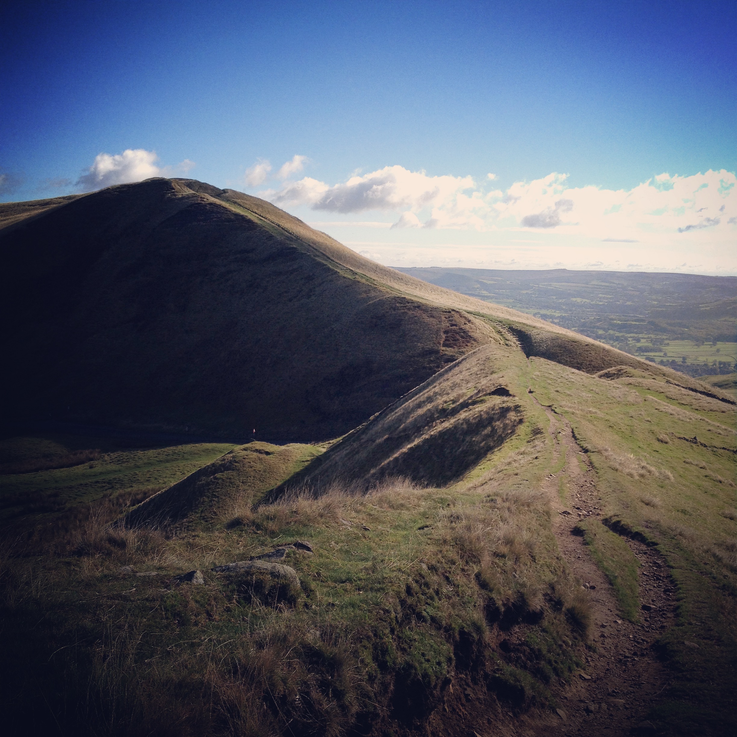
Rushop Edge (Derbyshire) gives great visibility to the task ahead (Photo: John Gibbard)
One of my most persistent habits is the use of analogies to describe user experience problems. I don’t always get it right, occasionally this means that I’ve made the concept harder to understand and everyone leaves the conversation a little more befuddled.
Today I think I got one right though, largely because my work and non-work life have been in close proximity this past month. I recently returned from another sojourn to The Lake District and during my fell walks it occurred that arduous ascents draw strong parallels to the most problematic interactions we have online and in-store. Several years ago Stephen P. Anderson showed a graph designed by Joshua Porter that bore an obvious resemblance to a mountain. In a task we have to surmount a peak, we have a certain amount of motivation to perform this task and consequently we can increase success rate by either making this mountain easier to climb or making the motivation to climb it even stronger.

Joshua Porter’s chart as presented by Stephen P. Anderson in 2011.
Tasks are not always (in fact they are rarely) single peaks of effort. When these tasks require multiple deployments of effort it’s really important to help the user understand their position in the overall challenge – how much they’ve completed, how much there is left to do and what the reward (benefit) is of completing it.
One of the jobs I’m engaged with a lot is the design and development of transactional forms – particularly for financial services organisations. Investment modelling, quotes, illustrations, that sort of thing. These are tasks that typically have a large number of requirements for data capture – many of which are regulatory mandatories. This means, simply, that we can’t make the mountain much smaller. What we need to do is help them climb it and make them want to climb it.
A way in which we can do this is through reducing the task to smaller steps, sometimes colloquially referred to as ‘eating the elephant’ but in cognitive psychology it’s part of what is known as ‘chunking’. (Aside: strictly, chunking is part of how our short-term memory behaves but it has become shorthand for the manner in which we reduce tasks to related component parts).
This isn’t easy to do. There are a host of ways in which we might design a chunked or sequential process. We might ask one question at a time, we might ask a cluster of questions. These clusters might be related to concepts you know (e.g. ‘about your savings’, ‘your payment details’) or they might just be related to how the system or business needs the information (e.g. ‘Some assumptions we have made’, ‘Things you need to tell us about’). The manner in which we present information has profound effects on how much effort we perceive the process to be.
A common technique I see is to cluster questions together and hide additional questions (through the very sensible method of progressive disclosure) but giving the user false hope that they will proceed through the task rapidly. So you might, for example, see a 3 step process but after a few questions you realise that step 1 is actually about three different steps and despite completing fields and perhaps even clicking a next or continue button, you’re still on step 1. These are the false peaks. You think you’ve reached the summit when you reach the next or continue button, only to find that there are another load of questions to complete.
What effect does that have on your perception of the remaining steps? How can you determine how far you are through the process and what you have in store? It has just the same soul-destroying effect on you as climbing a mountain where the eventual summit is hidden behind a series of maddening false peaks that make the task ahead infuriating.
We recently proposed a number of alternatives to a data collection process and one of these was to show everything on one long page. Much like a traditional paper form, customers arrived at it and sized it up (ie. they scrolled all the way to the bottom before inputting anything). They got the measure of it. It might have still intimidated them but at least they knew what they were letting themselves in for. In effect, to hammer the analogy, they got a great view of the path up the whole mountain.
Sometimes of course it’s likely that the majority of users will only need to complete a fraction of those questions – and so we show them a simpler, more likely path and find ways to handle the exceptions/outliers. So, like so many user experience problems, there must be a happy medium. The great thing about digital is that we can find this optimum ‘happy medium’ through multivariant testing. We can put out versions of our forms in full-length, clustered paginated, question-by-question or accordion formats. We can trial progress indicators with major sections, major and minor sections, with labels or with numbers. All of these things can lead us to create data capture that is more successful for user and the client (business/organisation whatever).
Translating what can sometimes feel like fiddly user experience problems into tangible, real-world analogies can therefore actually be quite useful. We all know what it’s like to slog through a form and we might well know the pain of what if feels like to climb a tortuous hill on foot or by bike. Fortunately whilst we might not be furnished with the ability to change the profile of mountains, we can certainly furnish our digital travellers with a much more agreeable route to the summit.
