Tag Archives: parkrun

Luxury UX beyond veneer: structure as brand equity

Split illustration in muted tones: on the left, a sleek SUV fades into static on a computer configurator screen; on the right, a calm hotel lobby with warm wood panelling, guests moving easily, and luggage arriving without fuss. The contrast shows polish versus structure, with luxury defined by order and rhythm rather than surface gloss.
Luxury isn’t in the chrome or the marble, it’s in whether the flow holds together without a fuss.

Luxury brands spend fortunes on surface. The right serif typeface. The right depth of cream on a website background. The right stock gsm on the brochure. Product renders with depth of field and lighting artefacts. But luxury UX cannot stop at veneer. If the underlying structure is clumsy, if journeys collapse into confusion or friction, then no amount of polish will hold that illusion.

The truth is that structure itself carries brand equity. The way a digital product is architected, how steps are ordered, how rules are introduced, how decisions are simplified, does more to signal competence and care than a thousand pixels of perfected pack shots. At Jaguar Land Rover we learned that millions of pounds of glossy configurator rendering and photoshoots is wasted if the journey collapses under its own contradictions.

When veneer is not enough

Consider that car configurator (I know I’ve been there before). The surface details may be flawless: chrome toggles, cinematic photography and transitions, elegant typography. Yet if the underlying structure forces a prospective customer through contradictory options, backtracking, or endless reloads, the brand is weakened. The luxury dissolves. Instead of modernity, the prospect experiences muddle. Instead of trust, they feel doubt.

Luxury is clarity disguised as ease. It is the sense that someone has already edited the path, made the trade-offs, and left you with decisions that feel not just coherent but inevitable. That coherence is structural. It is information architecture, not simple brand varnish.

Structure as invisible luxury

In regulated sectors, be it finance, healthcare, mobility, the stakes are higher still. Here, the user must feel that the product knows where it is going. A well-structured flow reassures not only through compliance but through a designed rhythm: disclosure followed by choice, choice followed by confirmation. In finance, disclosure sequencing is as much brand equity as trust marks in the footer. At Aviva, I saw how form ordering and timing mattered more than any banner, ad or brand flourish: get it wrong and trust collapses, get it right and the entire flow feels humane.

    This isn’t just true for luxury. At parkrun, where we were engaged to think about participant and volunteer profiles, the brand moment wasn’t surface polish but whether participants could find a barcode or book a roster slot without friction. There are quieter sectors away from money and luxe, but the principle holds: structure carries the brand.

    Hospitality and the British lens

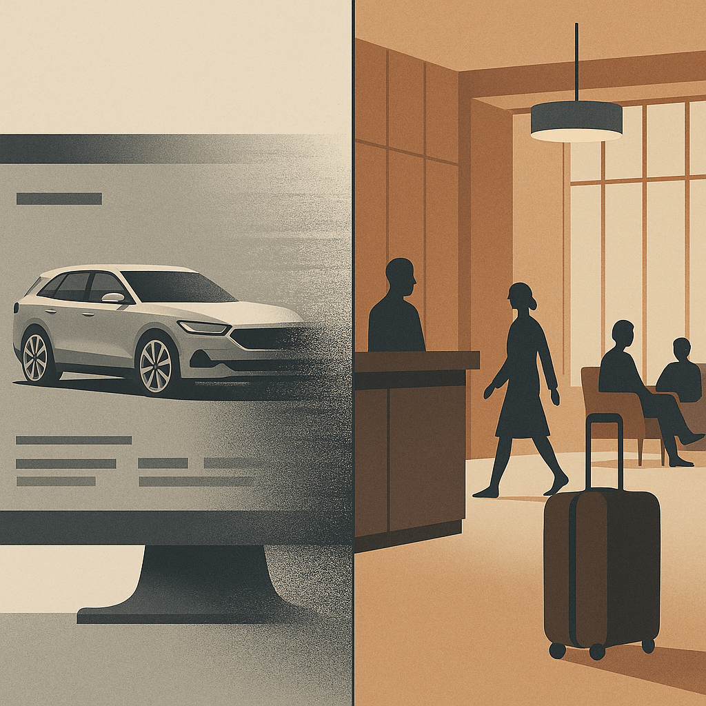
    Top-end hospitality has always understood that structure outlasts surface. A hotel lobby isn’t luxury because of materials and furnishings alone; it’s luxury because check-in is peaceful, calming, effortless, because luggage appears without fuss, because the guest never feels unwillingly abandoned. The choreography, the sequencing of service, is the brand. Digital is no different. Done well, it is hospitality by other means.

    And here, for me, Britishness adds something. Where continental, EMEA or American luxury can lean toward performance, grand gestures, overt pampering, British luxury often communicates through understatement. Polished restraint. A dry nod over a champagne cascade and a platter of Dubai chocolate. That sensibility, translated into UX, means editing with discipline: fewer options, quieter confirmations, a flow that carries the user forward without ever drawing attention to itself. Not austere, not joyless. Just less show, more order.

    Brand equity in restraint

    A luxury brand earns equity not just through what it offers, but through what it withholds. The best experiences show judgement in what not to display, what not to demand, where to pause. Luxury isn’t ensured by the liberal application of gloss. Sheen can be appropriated, copied, imitated overnight. What endures is structure: the edits, the sequencing, the courage to strip things back until only what matters remains.

    When the experience lands with this quiet integrity, the user may never notice the scaffolding beneath. But they will feel the brand in the unbroken rhythm of moving forward without friction. That is luxury UX beyond veneer, luxury as restraint, stewardship, clarity. A quiet moral order and the calm assurance that polish and structure belong together if the experience is to endure.

    AI: This piece was written by me. I used ChatGPT as a sub-editor to keep tone aligned with my voice. The experiences, perspectives and final edits are mine. AI also produced the tag list, excerpt and image that accompanies it.

    Tagged , , , , , , , , , , , , ,

    Tanda Predictions for Marathon Times

    With the Asics Stockholm Marathon just a few weeks away it’s time to take stock of a few things in my running year.

    Although not documented on this blog, I’ve set myself a challenge of running every single day this year (at least 3.2k – two miles in old money). This was loosely inspired by Advent Running and the Tracksmith poster, but the origins are neither here nor there. So far I’ve hit it.

    Doing a challenge like that has naturally impacted my traditional marathon build-up. I’ve followed a Garmin plan this time around and on rest days I’ve just done light runs but other than that I’ve tried to stick to tempo or threshold training on the selected session days. The big ‘but’ of all this has been the effect it’s had on my overall quality of session: tempo runs are often on tired legs, intervals are not even harder to complete and the long runs in recent weeks have seen some incredibly slow pace and high heart rates.

    To make sense of this, or at least allow me to predict what this might all mean for Stockholm I have been fretting about the long runs in particular. In recent weeks, I’ve hit 32.1, 35, 31.1, 33.6 km each weekend. I’ve done 5 runs over 30k this year and a further 5 over 20k. All of which is much more than I’ve done in the past but I’ve been intentionally running them slower. I’ve tried to stick to Zone 2 Heart Rates, under 140bpm which means around 5:10-5:40 pace per km. It should feel easy but after a while it does fatigue you regardless and it begins to hurt as I run more heavily by slumping into slower cadences and mentally I struggle with the discipline of keeping the HR low especially now the days are 15-20 degrees warmer than those first runs of the year.

    Today I stumbled across the Tanda discussions from Christof Schwiening‘s blog which I found via Charlie Wartnaby and the sub 3hr Facebook Group. I printed out this graph and started to plot my weekly distance against average pace to see where I sit. Fortunately, Strava’s log page gives me the weekly duration and distance figures so I did a few calculations on bane.info and plotted 12 weeks’ worth of data. To my amazement it had me sitting along the 3hr 15′ contour and, given the strength of this model, I’m quite encouraged by that.


    IMG_5033

    Black x marks indicate my training weeks


    There’s no question that the long runs have really frustrated me, on the days I’ve run slow I’ve wondered how I could even run at paces I was comfortable at in 2015, 2012 and 2011 for the full distance. But then this year I’ve also hit a parkrun PB of 19:03 and regularly go sub 3:45 on my commute runs and in interval sessions. My Garmin VO2 max has been as high as 60 and is currently hovering at 58/59. So I’m fit and, touch-wood, largely injury free. A niggling sciatic nerve, a bit of gluteus numbness and some hints of ITB all might flare up on the day but equally, could not, and if they don’t? Well, to hit 3:15 would be a dream and put me firmly on the road of my 5-year plan to sub 3 with a good opportunity to go quicker in York in October. However, that means averaging 4′ 37″ /km for the entire race and that is a pace which I exceeded for just 25 minutes on Sunday (after 2 hrs 20 mins of slower running). Even with adrenaline and a lighter few weeks ahead I’m not sure I’ve got that in me, and that in itself is a revelation: physiologically the data says I should be able to do it, but my own sense of perceived effort says it’s not.

    screenshot-connect.garmin.com 2016-05-16 19-15-52.png

    I’ve got time to set that goal, create the pace band and work out what I’ll go at. Keeping an eye on the temperature (average 18 C) and wind on the day will have a bearing but when you’ve spent a fair amount of coin flying out there, hotels and food, do you really want to risk having 4 hours of hell on the road because you took a risk and went out at a punchy pace?

    On the 4th June, we’ll know…

    Tagged , ,