Tag Archives: Jaguar Land Rover

Luxury UX beyond veneer: structure as brand equity

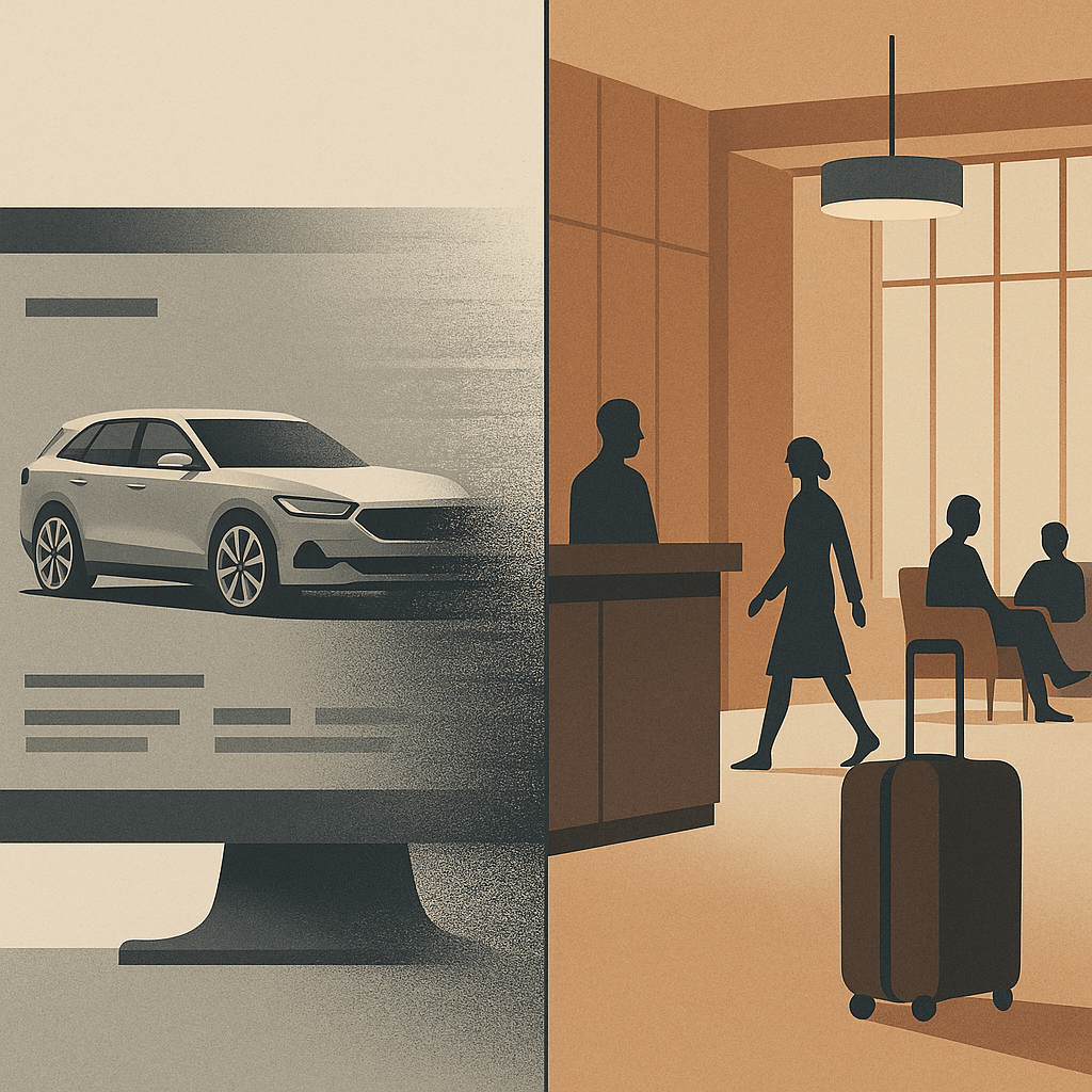
Split illustration in muted tones: on the left, a sleek SUV fades into static on a computer configurator screen; on the right, a calm hotel lobby with warm wood panelling, guests moving easily, and luggage arriving without fuss. The contrast shows polish versus structure, with luxury defined by order and rhythm rather than surface gloss.
Luxury isn’t in the chrome or the marble, it’s in whether the flow holds together without a fuss.

Luxury brands spend fortunes on surface. The right serif typeface. The right depth of cream on a website background. The right stock gsm on the brochure. Product renders with depth of field and lighting artefacts. But luxury UX cannot stop at veneer. If the underlying structure is clumsy, if journeys collapse into confusion or friction, then no amount of polish will hold that illusion.

The truth is that structure itself carries brand equity. The way a digital product is architected, how steps are ordered, how rules are introduced, how decisions are simplified, does more to signal competence and care than a thousand pixels of perfected pack shots. At Jaguar Land Rover we learned that millions of pounds of glossy configurator rendering and photoshoots is wasted if the journey collapses under its own contradictions.

When veneer is not enough

Consider that car configurator (I know I’ve been there before). The surface details may be flawless: chrome toggles, cinematic photography and transitions, elegant typography. Yet if the underlying structure forces a prospective customer through contradictory options, backtracking, or endless reloads, the brand is weakened. The luxury dissolves. Instead of modernity, the prospect experiences muddle. Instead of trust, they feel doubt.

Luxury is clarity disguised as ease. It is the sense that someone has already edited the path, made the trade-offs, and left you with decisions that feel not just coherent but inevitable. That coherence is structural. It is information architecture, not simple brand varnish.

Structure as invisible luxury

In regulated sectors, be it finance, healthcare, mobility, the stakes are higher still. Here, the user must feel that the product knows where it is going. A well-structured flow reassures not only through compliance but through a designed rhythm: disclosure followed by choice, choice followed by confirmation. In finance, disclosure sequencing is as much brand equity as trust marks in the footer. At Aviva, I saw how form ordering and timing mattered more than any banner, ad or brand flourish: get it wrong and trust collapses, get it right and the entire flow feels humane.

    This isn’t just true for luxury. At parkrun, where we were engaged to think about participant and volunteer profiles, the brand moment wasn’t surface polish but whether participants could find a barcode or book a roster slot without friction. There are quieter sectors away from money and luxe, but the principle holds: structure carries the brand.

    Hospitality and the British lens

    Top-end hospitality has always understood that structure outlasts surface. A hotel lobby isn’t luxury because of materials and furnishings alone; it’s luxury because check-in is peaceful, calming, effortless, because luggage appears without fuss, because the guest never feels unwillingly abandoned. The choreography, the sequencing of service, is the brand. Digital is no different. Done well, it is hospitality by other means.

    And here, for me, Britishness adds something. Where continental, EMEA or American luxury can lean toward performance, grand gestures, overt pampering, British luxury often communicates through understatement. Polished restraint. A dry nod over a champagne cascade and a platter of Dubai chocolate. That sensibility, translated into UX, means editing with discipline: fewer options, quieter confirmations, a flow that carries the user forward without ever drawing attention to itself. Not austere, not joyless. Just less show, more order.

    Brand equity in restraint

    A luxury brand earns equity not just through what it offers, but through what it withholds. The best experiences show judgement in what not to display, what not to demand, where to pause. Luxury isn’t ensured by the liberal application of gloss. Sheen can be appropriated, copied, imitated overnight. What endures is structure: the edits, the sequencing, the courage to strip things back until only what matters remains.

    When the experience lands with this quiet integrity, the user may never notice the scaffolding beneath. But they will feel the brand in the unbroken rhythm of moving forward without friction. That is luxury UX beyond veneer, luxury as restraint, stewardship, clarity. A quiet moral order and the calm assurance that polish and structure belong together if the experience is to endure.

    AI: This piece was written by me. I used ChatGPT as a sub-editor to keep tone aligned with my voice. The experiences, perspectives and final edits are mine. AI also produced the tag list, excerpt and image that accompanies it.

    Tagged , , , , , , , , , , , , ,

    Striving for Imperfection: Why Flaws Make Things Feel Real

    Perfection has become a tell. Too smooth, too balanced, too… AI. In a world of generative everything, we’ve reached a strange inflection point: human-centred design now demands imperfection, not as a flaw, but as a feature.

    Because friction is fidelity. And too much polish starts to smell synthetic.

    When Random Doesn’t Feel Random

    Apple’s original shuffle algorithm was mathematically pure, each track had an equal chance of playing. But users complained. It didn’t feel random. Why? Because true randomness includes clumps, repetitions, patterns that seem suspect. A couple of U2 tracks in a row and suddenly the algorithm was “broken.”

    So Apple redesigned it to be less random, so that it would seem more random. Illusion of imperfection, engineered.

    It’s the same with LLMs. Outputs that are too balanced, too polished, ring false to human ears. We need to start prompt-engineering flaws into our copy, because believability demands mess.

    Breath Marks and Broken Grammar

    I have a playlist I use to test audio (car stereos, headphones, my hi-fi separates). Not for punch or clarity. For something else. For breath, for scratches, for the hiss of it all. Those tiny artefacts left in because they mattered. Because someone chose to keep them.

    Same applies to writing. I’ve airbrushed things too, of course I have. Smoothed over copy that should have stung a little. A good sub-editor knows when to let a clause run ragged. When tidiness would kill the tone. And when grammar should yield to cadence. On LinkedIn, where polish often passes for credibility, that kind of mess is rare, although the smell of all that polish is punget.

    The Pratfall Effect, Real Beauty

    The Pratfall Effect teaches us that we trust people (and brands) more when they’re good and a little flawed. A genius who spills coffee. A leader who admits doubt. We warm to it.

    Brands have learned this too. Dove’s Real Beauty Playbook (developed by Unilever) resonates because it shows unedited reality: pimples, pores, and all. At a recent session in London, Bianca Mack (WongDoody) reminded us of the campaign’s emotional resonance and shared new research on how people respond to AI-generated images and the labelling thereof.

    But who decides when an image is ‘too perfect’? That wasn’t clear.

    One crucial gap: that research didn’t appear to distinguish between image types. As I explored in my previous piece, “The Complexity and Nuance in Human-Centred Design: Beyond the ‘Average’ User” (Nov 2023), we don’t experience products or content generically, we interpret them through the lens of context, emotional expectations, and domain norms. We tolerate gloss on cars and watches. But we demand scars and breath in human faces.

    Against the Plinth: Notes from JLR

    When I led UX at AccentureSong for Jaguar Land Rover, we had this tension constantly. The art directors wanted visual purity: architecture that gleamed, cars posed like sculpture, not vehicles. But my team pushed back. We knew that real customers didn’t experience their Range Rover on a plinth. They experienced it on wet roads, in dim light, with children kicking the back seat. Our interfaces and imagery needed to feel lived in, not gallery-lit.

    There was always a pull between the pristine and the plausible. Between the brand fantasy and the user reality. The best work came when we embraced the rough edge.

    This picks up the argument I made in “The Complexity and Nuance in Human-Centred Design”, that designing for an average user strips out useful extremes. Here, it’s visual: perfection may be aesthetic, but it’s not trustworthy.

    Prompt Engineering with Bruises

    If you’re using LLMs for writing, design, or strategy, you’ll notice: the cleaner it reads, the less it lands. That might sound odd, but the flaws make it human.

    Try this instead:

    • Prompt for contradiction: “Add a small, unresolved tension.”
    • Prompt for failure: “Include a misstep or wrong decision.”
    • Prompt for tone: “Make this sound slightly defensive.”

    These aren’t weaknesses. They’re realism. They’re humanity.

    You don’t say it’s real, you show it.

    Which brings us back to humans. We now have a new role: not just creators, but curators of believability. If you let a model spit out 800 words of polished perfection and ship it unchecked, don’t be surprised if your readers scroll past. They know what machine-made sounds like.

    In Bianca’s research, people wanted to know when something was AI-generated, but perhaps more importantly, we want to know someone’s checked it. Because a watermark is more than a label. It’s a sign of judgement.

    Just as we caveat car ads, ‘closed course’, ‘professional driver’, we’re now being asked to signal artifice across digital domains. Not to apologise for it, but to own it.

    It’s not easy. As an industry we’re conditioned to edit out blemishes, not protect them. Maybe we’ve all just got too good at pretending we know what authenticity looks like.

    Closing

    Perfection doesn’t reassure. It can repel. If you want something to feel real, it needs to breathe. To blink. To bruise. In a world of frictionless content, the rough edge is where trust begins.

    This isn’t a stylistic preference. It’s a principle.

    AI was used to sub-edit this piece according to my personal tone of voice guidelines, it was also used to generate the cover image, WordPress excerpt, tagging recommendations and tighten the LinkedIn tease for it.

    Tagged , , , , , , , , , , , , , ,