Tag Archives: ia

smörgåsbord choice cuts (iv)

The usual selection of things I have seen and absorbed in the last few days around the internets.

Innovation
The laundrette that emails you when your clothes are done. Rather obvious idea that makes you wonder 1. why hasn’t someone done it before? 2. who still uses laundrettes?

Social Commentary
Daniel Pink questions what it means for (American) society now that the data shows for the first time that more people aged 25-34 have never been married than are married. He looks at Economics, Culture, Politics and new business opportunities.

Apple
According to Apple Insider (and probably two minutes earlier/later by Mac Rumors), the new Sharp phone has a display that matches the Retina display on the iPhone 4.

UX
One from the ‘No shit, Sherlock‘ school of UX insight. UX Movement alerts us to the news that right-aligned buttons on web forms work best. It suggests that you might use left-aligned buttons on single-page forms because: “it creates a clear and direct path to the button that users can’t miss” but doesn’t sufficiently explain why having it on the right in this instance wouldn’t be just as good. Because right-aligned buttons work best on multiple page/section forms, users have got used to them being on the right – such is the way conventions work. Why swap it around for the single page forms? This sort of article is potentially useful for a real newbie in UX design but it isn’t really telling me anything a lot of comparitive research and common sense wouldn’t. Not to mention the complete ignorance of languages that aren’t read left-to-right.

However, redeeming themselves, there is also a cute post from UX Movement about New York City reverting to Title Case on their signage to improve readability from the previous capitalised approach.

Moleskine
I am generally quite critical of hipster trends but I concede to loving my Moleskine and my Apple portables. This has made a bit of noise this week on the web, but in case (ahem) you missed it: Moleskine case covers for iPad and iPhone incorporating notepads.

Health & Fitness
As someone who has dabbled in dietary supplements (Chrondoitin, Gingko Biloba, Glucosamine, Omega 3) and who lives on a meat-light diet, I am struck by a conflict between believing marketing hype about supplements and knowing the evidence is light. David McCandless & Andy Perkins’ active infographic on Information Is BeautifulSnake Oil?” helps sort the supplements by evidence. Multiple bubbles exist for supplements depending on the number of health benefits associated. Very compelling visual and (amongst an awful lot of info-graphic noise recently) one with a genuine enlightening purpose. I don’t think the concept is new, it was a static graphic before no? but i believe the interactive element is.

Design
37 Signals admit on their blog that their site is much-imitated and that this may be a part of why they attempt a redesign every 6 months. The new look is a bit of a “back to basics” for them. There is a real emphasis on copywriting and on using colour sparingly for highlighting. It was interesting that their summary didn’t mention IA or structure as such – perhaps that is because it is a given in their processes.

A bit of a lightweight piece on Six Revisions about single-page websites. The accompanying text is a little frothy but it is notable for the showcase of attractive examples.

Finally,
As if to underline the point above about frothy analysis, 90 Percent of Everything had a great post earlier this week about why we should return to a little more academic rigour in our sharing of knowledge and testing of hypotheses. It suggests a few approaches including:

:: Returning to primary sources, not relying on second-hand re-telling of material
:: Ensure enough detail is included to allow the test or experience to be reproduced and re-evaluated. This includes sharing all the data.
:: Be honest about shortcomings. There aren’t enough examples of failure shared in the Information Architecture and User Experience community.

The author acknowledges the difficulty in achieving this in commercial and sensitive situations (client confidentiality for example) but it is a welcome piece of advice for us to avoid issuing sanitised soundbites for instant sharing. Very much worth a read and I wholeheartedly concur (even if I am guilty of just this fast food ux snacking on this very blog).

Advertisement
Tagged , , , ,

smörgåsbord choice cuts (iii)

Cycling
I have flirted with the idea of stripping-back my old Orange P7 ever since seeing the beautiful work at the Orange P7 project site . Back in 1995-6 I saved everything I earned at Sainsbury’s as a checkout assistant to buy my beloved bike. Back then it cost £1,200. It astonishes me that I could afford that when I couldn’t even justifiably cobble that together today for a MacBook Pro. Every so often the idea of bringing it back from the dead is freshened up and the post of the GT Bravado I saw on Cycle EXIF just serves to remind me what beautiful single-speeds 90s MTBs can make when treated with design dignity.

Information Architecture
Regular readers will know I curate (word of the moment for these days) thisisIA. The site showcases everyday examples of information design and organisation. I added a wonderful example today from Iain Tait’s crackunit blog that resonates with my autistic desire for order in cabling (Dare people should take a look at my zip-tied desk cables..).

Service
A quick look at a wonderful idea from the Hotel Exerda (found on PSFK) whereby hotel diners can see the recipes for the dishes they eat. Very much along the lines of those hotels where you can buy the fixtures and fittings.

Social
A very cute and simple idea seen in this Vimeo demo from Studio Sophisti [in het Nederlands] to use two lamps connected by the net (Ping) to sense when the other is on and consequently burn brighter. In so-doing the lights create a non-verbal communication link between the two users. I love the subtlety and intimacy of this idea that could be a very sweet way of connecting with loved ones. Away from your wife or girlfriend, both of you have connected lamps and you are working away when the lamp begins to burn brighter … touching.

Miscellaneous
A great find last week from my friend @Ppparkaboy was John Crace’s review in The Guardian of Roland Huntford’s new book Race for the South Pole: The Expedition Diaries of Scott and Amundsen. This review draws our attention to the fact we seem to laud Scott of the Antarctic despite of his catastrophic failure, yet Shackleton – “who didn’t lose a man .. remains a footnote in the national psyche”. I suspect, when we think about this, we can find similar examples amongst many of the modern era’s heroes – athletes, talent-show contestents and so-on. Huntford continues:

“Only in Britain do we revere the man who died in failure above the survivor. Elsewhere in the world, Scott is seen as rather second-rate – an incompetent loser who battled nature rather than tried to understand it.”

It is definitely worth absorbing the remainder of this review.

Nota: I have added a few more sources to my collection of regularly-monitored feeds to mix things up a bit. I get a little bit of a PSFK and FlowingData overload so would like to share a little more UX. I will also try and keep to the subheaded structure to allow scanners to skip past content they’re not interested

Tagged , , ,

More choice cuts on the smörgåsbord

I don’t propose that one or even now two swallows can make a summer or that this frisson of activity on the blog will not fade incredibly quickly and my writings will dry up as quickly as they appeared. Like a chalk stream, perhaps.

So, to continue from yesterday, a few more things I have seen, and ting:

1. Flowing Data drew my attention today to a few pertinent images posted on the excellent Historypin site. Historypin simply takes archive photographs and overlays them (sadly without the option to place with the opacity) on Google Street View images from today to place history in context. The selection identified in today’s post draws attention to The Blitz.

2. Something I shared with a client of our who recently rejected the idea of using accordion interaction on forms, Luke Wroblewski’s work with Etre to test the pattern and make some observations. Conclusion, not significant +ve effect on conversion, but equally no significant –ve effect for an identifiable +ve change in the perception of simplicity. Well, that’s how I interpreted it.

3. I read about this visual technique a while ago in the national press but it has been picked up by the curators of the Nudge blog. Norfolk City Council are using funnel planting patterns for trees to create the illusion that drivers are approaching junctions at speed. This technique has been used for years with line-painting on roads but to use the built/grown environment is new. This is a great example of what Dan Lockton calls Design With Intent.

4. In related news, Konigi had a short piece on ‘Dark Patterns’ which is perhaps on the Machiavellian side of behavioural design. These are interaction patterns which intentionally coerce/seduce users into performing actions they would not ‘normally’ have performed. This is work by the enigmatic Harry Brignull which was presented at UX Brighton (2010) and you can follow the entire 30 minute slideshare by visiting his excellent blog.

5. This is worth of a full post at some point, based on some thoughts shared with me by a member of my team, Richard Blair. In the meantime, take a look at PSFKs piece about the effect of the Times paywall on their RSS content. This tears me up. As a Times reader in the offline world I quite like the new online exclusivity a paywall has created and the ad-free experience but I desperately lament the loss of the ability to pour my favourite columnists into my Tabbloid by subscribing to their RSS. I now am forced to the site.

That’s it for today, similar but newer things tomorrow. And possibly a proper ‘comment’ piece later today.

Tagged , , , ,

When a 25 minute form is considered a customer-centred success

It is somewhat inevitable that having spent time working at a major financial services company, my best-fit moving agency-side would be on financial services accounts.

I started at Dare with responsibility for creating delightful and innovative digital experiences with Barclays before a small side-step into Barclaycard and thence, last year, to Standard Life. Throughout this time I have had exposure to countless transactional forms, most of which are understandably onerous to the customers, advisors and others that have to use them.

Often the request is to sex-up such interactions. Crudely, our clients want more Apple and less application. Fundamentally though it doesn’t matter how good a student of Wroblewski you are or how much Tumblr you have channelled, it’s still a mortgage/car insurance/SIPP and not an iPad. It may not be entirely the correct analogy, but it is a touch of ‘lipstick on a pig’.

So it is heartening to see ING direct have a crack at reflecting this in their ad campaign running (at least where I have seen it) on The Tube. Broadly, the message reads that they tried to make the application fun but that wasn’t possible so they made it easy. Easy is then reinforced by the assertion that it only takes 25 minutes to complete.

That’s right, twenty five minutes. And that is deemed to be a promotable statement. I would not be happy if I were the CEO of WordPress if we were going to our customers and saying that blogs could be setup in 25 minutes, and blogs can be complex, configurable things. Who in their right mind thinks a 25 minute transactional experience is great?

I don’t blame the IA here, I blame the Financial Services Authority (FSA) and organisational structures that fail to sufficiently-challenge the arcane rules and regulations around such customer-facing forms.

Time and time again work is stymied by regulations on type size, concealment of information and the mindless mantra of ‘clear, fair and not misleading’.

If behavioural theory has taught us anything it is that showing customers all the information they could possibly need to make the decision can never be unequivocally fair and unbiased. In the real world, such an approach leads only to bafflement, confusion and a sense of being overwhelmed. It’s drinking from a firehose. Experience designers have known about this for decades and use progressive disclosure and choice architecture as a strategies for helping and nudging people down a path. Show this to a compliance bod and instantly the fear of an FSA slap for non-disclosure or assumptive selling makes the red ink pour forth.

The IA (who ultimately represents the customer) has no right of reply. Such decisions are largely non-negotiable. Even, dear reader, in the event that we use video footage from user testing where customers bumble and stumble over needlessly complex choices or exasperatedly slump at the sight of swathes of small-print, none of this melts the ice. Rules supposedly there to protect the consumer are, invariably, confounding them.

In such a rigid culture of blind compliance, forms will continue to take 30 minutes to complete. Forms will continue to demonstrate a paralysing paradox of choice. Forms will continue to lead consumers into completing incorrect or inappropriate responses leading them poorly served and out-of-pocket.

In my experience no-one at the major organisations lobbies the FSA for change and no-one at the FSA shows any acknowledgement of the advances in digital interaction and behavioural theory. Both organisations are still heavily influenced by the paper application form and the advised ‘expert ‘ sale via a middleman. Understand this: in a post Retail Distribution Review (RDR) world, the rise of direct to consumer sales will be significant and if financial service companies want to feel more Apple, then they have to think and act with a fundamentally user-centred perspective from product development (including actuarial) and throughout distribution, marketing and customer service.

Perhaps a theoretical example might help. People buy investment products to achieve a certain growth in their wealth. Investment products with higher growth potential tend to be higher risk investments. The safer products (a more guaranteed return) will suit someone with a more cautious attitude to risk. To understand what your attitude to risk is, you can complete a series of straightforward questions. However, try and make a link between the two, such as “you have a cautious approach to savings, you are best suited to investment product A” and that is classed as advice and you cannot do that online. Despite it being helpful to do so. you can only infer, so you might say “Our results suggest you are cautious in your approach to risk. We have products which range from cautious to speculative in terms of risk. Here they are.”

It is laughable. Never mind getting them it to drink it, you can’t even lead this metaphorical horse to water, merely suggest that there might be water in the general vicinity.

I have looked-at and proposed solutions that effectively take a Starbucks coffee at home approach to guiding users toward a suitable financial product. I have considered and suggested that we recommend a product but do not exclude exposure to other nearly-suitable products. I have used FSA-approved approaches to risk questionnaires and terminology but the simple fact remains that a human following a script can advise on the phone or in a face-to-face meeting, but online it is unacceptable.

I would be interested to hear of anyone in the financial services industry, client-side or at the FSA that has heard-of any consultation and user-experience research on the online-advised sales process. Or any kind of dialogue that encourages exploration of consumer psychology to counter the anachronistic approach of this moribund Authority. As the industry comes under the watch of the nascent Consumer Protection and Markets Authority I sincerely hope that the digital post-RDR consumer is given much better consideration.

IMPORTANT NOTE: These views are my own. Neither do they represent Dare‘s opinion nor are they intended as a criticism of any clients past or present. This post must be considered as standalone comment on the financial services industry en masse.

Tagged , ,

Exposing oneself in public (myFry part 2)

It’s not like I spend my day looking for cures for cancer, I just design and redesign digital experiences. Even so, when something you worked on, however small, gets genuine public attention including (justifiable) criticisms and joyous praise, it feels like a big deal.

So much of the day-to-day work is behind the scenes. Hours of screentime, meetings, sketching and commutes home with ideas buzzing in your head. Then it breaks the surface and with celebrity behind it, it leads to me spending an inordinate (and unbillable) amount of time monitoring the twitter streams fishing for compliments.

So that was myFry and that was yesterday. It occurred to me yesterday that this took place around an app that isn’t even free and, whilst it is undeniably popular, it is never going to be an Angry Birds (Rovio 6m+ sales) or even an ECB Cricket App (the OTHER media). Those apps reach the sort of population that – even ten years ago – would have been considered incredible sales records for the most successful of recording artists. In this day and age, a well-designed and popular app means your creativity is engaged with far beyond the single sales for Xfactor winners (< 0.5m units).

So that got me thinking a bit more (since I was involved on the outskirts of the hugely successful Waterslide and less successful Rollercoaster apps, both of which are free), does it matter more when the app is paid-for? The myFry app is nearly £8, it is hardly throwaway entertainment. Users rightly demand that such experiences work. As far as I can recall this was the first thing I have done which is directly paid-for by end consumers. Of course, sites I  have worked on are indirectly paid for as customers buy the products and services offered but the transaction is nevertheless perceptibly free, they have not just shelled-out cash to use the interface.

That customers have just paid for it means that they more-keenly feel the user-experience niggles (and there are some, both intentional and unavoidable) and feed these back into the AppStore reviews. It is these reviews that I care deeply about, the heartfelt feelings of the people I spent hours and hours designing-for and thinking about in front of my screen and sketchpad.

And there I will leave myFry, until I need to return for alternative versions, updates or any other development that Dare and Penguin see fit. You, dear reader, will only know more when such additional work becomes public.

Tagged , , ,

“A wholly original kind of app”: The Information Architecture Behind myFry

My esteemed colleague Flo described it as what happens when “the stars align“, I separately described it as a ‘perfect storm’. This week Penguin launched myFry an iPhone app that we at Dare had been asked to create for Stephen Fry.

This was one of those projects which sets sparks off when the brief comes in. Already engaged on another app (this time more iPad than iPhone) for an established Penguin talent, word reached us that Penguin would like us to look at this Fry work – in an incredibly short space of time. As the days and weeks progressed we were fortunate (and I know this all sounds gushing) to be working alongside a client in Jeremy Ettinghausen who not only profoundly understood his client [Fry] but equally understood the capability and talents of his staff and his agency [Dare].

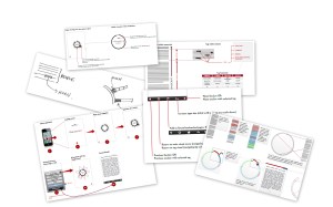
The first step was to meet and discuss with information artist Stefanie Posavec who was employed by Penguin as a cover artist and who’s extra-curricular work had caught everyone’s imagination. We discussed the taxonomy of the manuscript, the experience of Stephen Fry’s writing and ultimately the opportunities for an interaction. From some sketches and notes I took this work and began by laying out a visual of the manuscript, demonstrating how this could be tagged and chunked, how these chunks could form navigable elements and how we could represent relationships through the text.

This work went back to Stefanie, Jeremy and others at Penguin from which Stefanie produced conceptual visuals and the hard work of beginning to read, analyse and tag the book began. As this was an editoral task, this was best left to the publishing team (and Flo – see his tagging output) but it left myself (and I suspect Stefanie) nervously awaiting the outcome; utlimately the visualisation and interaction would be profoundly affected by how the book was re-cut. It is important to note here that nothing was removed from the manuscript or changed in ordering.

In the meantime, I began to work with Ron and Luke at Dare (both visual designers) to start to refine the interface layer, understand the interaction journeys and turn so-far static PSDs into beautifully engaging experiences. All the time we were working on this, Penguin and Flo were tagging away and the tech guys (James, Joe & Perry) were astonishingly already producing prototype experiences.

These tech prototypes were incredibly important to the project. They enabled us to see how the click-wheel navigation would work. The detail required in understanding how many ‘spines’ we could fit on the wheel to be usable for the majority of people on an iPhone was crucial to determining how many sections the book would be separated into. In prototyping this work the guys creatively developed the liquid ‘bounce’ feedback on the wheel which gave valuable feedback to the user as to where their finger was in relation to the wheel – something we were unlikely to solve in static IA/IxD.

As the days and weeks passed I continued to refine the screen flows for the app, demonstrating every single interaction from the point of clicking the app icon, reading in each conceivable scenario through to managing the internal app settings. We toyed with ideas such as a horizontal histogram view (rotate your phone to landscape to view the wheel stretched out in linear fashion) and we experimented with section-to-section navigation but each of these experiences were debated and eventually dropped. It is important to say that we thought as hard, about the stuff we dropped as we did about the stuff we kept.

I continued to learn about the limitations of iPhone development: (detail bit coming up) changing values in the central apps settings interface doesn’t affect the app until it is launched which means toggles rather than realtime action buttons, for example. As the real data came in our experts in tech began to work out a way of tying the design/IxD visuals together with the data to make it work and I performed some Excel analyses on the the outputs to establish how the live data would affect the visualisation patterns. Over time my role switched to reviewing and tweaking interactions, consulting to ensure that the final build stayed close to the original concept and, eventually, on the 10th September (my birthday) the app was approved.

In general, it simply could not have happened this way without the enthusiasm, collaboration and skill of everyone involved. In my vocation we spend a stupid amount of time redefining our job titles: IA/IxD/Ux etc. etc. What I can say is that this job gave me full exposure to just about everything we think of in this sphere: true information architecture with the taxonomic analysis of the manuscript, cutting-edge interaction design and strategic experience planning; it had it all. That all this was done for a client in Penguin and a subject in Stephen Fry that were as enthusiastic and involved as we were made it doubly exciting. The icing on the cake? Stephen’s contact with Messrs. Jobs and Ive, experience and design royalty, ensuring that my work, our work, is on their radar.

I left Norwich Union (now Aviva) nearly three years ago to join Dare with the express reason of doing work like this, long may it continue.

————–

Note: As of writing, within 5 hours since it launched, the app is already No. 4 in the iPhone Top Grossing apps.

Credits: Everyone involved in this project is writing about it and being gloriously magnanimous and humble in their praise for the team:

Official press stuff: Campaign wrote a simple summary and the Press Association have a piece too. As a long-time reader of Infosthetics it’s great that they have picked up on it too.

Tagged , , ,