Tag Archives: Human Centred Design

From Idea to Spaghetti: The UX Gap Killing Home 3D Printing

Here we are, a month on from Christmas, and a new 3D printer hums away in our home office. Our 11-year-old wants to print a simple fidget toy to show his mates on the school bus. Small object, quick reward, low stakes. The marketing.and the social shorts imply this is exactly what the printer’s for.

The reality is different. The printer works, of course it does, and the model exists. But the user has hit a wall.

That wall is the missing middle between “I want this object” and “here’s how to manufacture it.”

Consumer 3D printing hardware has improved fast: cheaper, sturdier, more reliable. Model libraries are abundant. The breakdown happens in the software, specifically the slicer. This is the gateway to printing, and it’s built like an expert tool.

The mismatch is structural. A beginner wants a reliable outcome; the slicer demands process control. More specifically:

  1. Language doesn’t map to intent
    Slicers expose machine concepts and internal mechanics. They describe parameters you can change: retraction distance, Z-offset, support interface, seam position. These settings are real, and they matter. But they’re barely framed around what the user is trying to achieve.

Beginners don’t think, “I need to adjust my retraction.” They think, “Dad, why’s it suddenly all stringy?” They don’t think, “support roof.” They think, “Dad, how do I get this off without snapping it?”

When labels map to the machine rather than the outcome, users can’t predict consequences. They can only guess, or disappear down Google rabbit holes.

  1. Choice isn’t prioritised
    Most slicers present “available” and “appropriate” as equals. The result is a dense panel of options with weak hierarchy and next to zero guidance on what matters first.

It may be designed with the intention of empowerment and precision. In practice it lands as cognitive burden. For a novice, the implicit message is: if this print fails, it’s because you couldn’t figure out to configure it correctly.

  1. Feedback arrives too late
    3D printing has a slow loop. Prints take hours and failures often show up late, or worse, out of sight. The cost of learning is time, material, and patience. When you’re 11, with limited downtime in the week and busy weekends, the threshold for giving up is pitifully low.

When things go wrong, the slicer rarely helps you diagnose or recover. And when the workflow itself is fragmented, ie. slice on one device, move a memory card, print on another, the feedback loop gets even weaker. People end up in forums, LLMs, and YouTube. There they meet the expertise gap: explanations (from well meaning nerds) built on mental models they don’t yet have.

A home office with a desktop 3D printer mid-print, tangled filament on the build plate, and a child sitting nearby watching the failed print in silence.

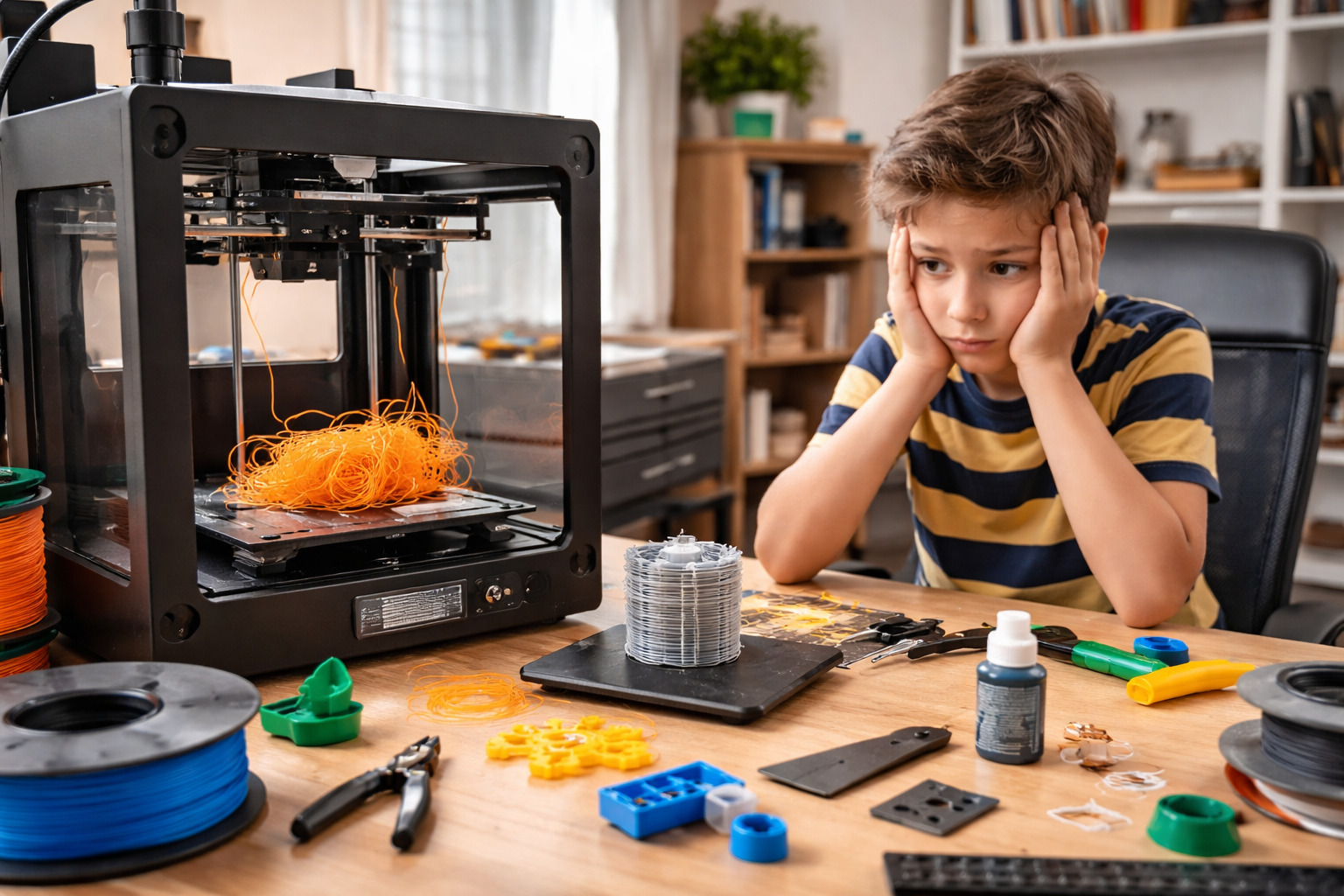
The net result is the domestic print system collapsing like a soufflé. The child loses interest because the reward is delayed and fragile. The parent becomes a reluctant technician, spending evenings debugging through YouTube and ChatGPT rather than, y’know, making. Eventually the printer becomes background noise, a source of family tension and, ultimately, a dust collector.

None of this requires better hardware. It requires different system behaviour.

A simpler learning curve would start with intent, not settings:

Does this need to be strong, or just look good?
Is speed important, or a reliable outcome?
Are you OK with supports, or should we minimise them?

Translate those answers into parameters quietly, and surface the trade-offs in plain language:

Cleaner finish = harder support removal.
Faster print = higher failure risk.
Stronger part = longer print time.

Then, add risk detection and guided recovery through intelligent prompting:

“First layer contact looks low for this material; this often fails. Increase it?”
“Stringing likely from this preview; reduce temperature or increase retraction?”

If a print fails, treat it as evidence, not user incompetence:

“It didn’t stick” – ie. adhesion failure – propose bed/temp/first-layer changes.
“The layers are in the wrong place” – ie. layer shift – propose speed/acceleration/belt checks.
“The supports damaged the print” – propose support style/density/contact changes.

That’s the missing middle: decision support, progressive disclosure, supervised recovery. As ever, the software work is not adding more controls to the slicer UI. It’s helping novices get to a successful print without turning a weekend hobby into an apprenticeship.

At this point someone will say, “Plenty of crafts are hard.” True. But many have immediate feedback, you see the mess you make with a brushstroke straight away. Others take longer, ceramics, for example, but typically a coach is alongside you, and you start small.

With 3D printing, the existence of model libraries and exciting videos creates a false sense of readiness. You’re effectively handed the Mona Lisa in week two and told to have at it. Or you’re asked to kick a 40-yard conversion in a stiff breeze, with no useful feedback as to why it fell short or why she’s got a wonky eye.

Until slicers take responsibility for the learning curve they impose, home 3D printing will keep making the same breezy social media promise that “anyone can make!” and delivering the same experience: anyone can… eventually.

AI: I used AI for the tags, the excerpt, image generation, and a light sub-edit. The ideas, references, observations, and anecdotes are mine.

Tagged , , , , , , , , , , , , , , ,

Time Returned, Time Resold

Rain-blurred motorway at dusk viewed through a windscreen; dashboard lights glow amber in an empty driver’s seat — a quiet image of autonomy and time unclaimed.
Autonomy promised freedom. Instead, it gave us metrics.

Every few years a new invention turns up promising to give us time back. The dishwasher did it, then the calendar app, now the self-driving car. Efficiency, they say, is liberation. But the minutes never come home. They’re quietly re-employed: answering messages that weren’t urgent until we saw them, scrolling through news we already half-read. We don’t get more time. It just comes back wearing a different outfit.

Design now speaks the intoxicating language of generosity. We’ll save you clicks. We’ll make it seamless. Lovely words, but they come with a tempo you didn’t choose. The system nudges, reminds, congratulates you on your streak. Even the oven chirps when it’s done pre-heating. Helpful, yes – in the way a personal trainer is helpful when all you wanted was a walk.

Efficiency was meant to hush the world, not make it chatter. Parcels update you mid-journey, cars suggest faster routes, TV apps interrupt the credits to make sure you don’t go off to bed just yet. You start to feel managed by your own apps and appliances. Is it me, or do they all sound slightly pleased with themselves?

Still, there is a deeper promise in all this autonomy. Because the best thing about a self-driving car isn’t speed, it’s permission. The choice to drive when you want to: for rhythm, for presence, for drivers like me who relish the satisfaction of line and camber, and to switch off when you don’t. The long crawl north to the Lakes. The dawn blast to the airport. The late-night, rain-spray-soaked slog home when you’d gladly hand over the wheel and let the motorway unspool while you exhale, watch the window-light flicker, maybe half-doze through an episode of something forgettable. Control should be optional, not constant.

That’s what the technology could be about: selective surrender or a quieter freedom. But for some unfathomable reason, the marketing and product design departments have decided autonomy is best packaged as constant optimisation. That means another dashboard app full of metrics and prompts and juanty reminders. We built cars clever enough to drive themselves, then gave them personalities that never stop talking.

Real luxury now isn’t speed but discretion: the right to decide how long something should take. To drive when you feel like driving. To look out of the window when you don’t. Technology can make both possible.

Convenience promised to return our hours, but mostly it’s taught us to account for them. Every minute feels spoken for. Perhaps the odd thing is how willingly we’ve agreed to it and the peculiar pleasure we take in shaving seconds off tasks we didn’t enjoy anyway.

Maybe the best thing a self-driving car could do is forget the ETA and let us forget, too.

AI: This piece was refined with AI, for the image prompt, tags, excerpt, and a little sub-editing. The ideas, references, and rhythm are mine.

Tagged , , , , , , , , , , , , , ,

Amazon’s UX: Why Customers Ignore the Chaos

Amazon’s interface is a mess. Everyone knows it, doesn’t matter if you’re in the industry or you just use it to buy lightbulbs, the odd book and some fancy Tupperware. It’s the digital equivalent of a hoarder’s house, clutter everywhere. A friend of mine once memorably described looking for something as like “rummaging through a warehouse with a torch”, but [she does it because] “I know the bloody thing I want is in there somewhere”. On any given part of the site there’s inexplicable stacks of unrelated items, and a sense that at any moment, something might fall on you. My particular hate are sponsored listings, intruding like pushy sales reps with their irrelevant nonsense while you’re on the way to buy the actual thing you searched for (although sometimes the actual thing turns out to be a not-quite-there copy from some random far-east factory). Genuine customer reviews also get buried under an avalanche of SEO-stuffed nonsense, and yet, dear reader… here I am, ordering 90% of what I buy from Amazon. And you do too.

However frustrating the experience, it isn’t bad enough to drive people away. Fast delivery, sheer product choice, and a checkout process so frictionless it should be flagged with Gamble Aware. All of this outweighs the UX sins.

So, Does UX Even Matter?

It is a question worth asking. If a platform’s core proposition is so compelling, with cheap prices, instant gratification and no meaningful alternative, does the user experience really determine success? Or does it just need to be functional enough?

The Amazon Conundrum

Armchair critics love to dissect Amazon’s UX. In the dark corners of the UGC web, Reddit threads are full of users raging against the chaotic interface. Tech journos lament the aggressive Prime pushing, the pay-to-win search results. On paper, it’s a usability horror show. But let’s be clear, Amazon isn’t neglecting UX. It employs entire teams of UX designers, researchers, and engineers who are constantly refining the experience. Not to make it more elegant, but to make it better at selling things. If adding another sponsored listing increases revenue, they’ll do it. In 2022 alone, Amazon made over $31 billion from its advertising business, largely driven by these placements, making it a core part of their revenue model (Vox). If customers still find something to buy despite the friction, then as far as Amazon is concerned, the system is working just fine. The difficulty we have as UXers is understanding and reconciling this. Because we see ‘Sponsored’ listings trump the actual best-result search listing we say “This is wrong, users hate this!” but somewhere deep in Amazon HQ is the data to say, “You know what, they actually don’t, and here’s some more $” (EcommerceFuel and others provide further context on how Amazon’s sponsored listings work and why they persist). The same logic applies to other blunt instruments like relentless pop-ups (deeply irritating but demonstrably effective at nudging hesitant users into making a decision) and those blinking, anxiety-inducing countdown timers all over that Instagram brand’s shop aren’t there by accident either.

When UX Takes a Back Seat

Of course, Amazon is hardly alone. Plenty of other sites with objectively terrible UX remain dominant because their value proposition is simply stronger than the frustration they cause:

  • Booking.com drowns you in pop-ups and ‘Only 1 left at this price!’ warnings. Yet its vast selection and competitive pricing make it impossible to ignore.
  • British Airways’ website looks and feels like it’s been trapped in 2009, but people still book flights because, they will always believe the brand stands for something British and the pilots are the best trained and most decent in the skies.
  • Vinted The latest upstart eCommerce brand is having a runaway success in the UK but this is absolutely down to the simplified sell-send logistics and payment process, and definitely not to the bloody awful filtering and product exploration UX (seven different ways to filter on Ralph Lauren sweaters anyone?).
  • GP surgery websites, National Rail, car park booking systems, there’s a vast ecosystem of poorly designed necessities that survive because users effectively have no choice or poorly rationalise their value/essentialism.

This phenomenon isn’t anecdotal or lost on UX thinkers. As David C. Wyld argues in The Endless Battle Against Bad UX, poor usability is pervasive in major companies, and fixing it isn’t always a top priority. Similarly, The World is Running on Bad UI (Michal Malewicz) notes how many essential services and platforms operate on clunky, outdated interfaces yet remain functionally irreplaceable. Their insights reinforce the central argument here: bad UX doesn’t necessarily mean bad business.

The Captive Audience Factor

The obvious point here is that there is a difference between platforms like Amazon, where the UX is frustrating but functional, and services where users are stuck with whatever’s available. The difference with Government portals, legacy corporate systems, anything remotely tied to infrastructure is that these things aren’t just designed badly; they are fundamentally unmotivated to improve.

It’s not even a matter of UX being ignored (again, plenty of these organisations are populated by skilled and well-meaning design folks), it’s often a mix of limited budgets, outdated tech stacks, bureaucracy (many hands), and the sheer pain and complexity of rebuilding something that’s been patched together over decades.

The same logic applies to countless internal systems in large organisations, where usability takes a backseat to bureaucratic inertia and legacy technology. Everyone grumbles about it, but change is slow, and innovation rarely prioritises the dull but essential parts of work life. Just as no one is investing to replace the office microwave that’s been there since the turn of the millennium, so we continue to suffer through whatever shitey interface we’re given.

The Reluctance to Overhaul

Could Amazon wholesale overhaul its UX if it wanted to? Technically, yes. But would it be worth it? Probably not. The site is a sprawling ecosystem of millions of products, channels and third-party sellers, advertising deals, and logistics chains. Trying to impose a sleek, minimalist interface would mean unpicking the very mechanics that drive sales at an enormous cost.

The same goes for other massive platforms. The bigger and more layered a system becomes, the harder (read more expensive) it is to rebuild from the ground up. This is exactly the scenario I described in The Local Maximum Problem, where businesses become trapped in cycles of micro-optimisation rather than taking bold steps toward meaningful UX improvements. Businesses, especially ones as enormous and entrenched as Amazon, often optimise for small, short-term gains instead of taking the risk of a complete overhaul. They’ve reached a peak where micro-adjustments keep the machine running, even if they don’t solve fundamental UX flaws. Redesigning from scratch is a leap into the unknown, and when the current setup is still printing money, who would take that risk? Maybe they update a search filter. Maybe they tweak the layout slightly. But the underlying experience remains a Frankenstein’s monster of competing priorities.

So, Does UX Matter?

Yes, but not in the way purists would like to believe. Good UX reduces friction, increases trust, and improves efficiency, but it doesn’t always dictate whether people use a platform. When the value proposition is strong enough, users will tolerate a lot.

The idealistic view is that platforms should improve out of respect for their users. But what do you think? Have you ever abandoned a platform because of its terrible UX, or do you find yourself sticking with frustrating experiences because the value proposition is just too strong? Perhaps if people keep clicking, why fix what isn’t broken?

Tagged , , , , , , , , , , , , ,