John Gibbard
smörgåsbord | user-experience ramblings
Category Archives: work
Devolve responsibility for your customer experience at your peril

In the world of customer experience, there are certain topics and industry sectors which, if you’re looking for examples of terrible customer service, are like shooting fish in a barrel. Consider, for example, the courier company.
It’s not a trivial thing, every single graph one finds when searching for online shopping shows a precipitous upward curve. We’re all doing it and as a fundamental part of our relationship with brands, it’s a curious thing that something so critical to the customer journey is outsourced to external companies – often at the lowest possible price.
The trouble is, it’s so often the point of the user experience that is most broken. eCommerce retailers have woken up and begun to spend big sums on the optimisation of their digital interaction design. They’re talking choice architecture, multi-variate testing, ethnography, eye-tracking and so on and so on. All very noble, but once we’ve slipped down their wide-necked and increasingly-greasy conversion funnel we’re left at the mercy of the cowboys they have contracted to send us our products.
Many of us are now experiencing that sinking feeling when the confirmation email drops into our box and proudly announces that [insert courier company here] are going to be delivering the purchase. Today on Twitter the comedian Richard Herring began tweeting his experiences of Yodel’s service. It opened a rich vein of commentary on the company’s undeniably appalling fulfilment of orders. Amongst the numerous comical and fantastical examples of their failures, a few posts stood out [ Why I’m boycotting Yodel and Yodel are an incompetent shower ]. It’s quite apparent that customers are now sufficiently motivated by the toxicity of their previous experiences with companies like Yodel, to take this out on the original vendor/provider.
From Terence Eden
Well, the solution’s simple – from now on I don’t accept deliveries from Yodel.
If I buy something and I receive a Yodel tracking ID, I’m cancelling the order.
If a Yodel driver turns up, I’ll refuse to accept delivery.In short, I am firing them – and I suggest you do the same.
In simple terms, customers will actually refuse to purchase from you if they know you’re using a courier who has failed them in the past.
This attribution of responsibility, the guilt by association or the sheer unwillingness to suffer the slings and arrows of outrageous delivery companies, anecdotally at least, is an opportunity for eTailers. Consider the benefit of giving customers the confidence that their shipping fee will be going to a highly-rated and ultra-low-failure-rate delivery company? Imagine that your customer can have complete confidence – underwritten by you as vendor – that their parcel will arrive safely, in good time.
If we as experience-obsessed strategists, are mapping and considering the service from end to end, we must insist that significant time and attention is paid to all touch points, including those that businesses choose to outsource (for perfectly legitimate reasons) and that the same care and attention to exceptional user experience is applied to those moments. The critical moment of delivery is too valuable to leave to the cold moneyed hand of procurement decision makers writing contracts with universally-derided delivery partners.
And, if you’re a courier company, perhaps using your twitter feed to merrily announce competition winners while disgruntled customers pick up the pieces (often literally) of your failed service, might not be the most sensible strategy…
UPDATE Richard Herring’s Metro piece on the failed delivery is a good read
Companies that use Yodel
UPDATE: After an atrocious delivery experience from ELC/Mothercare I have decided to produce a table showing retailers that use Yodel for their service to avoid them on that basis (other tables exist on MSE and Mumsnet but are out of date)
Mothercare & Early Learning Centre (July 2016) – Will no longer use at-home delivery
Great Little Trading Company – (July 2016) – Will no longer use whilst they contract Yodel
Tanda Predictions for Marathon Times
With the Asics Stockholm Marathon just a few weeks away it’s time to take stock of a few things in my running year.
Although not documented on this blog, I’ve set myself a challenge of running every single day this year (at least 3.2k – two miles in old money). This was loosely inspired by Advent Running and the Tracksmith poster, but the origins are neither here nor there. So far I’ve hit it.
Doing a challenge like that has naturally impacted my traditional marathon build-up. I’ve followed a Garmin plan this time around and on rest days I’ve just done light runs but other than that I’ve tried to stick to tempo or threshold training on the selected session days. The big ‘but’ of all this has been the effect it’s had on my overall quality of session: tempo runs are often on tired legs, intervals are not even harder to complete and the long runs in recent weeks have seen some incredibly slow pace and high heart rates.
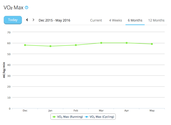
To make sense of this, or at least allow me to predict what this might all mean for Stockholm I have been fretting about the long runs in particular. In recent weeks, I’ve hit 32.1, 35, 31.1, 33.6 km each weekend. I’ve done 5 runs over 30k this year and a further 5 over 20k. All of which is much more than I’ve done in the past but I’ve been intentionally running them slower. I’ve tried to stick to Zone 2 Heart Rates, under 140bpm which means around 5:10-5:40 pace per km. It should feel easy but after a while it does fatigue you regardless and it begins to hurt as I run more heavily by slumping into slower cadences and mentally I struggle with the discipline of keeping the HR low especially now the days are 15-20 degrees warmer than those first runs of the year.
Today I stumbled across the Tanda discussions from Christof Schwiening‘s blog which I found via Charlie Wartnaby and the sub 3hr Facebook Group. I printed out this graph and started to plot my weekly distance against average pace to see where I sit. Fortunately, Strava’s log page gives me the weekly duration and distance figures so I did a few calculations on bane.info and plotted 12 weeks’ worth of data. To my amazement it had me sitting along the 3hr 15′ contour and, given the strength of this model, I’m quite encouraged by that.

Black x marks indicate my training weeks
There’s no question that the long runs have really frustrated me, on the days I’ve run slow I’ve wondered how I could even run at paces I was comfortable at in 2015, 2012 and 2011 for the full distance. But then this year I’ve also hit a parkrun PB of 19:03 and regularly go sub 3:45 on my commute runs and in interval sessions. My Garmin VO2 max has been as high as 60 and is currently hovering at 58/59. So I’m fit and, touch-wood, largely injury free. A niggling sciatic nerve, a bit of gluteus numbness and some hints of ITB all might flare up on the day but equally, could not, and if they don’t? Well, to hit 3:15 would be a dream and put me firmly on the road of my 5-year plan to sub 3 with a good opportunity to go quicker in York in October. However, that means averaging 4′ 37″ /km for the entire race and that is a pace which I exceeded for just 25 minutes on Sunday (after 2 hrs 20 mins of slower running). Even with adrenaline and a lighter few weeks ahead I’m not sure I’ve got that in me, and that in itself is a revelation: physiologically the data says I should be able to do it, but my own sense of perceived effort says it’s not.
I’ve got time to set that goal, create the pace band and work out what I’ll go at. Keeping an eye on the temperature (average 18 C) and wind on the day will have a bearing but when you’ve spent a fair amount of coin flying out there, hotels and food, do you really want to risk having 4 hours of hell on the road because you took a risk and went out at a punchy pace?
On the 4th June, we’ll know…
Using exercise icons on food labels is not the answer to the obesity epidemic
It’s well understood that the country is facing an obesity epidemic. There are few topics in public health as well covered in recent years. The sugar tax is happening and much debate is underway about the role governments and responsible bodies should have in modifying our irrational and damaging behaviour.
I have a vested interest in the subject from several perspectives: As a concerned citizen, as an endurance runner, as a proud supporter of the UK’s biggest mass exercise movement in parkrun and as a behavioural psychologist working in persuasive consumer design.
My empirical background adds a healthy dose of cynicism when I read today that the Royal Society for Public Health (RSPH) suggest the use of exercise labels for food to replace or augment the nutrition labelling.
The reason this is being suggested is that nutrition labelling isn’t working. The arguments here concern the fact that the detail is too complex for the general public, that it causes an unhealthy focus on calorie content that there is considerable ambiguity on how this information should be used by the consumer and the presentation of portion sizes.
I contend that the solution proposed by RSPH is also doomed to failure because it doesn’t affect the decision at the point of sale and allows our inner defence lawyer to contend and justify the purchase because ‘i’ll deal with the consequences of this bad choice later with some exercise’. It’s the same reason that carbon offsetting is an acceptance that we make the wrong choice with travel. This is what behavioural economists call the default norm, we are not affecting the ingrained status quo of the bad choice. It’s better than nothing, perhaps, but it avoids dealing with the real problem – which is that we don’t promote real nutritious and healthy food anywhere near enough.
The evidence, interrogated
To explain why this was felt to be a worthwhile intervention, some well-meaning commentators and the RSPH have pointed to a study in Baltimore, widely reported in October 2014 [CNN, Washington Post], and published in the American Journal of Public Health. This study placed 20 cm x 28 cm signs in a point of sale (PoS) display in stores that drew attention to the amount of exercise required to ‘burn off’ the carbonated drinks in the adjacent cabinet. It worked, and less drink was sold. However, there are a handful of reasons we cannot extrapolate the findings from this to the RSPH proposition.
- The Baltimore study was a confrontational intervention, it arrested the purchase process with a highly visible sign. Nudges here are just enough to bump people away from their behaviour.
- It isn’t sustainable, even if we accept the execution worked this time, like the note on the fridge to not forget your lunch, you’d ignore it very quickly on repeated presentations.
- This is before the purchase, packaging labels are not universally observed until post-purchase.
- The demographic tested was limited (urban, black, adolescents) and the cultural effects of their consumption and susceptibility for intervention have not been accounted for.
The people that read labels and packaging tend toward higher levels of education and are already motivated by a health goal: fat loss, protein intake etc. so the people making use of labels to change behaviour are already past the trigger point. RSPH cite Dr. Hamlin’s paper about the attention given to front of pack (FOP) labelling but even this paper acknowledges the profound limitations of FOP in the context of the myriad of marketing pressure applied to the persuasion for sale. They also acknowledge [Cowburn, G., Stockley, L., 2005] that the interpretation of labelling is going to be challenged by levels of education and nutritional sophistication. Finally, although the RSPH present research that indicates people would be ‘three times more likely to indicate they would undertake physical activity’, there is no evidence this intent is or would be followed-through.
Distracting us from the task at hand
Solutions may be found by modifying packaging and one could argue that it’s just part of a broad approach to changing perception and behaviour but I contend that it’s actually damaging to press ahead with it. To spend time considering and executing this is to distract from the real solution which is to make healthy food choices the norm. Considerable time and effort must be expended in the persuasive design industry to work with our natural biases and present good food as the obvious, natural and common choice. To dilute the salience of bad food in preference for clean, natural unprocessed alternatives.
I look forward to Public Health sector that recognises that until we confront the universally damaging food we sell in the same way we’ve confronted tobacco (i.e. through demonisation), we’re not going to be able to educate people away from their irrational desire to pursue the forbidden fruit. We cannot go around treating exercise, worthy and valuable as it is, as the cure for a problem we’ve not had the guts to deal with at source. You wouldn’t promote chemotherapy on cigarette packets … would you?
The RSPH paper itself acknowledges that the solution needs to tackle both sides of the obesity equation (ie. “When calories in … exceeds calories out” and “modifying both energy intake and energy expenditure”) but their solution will not change ‘calories in’ and does not have realistic prospect of effecting ‘calories out’.
EDIT: On the 9th May 2016 a piece by Nick Triggle was posted on BBC News which highlights the disparity alluded-to in the final section of this blog: “Some 58% of advertising spend is on confectionery and convenience food, compared to only 3% on fruit, vegetables and pasta” What Yoghurt Tells Us About The Obesity Fight retrieved 09/05/2016.
Artisanal food: an update
After an opportunity opened up in Charlie‘s workload we have finally managed to get our artisanal food generator coded and on a public-facing URL. We’d love you to give it a try. There is a previous post on this blog which tells you the story of why we think it demonstrates good persuasive thinking.
Late in 2015, we attended a Dare Sessions event with our friends The Foundry. The theme of the event was automation and David Atkinson from The Foundry referenced a wonderful bit of automation work where wine reviews were constructed using Markov Chains. This gives us some future direction perhaps in the logic although there is plenty to be getting on with as it is.
Finally, we’re proud to say that the associated Twitter account @shinyplums is gaining popularity although we’re not sure that everyone has worked out that it’s satirical. Which we rather like.
The only ‘disappointment’ personally was that Amanda Bacon’s food diary in US Elle shows us that no matter how ridiculous our strings might appear, the reality is much worse.
The Experience Gap
Thoroughly enjoyed this Harvard Business Review post about something we call at Dare, ‘The Experience Gap’. That is the huge gulf that often exists between a company’s perception of its customer experience and the reality of it. [The article isn’t entirely about this topic but is hugely valuable to consider the difference listening to customers and understanding]
Of course, much of what we consider marketing is about pushing the aspirational or intended experience from a product or service and caring less about the reality of it (which is generally something controlled by operations or product development teams).
A nice articulation of this gap can be seen in these two videos for Les Mills Grit Strength gym class. I shall leave them both here for direct comparison.
What you think you’ll experience
… and what you will almost certainly experience
Drawing Fire: How transparency in User Centred Design brings out the worst in our users.
There are certain roles in digital user-experience design that are coveted. Coveted for the opportunity they present to have your work seen and interacted with by a huge number of people, coveted because they represent Britain at its best, most accessible and world leading.
Jobs like the Government Digital Service and the British Broadcasting Corporation.

The new BBC.co.uk homepage across three screen sizes.
In that context, I’m a keen reader of the blogs both these organisations put out that explain and add authenticity to their work; the rigour and integrity of which is inspirational. [GDS & BBC]
Imagine then, having spent weeks and months developing user-centred solutions, using all the best thinking you can bear to the project. Deploying some of the brightest UX, Information Architecture and interaction design minds, commissioning (extensive) user testing and getting the buy-in and agreement of savvy and critical stakeholders. Imagine the end result being pushed to the expected audience and, in the spirit of transparency, sharing that journey online.
And then you read this response:
So another blog by another name showing all the hard work that has gone on the background, trying to justify the latest reason for the ‘responsive’ redesign. Just like the news app, just like the news page, you may have spent weeks shuffling you coloured bits of paper round on the wall and getting each other so excited that the toilets have never seen such use before, but the fact remains, you work has been pointless. The home page is crap, the news site is still crap and the news app still remains so crap, that those of us who still have access to version 2 now refuse to update.
And what will we see as a response to comments in this blog? Dismissal of those telling you that you have got the change wrong and continued insistence that this is the way forward. At least it’s something you can proudly tell you grandchildren in years to come, “I used to work for a Great British institution called the BBC and was involved in its downfall.”
Granted there is just a group of detractors and critics who are so full of hatred for a ‘biased’ BBC that one will never convince them, but even so, does this not make your heart sink? Sink at the ignorance, the stupidity at a group of people that cannot see how a truly incredible digital public service is designed entirely around the users. The undermining of the craft of the people that work on sites like this is deplorable. Patronisingly assuming that it’s just a self-congratulatory exercise involving coloured paper makes my blood boil.
When I read Hugh Gummett‘s original post I read about competitor analysis, stakeholder reviews, detailed requirements capture and interrogation of data. I can see there was more than cursory user testing, namely:
32 in-depth qualitative sessions and collecting quantitative feedback from around 400 people through surveys. Those recruited to provide feedback covered a wide range of demographics, had varied interests around areas such as news, sport, entertainment, lifestyle and learning..
Furthermore, the testing included a BETA site (opt-in) and multivariant testing of the implementations for the homepage. To give the team credit one really has to acknowledge that this was not a design done in a sealed room and foisted on a gullible public. But they can’t even win there, other commenters assert that 400 users aren’t sufficient as the BBC has 8 million users – not understanding how representative sampling works at all. Design a site for each one of those 8 million users? How does that work then? Sigh.
Perhaps I shouldn’t have looked at the comments, perhaps the UX team doesn’t either, nothing good ever comes from comment threads after all but my goodness me, as a way to demotivate this afternoon’s reading takes some beating.
Of course, if your head is as far above the parapet as it is at the BBC this kind of attack is inevitable. In our industry, we do have to stay strong and continue to work with confidence that we’re going about user-centred design in the right way. I take comfort from the fact that as practitioners we have raised the bar and are getting some many things right now that it takes a bit of pedantry and comment flaming to stir us and increase our resolve to ensure each implementation gets better and better for those that care about what we do.
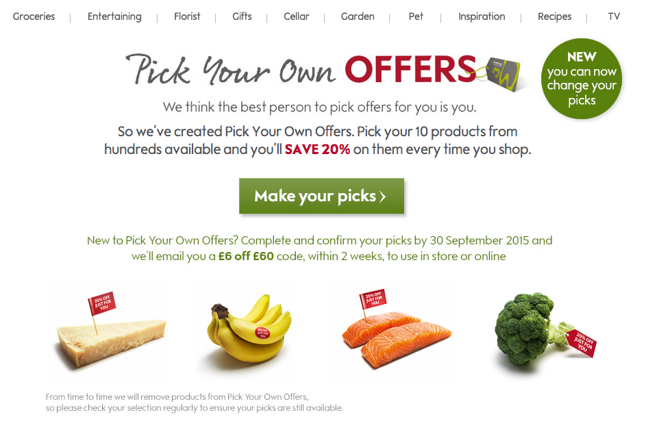
Waitrose, don’t make me think. The illusion of choice in the myWaitrose offers programme.
We have to begin by making the assumption that Waitrose made the decision to ‘force’ their loyal customers to choose their own offers on the basis that it would engender those customers to the brand and this would benefit the business. That is to say that someone at Waitrose ran the numbers and built a business case that said “This will be good for our business”. Now, there’s also a complication (that I freely admit I don’t fully understand) that getting more people to convert on these offers presumably means they lose margin on the specific sale but there is a general uplift on the basket of goods. One estimate put the cost of the scheme at a potential £5m to Waitrose.
From The Guardian, this is how it works:
To use the scheme shoppers must have a myWaitrose card. They can then create an online account, log in, and view the full list of almost 1,000 products from which to select the 10 items they want. They will then get 20% off the cost of these goods, however many times they buy them.
Discounts last for a fixed period, […]. After that shoppers get the chance to choose from a new list. The discount is applied automatically at the checkout, and is on top of other promotions. For example, chickens are currently £10 for three, with the 20% off on top of this.
I’m not a retail analyst. I am merely musing on a set of behavioural biases. A lot of the articles about the scheme are rich with chat about whether it’s a good deal or not for the customer. These article presuppose that the customer has done the work and selected the most pertinent 10 offers for them.
And that, dear reader, is quite the presupposition. More on that in a minute.
Talking of suppositions, Waitrose themselves make one by assuming that customer choice in this sphere is a good thing. Now, they may have done research that told them ‘customers want to choose their offers’. We know, however, that customers – human beings – are not that good at making unbiased decisions. That’s what behavioural theory tells us. Unless the research was rigorously executed with absolutely no bias then I have little faith in the leap Mark Price makes in this BBC News article from June:
The boss of Waitrose, Mark Price, says it’s a ground-breaking move giving customers the power to choose the offers they want.
“Different forms of personalised marketing have been around since the 1990s, but we’re introducing mass customisation in grocery. Customers can choose what’s valuable to them when they shop for groceries. We really are giving power to the consumer,” he said.
Ground-breaking it might be. Doesn’t make it right though.
A host of paradox of choice experiments have been run which demonstrate we are confounded by choice; too much choice, particularly where there is considerable cognitive effort involved in the eventual decision, makes that choice harder to make. We know that increasing choice (often) results in:
- Regret that we made an incorrect choice. We have no-one but ourselves to blame.
- Loss of presence; effectively question why we’re doing this task in the first place.
- Elevated expectation, we’ve been given this choice, we have to make the most of it.
- Peer pressure, other people would make better choices.
With the possible exception of the last item, the myWaitrose scheme falls, in my opinion, into this trap. The illusion of control and freedom it presents, coupled with the possible cost savings is insufficient motivation for me to get over the hump of the effort required to actually do it. As a customer and myWaitrose member, I must have received 20+ emails and direct mails encouraging me to take up my offers, I have never done this beyond a cursory look online. The reason is plain and simple: I cannot be bothered. Even before I’d seen the summaries in the aforementioned articles that showed around a 10% saving on a basket of goods (vs. Tesco) and that the hyped 20% on offer isn’t really against staples but more high-value infrequent goods.
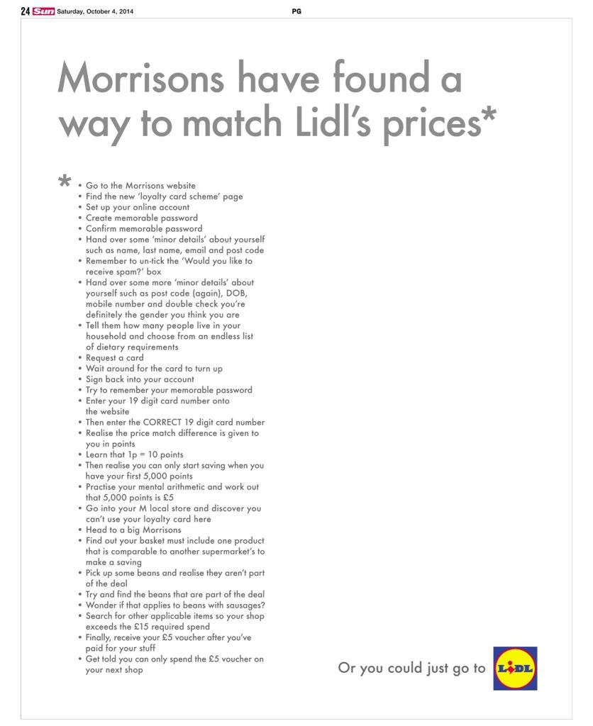
Stopping to think about the customer touchpoints and the interface here might help illustrate. It’s right out of the mantra of Don’t Make Me Think, perhaps that’s idealistic in this day and age, some things are inherently complicated, but saving money at a supermarket shouldn’t be difficult (as pointed out in this fantastic work by Lidl).
myWaitrose try and make things easier by pulling in the favourites from your recent in-store, online and Ocado shops, using these to guide you toward things you’re likely to want offers on. Aside from a couple of high-frequency items like baby wipes, I found myself getting stuck as the task of completing the 10 slots (actually a good, persuasive interaction pattern) became tricky. The value of these slots is such that you want to make the most of them, you don’t want to waste the 10 scarce slots with bad choices. So the decision gets harder.
You, the customer has to do some tricky things. Workout how best to ‘spend’ your ten offer slots. You’re effectively making 10 assessments on whether the offers are for items you’re likely to actually buy (wants vs. needs), taking a view on when you might buy them, and, of course, establishing whether the saving is considerable (accounting for multipacks, alternative places you might get them from etc.). The ‘when’ assessment here matters quite considerably; it’s not made particularly clear when these offers expire and the customer has to predict their own behaviour: “Am I likely to buy this in my next shop?”. They are highly unlikely to be making a prediction based on the likelihood to need an item in 2 month’s time, much of this will be based on the availability heuristic, meaning that they will be thinking about their most recent purchase of that item.
In short, it ain’t easy.
Time and data will tell Waitrose whether the process works for them. Whether the small % of their customers who have a loyalty card (and note, loyalty schemes tend to reward the already loyal, not magically create new loyalists) go through the process and buy more of the stuff they were already buying (one little-promoted benefit is that the offers are repeatable within the period so you can keep saving). My hunch is that the number of engaged and active myWaitrose offers is not the point. This is a brand exercise, encouraging people to think that Waitrose are all customer-focussed and that maybe having one of their free loyalty cards is a good thing. The important thing to Waitrose is knowing which customers spend on what products. I just wonder how long it will be before customers figure out the scheme just isn’t for them and that data mine ceases to be profitable.
EDIT: Update 08.FEB.2018 …. Waitrose close their PYO Offers scheme saying: “We’re always listening to our customers’ feedback on how we can make your shopping experience with us even better. Customers have increasingly told us they have difficulty remembering what their Pick Your Own choices were and how to update them, so we will be stopping ‘Pick Your Own Offers’ after 28 February. We will now be providing tailored vouchers and personalised offers through the post or at the checkout to make it easier for you to make savings on your favourite products.” It only took 3 years to come to that conclusion….
British Gas one-off kitchen appliance repairs is a clunky broken service
It’s always a risk when I rant discuss customer service issues, more than once in the past I have anxiety that a brand I’ve lambasted has been in the building to ask us to pitch or that we’ve been wooing. In this case, I’ve already spent some time in front of this brand, way back in 2008 (maybe 2009). One day it might come back on my plate but here’s the thing, I speak as I find, as an end user, the point is today was just another example of an ostensibly straightforward request being idiotically laborious to change.
Our dishwasher’s broken. It’s not that old, it’s showing an error code. I decided to use British Gas to fix it because their Channel 4 idents and suchlike make it look so easy. Cheerful engineers wielding spanners can repair anything.
I phoned up a couple of weeks ago, had a bit of a crap call-centre experience with shouty voices (I think they were trying to make themselves heard amongst the din) repetition of script after script, hand-offs and I think I had to tell them at least three times it was a one-off booking, not a sign up to a monthly repair plan. Eventually an appointment was booked.
I couldn’t make the appointment tomorrow, I wanted to cancel.
No obvious route back to cancel, had to tweet to get a phone number, eventually @BritishGasHelp (Jamie-Lee) did call me back.
Then, to move an appointment two weeks ahead took three hand-offs to different people, 23+ minutes of time (90% of which on hold) and involved full diaries “Nothing available until mid November” [It’s early September] and lots of tapping around on screens presumably.
How is it, in 2015, that something as logistically straightforward as this, results in a terrible process? Frustration, irritation, time-wasting for them and me. It’s insane.
Eventually an appointment was found. It’s an all day appointment, I’ll get about ten minutes warning before the engineer arrives but I’ll have to be at home from 8am to 6pm.
British Gas’ own website states “Technology and Innovation is key to the ethos of British Gas”, anecdotally at least there is much work to be done.
